Unlock a world of possibilities! Login now and discover the exclusive benefits awaiting you.
- Qlik Community
- :
- All Forums
- :
- QlikView App Dev
- :
- Combo Chart with %
- Subscribe to RSS Feed
- Mark Topic as New
- Mark Topic as Read
- Float this Topic for Current User
- Bookmark
- Subscribe
- Mute
- Printer Friendly Page
- Mark as New
- Bookmark
- Subscribe
- Mute
- Subscribe to RSS Feed
- Permalink
- Report Inappropriate Content
Combo Chart with %
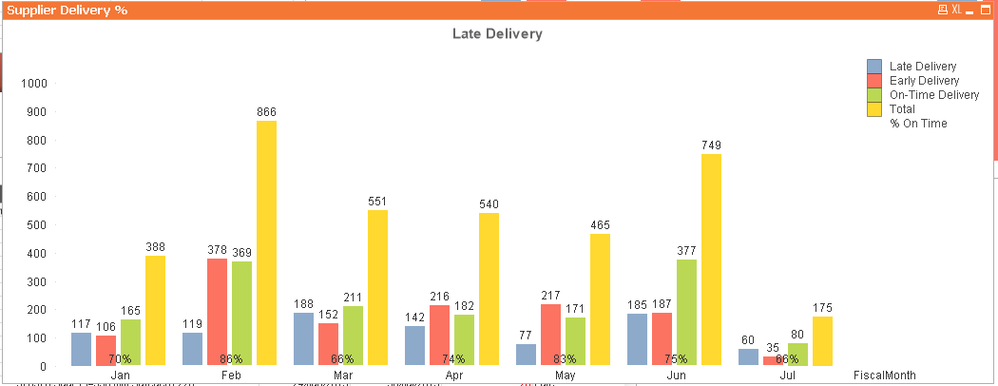
I'm trying to make a combo chart with counts of values as the bars and a % value of the bars as a line but the line is white and sits below all the bars.

The values on the data points are correct but I was hoping it would have another axis on the right or something to make the line a bit more meaningful than just at the bottom.
Is there any better ways to show this?
Accepted Solutions
- Mark as New
- Bookmark
- Subscribe
- Mute
- Subscribe to RSS Feed
- Permalink
- Report Inappropriate Content
Go to Chart|Properties|Axes.
Select the expression for the line and select Position Right (Top)
- Mark as New
- Bookmark
- Subscribe
- Mute
- Subscribe to RSS Feed
- Permalink
- Report Inappropriate Content
Go to Chart|Properties|Axes.
Select the expression for the line and select Position Right (Top)
- Mark as New
- Bookmark
- Subscribe
- Mute
- Subscribe to RSS Feed
- Permalink
- Report Inappropriate Content
Amazing thanks! Do you know how to change the colour of the line from White to any other colour?
- Mark as New
- Bookmark
- Subscribe
- Mute
- Subscribe to RSS Feed
- Permalink
- Report Inappropriate Content
Chart Pproperties|Expressions.
Click the + in front of the expression for the line.
Click Background Color.
Color can be entered as:
Color(1), Color(2), ... OR
rgb(235,55,77)