Unlock a world of possibilities! Login now and discover the exclusive benefits awaiting you.
- Qlik Community
- :
- All Forums
- :
- QlikView App Dev
- :
- Re: Comparing Data In Bar Chart
- Subscribe to RSS Feed
- Mark Topic as New
- Mark Topic as Read
- Float this Topic for Current User
- Bookmark
- Subscribe
- Mute
- Printer Friendly Page
- Mark as New
- Bookmark
- Subscribe
- Mute
- Subscribe to RSS Feed
- Permalink
- Report Inappropriate Content
Comparing Data In Bar Chart
Good afternoon everyone,
I was looking through some of the topics around but most of it seems to be using Sum(Actual) - Sum(Forecast) to obtain the forecast data, and I am not sure that is going to work.
I am pulling data from our working hours and grouping it to the 4 categories in the bar chart seen in the screenshot below.
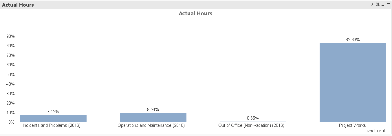
Does anyone have any idea on how to add another expression to show specific set hours for comparison? Take for example, I would like another bar chart containing the set hours of Project Work to be 82%, the Operations and Maintenance to be 10%, while Incidents being 7% and the last 1% being Out of Office.
That way I can compare it to the actual hours % seen above and see the difference.
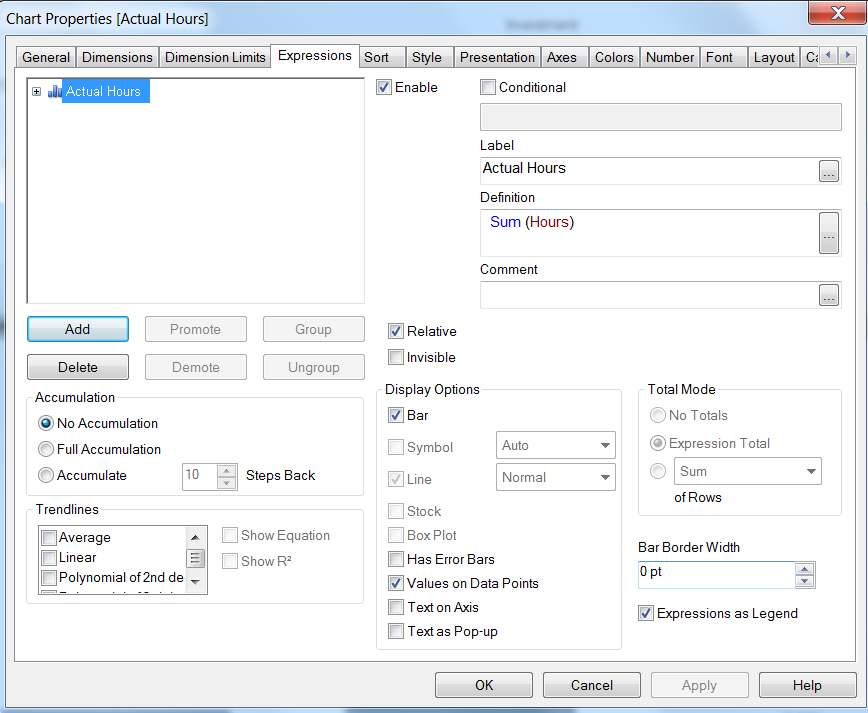
This is the current expression I am using.
Accepted Solutions
- Mark as New
- Bookmark
- Subscribe
- Mute
- Subscribe to RSS Feed
- Permalink
- Report Inappropriate Content
Hi,
You can load an inline load in the script like this:
load * inline
[
| Investment | Target |
| Incidents and Problems(2016), | 7 |
| Operations and Maintenance(2016), | 10 |
| out of Office(Non-vacation)(2016), | 1 |
| Project Works, | 82 |
and then create a separate expression like Num(sum(Target)/100,'#,##0%')
HTH
sushil
- Mark as New
- Bookmark
- Subscribe
- Mute
- Subscribe to RSS Feed
- Permalink
- Report Inappropriate Content
Hi Ernst,
can u share a sample of your data?
Thanks,
- Mark as New
- Bookmark
- Subscribe
- Mute
- Subscribe to RSS Feed
- Permalink
- Report Inappropriate Content
Hi,
You can load an inline load in the script like this:
load * inline
[
| Investment | Target |
| Incidents and Problems(2016), | 7 |
| Operations and Maintenance(2016), | 10 |
| out of Office(Non-vacation)(2016), | 1 |
| Project Works, | 82 |
and then create a separate expression like Num(sum(Target)/100,'#,##0%')
HTH
sushil
- Mark as New
- Bookmark
- Subscribe
- Mute
- Subscribe to RSS Feed
- Permalink
- Report Inappropriate Content
Do you mean to show limits or targets? You can use another expression:
=Pick(Match(dimensionName, 'Incidents...', 'Op...', 'Out...', 'Pr...'), 0.07, 0.10, 0.01, 0.82')
Fill correct name and values of the dimension.Format as 0% in the Number tab of the chart properties. If you use a combo chart, you could draw these points using symbol instead of a bar.
- Mark as New
- Bookmark
- Subscribe
- Mute
- Subscribe to RSS Feed
- Permalink
- Report Inappropriate Content
Thanks Sushil!
- Mark as New
- Bookmark
- Subscribe
- Mute
- Subscribe to RSS Feed
- Permalink
- Report Inappropriate Content
Thank you! Your solution works too!