Unlock a world of possibilities! Login now and discover the exclusive benefits awaiting you.
- Qlik Community
- :
- All Forums
- :
- QlikView App Dev
- :
- Re: Flat Gauges
- Subscribe to RSS Feed
- Mark Topic as New
- Mark Topic as Read
- Float this Topic for Current User
- Bookmark
- Subscribe
- Mute
- Printer Friendly Page
- Mark as New
- Bookmark
- Subscribe
- Mute
- Subscribe to RSS Feed
- Permalink
- Report Inappropriate Content
Flat Gauges
Hi Community,
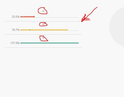
Could any one please explain how this chart would be working.
-- Regards,
Villyee
- Mark as New
- Bookmark
- Subscribe
- Mute
- Subscribe to RSS Feed
- Permalink
- Report Inappropriate Content
Hi,
It's just an idea, an example as how to use the design tools to adjust tha gauge object for a flat and friendly design.
Marc.
- Mark as New
- Bookmark
- Subscribe
- Mute
- Subscribe to RSS Feed
- Permalink
- Report Inappropriate Content
As Mac says, they are just design example only! There's no 'real code' behind them ![]()
- Mark as New
- Bookmark
- Subscribe
- Mute
- Subscribe to RSS Feed
- Permalink
- Report Inappropriate Content
If you take a look in the properties (presentation tab) of the gauge in the upper left corner of this app, you’ll notice three key parameters:
- - Fill to Value
- - Cylinder Thickness = 0
- - Angle span = 180
The Fill to Value parameter shows the red segment filled until it meets its value (65% as stated in the Expression box). By setting the Cylinder Thickness to 0 you get a circle like representation of the gauge. The Angle Span = 180 creates half a circle (180 degrees) that represents 100%.
This gauge is a two layered gauge. One for the red part (65%) and one for the grey part (65 – 100%).
- Mark as New
- Bookmark
- Subscribe
- Mute
- Subscribe to RSS Feed
- Permalink
- Report Inappropriate Content
1. How to place " ABC " above the strip? 2. How to add a dotted line at the bottom
