Unlock a world of possibilities! Login now and discover the exclusive benefits awaiting you.
- Qlik Community
- :
- All Forums
- :
- QlikView App Dev
- :
- Re: Histogram for frequency of deals + cumulative ...
- Subscribe to RSS Feed
- Mark Topic as New
- Mark Topic as Read
- Float this Topic for Current User
- Bookmark
- Subscribe
- Mute
- Printer Friendly Page
- Mark as New
- Bookmark
- Subscribe
- Mute
- Subscribe to RSS Feed
- Permalink
- Report Inappropriate Content
Histogram for frequency of deals + cumulative line for income generated from these deals
Hi all,
I have a list of deals we have. Some are small, some are medium and some are big. I want to test a hunch that the small deals take an unproportionate amount of work. Without getting to the details as to why I need it in the following format, I'd like to get your help to create the following object:
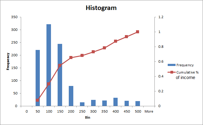
horizontal axis = bins for deal size, multiples of $50.
left vertical axis = absolute numbers, to represent the number of deals that fall under each of these bins (just a regular histogram...).
right vertical axis = %. These will represent the cumulative % of total income generated from those deals. That is, unlike regular histograms with an accumulation line, here the line represents the cumulative % of income generated from the deals. So we're moving from looking at the frequency, to looking at the portion of the $ they generate. Hope I'm making myself clear enough. For example: if all the deals together generated 10,000 MRR (monthly recurring revenue), and there are 40 deals in the first bin of $0-50, and the total MRR from those 40 deals is $1600, than the right vertical axis value would be 16%. If the next bin generates $400, than the value would be 20% (since it cumulative, etc.).

Since the data I work with is confidential, I attach a file with dummy data and the end result I had in mind.
would really really appreciate your help! thanks! ![]()
- « Previous Replies
-
- 1
- 2
- Next Replies »
Accepted Solutions
- Mark as New
- Bookmark
- Subscribe
- Mute
- Subscribe to RSS Feed
- Permalink
- Report Inappropriate Content
It is possible to get the graph without touching any code but it is more complex and you lose some functionality. For example, the numbers are no longer "associated" with a Bin. If a user wants to filter the data to see only Bin 50's for example, he will not be able to. Here is an example for you so that you can see what I mean. Of the two options, I definitely recommend the former.
As for aligning the bars between the tick marks... I am not sure how to go about doing that. I bet Gysbert Wassenaar would know. Anyways, hope it helps!
- Mark as New
- Bookmark
- Subscribe
- Mute
- Subscribe to RSS Feed
- Permalink
- Report Inappropriate Content
See attached.
- Mark as New
- Bookmark
- Subscribe
- Mute
- Subscribe to RSS Feed
- Permalink
- Report Inappropriate Content
Why are you using a cumulative line?
- Mark as New
- Bookmark
- Subscribe
- Mute
- Subscribe to RSS Feed
- Permalink
- Report Inappropriate Content
Reread your post and it sounds like you want MRR as the percentage instead of count. See attached.
- Mark as New
- Bookmark
- Subscribe
- Mute
- Subscribe to RSS Feed
- Permalink
- Report Inappropriate Content
First off - Rebecca - thank you very much! ![]()
couple of questions:
1) is it possible to have the bins show on the horizontal axis like they're supposed to in a histogram? i.e. that the bars would be between the tick marks and not 'on them'?
2) is there a way to go about it with no interference to the code, just with expressions? We have such a complex script here... too afraid to touch anything! ![]()
thanks again! you're delightful!
- Mark as New
- Bookmark
- Subscribe
- Mute
- Subscribe to RSS Feed
- Permalink
- Report Inappropriate Content
Hi David,
It's a sort of Pareto analysis. Think, for sake of argument, that each record takes the same time to process and collect. We have a feeling that the bulk of work comes from the small companies that have very small orders. Makes sense?
- Mark as New
- Bookmark
- Subscribe
- Mute
- Subscribe to RSS Feed
- Permalink
- Report Inappropriate Content
It is possible to get the graph without touching any code but it is more complex and you lose some functionality. For example, the numbers are no longer "associated" with a Bin. If a user wants to filter the data to see only Bin 50's for example, he will not be able to. Here is an example for you so that you can see what I mean. Of the two options, I definitely recommend the former.
As for aligning the bars between the tick marks... I am not sure how to go about doing that. I bet Gysbert Wassenaar would know. Anyways, hope it helps!
- Mark as New
- Bookmark
- Subscribe
- Mute
- Subscribe to RSS Feed
- Permalink
- Report Inappropriate Content
Ha, you weren't joking when you said this way is more complex! ![]()
Thank you very much Rebecca! ![]()
- Mark as New
- Bookmark
- Subscribe
- Mute
- Subscribe to RSS Feed
- Permalink
- Report Inappropriate Content
Rebecca,
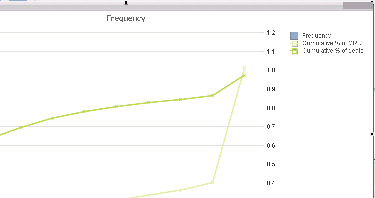
I followed your example, and also added another similar cumulative line to do a cumulative line chart of the frequency (for instance to see that 80% of the deals only generate 40% of revenue, etc.). Notice something weird - neither of the cumulative lines touch the 1, or 100% mark. One is below and one is above. Any ideas why such a thing would happen?
Thanks
Al

- Mark as New
- Bookmark
- Subscribe
- Mute
- Subscribe to RSS Feed
- Permalink
- Report Inappropriate Content
That's strange. Do you have any negative numbers in there? View the data as a straight table and see if anything jumps out.
- « Previous Replies
-
- 1
- 2
- Next Replies »