Unlock a world of possibilities! Login now and discover the exclusive benefits awaiting you.
- Qlik Community
- :
- All Forums
- :
- QlikView App Dev
- :
- Re: Horizontal Bar Chart - Adding multiple columns...
- Subscribe to RSS Feed
- Mark Topic as New
- Mark Topic as Read
- Float this Topic for Current User
- Bookmark
- Subscribe
- Mute
- Printer Friendly Page
- Mark as New
- Bookmark
- Subscribe
- Mute
- Subscribe to RSS Feed
- Permalink
- Report Inappropriate Content
Horizontal Bar Chart - Adding multiple columns/dimensions in X-axis
Hello, all!
My name's Lucas and I'm new to Qlikview and this community.
I'm working on creating a gantt chart (via a combo chart) with the goal of displaying a variety of 'columns' for a single line item and a corresponding gantt line with it. So far, I've been successful in creating a line item with 2 'columns' and a gantt line with watermark:
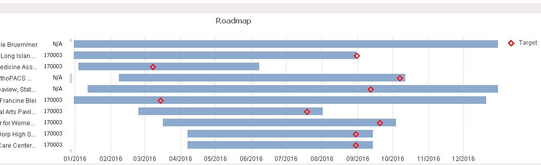
As you can see, I have the name of the activity on the left margin; this is the only dimension I'm using in the Dimensions tab (sorry that the whole name is being cut off, but you get the picture.) To the right of it is a code (e.g., 170003) that I'm displaying via an expression in the Expressions tab. In the display options for this expression, I'm selecting Text on Axis and this allows me to bring the field in.
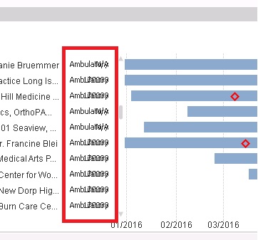
What I would like to do is to bring in other data to the right of the code that I've already surfaced. However, when I use the same functionality (that is, Text on Axis for a different expression,) the data is overlaid:
Is there a way to overcome this? Perhaps there's another way to do it?
Also, is there a way to bring in a header to show the name of attribute/dimension to illustrate what the column represents?
Thank you all in advance!
- Mark as New
- Bookmark
- Subscribe
- Mute
- Subscribe to RSS Feed
- Permalink
- Report Inappropriate Content
press ctrl+shift and resize your chart.
hope that helps
- Mark as New
- Bookmark
- Subscribe
- Mute
- Subscribe to RSS Feed
- Permalink
- Report Inappropriate Content
Frank,
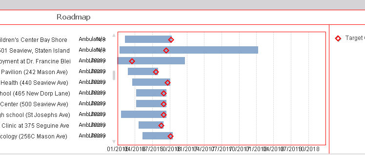
Thanks for the speedy reply! Unfortunately, that isn't working for me. It looks like it isn't something that can be moved out:
- Mark as New
- Bookmark
- Subscribe
- Mute
- Subscribe to RSS Feed
- Permalink
- Report Inappropriate Content
and by pressing ctr-shift and then trying to move the red marked area morr to the right side so that there is more space for your third dimension? Can u share a sample?
- Mark as New
- Bookmark
- Subscribe
- Mute
- Subscribe to RSS Feed
- Permalink
- Report Inappropriate Content
Frank,
Yes, I did that. When you say, share a sample, what do you mean? If you mean attaching a file, unfortunately, I can't. Company policy. 
- Mark as New
- Bookmark
- Subscribe
- Mute
- Subscribe to RSS Feed
- Permalink
- Report Inappropriate Content
Perhaps you can create and upload a little qvw with some random data loading in script and using this data in your chart! So it is more easy to assist
- Mark as New
- Bookmark
- Subscribe
- Mute
- Subscribe to RSS Feed
- Permalink
- Report Inappropriate Content
Hi Lucas!
I do not believe you can have multiple Text on Axis that will show more than 1 column. But you can get away with combining the two fields into one Text on Axis like:
=Code & ' - ' & Field1
Unfortunately there's no headers to explain these fields, but a work around could be adding Pop-up Information to show when a person hovers over the bar like:
='Activity: ' & Activity & chr(10) &
'Code: ' & Code & chr(10) &
'Field1: ' & Field1 & chr(10) &
'Start Date: ' & [Start Date] & chr(10) &
'End Date: ' & [End Date] & chr(10) &
'Target Date: ' & [Target Date] & chr(10)
Just make sure that expression is Text as Pop-up.
Certainly, you could add a text box above the chart or on it (just have a higher layer) for a header.
Attached is an example qvw.
Hope this helps!