Unlock a world of possibilities! Login now and discover the exclusive benefits awaiting you.
- Qlik Community
- :
- All Forums
- :
- QlikView App Dev
- :
- Re: Intermittent column totals
- Subscribe to RSS Feed
- Mark Topic as New
- Mark Topic as Read
- Float this Topic for Current User
- Bookmark
- Subscribe
- Mute
- Printer Friendly Page
- Mark as New
- Bookmark
- Subscribe
- Mute
- Subscribe to RSS Feed
- Permalink
- Report Inappropriate Content
Intermittent column totals
Greetings,
I have a pivot chart which is showing intermittent totals. There are two columns (Record ID and Current Balance) not shown in the attachement. I did not include these columns since there is only one column with the imtermittent totals. I don't want it to show totals at all since I will be using this chart for a report. Has anyone run into a problem like this before? I have not been able to find a thread addressing this issue.
I would also like to limit the Current Balance column to amounts that are less than zero.
- Mark as New
- Bookmark
- Subscribe
- Mute
- Subscribe to RSS Feed
- Permalink
- Report Inappropriate Content
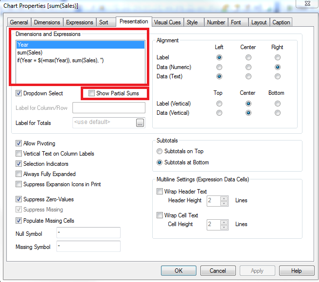
To get rid of the totals, go through each dimension on the Presentation tab, and un-check "Show Partial Sums":

For hiding Current Balance when it is not less than zero, if you have more than one expression, you'll need to use an aggr() in your one of your dimensions in order to hide the row. If it is your only expression, you should be able to use set analysis on it in order to hide it. Without knowing what your data model or dimensions/expressions look like, it's hard to say exactly what you need.
- Mark as New
- Bookmark
- Subscribe
- Mute
- Subscribe to RSS Feed
- Permalink
- Report Inappropriate Content
Hello Nicole,
Thanks for the quick response. I have attached the properties box of the expressions. All expressions have the Show Partial Sums box unchecked. I was not successful in using the aggr function as suggested.
Thanks,
Frank
- Mark as New
- Bookmark
- Subscribe
- Mute
- Subscribe to RSS Feed
- Permalink
- Report Inappropriate Content
What are your dimensions? Can you post a .qvw?
Preparing examples for Upload - Reduction and Data Scrambling
- Mark as New
- Bookmark
- Subscribe
- Mute
- Subscribe to RSS Feed
- Permalink
- Report Inappropriate Content
I have atached the QVW as suggested. Thank you for your assistance.
- Mark as New
- Bookmark
- Subscribe
- Mute
- Subscribe to RSS Feed
- Permalink
- Report Inappropriate Content
How about the attached?
- Mark as New
- Bookmark
- Subscribe
- Mute
- Subscribe to RSS Feed
- Permalink
- Report Inappropriate Content
I am trying to mimic the layout of a report that was previously created in MS Access. It looks like I can use it except for the intermittent totals. If I can get rid of the intermittent totals then I can preset the report to the client for approval.
I understand the aggr function that you mentioned previously. Thanks you.
- Mark as New
- Bookmark
- Subscribe
- Mute
- Subscribe to RSS Feed
- Permalink
- Report Inappropriate Content
What I just attached on my previous post doesn't have the intermittent totals... Are you saying that you want the totals now?
- Mark as New
- Bookmark
- Subscribe
- Mute
- Subscribe to RSS Feed
- Permalink
- Report Inappropriate Content
The way the roiginal report is laid outone line has the Reconciling Department and then the other fields appear on subsequent lines. So you could say that the reconciling department is like a section header. I was using the expressions to try to get the chart to mimic the original report.
Reconciling Department
Account Number Record ID Tax ID Current Balance
Account Number Record ID Tax ID Current Balance
Reconciling Department
Account Number Record ID Tax ID Current Balance
- Mark as New
- Bookmark
- Subscribe
- Mute
- Subscribe to RSS Feed
- Permalink
- Report Inappropriate Content
I don't think that's possible in QlikView, but someone can correct me if I'm wrong...