Unlock a world of possibilities! Login now and discover the exclusive benefits awaiting you.
- Qlik Community
- :
- All Forums
- :
- QlikView App Dev
- :
- Line chart of Expressions separated by Dimension
- Subscribe to RSS Feed
- Mark Topic as New
- Mark Topic as Read
- Float this Topic for Current User
- Bookmark
- Subscribe
- Mute
- Printer Friendly Page
- Mark as New
- Bookmark
- Subscribe
- Mute
- Subscribe to RSS Feed
- Permalink
- Report Inappropriate Content
Line chart of Expressions separated by Dimension
Good Morning Everyone,
Intro
The company I am working for is looking to transition from Tableau to QlikView and potentially onto QlikSense. My role is to get up to speed with QlikView and to do a review on QlikView Vs Tableau, highlighting the benefits and drawbacks to both. At the moment I am really enjoying the ability of QlikView to easily drill down and search through big data sets.
The Question
The data below is a sample of a larger SQL table containing Manufacturing ID, Manufacturing Date and 6xTemperature measures.
TempX columns display temperature differentials from a set point throughout manufacturing.
SetPoint 1- Start production --> SetPoint 6 -End production
As you can see several rows have the same manufacturing ID, e.g ID 394337 appears in the first four rows.
I would like to plot the average temperature profile for each ID. (See Tableau Chart)
As an example of what I am trying to achieve I have included the Tableau counter chart, I don't believe I have enough Qlik expertise to replicate this.  All advice would be greatly appreciated. I have attached the QlikView document.
Thanks
Steve
Sample Table.
| ID | Date | Temp1 | Temp2 | Temp3 | Temp4 | Temp5 | Temp6 |
| 3943337 | 04/01/2016 | -0.32 | 0 | 0.49 | 0.84 | 1.93 | 2.67 |
| 3943337 | 04/01/2016 | -0.32 | 0 | 0.49 | 0.84 | 1.93 | 2.67 |
| 3943337 | 04/01/2016 | -0.32 | 0 | 0.49 | 0.84 | 1.93 | 2.67 |
| 3943337 | 04/01/2016 | -0.32 | 0 | 0.49 | 0.84 | 1.93 | 2.67 |
| 3943338 | 04/01/2016 | 0.51 | 1.22 | 1.19 | 1.45 | 2.09 | 3.5 |
| 3943338 | 04/01/2016 | 0.51 | 1.22 | 1.19 | 1.45 | 2.09 | 3.5 |
| 3943338 | 04/01/2016 | 0.51 | 1.22 | 1.19 | 1.45 | 2.09 | 3.5 |
| 3943338 | 04/01/2016 | 0.51 | 1.22 | 1.19 | 1.45 | 2.09 | 3.5 |
| 3943342 | 04/01/2016 | -1.34 | -0.65 | -0.3 | 0.15 | 0.7 | 1.21 |
| 3943342 | 04/01/2016 | -1.34 | -0.65 | -0.3 | 0.15 | 0.7 | 1.21 |
| 3943342 | 04/01/2016 | -1.34 | -0.65 | -0.3 | 0.15 | 0.7 | 1.21 |
| 3943342 | 04/01/2016 | -1.34 | -0.65 | -0.3 | 0.15 | 0.7 | 1.21 |
| 3943339 | 05/01/2016 | 0.27 | 0.97 | 0.64 | 0.71 | 3.31 | 2.56 |
| 3943339 | 05/01/2016 | 0.27 | 0.97 | 0.64 | 0.71 | 3.31 | 2.56 |
| 3943339 | 05/01/2016 | 0.27 | 0.97 | 0.64 | 0.71 | 3.31 | 2.56 |
| 3943339 | 05/01/2016 | 0.27 | 0.97 | 0.64 | 0.71 | 3.31 | 2.56 |
| 3943340 | 05/01/2016 | 0.19 | 0.24 | 1.13 | 0.75 | 2.47 | 1.58 |
| 3943340 | 05/01/2016 | 0.19 | 0.24 | 1.13 | 0.75 | 2.47 | 1.58 |
| 3943340 | 05/01/2016 | 0.19 | 0.24 | 1.13 | 0.75 | 2.47 | 1.58 |
Tableau chart of temp profile per manufacturing run. (note: the tableau chart does not contain the sample data, this a screenshot into the complete SQL table)
My Attempt..
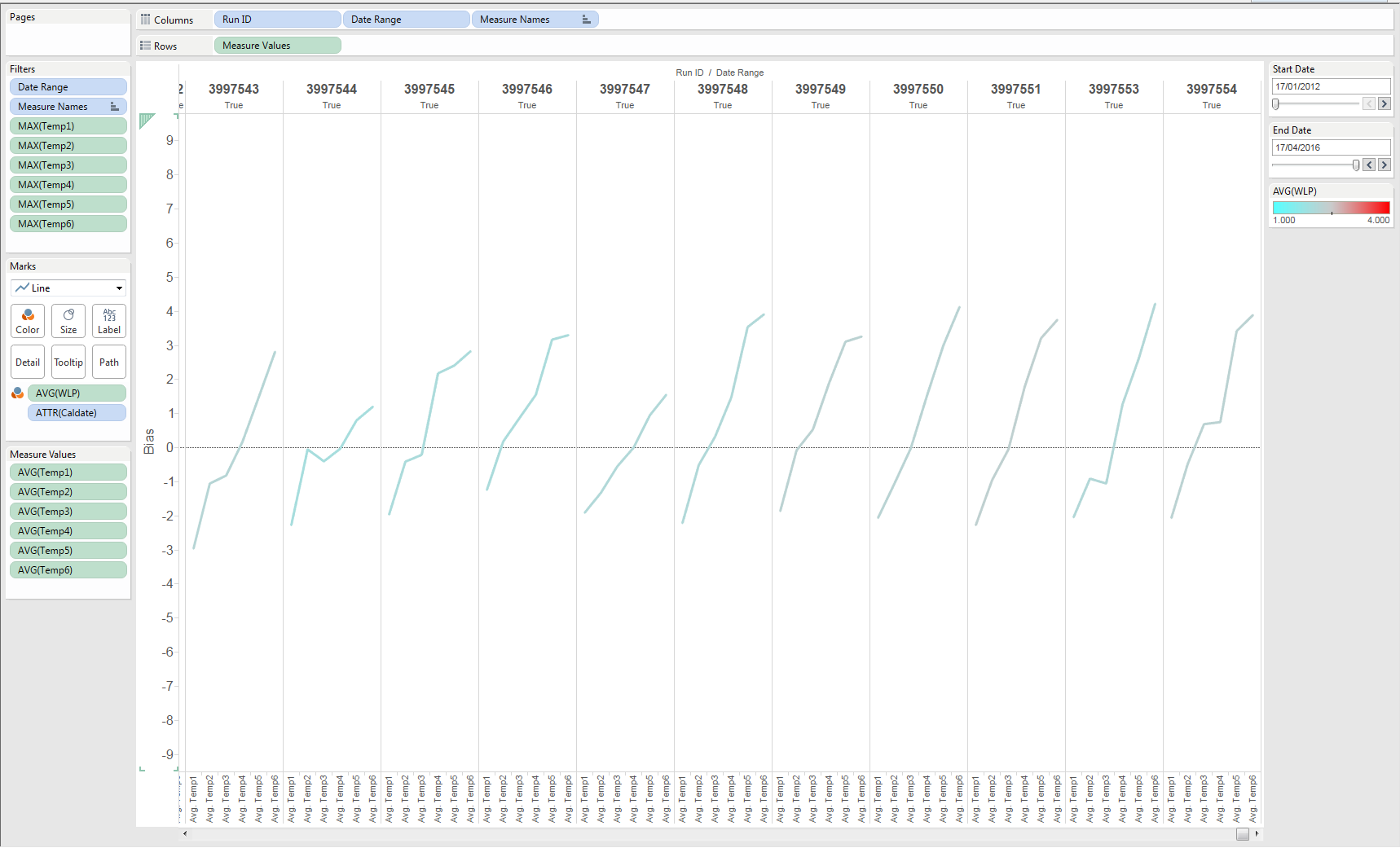
I was unable to find a way to plot TempX along the X and then separate by ID (like in the chart above). I ended up with a continuous line chart for each Tempdiff 1,2,3 etc... 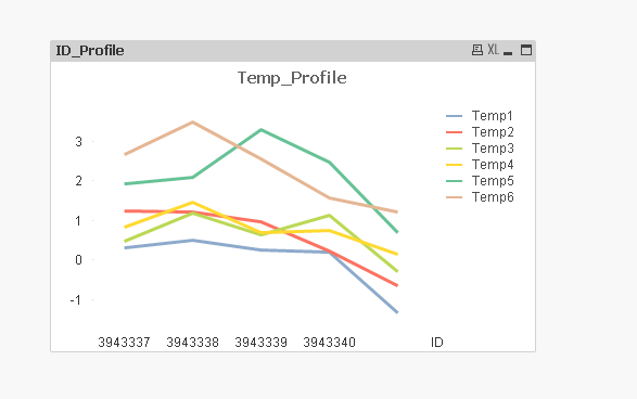
Accepted Solutions
- Mark as New
- Bookmark
- Subscribe
- Mute
- Subscribe to RSS Feed
- Permalink
- Report Inappropriate Content
Something like this?
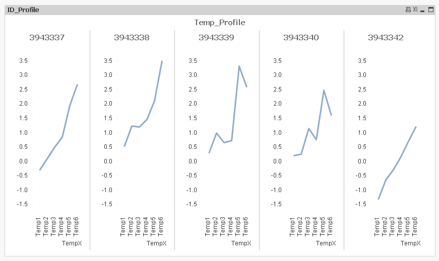
Used the option to Trellis on the dimension tab
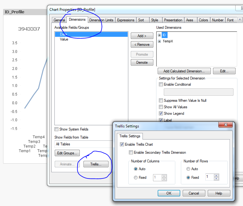
And transformation of your data model:
CrossTable(TempX, Value, 2)
LOAD ID,
Date,
Temp1,
Temp2,
Temp3,
Temp4,
Temp5,
Temp6
FROM
[https://community.qlik.com/thread/220930]
(html, codepage is 1252, embedded labels, table is @1);
- Mark as New
- Bookmark
- Subscribe
- Mute
- Subscribe to RSS Feed
- Permalink
- Report Inappropriate Content
Something like this?
Used the option to Trellis on the dimension tab
And transformation of your data model:
CrossTable(TempX, Value, 2)
LOAD ID,
Date,
Temp1,
Temp2,
Temp3,
Temp4,
Temp5,
Temp6
FROM
[https://community.qlik.com/thread/220930]
(html, codepage is 1252, embedded labels, table is @1);
- Mark as New
- Bookmark
- Subscribe
- Mute
- Subscribe to RSS Feed
- Permalink
- Report Inappropriate Content
Hi Sunny,
That's exactly what I was looking for!!
Thank you