Unlock a world of possibilities! Login now and discover the exclusive benefits awaiting you.
- Qlik Community
- :
- All Forums
- :
- QlikView App Dev
- :
- Re: Line chart values hidden by other lines
- Subscribe to RSS Feed
- Mark Topic as New
- Mark Topic as Read
- Float this Topic for Current User
- Bookmark
- Subscribe
- Mute
- Printer Friendly Page
- Mark as New
- Bookmark
- Subscribe
- Mute
- Subscribe to RSS Feed
- Permalink
- Report Inappropriate Content
Line chart values hidden by other lines
Hi
I have a line chart graph where the lines run on top of other lines as the values are so close. We need a way to have the lines not overlap as much so you can see each line. This varies a lot between client as some may have values on the line chart running within 100000 of each other, in other case this may be in the millions.
I have tried different line styles and colors already, so this does not seem to be the solution. I have also taken out the forced 0 out As seen in the example this is that I cannot separate the lines. Probably something with the scaling would work. Note though that for some values may sun in millions in other cases it could be in thousands
- Mark as New
- Bookmark
- Subscribe
- Mute
- Subscribe to RSS Feed
- Permalink
- Report Inappropriate Content
Unfortunately no, these are trendlines they want to see was hoping there was a way to spread out the values on the y-axis.
- Mark as New
- Bookmark
- Subscribe
- Mute
- Subscribe to RSS Feed
- Permalink
- Report Inappropriate Content
OK try this:
1. on presentation tab set the Line width to 4
2. on expression tab, select sum(finance) and set the Line Style to '<S3>'
3. on expression tab, select sum(Target) and set the Line Style to '<W0.5>'
and you can see both lines quite clearly
Andy
Andy
- Mark as New
- Bookmark
- Subscribe
- Mute
- Subscribe to RSS Feed
- Permalink
- Report Inappropriate Content
a completely different approach you can take, especially since so many of the numbers overlap, is to plot 1 line that is just the difference, and when you hover, you can show values for original, current and the difference
you can also go to the mumbers tab and put in symbols for thousands and millions

- Mark as New
- Bookmark
- Subscribe
- Mute
- Subscribe to RSS Feed
- Permalink
- Report Inappropriate Content
You can set static min & max based on the low/high values in the data.
RangeMin(
Min(aggr(sum(Finance), Year))
,Min(aggr(sum(Target), Year))
)
See attached.
-Rob
- Mark as New
- Bookmark
- Subscribe
- Mute
- Subscribe to RSS Feed
- Permalink
- Report Inappropriate Content
Hi Rob
I did what you suggested, most of the other guys have been helpful but yours so far is closest to what I am looking for. I attached and example of real figures on my model just to show what it does, Year 1314 everything is too close still, year 1415 and 1516 is what I am looking for but the lines are outside the range of the Line chart.
Did I miss something you did on your example?
Also I would like an alternative to having divide by 1000000 in the expressions. If I take it out there the Static Min and Static max also needs a change, but this is not the big issue right now. For now I can live with it and change it later
- Mark as New
- Bookmark
- Subscribe
- Mute
- Subscribe to RSS Feed
- Permalink
- Report Inappropriate Content
See the reply to Rob about using the divide by million. Something is not working 100% with the divide by 1000000, I have used your suggestion before in some other models, just here with the ranges on the line chart it does not work for me. Not sure again if I just have something small I am missing
- Mark as New
- Bookmark
- Subscribe
- Mute
- Subscribe to RSS Feed
- Permalink
- Report Inappropriate Content
Here's your sample modified to fix the 1314 year. The selection in MonthName needed to be ignored in the Max()/Min() as well as the Sum(). See the attached.
Also, as an alternative to dividing by million, I just used the auto scaling on the Number tab.
-Rob
- Mark as New
- Bookmark
- Subscribe
- Mute
- Subscribe to RSS Feed
- Permalink
- Report Inappropriate Content
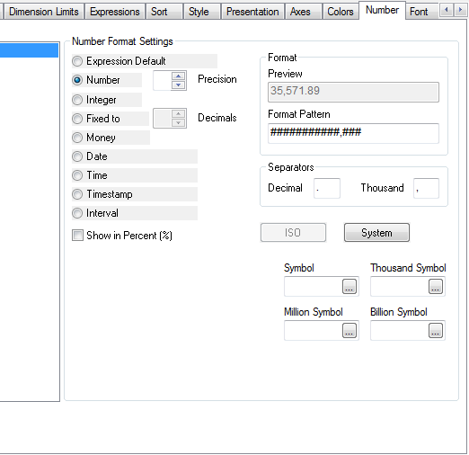
Thanks Rob, where is the autoscaling on the Number tab? Is it just using the $, $K, $M symbols
- Mark as New
- Bookmark
- Subscribe
- Mute
- Subscribe to RSS Feed
- Permalink
- Report Inappropriate Content
Got it, understand what you are doing. Two questions still though. What does Statis Step 1 do exactly?
Then is there a way of getting the values on the points to show within the value range , example having 138995 and 138965 also showing as values?
- Mark as New
- Bookmark
- Subscribe
- Mute
- Subscribe to RSS Feed
- Permalink
- Report Inappropriate Content
Hi
I added few fields we are also using to the RangeMin and RangeMax and now it's not working. I have had a look through the manuals but I am not understanding what is wrong. I think I do not understand what I should have between "Min" and "aggr(Sum" example why are you including the Monthname exclusion there, should I be adding all my fields as well?
RangeMin( Min({<MonthName=,AccountType = {P},BudgetTypeGroup = {Expenditure}>}aggr(Sum({<MonthName=,AccountType = {P},BudgetTypeGroup = {Expenditure}>}BudgetDistributionCalculation), FinancialYear, MonthName))
,Min({<MonthName=,AccountType = {P},BudgetTypeGroup = {Expenditure}>}aggr(Sum({<MonthName=,AccountType = {P},BudgetTypeGroup = {Expenditure}>}BudgetDistributionCalculation + BudgetMovementMonthly), FinancialYear, MonthName))
)