Unlock a world of possibilities! Login now and discover the exclusive benefits awaiting you.
- Qlik Community
- :
- All Forums
- :
- QlikView App Dev
- :
- Re: Need help to show traffic light gauge charts
- Subscribe to RSS Feed
- Mark Topic as New
- Mark Topic as Read
- Float this Topic for Current User
- Bookmark
- Subscribe
- Mute
- Printer Friendly Page
- Mark as New
- Bookmark
- Subscribe
- Mute
- Subscribe to RSS Feed
- Permalink
- Report Inappropriate Content
Need help to show traffic light gauge charts
Hi ,
I am new to Qlikview. I am trying to design a Traffic Light Gauge chart and show Green , Yellow and Reg lights based on the one of the column values (Business_sourced/Rejection score). below is my data source. I selected region as dimesion and in expression i used this condition
If (Business_sourced>=50,'qmem://<bundled>/BuiltIn/led_g.png','qmem://<bundled>/BuiltIn/led_r.png')
but no data is displayed . Can some one help me how to design and show the Traffic Gauge Lights chart
| City | Region | Business sourced | Bad quality | Rejection score |
| Mumbai | West | 130 | 10 | 7.70% |
| Pune | West | 50 | 2 | 4.00% |
| Indore | West | 60 | 0.6 | 3.00% |
| Kolkata | East | 100 | 7 | 7.00% |
| Burdwan | East | 15 | 0.2 | 1.30% |
| Ranchi | East | 60 | 3 | 7.50% |
| Delhi | North | 150 | 20 | 13.30% |
| Gurgaon | North | 60 | 0.5 | 1.30% |
| Chandigarh | North | 50 | 1 | 2.00% |
| Amritsar | North | 10 | 0.7 | 7.00% |
| Bangalore | South | 90 | 4 | 4.40% |
| Chennai | South | 95 | 3 | 3.20% |
| Mysore | South | 60 | 1 | 2.50% |
- Mark as New
- Bookmark
- Subscribe
- Mute
- Subscribe to RSS Feed
- Permalink
- Report Inappropriate Content
Hi,
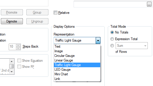
in Chart Properties --> Expressions --> [choose the expression you want to be a traffic light gauge] and in Dispay Options --> Representation --> Traffic Light Gauge.
S.
- Mark as New
- Bookmark
- Subscribe
- Mute
- Subscribe to RSS Feed
- Permalink
- Report Inappropriate Content
- Mark as New
- Bookmark
- Subscribe
- Mute
- Subscribe to RSS Feed
- Permalink
- Report Inappropriate Content
Need to select representation as image under display options after giving the conditions
- Mark as New
- Bookmark
- Subscribe
- Mute
- Subscribe to RSS Feed
- Permalink
- Report Inappropriate Content
If you have a copy we can take a look. If there are multiple values for 'Business_sourced' for each dimension you will need to wrap a function around it e.g. SUM()
If (SUM(Business_sourced)>=50,'qmem://<bundled>/BuiltIn/led_g.png','qmem://<bundled>/BuiltIn/led_r.png')
- Mark as New
- Bookmark
- Subscribe
- Mute
- Subscribe to RSS Feed
- Permalink
- Report Inappropriate Content
Thanks All , It worked finally changed the display options represenation property to image.
- Mark as New
- Bookmark
- Subscribe
- Mute
- Subscribe to RSS Feed
- Permalink
- Report Inappropriate Content
You're welcome.
Consider to mark as useful the answers you think help you 
Bye
S.
- Mark as New
- Bookmark
- Subscribe
- Mute
- Subscribe to RSS Feed
- Permalink
- Report Inappropriate Content
Hi Simone,
I have a similar requirement. As an example, I have created a straight table taking Business area as dimension. I have an in which we are calcualting service avaibility and in assigning the colour to the result as below.
If Service Availability % >95, GREEn Colour,
If service availability % >75 and <95, AMBER colour,
if service availability % <75, RED colour.
Now i am using a gauge chart(in form of traffic light) in which i want to show below details.
Red >2 services statistics breaching their SLA targets
Amber 1-2 services YTD statistics breaching their SLA targets
Green No services YTD statistics breaching their SLA targets
Please help me how can we show this in Traffic signal chart.
Regards
Bibhu