Unlock a world of possibilities! Login now and discover the exclusive benefits awaiting you.
- Qlik Community
- :
- All Forums
- :
- QlikView App Dev
- :
- Re: Recipe for a Pareto Analysis
- Subscribe to RSS Feed
- Mark Topic as New
- Mark Topic as Read
- Float this Topic for Current User
- Bookmark
- Subscribe
- Mute
- Printer Friendly Page
- Mark as New
- Bookmark
- Subscribe
- Mute
- Subscribe to RSS Feed
- Permalink
- Report Inappropriate Content
Recipe for a Pareto Analysis
Hi All
I try to duplicate the HIC post on the above mentioned :-
http://community.qlik.com/blogs/qlikviewdesignblog
I am not able :-
1. Make the chart Bar show yellow color when it is less then 80%
2. How to plot a blue line at 80%.
3. How to sort the sales column.
Enclosed my QV doc
- « Previous Replies
-
- 1
- 2
- Next Replies »
Accepted Solutions
- Mark as New
- Bookmark
- Subscribe
- Mute
- Subscribe to RSS Feed
- Permalink
- Report Inappropriate Content
The changes I did to your document were:
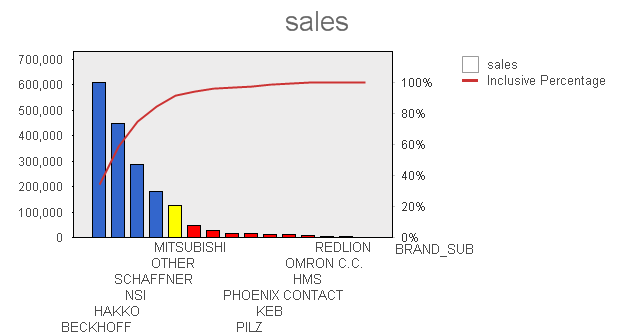
Set the sort order - Sort by expression. (picture shows status after change)

Turn off the accumulation of "Inclusive Percentage" and turn off "Relative". (picture shows status before change)
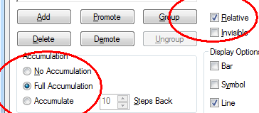
Enable the Exclusive percentage (picture shows status before change)
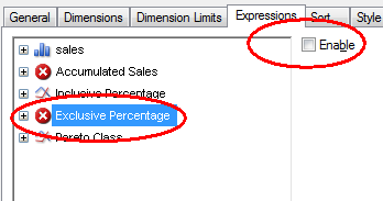
HIC
- Mark as New
- Bookmark
- Subscribe
- Mute
- Subscribe to RSS Feed
- Permalink
- Report Inappropriate Content
You had missed to sort the bars by expression.
HIC
- Mark as New
- Bookmark
- Subscribe
- Mute
- Subscribe to RSS Feed
- Permalink
- Report Inappropriate Content
Hi HIC
Thank you for your reply to my post. i must said all your blog post very are very interesting , and i like this one , because you make the chart display all the impt info.
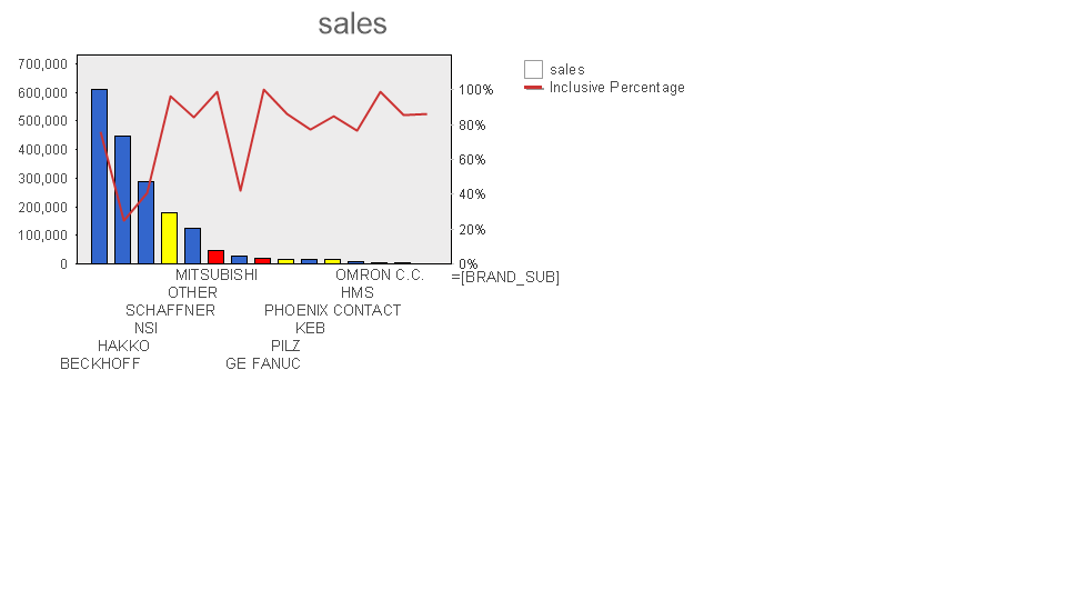
The QV doc you send me is not sort as per your upload image , can you kindly help me to send the correct qv doc again pls. as i still unable to sort the bar chart. now bar chart look like below:-
Paul
- Mark as New
- Bookmark
- Subscribe
- Mute
- Subscribe to RSS Feed
- Permalink
- Report Inappropriate Content
The changes I did to your document were:
Set the sort order - Sort by expression. (picture shows status after change)

Turn off the accumulation of "Inclusive Percentage" and turn off "Relative". (picture shows status before change)

Enable the Exclusive percentage (picture shows status before change)

HIC
- Mark as New
- Bookmark
- Subscribe
- Mute
- Subscribe to RSS Feed
- Permalink
- Report Inappropriate Content
HIC
clever help me , found the bug of using row for accumulated sales , no wonder i keep trying and not able to get what i want. i will try to avoid
- Mark as New
- Bookmark
- Subscribe
- Mute
- Subscribe to RSS Feed
- Permalink
- Report Inappropriate Content
Hi HIC
I have try your pointer with 3 image, i still not able to get it right.
From you first reply , the image you post show the chart working fine , it is possible for you to send me the QV doc which is working. ( Previously the one you send is not working ).
Paul
- Mark as New
- Bookmark
- Subscribe
- Mute
- Subscribe to RSS Feed
- Permalink
- Report Inappropriate Content
Here you are. /HIC
- Mark as New
- Bookmark
- Subscribe
- Mute
- Subscribe to RSS Feed
- Permalink
- Report Inappropriate Content
Thank HIC
This is the same one which you send last time. Funny below image is what i see when i open your QV doc send to me , are you seeing the same image ? if yes , may i know why you post one image during your first reply , you image the sales bar is sort from hi to lo. where mine is not.
Paul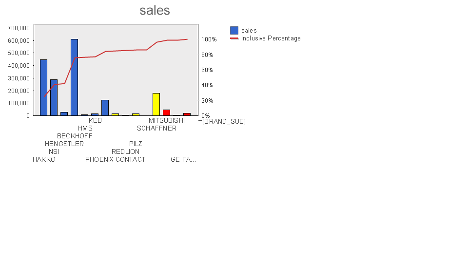
- Mark as New
- Bookmark
- Subscribe
- Mute
- Subscribe to RSS Feed
- Permalink
- Report Inappropriate Content
Hi HIC
I am very sorry to keep asking you again.
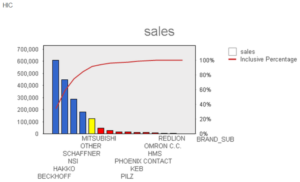
As I am still confuse. Hope you can enlighten me on this . when you first reply me my post , you post a image below , which is what i am looking for. But then when you give me the QV doc i keep getting sales bar is not sort in hi to lo. and you told me i miss out sort in expression sum(sales).
I told you after add sum(sales) , i still not able make the chart as below , again you give me 3 screen shot , and i try still unable to make it .
So i just like to know it is due to QV ver i am using 9 and you are using ver 11 , and the buy for ver 11 is already clear on when using row to cal the sales contribution ? But then i the blog post you make a comment , sales contribution cal on the fly is not possible for dynamic diamension. Hope you can clear my doubt. Any many thank for your contribution in many nice article.
- Mark as New
- Bookmark
- Subscribe
- Mute
- Subscribe to RSS Feed
- Permalink
- Report Inappropriate Content
I don't know why you don't see the same graph. When I download the "QV_Template ver079 hic.qvw" above (from this thread) and open it in QlikView 9, the graph looks perfect:
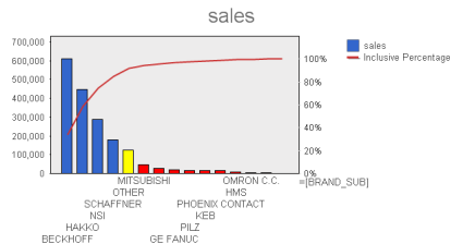
So I do not believe it has to do with the version.
What I mean with "calculating on the fly" is to be able to calculate the Pareto Class as a Calculated Dimension or as a Calculated Field in a List Box. I do not think this is possible.
HIC
- « Previous Replies
-
- 1
- 2
- Next Replies »