Unlock a world of possibilities! Login now and discover the exclusive benefits awaiting you.
- Qlik Community
- :
- All Forums
- :
- QlikView App Dev
- :
- Re: Scatter Plot- Is QlikView implementation short...
- Subscribe to RSS Feed
- Mark Topic as New
- Mark Topic as Read
- Float this Topic for Current User
- Bookmark
- Subscribe
- Mute
- Printer Friendly Page
- Mark as New
- Bookmark
- Subscribe
- Mute
- Subscribe to RSS Feed
- Permalink
- Report Inappropriate Content
Scatter Plot- Is QlikView implementation short of the Ideal
Hi,
I have been using QlikView for around 6 months now, and am impressed by its Data Discovery capabilities.
However, if I my understanding is correct, it appears that the Scatter Plot implementation is not ideal.
Quoting from the book, Making Sense of Data (Glenn J Myatt, Wiley-2007):
Scatterplots can be used to identify whether any relationship exists between two continuous variables based on the ratio or interval scales. The two variables are plotted on the x- and y-axes. Each point displayed on the scatterplot is a single observation. The position of the point is determined by the value of the two variables.
A scatter plot, by default, should attempt plotting EVERY data point. QlikView mandates a dimension, and then proceeds by default to sum the two variables selected (x & y). In case you want every point to be plotted, the primary key of the data set would have to be selected, which will lead to the legend giving strange values.
Is there a better way to use scatter plots in QlikView?
- Tags:
- scatterplot
- « Previous Replies
-
- 1
- 2
- Next Replies »
- Mark as New
- Bookmark
- Subscribe
- Mute
- Subscribe to RSS Feed
- Permalink
- Report Inappropriate Content
Have a look here: Recipe of Making Scatter Chart and the links you get there provided by Barry Harmsen
- Mark as New
- Bookmark
- Subscribe
- Mute
- Subscribe to RSS Feed
- Permalink
- Report Inappropriate Content
Thanks.
The link explains the Scatter plot implementation in QlikView. Looks like Dimension is a must, which need not necessarily be a case for Scatter plot.
For instance, if you have data for Wind Speed, and Pollution for various Cities, say 5 Cities, taken on different dates, say for 1 reading for each day of the week.
If we simply wanted to see all the 52 X 5 plot values as a scatter plot, using the Primary key or Record ID appears to be the only option.
If we want to see the relationship between the variables for various cities on a scatter plot, looks like we will be forced to aggregate the variable (sum/average/max/min etc) values, and be left with 5 plot points.
Which brings me back to the question - is this a drawback of QlikView, and is QlikView thinking of enhancing their scatter plot feature?
- Mark as New
- Bookmark
- Subscribe
- Mute
- Subscribe to RSS Feed
- Permalink
- Report Inappropriate Content
I guess there is a disconnect. Could you provide a sample of what you want it to be like?
- Mark as New
- Bookmark
- Subscribe
- Mute
- Subscribe to RSS Feed
- Permalink
- Report Inappropriate Content
Hi,
Here are two plots, one done in R based on the mileage data (mpg dataset), which shows how the mileage per gallon varies with engine displacement( in litres) for different car driver types (front, rear, or 4 WD).
While R, by default plots all the data points, and you had the option of using colour to show the driver type, in QlikView, to get all the data points plotted, I had to use the Record ID for each record as the dimension, and a meaningless summation of the two variables, I cannot think of an easy way of how to label these data points now as to encode the driver type information.
Had I used the drive type as dimension, and used highway mileage and displacement as expressions, I would have got only three data points on the scatter plot.
Scatter Plot in R:
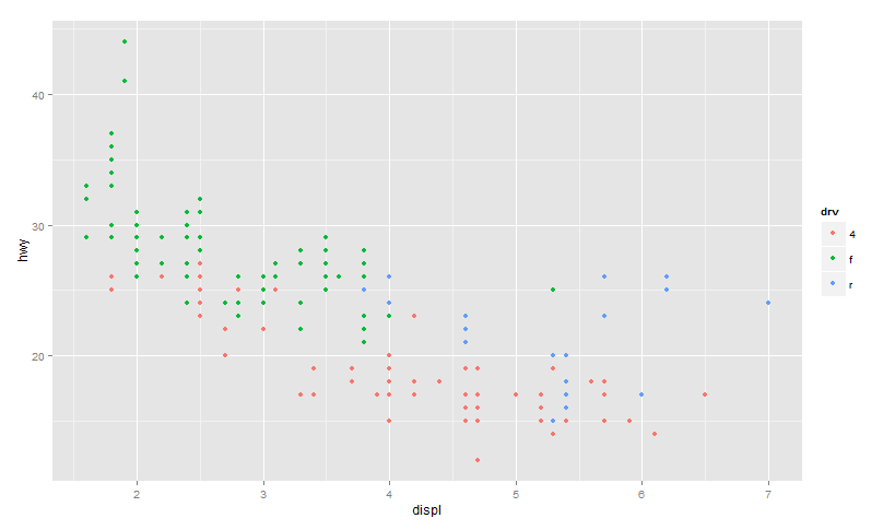
and now an attempt to generate a similar plot in QlikView
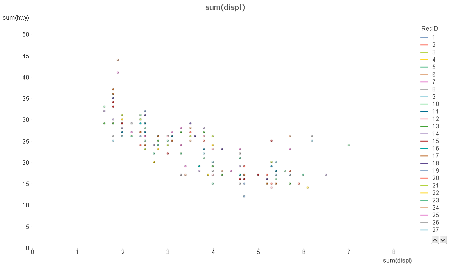
An easy way, or any way to generate the first plot in QlikView would be welcome, and resolve my doubt regarding QlikView's capability in generating good scatterplots.
Gopinath
- Mark as New
- Bookmark
- Subscribe
- Mute
- Subscribe to RSS Feed
- Permalink
- Report Inappropriate Content
Of course dimension is a must. The dimension is just the definition of what each point should represent.
You say "all data points" should be drawn, but this concept is ambiguous in a multi-table model. So you have to specifiy which field (or table) to use. If you want 5 Cities x 52 Days as dimension, then you should use City and Day as dimension(s). Either as one field (City & '-' & Day; defined in the script or as calculated dimension) or as two separate dimensions (to get the colors right). I would say that QlikView is more flexible than most other tools in what you can use to represent each point.
Concerning the expression: Of course you must use an aggregate!. QlikView cannot à priori "know" whether there is one or several wind speed values per City x Day. Hence, QlikView must use an aggregation. (See more here.) If you know that there is only one value of the field [Wind Speed], then you can use this, and it will work. QlikView will then use Only([Wind Speed]). Or, you can use Avg(), which also will work.
HIC
- Mark as New
- Bookmark
- Subscribe
- Mute
- Subscribe to RSS Feed
- Permalink
- Report Inappropriate Content
Just to add an example. Is this what you were looking for?
- Mark as New
- Bookmark
- Subscribe
- Mute
- Subscribe to RSS Feed
- Permalink
- Report Inappropriate Content
Thanks.
I guess the operative point is - In QlikView, Dimension is just the definition of what each point should represent.
In QlikView, with multiple tables, aggregation becomes a necessity.
The challenge now is to find an easy way of distinguishing the individual data points (City to which it pertains), for the default legend value (City-Day combination) is of no relevance on a plot.
Gopinath
- Mark as New
- Bookmark
- Subscribe
- Mute
- Subscribe to RSS Feed
- Permalink
- Report Inappropriate Content
If you use
- st dimension: Measurement = City & '-' & Day
- nd dimension: City
then I think you will get what you want. You may need to change the Representation to 'Only Symbols' also (Presentation tab).
HIC
- Mark as New
- Bookmark
- Subscribe
- Mute
- Subscribe to RSS Feed
- Permalink
- Report Inappropriate Content
PS: If the main goal is to color the data points according to City, then you should take a look at
http://community.qlik.com/blogs/qlikviewdesignblog/2012/12/04/colors-in-charts
and use the same method on the City field.
HIC
- « Previous Replies
-
- 1
- 2
- Next Replies »