Unlock a world of possibilities! Login now and discover the exclusive benefits awaiting you.
- Qlik Community
- :
- All Forums
- :
- QlikView App Dev
- :
- Re: Straight table ignoring dimension - How to con...
- Subscribe to RSS Feed
- Mark Topic as New
- Mark Topic as Read
- Float this Topic for Current User
- Bookmark
- Subscribe
- Mute
- Printer Friendly Page
- Mark as New
- Bookmark
- Subscribe
- Mute
- Subscribe to RSS Feed
- Permalink
- Report Inappropriate Content
Straight table ignoring dimension - How to convert to line chart
Hello,
I have a set of data which basically has a series of transactions, each of which is tied to an account. Some of the accounts are revenue categories, while others are cost categories.
In this sample data set we have 3 groups, Manufacturing, IT and Marketing. Each of these groups has 1 revenue account and multiple cost accounts.
I've set up a straight table which shows the cost as a percentage of revenue got each group, based on a certain cost accounts only. To do this, I have the Account Group and Variable Cost Account dimensions included in the table, with the Variable Cost Account being ignored in the expression calculating the revenue at an Account Group level.
| Month | Account Group | Variable Cost Account | Revenue | Cost | Margin % |
| Sep 2020 | IT | IT Material Cost | 31,500.00 | 3,100.00 | 9.84% |
| Sep 2020 | IT | IT Staff Cost | 31,500.00 | 12,000.00 | 38.10% |
| Sep 2020 | IT | - | 31,500.00 | 0.00 | 0.00% |
| Sep 2020 | Manufacturing | Manufacturing Material Cost | 27,000.00 | 1,700.00 | 6.30% |
| Sep 2020 | Manufacturing | Manufacturing Staff Cost | 27,000.00 | 6,200.00 | 22.96% |
| Sep 2020 | Manufacturing | - | 27,000.00 | 0.00 | 0.00% |
| Sep 2020 | Marketing | Marketing Material Cost | 13,500.00 | 700.00 | 5.19% |
| Sep 2020 | Marketing | Marketing Staff Cost | 13,500.00 | 3,400.00 | 25.19% |
| Sep 2020 | Marketing | - | 13,500.00 | 0.00 | 0.00% |
Leaving only the Margin % expression, the data shows what we need - certain cost categories as a percentage of revenue for their corresponding group:
| Month | Account Group | Variable Cost Account | Margin % |
| Aug 2020 | IT | IT Material Cost | 10.77% |
| Aug 2020 | IT | IT Staff Cost | 34.62% |
| Aug 2020 | Manufacturing | Manufacturing Material Cost | 6.25% |
| Aug 2020 | Manufacturing | Manufacturing Staff Cost | 25.00% |
| Aug 2020 | Marketing | Marketing Material Cost | 5.00% |
| Aug 2020 | Marketing | Marketing Staff Cost | 25.00% |
| Sep 2020 | IT | IT Material Cost | 9.84% |
| Sep 2020 | IT | IT Staff Cost | 38.10% |
| Sep 2020 | Manufacturing | Manufacturing Material Cost | 6.30% |
| Sep 2020 | Manufacturing | Manufacturing Staff Cost | 22.96% |
| Sep 2020 | Marketing | Marketing Material Cost | 5.19% |
| Sep 2020 | Marketing | Marketing Staff Cost | 25.19% |
The challenge is that I'm trying to convert this last table to a line chart, to show the percentage trend per Variable Cost Account over months. When doing this, the Account Group dimension is included and its data points skew the chart, as it has 3 dimensions.
However, if I remove it, the expression totals will not be correct.
Any advice on how I can get the line chart to display the values from the straight table, in line chart format only?
I have attached a sample app which shows the issue and has the 2 objects, to which I'm referring.
Thanks,
Dod
Accepted Solutions
- Mark as New
- Bookmark
- Subscribe
- Mute
- Subscribe to RSS Feed
- Permalink
- Report Inappropriate Content
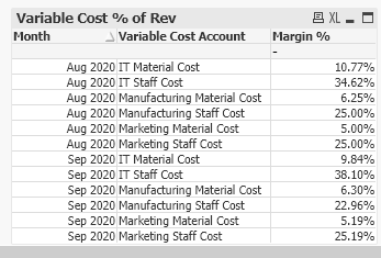
try this expression:
= aggr(nodistinct Sum({<[Cost Type]={'Variable'}>}[Cost Total]),[Account Group],Month, [Variable Cost Account]) /
aggr(nodistinct Sum([Revenue Total]), [Account Group],Month)
this is the straight table:
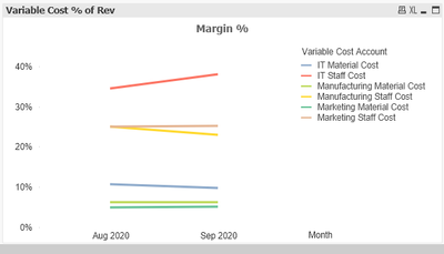
if converted to line:
- Mark as New
- Bookmark
- Subscribe
- Mute
- Subscribe to RSS Feed
- Permalink
- Report Inappropriate Content
Still trying to wrap my head around this but something tells me you might want to look at using the TOTAL statement in your margin % column. If I am not mistaken that would be in the revenue field. You could also look at using the aggr function.
- Mark as New
- Bookmark
- Subscribe
- Mute
- Subscribe to RSS Feed
- Permalink
- Report Inappropriate Content
Thanks for the response.
I have used the TOTAL statement in the Revenue element of the margin % expression:
=(Sum({<[Cost Type]={'Variable'}>}[Cost Total]))
/
Sum(Total<[Account Group],[Month]> [Revenue Total])
This works fine when presenting the data in a straight table. However, for it to be accurate, it does need the Account Group dimension to be part of the table.
When trying to display the data in a line chart, I need to remove the Account Group dimension as otherwise, it has 3 dimensions and the Variable Cost Account margin % values won't display on their own.
However, removing the Account Group dimension impacts the calculation.
I'm trying to figure out another way of calculating each Variable Cost Account as percentage of its Account Group revenue total, without needing to include the Account Group dimension.
Thanks again.
- Mark as New
- Bookmark
- Subscribe
- Mute
- Subscribe to RSS Feed
- Permalink
- Report Inappropriate Content
I'm just checking if anyone has any advice on this.
The issue is shown in the .qvw file I attached.
Thanks,
Dod
- Mark as New
- Bookmark
- Subscribe
- Mute
- Subscribe to RSS Feed
- Permalink
- Report Inappropriate Content
What may help the most is if you can provide a screenshot of how you want the line chart to actually appear, that is likely going to be most helpful in getting further responses on this. The only place I could point you for other ideas would be the following two Community areas:
https://community.qlik.com/t5/Qlik-Design-Blog/bg-p/qlik-design-blog
https://community.qlik.com/t5/QlikView-Documents/tkb-p/qlikview-documents
Regards,
Brett
I now work a compressed schedule, Tuesday, Wednesday and Thursday, so those will be the days I will reply to any follow-up posts.
- Mark as New
- Bookmark
- Subscribe
- Mute
- Subscribe to RSS Feed
- Permalink
- Report Inappropriate Content
try this expression:
= aggr(nodistinct Sum({<[Cost Type]={'Variable'}>}[Cost Total]),[Account Group],Month, [Variable Cost Account]) /
aggr(nodistinct Sum([Revenue Total]), [Account Group],Month)
this is the straight table:
if converted to line:
- Mark as New
- Bookmark
- Subscribe
- Mute
- Subscribe to RSS Feed
- Permalink
- Report Inappropriate Content
Thank you very much, @edwin . This has produced the output I needed. Your help is much appreciated.
@Brett_Bleess, I needed the line chart to display with only the Month and Variable Cost Account dimensions, but to retain the actual cost % totals from the table including the Account Group dimension. Thanks also for the guidance.

