Unlock a world of possibilities! Login now and discover the exclusive benefits awaiting you.
- Qlik Community
- :
- All Forums
- :
- QlikView
- :
- Threshold visualization in diagram, to be values /...
- Subscribe to RSS Feed
- Mark Topic as New
- Mark Topic as Read
- Float this Topic for Current User
- Bookmark
- Subscribe
- Mute
- Printer Friendly Page
- Mark as New
- Bookmark
- Subscribe
- Mute
- Subscribe to RSS Feed
- Permalink
- Report Inappropriate Content
Threshold visualization in diagram, to be values / plan values
Hey guys,
does anybody of you experts know, if this visualization requirement can easily be done with QlikView?
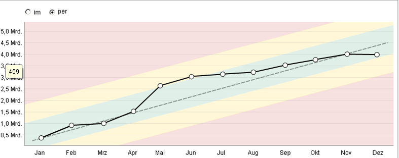
My special concern goes to the red, yellow and green layers which I think should represent the thresholds or "to be" values.
I guess you could solve it with two overlapping transparent diagrams, but is there a way to solve it with only one diagram?
Sorry I don't have any more information at that point, we are just evaluating some requirements if we could solve it with QlikView
Any input is highly appreciated.
Cheers, msglanges
- Mark as New
- Bookmark
- Subscribe
- Mute
- Subscribe to RSS Feed
- Permalink
- Report Inappropriate Content
No one?
- Mark as New
- Bookmark
- Subscribe
- Mute
- Subscribe to RSS Feed
- Permalink
- Report Inappropriate Content
msgangles
You could create the background graphic as a png or jpg file (using a graphics app), and use that as the chart background (on the colors tab, frame background). It would not be a static image and would not respond to selections, but that may be OK for your requirements.
Hope that helps
Jonathan
- Mark as New
- Bookmark
- Subscribe
- Mute
- Subscribe to RSS Feed
- Permalink
- Report Inappropriate Content
Thanks for your reply Jonathan
Unfortunately the requirement allows the coloured layers not to be static, because they are "to be values" or threshold like in the traffic light gauge..
In this example you would have to define for January, everything over 2Mrd is red ... and so on.
I was hoping you could solve it with two different key figures in one diagram, but I haven't found a formatting option which visualizes as it is defined in the above picture. 
Maybe anyone else has solved a similar requirement or has any input? 
- Mark as New
- Bookmark
- Subscribe
- Mute
- Subscribe to RSS Feed
- Permalink
- Report Inappropriate Content
Haven't tried, but maybe you could reuse some of the logic used in this sample
http://community.qlik.com/message/153383
to get your coloured sections. It's probably kind of a hack.
Stefan