Unlock a world of possibilities! Login now and discover the exclusive benefits awaiting you.
- Qlik Community
- :
- All Forums
- :
- QlikView App Dev
- :
- Re: Traffic Lights - Same row as #'s
- Subscribe to RSS Feed
- Mark Topic as New
- Mark Topic as Read
- Float this Topic for Current User
- Bookmark
- Subscribe
- Mute
- Printer Friendly Page
- Mark as New
- Bookmark
- Subscribe
- Mute
- Subscribe to RSS Feed
- Permalink
- Report Inappropriate Content
Traffic Lights - Same row as #'s
Is it possible to have your traffic lights in qlikview on the same row as the numbers you're trying to indicate are Green/Yellow/Red.
I can't figure this out.
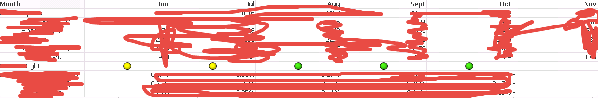
Currently the lights are on their own row, but I want them on the same row as one that has TEXT to indicate that that value either A) needs looked at, or B) is good to go.
BTW this is a pivot table
Accepted Solutions
- Mark as New
- Bookmark
- Subscribe
- Mute
- Subscribe to RSS Feed
- Permalink
- Report Inappropriate Content
Hi Marcus, there is certainly a work around for this in case someone needs it.
See here:
- Mark as New
- Bookmark
- Subscribe
- Mute
- Subscribe to RSS Feed
- Permalink
- Report Inappropriate Content
That's not possible. But you could add special chars like arrows to indicate good/bad results - I mean something like: Arrows HTML Code - Character Codes. Further you could consider to color the text (and an appropriate arrow ?) to their result.
- Marcus
- Mark as New
- Bookmark
- Subscribe
- Mute
- Subscribe to RSS Feed
- Permalink
- Report Inappropriate Content
what good are the lights if they can't be shown next to the appropriate values... unless you have the expressions in columns... which makes it difficult to view if you have a a lot of expressions..... which I do. Especially since I have Categories and sub categories. This would be hard to view horizontally versus vertically.
- Mark as New
- Bookmark
- Subscribe
- Mute
- Subscribe to RSS Feed
- Permalink
- Report Inappropriate Content
That there are objects/features like gauges doesn't mean that's useful and recommended to use them. Personally I would try to avoid them and creating a user-friendly gui more in ways like here explained:
Learning Qlikview Data Visualization (September 2013)
Karl Pover
ISBN-13: 978-1782179894
Mastering Qlikview Data Visualization (April 2016)
Karl Pover
ISBN: 978-1782173250
Creating Stunning Dashboards with QlikView (October 2015)
Julian Villafuerte
ASIN: B017YC72MU
More you could find here: Books and literature.
- Marcus
- Mark as New
- Bookmark
- Subscribe
- Mute
- Subscribe to RSS Feed
- Permalink
- Report Inappropriate Content
In most cases, the end-user drives the criteria, as in mine. Some of my end users don't have time for the GUI - which is why I need a dashboard that can point them exactly to the places they need to keep an eye on. End-users are C-SUITE
- Mark as New
- Bookmark
- Subscribe
- Mute
- Subscribe to RSS Feed
- Permalink
- Report Inappropriate Content
Are you suggesting adding arrows as text objects and put them next to the row? I'm confused. Is there any way to have more than one value/object in a cell using qlikview, other than hard coding 1000 text objects
- Mark as New
- Bookmark
- Subscribe
- Mute
- Subscribe to RSS Feed
- Permalink
- Report Inappropriate Content
In a cell you could have a gauge or a link or a picture or any text whereby the text mustn't be just a number else there could be various text-parts combined like numbers + arrows + additional informations and which could be set conditionally in bold or colored - which would provide a good readability even by a quick look on them.
- Marcus
- Mark as New
- Bookmark
- Subscribe
- Mute
- Subscribe to RSS Feed
- Permalink
- Report Inappropriate Content
Marcus could you provide an example? Another thought I had - Is there a way to "hide" the dimension values and label, i.e. in the picture above - MONTH, and the 6 months that follow, as well as making the pivot table itself transparent? Then I could just overlay pivot tables that contain the traffic lights with the rows that contain the values...
- Mark as New
- Bookmark
- Subscribe
- Mute
- Subscribe to RSS Feed
- Permalink
- Report Inappropriate Content
Hi Marcus, there is certainly a work around for this in case someone needs it.
See here: