Unlock a world of possibilities! Login now and discover the exclusive benefits awaiting you.
- Qlik Community
- :
- All Forums
- :
- QlikView App Dev
- :
- Re: add 'text in chart ' to gauges in a Trellis ch...
- Subscribe to RSS Feed
- Mark Topic as New
- Mark Topic as Read
- Float this Topic for Current User
- Bookmark
- Subscribe
- Mute
- Printer Friendly Page
- Mark as New
- Bookmark
- Subscribe
- Mute
- Subscribe to RSS Feed
- Permalink
- Report Inappropriate Content
add 'text in chart ' to gauges in a Trellis chart arrangement
I have a series of gauges showing % objective achieved in sales performance in a number of districts within a selected region. The gauges are trellis-ed I want to add text that shows the exact value of the percentage achieved. When I add a Text in Chart calculation, it only shows ONCE for the entire chart, using the sum of the sales / sum of objectives for all districts within the selected region. Any ideas on how to make it calculate and show for each district?
thanks!
- Mark as New
- Bookmark
- Subscribe
- Mute
- Subscribe to RSS Feed
- Permalink
- Report Inappropriate Content
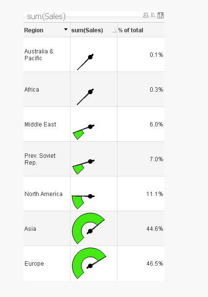
The trellis won't give you this but a 'spark line' will give a version of this, but not on the actual chart.
To create a spark line, create a straight table chart and add the dimension you want trellised. Include the expression you had from before but on the expression tab change the 'representation' of the expression from text to one of the gauges.
Increase the row height on the presentation tab to make it better and do other styling as you see fit.
In the sample below the 'text in chart' shows to the right of the chart. Best part is its all dynamic.
- Mark as New
- Bookmark
- Subscribe
- Mute
- Subscribe to RSS Feed
- Permalink
- Report Inappropriate Content
Thanks Jonathan, I will lok into this option.