Unlock a world of possibilities! Login now and discover the exclusive benefits awaiting you.
- Qlik Community
- :
- All Forums
- :
- QlikView App Dev
- :
- showing percent in Y- axis
- Subscribe to RSS Feed
- Mark Topic as New
- Mark Topic as Read
- Float this Topic for Current User
- Bookmark
- Subscribe
- Mute
- Printer Friendly Page
- Mark as New
- Bookmark
- Subscribe
- Mute
- Subscribe to RSS Feed
- Permalink
- Report Inappropriate Content
showing percent in Y- axis
I have requirement to show the Y axis of line chart in percent, similar to Mekko Chart.
With some simple data I simply used count(data)/count(total(data) for the expression but when I used it in a different larger sample with the following expression :
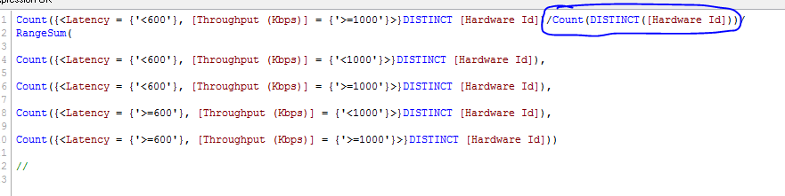
Count({<Latency = {'<600'}, [Throughput (Kbps)] = {'<1000'}>}DISTINCT [Hardware Id])/Count(DISTINCT([Hardware Id]))
and changed the number to integer and selected show in percent under number tab, the total number does not result in 100%. In this example it shows below 100%, and real data I had even more than 100%. Any hint how to simply make it like Mekko chart so that it is always showing 100%.

This is a continuation of the discussion from different thread https://community.qlik.com/message/1064903?et=watches.email.thread#1064903
The expression seems to be correct and theoretically all numbers should add up in 100%. Any clue ?
- « Previous Replies
-
- 1
- 2
- Next Replies »
- Mark as New
- Bookmark
- Subscribe
- Mute
- Subscribe to RSS Feed
- Permalink
- Report Inappropriate Content
Hi Sunny,
The above expressions are still showing huge percentage and not showing the
100% of total. when all lines are stacked together.
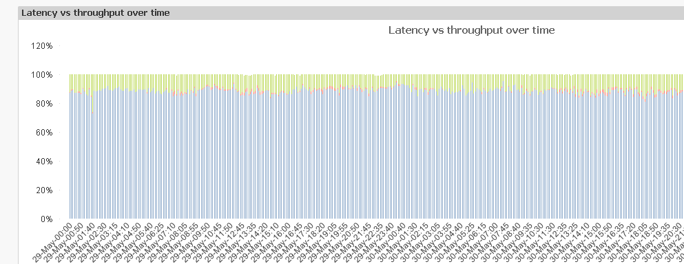
I'd like to show this image but simply with % in Y axis . I'd like to have
a flat 100% line on the top. How was this chart created?
I tried all your suggestions but none are working as expected.
Any other hints or clue?
- Mark as New
- Bookmark
- Subscribe
- Mute
- Subscribe to RSS Feed
- Permalink
- Report Inappropriate Content
I guess I am just trying to use a very basic idea that if I have four numbers 1, 2, 3, 4 and I want to find a percentage that add up to 100%, I will do something like this:
1/(1+2+3+4) = 10%
2/(1+2+3+4) = 20%
3/(1+2+3+4) = 30%
4/(1+2+3+4) = 40%
This should always add up to 100%
Now I am not entirely sure what is different about your particular scenario, but if you do this:
Expression1/RangeSum(Expression1, Expression2, Expression3, Expression4)
Expression2/RangeSum(Expression1, Expression2, Expression3, Expression4)
Expression3/RangeSum(Expression1, Expression2, Expression3, Expression4)
Expression4/RangeSum(Expression1, Expression2, Expression3, Expression4)
I see no reason why it would not sum up to 100%
How many dimensions do you have in your chart? I hope just one....
- Mark as New
- Bookmark
- Subscribe
- Mute
- Subscribe to RSS Feed
- Permalink
- Report Inappropriate Content
That's what I was thinking too. Theoretically it should add up to 100% and
simply shows horizontal line of 100% on the top.
I only have one dimension in this scenario, which is time, which is
timestamp(, 'DD-MMM-hh:mm').
I use integer and show in percent for the Y axis, which I think it just
simply shows the number in percent and does not affect any calculation.
I tried in both test and real file and both are not showing correctly.
The attached is a sample file
- Mark as New
- Bookmark
- Subscribe
- Mute
- Subscribe to RSS Feed
- Permalink
- Report Inappropriate Content
Did you notice this part here?
You have this in your last 3 expressions..... and see what that is doing in the straight table:

Once I remove that

Bingo, the chart is fixed
I am attaching the file for you to check.
Best,
Sunny
- Mark as New
- Bookmark
- Subscribe
- Mute
- Subscribe to RSS Feed
- Permalink
- Report Inappropriate Content
HI Sunny,
Many thanks for spotting this silly mistake. It works now after I removed
the garbage statements in the expressions. It might be caused by cut and
paste at the first place.
Again, thanks for spotting this.
- Mark as New
- Bookmark
- Subscribe
- Mute
- Subscribe to RSS Feed
- Permalink
- Report Inappropriate Content
Awesome!!!
I am glad it is working now  . I would ask you to close this thread down if you got what you wanted by marking the correct and helpful responses.
Qlik Community Tip: Marking Replies as Correct or Helpful
Best,
Sunny
- Mark as New
- Bookmark
- Subscribe
- Mute
- Subscribe to RSS Feed
- Permalink
- Report Inappropriate Content
May be something like this

You are data is not 100% beciuase the Latency has null values which are counted in the Count( Distinct HardwareID)
change the Denominator as something like the below
Count({<Latency = {'<600'}, [Throughput (Kbps)] = {'<1000'}>}DISTINCT [Hardware Id]) /
count({<Latency={"=len(Latency)>1"},[Throughput (Kbps)]={"=len([Throughput (Kbps)])>1"}>} DISTINCT [Hardware Id])
- Mark as New
- Bookmark
- Subscribe
- Mute
- Subscribe to RSS Feed
- Permalink
- Report Inappropriate Content
Thanks for additional information.
The tips that Sunny suggested also worked.
- « Previous Replies
-
- 1
- 2
- Next Replies »