Unlock a world of possibilities! Login now and discover the exclusive benefits awaiting you.
Suggest an Idea
Vote for your favorite Qlik product ideas and add your own suggestions.
- Qlik Community
- :
- Support
- :
- Ideation
- :
- Submit an Idea
- :
- Ideation
- :
- Ideas
- :
- Better visibility for long field names in the obje...
- Subscribe to RSS Feed
- Mark as New
- Mark as Read
- Bookmark
- Subscribe
- Printer Friendly Page
- Report Inappropriate Content
Better visibility for long field names in the objects pane
- Mark as New
- Bookmark
- Subscribe
- Mute
- Subscribe to RSS Feed
- Permalink
- Report Inappropriate Content
Better visibility for long field names in the objects pane
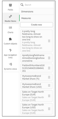
I'd like to add an idea for better visibility of long field names and master items such as
Sales on Target North Europe (USD)
SomeProductName Market Share (%)
10.2.4.1 KPI - Cost of Goods Sold (Previous Year)
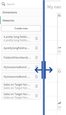
Usually the most relevant information can be found at the end of the description text, when creating Master Items. In the current object list view this piece of information is often clipped off due to the fixed width. The full text can only be retrieved by hovering over or clicking through multiple items in the list until you find the one you are searching for.
I think many Qlik app designers know the frustration of having to duplicate items that start with the same text and getting lost between your duplicates and therefore editing the wrong field.
There are simple solutions to this problem and I want to suggest two:
- Implement line-breaks and word-wraps for field names.
We have added some CSS to our custom Sense Theme to realize this feature. - Since everything is reactive you could simply make the object pane width resizable.
(This feature would be nice in other parts of the application too, e.g. Data Load Editor)
I have checked and this issue exists in all versions of Qlik Sense: Qlik Sense Business , Qlik Sense Desktop , Qlik Cloud.
Looking forward to hear your opinions on this.
You must be a registered user to add a comment. If you've already registered, sign in. Otherwise, register and sign in.

