We have access on the Qlik download site, to get the preferred products.
There the selection of the desired version in combination of the release number is not intuitive. Look the following example:

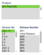
Qlik Replicate and the version 2021.11 is selected. Based on the white and grey underlying text I see, that for that combination the release number "Initial Release" and "SR1" is selectable.
It would be better if you just show the possible selections. So just remove the other entries SR2-SR9.
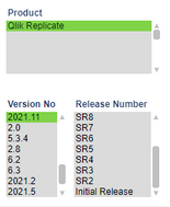
The moment I select the latest version "SR1" all other entries are also underlayed grey.

Now it isn't possible to see, which release numbers are available.
It could be a little bit more intuitive 🙂
Maybe you agree with me 😄