Unlock a world of possibilities! Login now and discover the exclusive benefits awaiting you.
- Subscribe to RSS Feed
- Mark as New
- Mark as Read
- Bookmark
- Subscribe
- Printer Friendly Page
- Report Inappropriate Content
We have been talking a lot about color recently. Chuck showed us how to manage colors and alpha transparencies to increase visual perception in our dashboards making it clear for business users to consume charts. A few days before, Apeksha shared some good tips about color usage in QlikView apps. If you are looking for more insight about color and interpretations I strongly recommend you to read Apeksha’s Technical Brief.
Choosing the right colors.
Colors are present in our apps not only in the charts but also in the backgrounds, tab row, captions, and so forth. It’s key to find a color palette that works and that lets business users consume information quickly and in an efficient way.
There are lots of content and good examples on the internet about color palettes; sites like kuler.adobe.com can provide you with some nice color combinations for your next project.
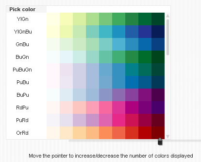
Some of the most popular color combinations are in colorbrewer2.org. Created by Cynthia Brewer, Mark Harrower and The Pennsylvania State University. It was originally designed for cartographers but it’s a standard in academia for any type of data visualization. (http://colorbrewer2.org/)
I created a QV app (see below) with these colors palettes to facilitate their adoption by our community. Feel free to use, improve and distribute it.
Testing your colors
As discussed earlier in this blog, around 7-8% of world’s population has some short of different color perception. To create great looking QlikView apps you should be conscious that some people out there do not see colors as you do.
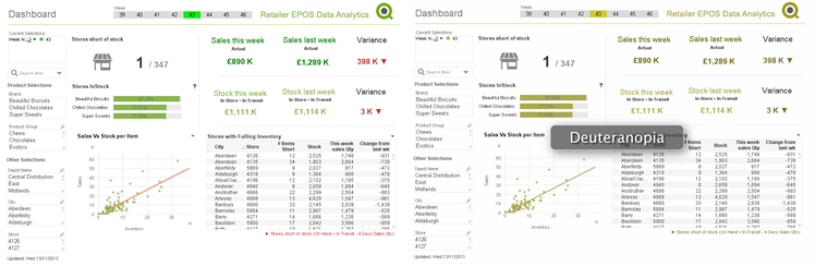
To avoid that potential risk that could ruin your app, you could use one of the pre-designed color blind safe palettes and/or you could test your app using a tool that lets you emulate a color blind environment.
Color Oracle is a free color blindness simulator for Window, Mac and Linux. It takes the guesswork out of designing for color blindness by showing you, in real time, what people with common color vision impairments will see. http://www.colororacle.org/
Reading colors
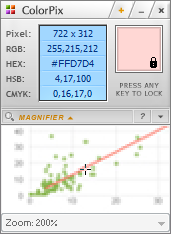 Common tasks are time consuming and when it comes to color it’s very common to find yourself trying to reuse corporative colors. It is probably safe to assume that we all have a color picker tool installed in our machines, but in case you do not... My personal favorite is ColorPix.
It’s a standard Color picker tool but it has some features I find it very useful when working with QlikView. I use ColorPix mouse accelerators a lot, that let me copy the RGB value by clicking on the displayed number, then I just need to type RGB( Ctrl+C ) into calculated base color expression box to include the color in my app.
These are 3 small utilities that make my life much easier but, what about you? Are you using any other tool to help you with your QlikView development? Share it with us in the comments!
Enjoy Qliking!
AMZ
Extra: Safe color palettes QV app
You must be a registered user to add a comment. If you've already registered, sign in. Otherwise, register and sign in.