Unlock a world of possibilities! Login now and discover the exclusive benefits awaiting you.
- Qlik Community
- :
- Forums
- :
- Analytics & AI
- :
- Products & Topics
- :
- App Development
- :
- Bar chart with more than 2 dimensions - Alternativ...
- Subscribe to RSS Feed
- Mark Topic as New
- Mark Topic as Read
- Float this Topic for Current User
- Bookmark
- Subscribe
- Mute
- Printer Friendly Page
- Mark as New
- Bookmark
- Subscribe
- Mute
- Subscribe to RSS Feed
- Permalink
- Report Inappropriate Content
Bar chart with more than 2 dimensions - Alternative approaches?
Hi,
I understand that in Sense we cannot have a bar chart with more than two dimensions. I have a requirements whereby we want to show the annual breakdown of things by two different categories, lets call them Primary and Secondary
So we have a dimension of years, grouped bars to show the volume of the Primary dimensions for each year, and then would like to see these bars stacked, to show the volume of each secondary dimension for each primary
Something like:
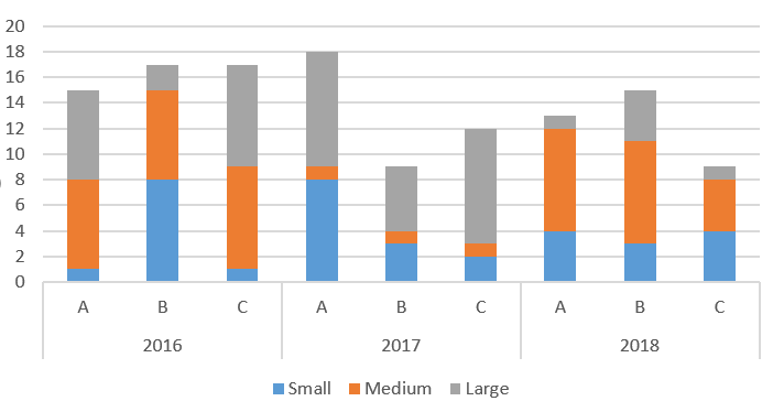
I don't believe this is possible, with us limited to a max of 2 dimensions. Anyone got any suggestions of how to represent the above in a chart, or a number of charts with an alternative approach?
Thanks in advance
Matt
- Mark as New
- Bookmark
- Subscribe
- Mute
- Subscribe to RSS Feed
- Permalink
- Report Inappropriate Content
It looks like you're more interesting in how A-B-C compare against each other then Year on Year comparisons. So you could create a calculated dimension like Year & '-' & Primary to create a single dimension with values like 2016-A, 2016-B, 2016-C, 2017-A etc.
The treemap can use more dimensions, but it may be hard to read. And of course there's always the simple table, or the pivot table.
talk is cheap, supply exceeds demand
- Mark as New
- Bookmark
- Subscribe
- Mute
- Subscribe to RSS Feed
- Permalink
- Report Inappropriate Content
Thanks for the suggestions - the calculated dimension does work, but it's quite difficult to see where one year ends and another begins, any ideas on that?
Meanwhile, I'll try a treemap and see how that looks.