Unlock a world of possibilities! Login now and discover the exclusive benefits awaiting you.
- Qlik Community
- :
- Blogs
- :
- Technical
- :
- Design
- :
- Building fast & efficient Qlik Sense visualizatio...
- Subscribe to RSS Feed
- Mark as New
- Mark as Read
- Bookmark
- Subscribe
- Printer Friendly Page
- Report Inappropriate Content
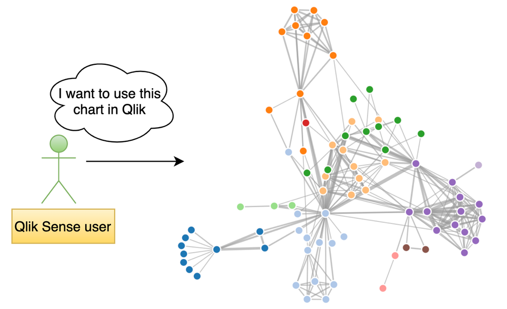
Building a visualization from scratch is always a time & resource-intensive task. Specifically, when you would like to design something which is out-of-the-box or custom, there is a learning curve to getting hold of component-based frameworks such as D3.js but your ultimate goal of using the visualization may be different.

For instance, in the Qlik Sense world, a BI Developer might just be focused on using the visualization on their dashboards and presenting key metrics. Similarly, a Data Scientist might just use it for exploratory data analysis or validating their hypothesis. Irrespective of the use-cases, building a Qlik Sense visualization extension should not be cumbersome.
An easy way to get started building a visualization extension in Qlik Sense is by using our framework-agnostic library, Nebula.js. If you haven’t tried Nebula, here is a simple tutorial to get right into it. Basically, Nebula comes with a bundle of visualization objects and APIs to interact with the engine & even allows for seamless integration of custom charts (e.g. D3) so they can be used within the Qlik Sense environment.
One of the many incentives of working with Nebula is that it is framework-agnostic and allows using any available charting frameworks to create new visualizations for use within Qlik’s platform. In this blog, we will understand how to quickly build a visualization extension by integrating Nebula.js with a widely used charting library called Plotly. Personally, Plotly has been a top choice for many of my use-cases due to the ease of its use and native interaction capability.
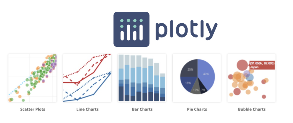
Plotly is an open-source, interactive library that is built on top of d3.js and stack.gl. Plotly.js ships with over 40 chart types, including 3D charts, statistical graphs, and SVG maps.
 Source: Plotly.js
Before we walk through the steps to build our Qlik Sense extension, let me give you a brief background about the problem I was trying to solve and how Plotly has made that journey easy. As part of my research work, I had to design a prototype that could visualize mountain elevation data in 3D. A common way to achieve this is by using Surface plots.
Surface plots are diagrams of three-dimensional data. Rather than showing the individual data points, surface plots show a functional relationship between a designated dependent variable (Y), and two independent variables (X and Z).
 A Surface plot
Now, since my experience with 3D visualization has been limited, I was looking for an easy-to-adopt solution and after reviewing a few available JavaScript libraries, Plotly seemed to be a great choice. Also, in my case, I was looking for an effortless way to interact with the data since I needed to invoke the data from Qlik Sense first and Plotly served that purpose.
Alright now, let’s try building a 3D Surface plot using a sample data set. This dataset is made publicly available by Plotly and looks like its elevation details of Mt. Bruno.
Pre-requisites:
- Node.js (version 10 or newer)
- An existing web integration
- Install plotly.js library via NPM
Step 1: Create a Nebula project
The quickest way to get started is to use the nebula.js CLI:
npx @nebula.js/cli create hello --picasso none
The command scaffolds a project into the /hello folder with all the required files under /src .
To read more around building extensions with Nebula, here is a basic tutorial.
Step 2: Install Plotly.js using NPM
To get all the dependencies related to Plotly, we will do an NPM install. Please route to the /hello folder and run the following command.
npm install plotly.js-dist
Now if I check my package.json file, I can see that the dependency has been installed.

Step 3: Import Plotly library
Next, to use all the Plotly related stuff, we will import the library in our main JavaScript file index.js, and from here on we will start building our visualization. This is how my code looks like now.
import { useElement } from '@nebula.js/stardust';
import properties from './object-properties';
import data from './data';

import Plotly from 'plotly.js-dist'

export default function supernova() {
  return {
    qae: {
      properties,
      data,
    },
    component() {
      const element = useElement();
      element.innerHTML = '<div>Hello!</div>';
    },
  };
}
Step 4: Accessing QIX engine and retrieving data
Now that we have all the required dependencies, let’s start invoking the data that is there in our Qlik Sense app (with which we plan to use this extension). Nebula offers custom hooks that enable us to access the hypercube to interact with the dimensions & measures.
To retrieve our data, we first need to access the layout through the useLayout() hook and then use it in combination with the useEffect() hook. The hypercube’s qDataPages[0].qMatrix contains all the dimensions and measures, and we will pass this data to the Plotly visualization object using a function viz() that we will define later. The below code snippet shows how to achieve this.
component() {
      const element = useElement();
      const layout = useLayout();

      //getting data array from QS object layout
      useEffect(() => {
        var qMatrix = layout.qHyperCube.qDataPages[0].qMatrix;

        //an array that invokes each row of qMatrix from layout:
        var data = qMatrix.map(function (d) {
          return {
            0: d[0].qText,
            1: d[1].qText,
            2: d[2].qText,
            3: d[3].qText,
            4: d[4].qText,
            5: d[5].qText,
            6: d[6].qText,
            7: d[7].qText,
            8: d[8].qText,
            9: d[9].qText,
            10: d[10].qText,
            11: d[11].qText,
            12: d[12].qText,
            13: d[13].qText,
            14: d[14].qText,
            15: d[15].qText,
            16: d[16].qText,
            17: d[17].qText,
            18: d[18].qText,
            19: d[19].qText,
            20: d[20].qText,
            21: d[21].qText,
            22: d[22].qText,
            23: d[23].qText
          };
        });

        var width = 1000;
        var height = 400;

        var id = "container_" + layout.qInfo.qId;

        // if not created, use id and size to create
        const elem_new = `<div id=${id}></div>`;
        element.innerHTML = elem_new;

       //function to draw Plotly surface plot
        viz(data, width, height, id);
      }, [element, layout]);
 }
Step 5: Creating the Surface plot
Our next step is to build the topological 3D surface plot using the data we retrieved from Qlik Sense and Plotly.
We define a basic layout for our Plotly visualization like this.
var layout = {
  title: 'Mt Bruno Elevation',
  autosize: false,
  width: 800,
  height: 500,
  margin: {
    l: 65,
    r: 50,
    b: 65,
    t: 90,
  }
};
Next, we want to store our values as an array so we can pass it to Plotly as it would expect. The following function does the same.
function unpack(data, key) {
  return data.map(function(data) {
    return data[key];
  });
}
var z_data=[ ]
for(var i=0;i<24;i++)
{
  z_data.push(unpack(data,i));
}
To render the Plotly 3D surface chart, we will need to define a data parameter by specifying the array and type of the plot.
var data = [{
  z:z_data,
  type: 'surface'
}];
Finally, we render the chart by passing the object id, data and layout to the newPlot() method.
Plotly.newPlot(id, data, layout);
Step 6: Create a Qlik Sense extension
The last step is to create a visualization extension that can be used within Qlik Sense environment. To do that, we will use the following Nebula CLI command.
nebula sense
This creates a ZIP file with all the required files so we can import it to Qlik Sense.
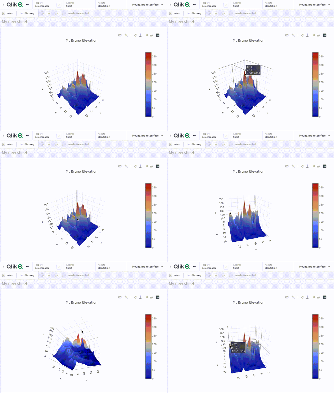
Here’s our 3D Surface plot in Qlik Sense.

This tutorial showcases an easy approach to developing custom visualizations to be used within Qlik Sense using Nebula.js and a 3rd-party charting library called Plotly. The goal was to give an idea of how effortlessly you can build out-of-the-box solutions without really investing much time by designing them from scratch.
The entire code can be found here: https://github.com/qlik-oss/QlikSense_Plotly
~Dipankar, R&D Advocate
You must be a registered user to add a comment. If you've already registered, sign in. Otherwise, register and sign in.