Unlock a world of possibilities! Login now and discover the exclusive benefits awaiting you.
- Qlik Community
- :
- Blogs
- :
- Technical
- :
- Design
- :
- How to read and use the new Qlik Sense Box Plot
- Subscribe to RSS Feed
- Mark as New
- Mark as Read
- Bookmark
- Subscribe
- Printer Friendly Page
- Report Inappropriate Content
Continuing with the description of the new charts available in the Qlik Sense June 2017 release, today is the Box plot’s turn.
The American mathematician John W. Tukey introduced the box-and-whisker plot (called simply a box plot) in his 1977 book, "Exploratory Data Analysis".
Like the Distribution plot, the Box plot is a histogram-like method of displaying data and is appropriate to represent the degree of dispersion, skewness, and whether there are potential unusual observations in the data set. It’s particularly useful for comparing distributions between several sets of data, short of having several histograms close to each other so you can compare across them. The data center, spread and overall range are immediately apparent for each data set.
In my previous post about the distribution plot, I used an example data set containing data for 3 salespersons recording their monthly sales data. I'll reuse that data to illustrate how the box plot works.
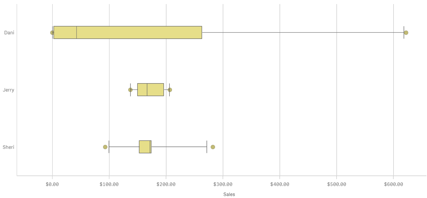
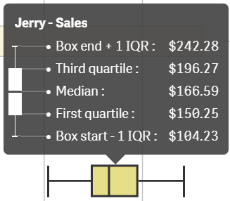
A Box plot will typically help us to visualize 5 numbers, the statistical median represented as a horizontal line inside the box, the box ends show the first and third quartiles values. The whiskers indicate the range of the data and they are represented as horizontal lines ending in a small vertical line. Whiskers extend to the farthest points that are not outliers. Depending on the box plot configuration you choose, a provision is made for the representation of extreme values, typically upper/bottom quartile range +/- 1 x interquartile range or IQR. Additionally, outliers or extreme values are represented with dots.
Some general observations about our salespersons’ box plots:
- The box plot is comparatively short – see Sheri. This suggests that overall monthly sales have a high level of similarity with each other.
- The box plot is comparatively tall – see Dani. This indicates Dani’s monthly sales are quite different across the year.
- The box plot is skewed – see Dani. There are more data points on the left/bottom (toward lower values), most of Dani's sales are small amount of sales.
To get the chart working in your Qlik Sense app it only requires one dimension (add a second dimension to compare across it) and one expression. Qlik Sense's new Box plot offers three standard presets, standard (Tukey), percentile-based, and standard deviation. For those of you with special needs or for those interested in learning more about fine tuning your chart, there’s a manual mode that give us full control over each one of the chart elements.

Enjoy it.
Arturo (@arturoqv)
You must be a registered user to add a comment. If you've already registered, sign in. Otherwise, register and sign in.