Unlock a world of possibilities! Login now and discover the exclusive benefits awaiting you.
- Qlik Community
- :
- Blogs
- :
- Technical
- :
- Design
- :
- Mashup Editor - Toggle charts with jquery
- Subscribe to RSS Feed
- Mark as New
- Mark as Read
- Bookmark
- Subscribe
- Printer Friendly Page
- Report Inappropriate Content
There were numerous times that I was asked to show more than one chart in the same page. This tutorial will show you how to place two buttons which will toggle the visibility of certain graphs.
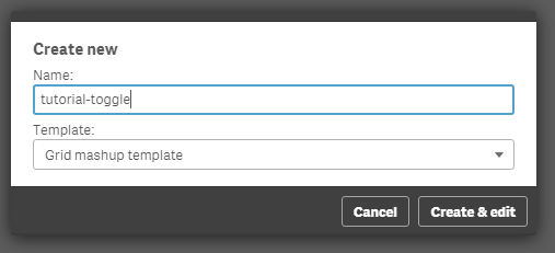
- From the Mashup Editor create a new mashup and select the "Grid mashup template". This will add in your page Bootstrap which we will need for the buttons that will handle the toggling.
- Then, select the "Helpdesk Management" and place the charts that you want to toggle onto the grid. I selected "Avg Case Resolution Time" and "Open Cases by Age".
- If you want to preview your files in another tab outside of the Mashup editor, the url would be something like "http://localhost:4848/extensions/tutorial-toggle/tutorial-toggle.html".
- You will see in your html the grid with rows and columns and your visualizations.
<div class="row">
  <div class="col-sm-6 qvplaceholder" id="QV01">
  </div>
  <div class="col-sm-6 qvplaceholder" id="QV02">
  </div>
  </div>
  <div class="row">
  <div class="col-sm-6 qvobject" id="QV03">
  </div>
  <div class="col-sm-6 qvobject" id="QV04">
  </div>
</div>
- Make sure you remove the "qvplaceholder" from QV01 and QV02, otherwise you will have a lot of extra space between your buttons and the chart.
- In your js file you will see the code that places the objects into the html grid. Just for now, we will place both of the objects. We only need their ids, so later on we will remove the second chart.
  //callbacks -- inserted here --
  //open apps -- inserted here --
  var app = qlik.openApp('Helpdesk Management.qvf', config);

  //get objects -- inserted here --
  app.getObject('QV04','a5e0f12c-38f5-4da9-8f3f-0e4566b28398');
  app.getObject('QV03','PAppmU');
- Now, we will create 2 radio buttons that handle the toggling of the charts. In row 1 and column 1 we will add the following:
<div class="btn-group" data-toggle="buttons">
  <label class="btn btn-default active">
  Avg Case Resolution Time
  <input type="radio" id="chart" name="chart" value="PAppmU" checked="checked"/>
  </label>
  <label class="btn btn-default">
  Relative to Population
  <input type="radio" id="chart" name="chart" value="a5e0f12c-38f5-4da9-8f3f-0e4566b28398"/>
  </label>
  </div>
- Now we can remove the second chart, 'QV04' from the JS file.
- The final page should look like this

- If you have time and you want to make this more visual appealing, you can add some transition effects like fading.
- We will add the "$('#QV03').fadeOut" in the JS file. Once this is completely faded out, we will then replace the object and fade it back in.
$( document ).ready(function() {
  $("input[name='chart']").change(function(obj){
      $('#QV03').fadeOut('fast', function(){
      app.getObject('QV03',obj.target.value);
      $('#QV03').fadeIn('fast');
    });
  });
});
- If for any reason the object does not show after hiding the first element, try to add qlik.resize and the id of the new object.
qlik.resize(obj.target.value)
Attached you will find all of the files. Just unzip and place into your "Documents\Qlik\Sense\Extensions" folder.
- « Previous
-
- 1
- 2
- Next »
You must be a registered user to add a comment. If you've already registered, sign in. Otherwise, register and sign in.