Unlock a world of possibilities! Login now and discover the exclusive benefits awaiting you.
- Qlik Community
- :
- Blogs
- :
- Technical
- :
- Design
- :
- The intelligent responsive design
- Subscribe to RSS Feed
- Mark as New
- Mark as Read
- Bookmark
- Subscribe
- Printer Friendly Page
- Report Inappropriate Content
Sometimes it’s the small details that make a very big difference. Intelligent responsive design is completely integrated in Qlik Sense; it seems so brilliant to me that I don’t want it to go unnoticed for you.
Responsive web design (RWD) is an approach to web design aimed at crafting sites to provide an optimal viewing experience—easy reading and navigation with a minimum of resizing, panning, and scrolling—across a wide range of devices (from desktop computer monitors to mobile phones).
A site designed with RWD adapts the layout to the viewing environment by using fluid, proportion-based grids, flexible images (…)
Qlik Sense has taken it one step further than the RWD described above, by adding responsive intelligence into the objects themselves.
Intelligent responsive design is not just adjusting the layout to make objects and charts to fit nicely into your device’s screen, but it’s a product smart enough to know when to switch between summary and detailed information based on the available real estate. Qlik Sense is automatically adjusting and tweaking each individual object and chart to give us the right visualization anywhere, optimizing the entire user experience for the device being used.
Let’s review some of my favorite examples of intelligent responsive design in Qlik Sense:
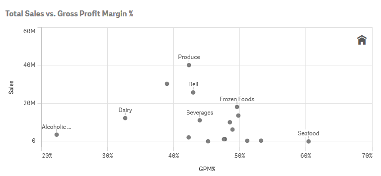
This scatter chart is displaying Product group Sales Amount vs Margin. As soon as I fine-tuned some basic chart properties, Qlik Sense will do the rest, maximizing the information displayed based on the available real estate. It’s a fluid chart.
As you will notice in the scatter chart above not all the labels are visible, Qlik Sense is adjusting the amount of information to increase user comprehension.
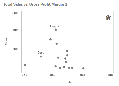
The same chart displayed in a smaller device introduces some changes; first, we notice that even fewer labels are being displayed so we can easily see the patterns and correlation. Second, the x-axis’ scale is a bit wider to avoid adding noise into the chart.
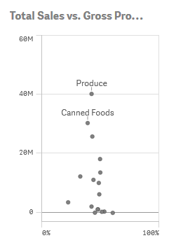
Within the chart shown above, the same visualization is in yet another size while the form factor is adapted to the available real estate. Elements such as dot size, dot labels and axis are scaled again. In this smaller version of the chart, the axis labels and the home icon have been removed automatically and font size has been adjusted.
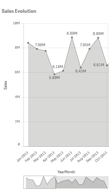
Line thickness is adjusted in line charts and a scrolling mini-charts appears when needed.
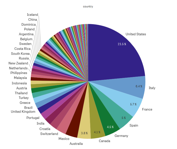
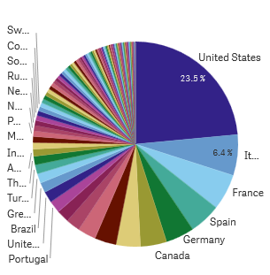
Pie chart labels and values only appear if enough space.
Qlik Sense has adapted these charts, rescaling the level of detail and functionality to maximize the user experience; this is not just resizing, but intelligent responsive design.
Enjoy Qliking!
AMZ
---
PS: I’ve had to force Qlik Sense to let me do a pie chart like that; by default Qlik Sense is preventing me to commit the crime. I do not recommend a rainbow pie chart to represent that data, a bar chart or a treemap would've been more effective… but if you still want to do it, do it in style.
You must be a registered user to add a comment. If you've already registered, sign in. Otherwise, register and sign in.