Unlock a world of possibilities! Login now and discover the exclusive benefits awaiting you.
- Qlik Community
- :
- Blogs
- :
- Technical
- :
- Design
- :
- The new Distribution plot
- Subscribe to RSS Feed
- Mark as New
- Mark as Read
- Bookmark
- Subscribe
- Printer Friendly Page
- Report Inappropriate Content
The Qlik Sense June 2017 release came with a bunch of new visualizations, distribution plot is one of the new objects available to drag and drop into Qlik Sense. Let’s use an example to check what a distribution chart can tell us that was previously hidden from our eyes.
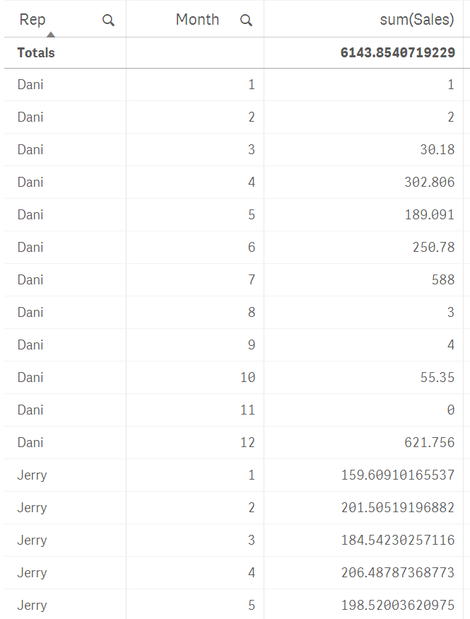
I’m going to use a very simple example of sales data, it contains 3 sales rep and monthly sales that extends over a year. We want to see how our reps are preforming over the year by observing some execution indicators such as total sales and average sales.
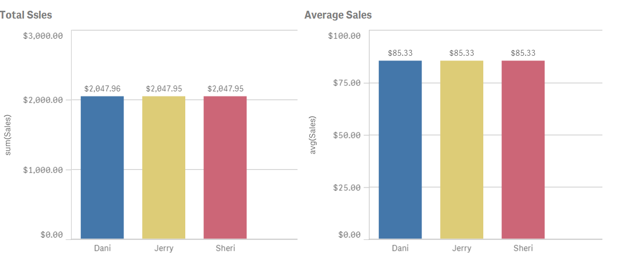
In our not-so-random example data, sales are even for the sales team. As you can see in the picture below, their aggregated numbers are almost identical.
Average is just not enough to see how sales rep are performing, we need more granularity if we really want to understand how the sales process works. To do so we could try to include months and maybe use a different visualization object like a line chart.
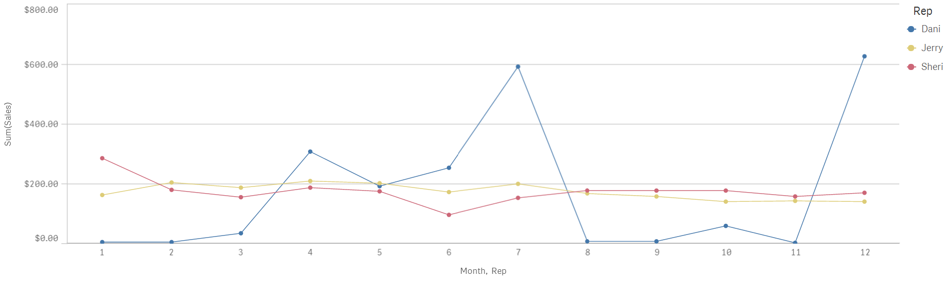
Line chart will help us to see sales with a temporal component, I see how both Jerry and Sheri have a very regular sales process over the months while Dani's go all over the board with excellent months and not so great ones.
Distribution plot can help me to get a better picture of our sales by giving us a glance of data dispersion.
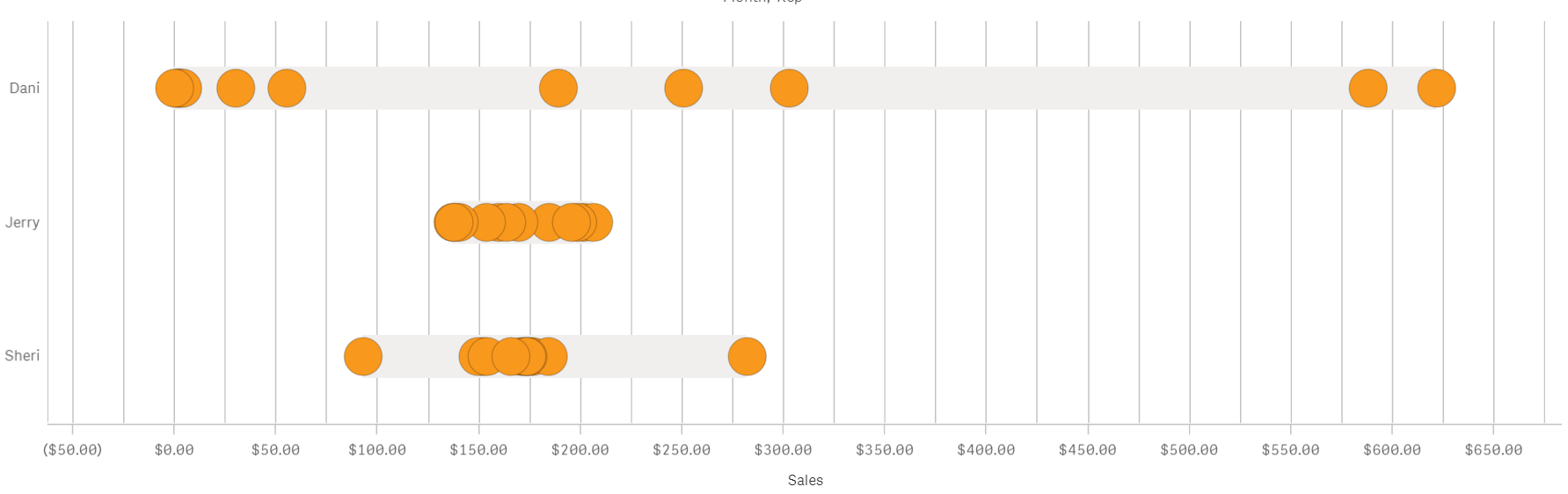
I see that despite having the same yearly sales amount and sales average the actual distribution over time is quite different from each other.
Jerry has tight sales performance month to month with all the points(months) falling in a compact cluster. Sheri meanwhile has a very tight bucket of dots a little over $150 but also a couple of months that could be considered as outliers. That is valuable information that wasn’t obvious only attending to the line chart.
Dani's sales don’t follow the pattern described by the other two individuals. For Dani, monthly sales range from $0 to $600 is either an excellent or a terrible month. Any company will be happier with a more consistent sales performance and our imaginary company is no exception to that. By learning how each one of the sales team performs we can take the necessary actions to help Dani to be more reliable.
As we have seen similar yearly sales and identical sales average could hide some valuable information, there’s a story in your data that needs to be discovered.
Enjoy it,
Arturo (@arturoqv)
You must be a registered user to add a comment. If you've already registered, sign in. Otherwise, register and sign in.