Unlock a world of possibilities! Login now and discover the exclusive benefits awaiting you.
- Qlik Community
- :
- Blogs
- :
- Technical
- :
- Design
- :
- Using Nebula.js & D3.js to build a visualization e...
- Subscribe to RSS Feed
- Mark as New
- Mark as Read
- Bookmark
- Subscribe
- Printer Friendly Page
- Report Inappropriate Content
In my previous blog post, I talked about how custom visualization extensions enable you to go beyond the default visualization capabilities of Qlik Sense and we took a look at how to create a custom Stream Chart using Qlik’s Nebula.js and Picasso.js.
Sometimes however, you might find yourself wanting to build more complex charts that can be difficult to do using only what the Picasso.js library has to offer.
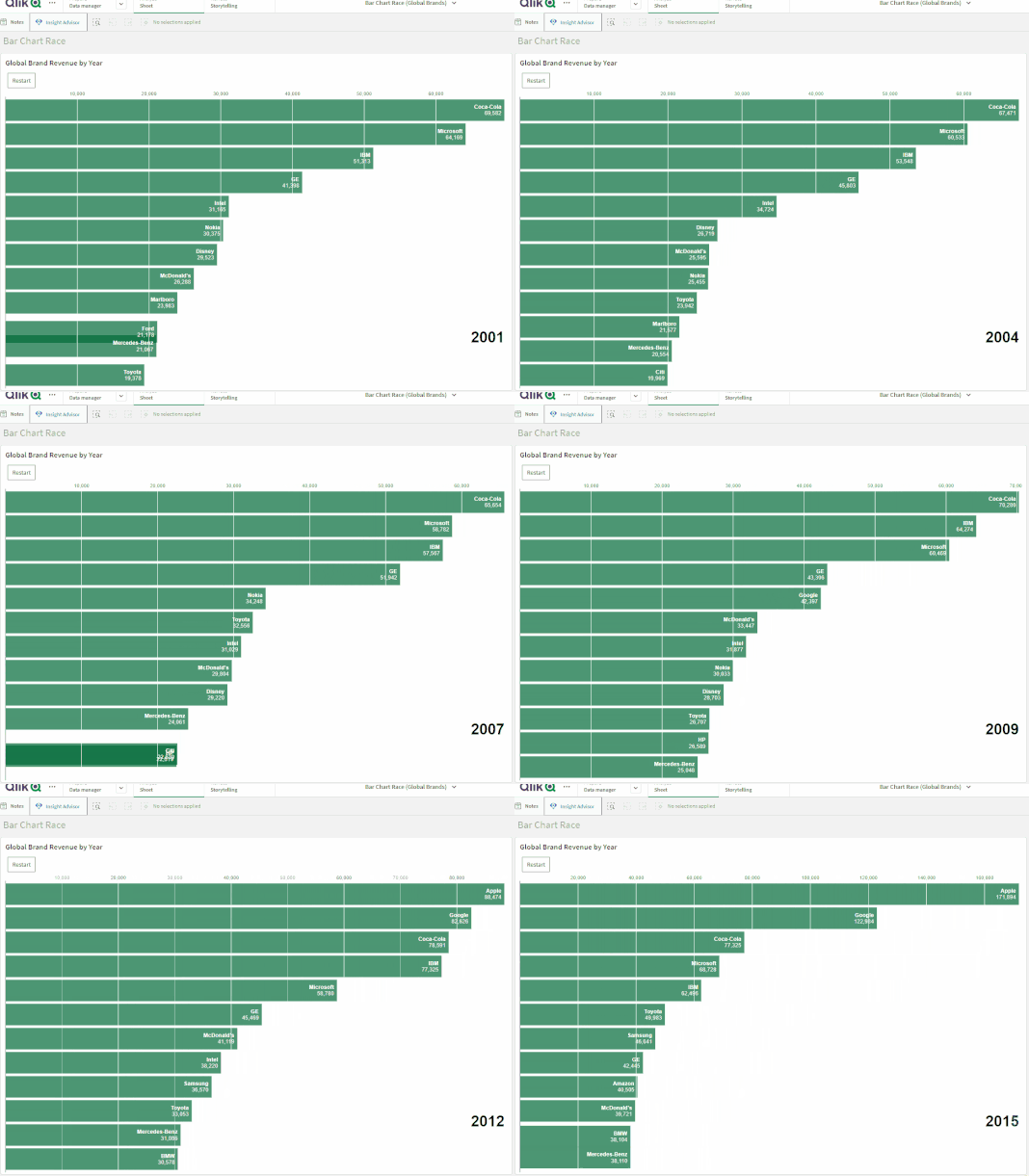
In this blog post, we will do just that as we build a cool Racing Bar Chart visualization using D3.js that we will then package and upload to our Qlik Cloud tenant.
First, let’s talk about what a Bar Chart Race visualization is and where you can use it to enhance your data storytelling:
A bar chart race is a type of data visualization that displays changes in data over time using dynamic animated bars. It’s often used to show the ranking or position of different groups or categories over a period of time.
In a bar chart race, the bars representing each group/category move horizontally or vertically to show the changes in their values over time. The length of the bars represents the magnitude of the data being visualized.
This type of chart is particularly effective in visualizing data that is dynamic and changes frequently. It can be used to compare different categories or groups in terms of their performance, popularity, or other factors over time. Bar chart races are also visually engaging, making them a popular tool for sharing data on social media and other platforms.
Some examples of usage include:
- Comparing sales data for different products or services
- Showing the distribution of income levels across a population
- Visualizing the frequency of different types of crimes in a city or region
- Monitoring the spread of a virus across countries
- Comparing the popularity of different social media platforms over time
Project setup
If you are new to creating visualization extensions in Qlik Sense, you might want to go through my previous blog post or check out these resources as I’m not going to cover all the details here.
- Run the following command to bootstrap the codebase (notice that we used the “—picasso none” to prevent the generation of a picasso.js template)'
npx @nebula.js/cli create racing-bar-chart --picasso none - Next, move into the newly created project directory and run the following commands (1st one to install D3.js, and 2nd one to run our project)
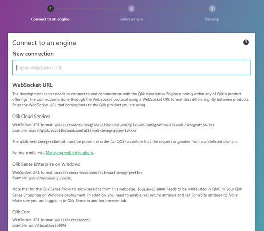
This will open the Nebula.js dev UI, follow the instructions to connect to your Qlik Cloud tenant:npm i d3@6.0.0 --save npm run start - Enter the websocket URL which includes the “web integration id” and is formatted like this:
wss://YOUR_TENANT.us.qlikcloud.com/&qlik-web-integration-id=YOUR_WEBINTEGRATION_ID
P.S: to get your web integration id, go to your Qlik Management Console, click on “Web” on the left sidebar, then click on “Create new"
- Next, select the Qlik Sense App from the list (The QVF with data is attached to this post)
- Back to the code base, we need to edit the configuration files to define the data structure as follow:
- object-properties.js:
const properties = { showTitles: true, title: "", subtitle: "", footnote: "", qHyperCubeDef: { qDimensions: [], qMeasures: [], qInitialDataFetch: [ { qWidth: 3, qHeight: 3300, }, ], }, }; export default properties; - data.js:
export default {
  targets: [
    {
      path: "/qHyperCubeDef",
      dimensions: {
        min: 1,
      },
      measures: {
        min: 1,
      },
    },
  ],
};
- object-properties.js:
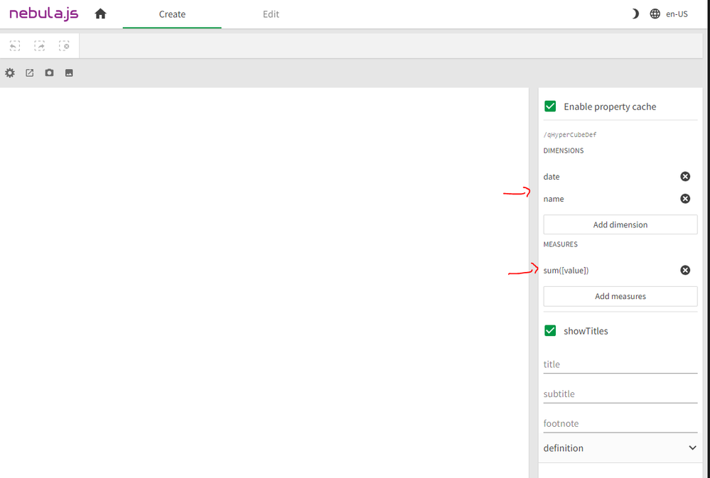
Since we’re going to view Brand Value over time for Companies, we need 1 measure (sum(value)) and 2 dimensions (Date and Name).
- You can now select these 2 dimensions and 1 measure in the Nebula.js dev UI on your browser:
Developing the visualization in Nebula.js and D3.js:
For the purposes of keeping this post short, we’re not going to dive deep into the details of the D3.js code. You can visit this comprehensive post by the co-creator of Observable and main developer of this library, that explains in detail the implementation of this chart.
- index.js:
This is the main entry of our extension and contains our Nebula.js code.
Note that we’re using a few hooks from the imported @nebula.js/stardust package which should be familiar if you’re used to developing React.js applications.
- useElement provides the HTML element where we attach our visualization.
- useLayout is used to get the layout of our generic object (hypercube).
- useEffect is used to run the callback function we pass it when certain values change.
- useState helps keep track of state within the application. In this case we use it to replay the animation.
- vis.js:
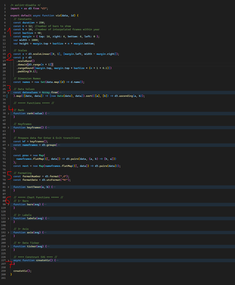
This is where all the magic happens and where the D3.js specific code lives. For brevity, I will highlight the important parts of this file:
1: constants needed in calculating d3 scales and positionning.
2: D3 scales with x being a linear scale and y being a band scale
3: Data derived from the source data (gets passed on index.js)
4: Helper functions including rank() function to compute brand ranks, and keyframes() to compute interpolate values within each year for a smooth animation.
5: D3 formatting functions
6: D3 drawing functions for the components that make up the visualization:
- Bars
- x-axis
- labels (on each bar)
- ticker (Date)
7: D3 animation that iterates over each keyframe and updates the components above.
Finally, to build the extension, run:
npm run build
And in order to package the extension for Qlik Sense, run: (make sure to zip the folder in /dist before uploading it to your tenant)
npm run sense
-------------------------------
Source Code on Github: https://github.com/ouadie-limouni/Qlik-Nebula-Bar-Chart-Race-Viz-Extension
Zipped Extension: Attached
QVF: Attached
You must be a registered user to add a comment. If you've already registered, sign in. Otherwise, register and sign in.


