Unlock a world of possibilities! Login now and discover the exclusive benefits awaiting you.
- Qlik Community
- :
- Support
- :
- Support
- :
- Knowledge
- :
- Support Articles
- :
- Top 10 Viz tips - Part II
- Subscribe to RSS Feed
- Mark as New
- Mark as Read
- Bookmark
- Subscribe
- Printer Friendly Page
- Report Inappropriate Content
Top 10 Viz tips - Part II
- Mark as New
- Bookmark
- Subscribe
- Mute
- Subscribe to RSS Feed
- Permalink
- Report Inappropriate Content
Top 10 Viz tips - Part II
Jun 4, 2024 9:15:16 PM
Nov 10, 2019 2:50:53 PM
At Qonnections 2019 I hosted a session with tips called “Qlik Sense Visualizations, best practice and top tricks”. I have received a lot of positive feedback, so I decided to make a part two with 41 more or less useful new tips.
Positive and negative bars in the same column
Bullet chart in table
Lollipop chart
IBCS charts
Special sum in table
Gauges
Mix value and percentage
Horizontal filters
Sharper tables
Lines and markers
Distribution plot tips
Annotations
Stacking and grouping
Vertical waterfall
Alternate states
Current selection
Show conditions
Select by list
Search options
Brushing
Pivot table sort
Pivot sort part 2, Pareto analysis
Add descriptions to charts
TreeView
Comparing tables
Best selling combo
KPI with indicators
Venn diagram
Venn diagram nr 2
Container tips
Master item management
Drill down bread crumbs
Target chart with CSS
Triggers and email alerts
Cyclic measures
Line graphs with bands
Color bands
Dimension dependent master measures
Control Charts
Check boxes and radio buttons
Filter sliders
I want to emphasize that most of the tips are invented by others than me, I tried to credit the original author at all places when possible. Many of the tips have been published before on the Qlik Community, the app below can be viewed as my current top picks.
If you liked it, here's more in the same style:
- 24 days of visualization Season II, Season I
- Top 10 Tips Part VIII, VII, VI, V, IV, III, II , I
- Let's make new charts with Qlik Sense
- FT Visual Vocabulary Qlik Sense version
- Similar but for Qlik GeoAnalytics : Part III, II, I
Thanks,
Patric
- Mark as Read
- Mark as New
- Bookmark
- Permalink
- Report Inappropriate Content
For anyone who is interested in Data Brushing, I documented a bit more complex approach here:
https://blog.emarkanalytics.com/data-brushing-on-a-user-defined-set/
-Radovan
- Mark as Read
- Mark as New
- Bookmark
- Permalink
- Report Inappropriate Content
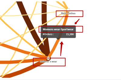
Hi guys. Chord diagram works incorrect, placement of connections is wrong. Screenshot made without any selections.
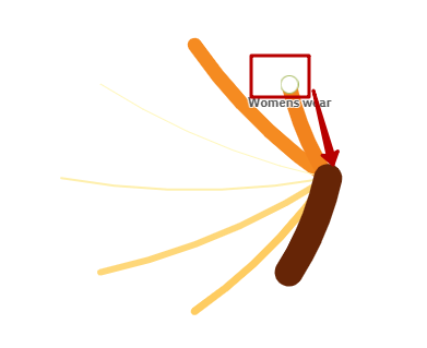
Also, when one category is selected, point displayed in wrong place
Any suggestions how to fix it? Already spent few hours, still no clue 🙂
- Mark as Read
- Mark as New
- Bookmark
- Permalink
- Report Inappropriate Content
- « Previous
-
- 1
- 2
- Next »


