Unlock a world of possibilities! Login now and discover the exclusive benefits awaiting you.
- Qlik Community
- :
- Discover
- :
- Blogs
- :
- Product
- :
- Design
- :
- Real Madrid v. Barcelona fandom map; why this map ...
- Subscribe to RSS Feed
- Mark as New
- Mark as Read
- Bookmark
- Subscribe
- Printer Friendly Page
- Report Inappropriate Content
It was Saturday 11:30 when my phone buzzed; I picked it out of my pocket and checked the message. “Hey, I’m running late. See you in 15 min“. At that time I was already in a bar packed with football fans wearing Messi or Ronaldo jerseys ready to watch one of the best games of the year. El Clásico, where the two best teams in the world, Real Madrid and Barcelona, go head-to-head.
With a few minutes to kill before the game kickoff I was browsing my Twitter (@arturoqv) timeline when I stumbled upon a link to the map below.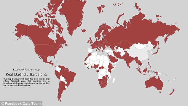
Facebook Fandom map.Displays which one of the two teams has more fans (likes) on their official Facebook page.
When I looked at the map, and despite having a pretty good idea of what to expect, it took me a while to understand what I was looking at. Where was the chart legend? After reading the text on the chart I finally understood that the red areas were for Barcelona while the white areas are for Real Madrid fans. It’s pretty clear that Barcelona has a lot more fans that Real Madrid, right?
Later when the game ended (congratulations to Real Madrid fans for such a great game and victory) I wanted to check the map again. This time I used my favorite search engine to find the map, it pointed me to an article from the Daily Mail. The article includes some facts in addition to the cited map, such as the total number of fans. Based on Facebook-likes data, Barcelona has more than 77 million fans while Real Madrid has a very close 75.5 million. Just 1.5 million people difference.
But, wait a minute that changes everything, right?
Why this map is poorly coded?
It seems clear that Facebook Data team aim was to illustrate fandom across the world in a binary and easy way by comparing just two numbers, Barcelona and Real Madrid number of fans, but is the visualization being truthful?
Well, I don’t think so. The data may be good but the information it contains is partial and is not giving the readers all the relevant data.
Based on the above map color code, you might think that Barcelona FC is by far more popular. When looking at the actual numbers; there are only 2% more Barça supporters than Real Madrid. The map doesn’t reflect at all that small difference; on the contrary it’s showing a huge distance between teams.
How to improve it?
Working with diverging gradient color scheme will show where the difference is more intense, where the gap is bigger.
In the map below we still can see how the forces are distributed across the countries, blue versus red, but this time using color intensity we can see how big the difference between the two teams is.
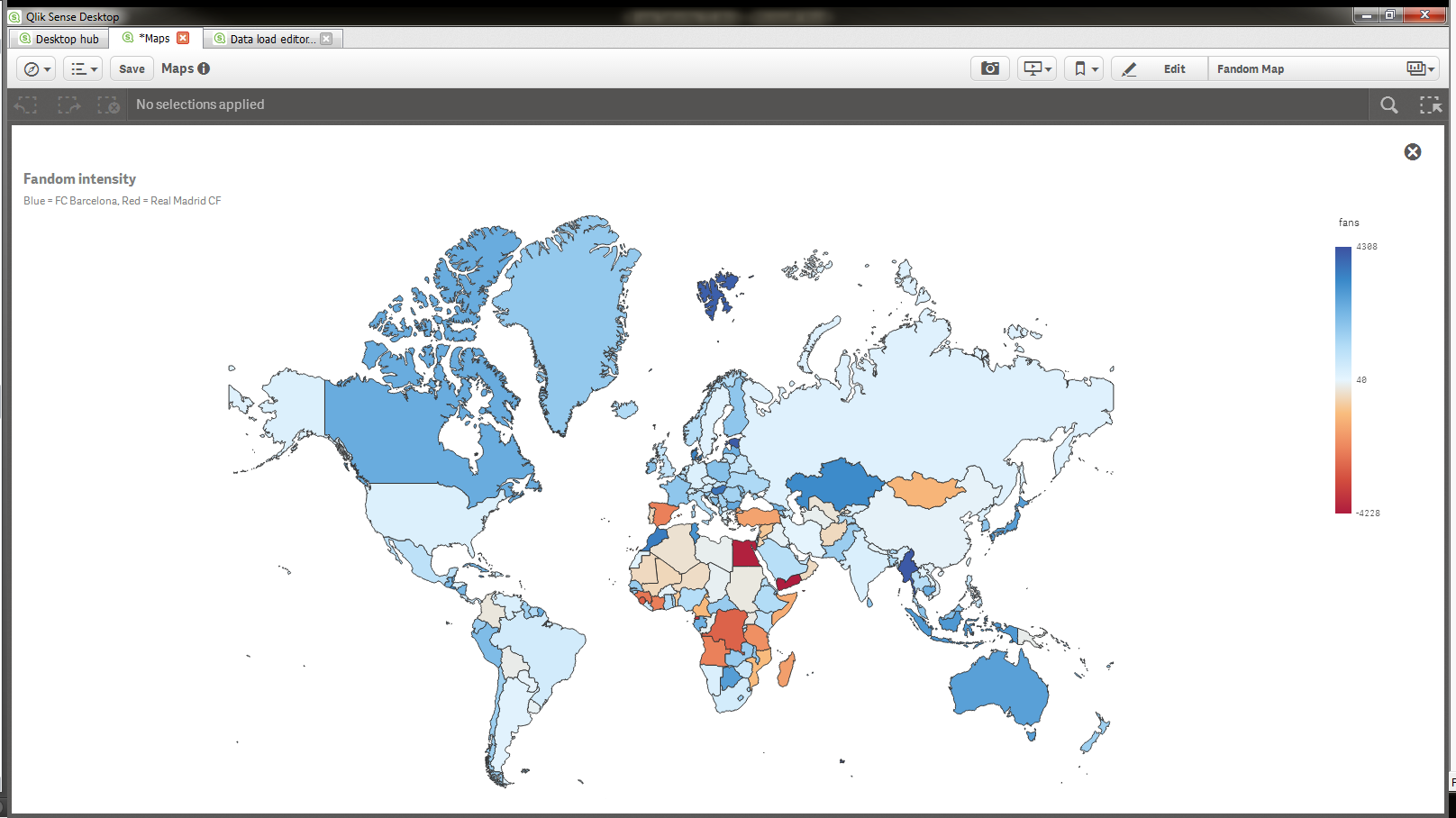
Unfortunately Facebook is not making their data available anywhere so I made up some fake data to illustrate my example
Adding more information layers
In terms of data density the map above is far more complete and truthful than the original one but the downside is that isn’t so obvious which team has more fans across the globe.
We could improve readers’ comprehension creating what I think is a better and more truthful experience.
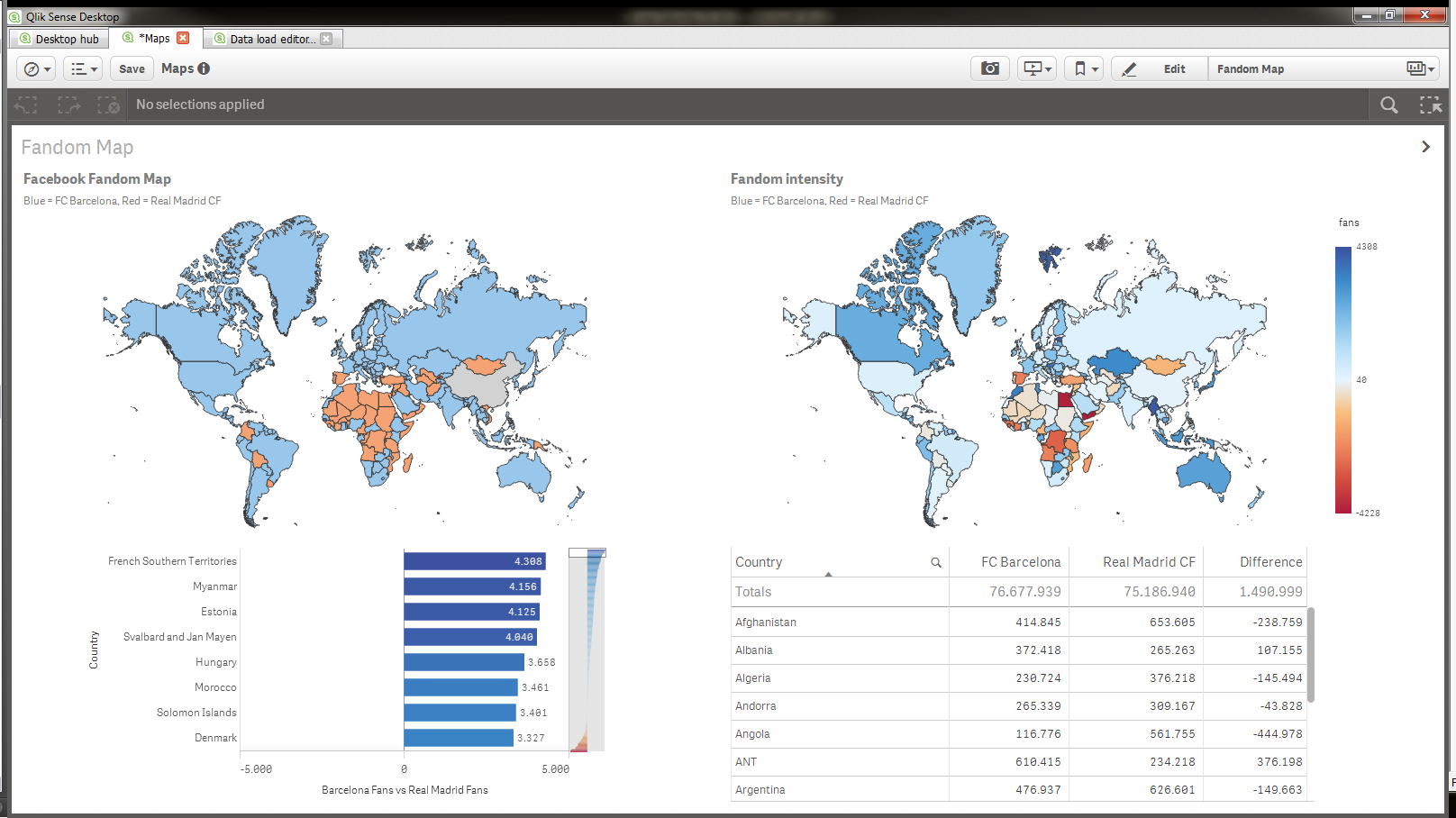
First we will create a map that will color the countries based on which team has more fans in it (top left chart) nothing new here, we are showing same information as in the original chart. Next we’ll add more information layers (objects) to our sheet. Fandom intensity chart on the top right corner shows not just where there are bluer fans but also it displays how big the gap is. To complete our alternative proposal we could add a couple of supporting charts; a bar chart that lets readers accurately see how big the gap is and compare countries, and a table for those number lovers in the audience.
I guess the bottom line of this story is, always show all the relevant and supportive data that will guide readers or users to better understand the facts.
Enjoy Qliking!
You must be a registered user to add a comment. If you've already registered, sign in. Otherwise, register and sign in.