Unlock a world of possibilities! Login now and discover the exclusive benefits awaiting you.
- Qlik Community
- :
- Forums
- :
- Forums by Product
- :
- Products (A-Z)
- :
- Qlik Sense
- :
- Documents
- :
- Creating Mini Chart in Qlik Sense tables
- Move Document
- Delete Document
- Subscribe to RSS Feed
- Mark as New
- Mark as Read
- Bookmark
- Subscribe
- Printer Friendly Page
- Report Inappropriate Content
Creating Mini Chart in Qlik Sense tables
- Move Document
- Delete Document and Replies
- Mark as New
- Bookmark
- Subscribe
- Mute
- Subscribe to RSS Feed
- Permalink
- Report Inappropriate Content
Creating Mini Chart in Qlik Sense tables
Hi all,
Mini Charts have always been a good feature in QlikView and It's really 'frustrating' that this has not been added (yet) in Qlik Sense.
With hopes that the Qlik Team will think about such improvements for the next releases, let's discuss here how to create our own mini chart in a Qlik Sense Table.
The following expressions might seem 'complicated' at first sight, but remember that It will be generic.
You'll only have to change your : Dimension(s) and Measure to adapt to your need.
Thus, their use will be very easy.
Let's begin :
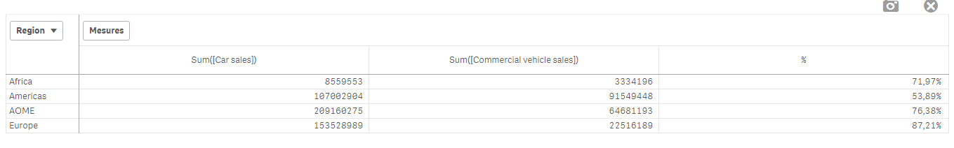
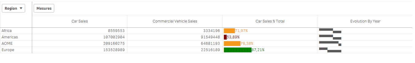
Suppose we have:
As a dimension: OICA Region
As measures:
Sum(Sales)
Sum("Commercial Vehicle Sales")
Sum(Sales) / (Sum(Sales)+Sum("Commercial Vehicle Sales"))
Here is our current table:
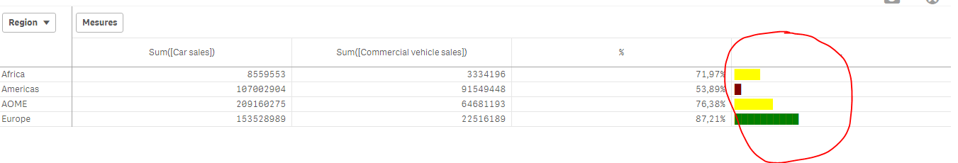
Now, we want to add, a mini 'bar' to represent the %:
How to do so:
As an expression:
=repeat('█',
rangemax(rangemin( ceil(((column(1)/column(2))-1)*2.5),10),0)
)
With that, we repeat the square sign and precise the limits.
And as a text Color expression:
if( (sum([Car sales])/(sum([Car sales])+sum([Commercial vehicle sales])))>=0.8,Green(),
if((sum([Car sales])/(sum([Car sales])+sum([Commercial vehicle sales])))>=0.7,Yellow(),
Red()))
Result:
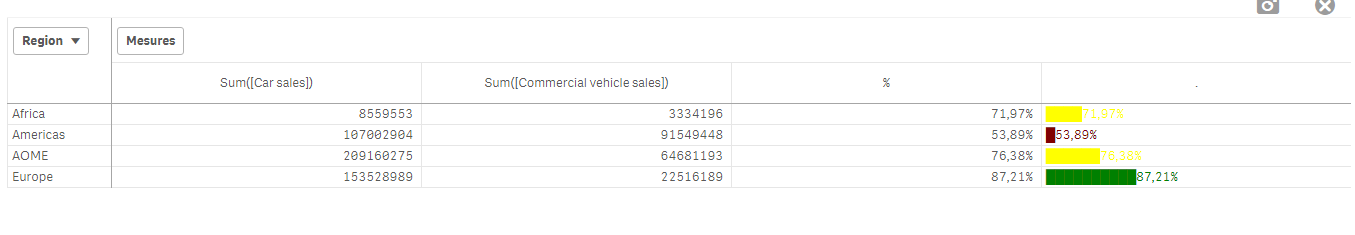
We can also Add the % in front of the bar by adding it in the expression:
From :
=repeat('█',
rangemax(rangemin( ceil(((column(1)/column(2))-1)*2.5),10),0)
)
To:
=repeat('█',
rangemax(rangemin( ceil(((column(1)/column(2))-1)*2.5),10),0)
) & num((sum([Car sales])/(sum([Car sales])+sum([Commercial vehicle sales]))),'# ##0,00%')
Result:
You can even alter it as follow:
repeat(chr(09608),round( sum([Car sales])/(sum([Car sales])+sum([Commercial vehicle sales])) * 10))
&repeat(chr(09617),10-round( sum([Car sales])/(sum([Car sales])+sum([Commercial vehicle sales])) *10))
&num((sum([Car sales])/(sum([Car sales])+sum([Commercial vehicle sales]))),'# ##0,00%')
&if(sum([Car sales])/(sum([Car sales])+sum([Commercial vehicle sales]))>0.7,'▲','▼')
result:
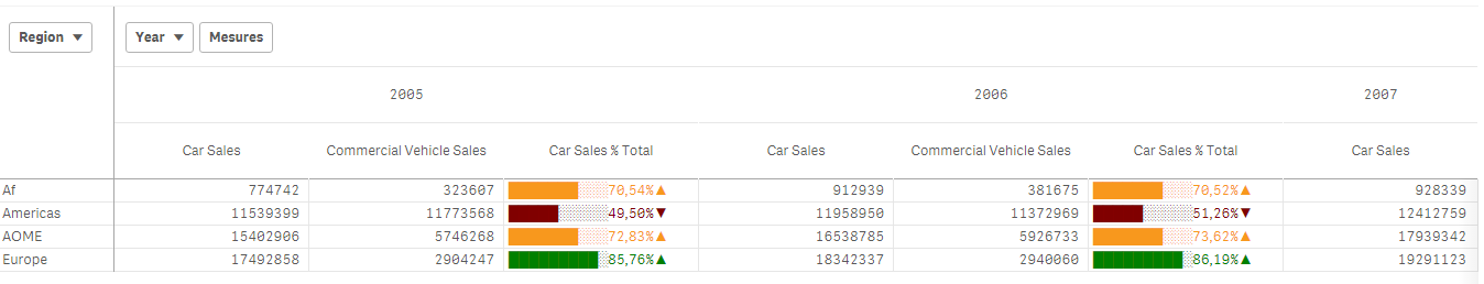
Now, let's suppose we want to add another mini chart, a trend one, to see the % expression by Year:
If it has increased or decreased from a year to the next one.
How to do so?
Expression:
=concat(
aggr(
if((sum([Car sales])/(sum([Car sales])+sum([Commercial vehicle sales]))) > above((sum([Car sales])/(sum([Car sales])+sum([Commercial vehicle sales])))),
'▀',if((sum([Car sales])/(sum([Car sales])+sum([Commercial vehicle sales]))) < above((sum([Car sales])/(sum([Car sales])+sum([Commercial vehicle sales])))),'▄',' ')
)
,[OICA region], (Year,(NUMERIC, ASCENDING))
)
,'',[OICA region])
Wirh:
Red: Our Dimension
Green: The trending dimension
Blue: our expression compared to the previous one (by year, the trending expression)
If expression by Year > expression Previous Year then , Square Up
If expression by Year < expression Previous Year then , Square down
Result:
Special thanks to blog Von Heldendaten in which I found this:
QlikView + Qlik Sense Blog von Heldendaten: Qlik Sense Calendar Measures & "Minicharts" in Tabellen.
Hope you like it !
Omar,
- Move Comment
- Delete Comment
- Mark as Read
- Mark as New
- Bookmark
- Permalink
- Report Inappropriate Content
Neat solution. I like finding ways to solve problems without extensions, for situations where extensions are not an option.
Where extensions are possible, the Table extension from VizLib does mini-charts and a lot more besides.
- Move Comment
- Delete Comment
- Mark as Read
- Mark as New
- Bookmark
- Permalink
- Report Inappropriate Content
thank you for your detailed how to.
In addition, to make it easier to read declare a variable for:
car_sales = (sum([Car sales])/(sum([Car sales])+sum([Commercial vehicle sales]))
Then it's just a question of creating a custom measuer with your code
=repeat('█', rangemax(rangemin( ceil(((column(1)/column(2))-1)*2.5),10),0)
)
Also,
If you want to avoid having your columns being presented, with some changes you can apply your formulas directly
repeat('█',
rangemax(rangemin( ceil((($(car_sales ))-1)*2.5),10),0)
) & num($(car_sales)),'# ##0,00%')
Cheers 
- Move Comment
- Delete Comment
- Mark as Read
- Mark as New
- Bookmark
- Permalink
- Report Inappropriate Content
Just a correction on the your code
& num((sum([Car sales])/(sum([Car sales])+sum([Commercial vehicle sales]))),'# ##0,00%') will cause a visual bug
& num((sum([Car sales])/(sum([Car sales])+sum([Commercial vehicle sales]))),'###0,00%') should fix it
- Move Comment
- Delete Comment
- Mark as Read
- Mark as New
- Bookmark
- Permalink
- Report Inappropriate Content
Hi if you haven't already found the solution for your requirement hope this helps.- I had a similar requirement and was able to get this far.
Pivot table :
This is my measure expression
repeat('█', round(aggr(num(sum(numbers),'0'),Rating,Student)/noofcolumns(total))) & '-' & aggr(num(sum(numbers),'0'),Rating,Student)
used a BG color as well :=rgb(245,245,245)(optional)
and text color expression is :
ColorMix1( (rank(total column(1))/(noofrows(TOTAL)/2))-1 ,rgb(15,97,19), rgb(36,242,19))
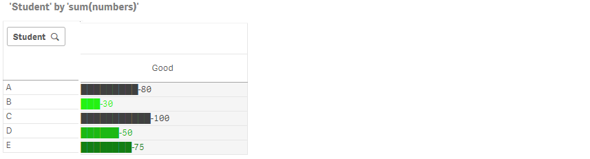
thanks
- Move Comment
- Delete Comment
- Mark as Read
- Mark as New
- Bookmark
- Permalink
- Report Inappropriate Content
Hi,
I have tried to implement your minichart string...
=repeat('█',
rangemax(rangemin( ceil(((column(1)/column(2))-1)*2.5),10),0)
)
in my application this is not working anymore?!
- Move Comment
- Delete Comment
- Mark as Read
- Mark as New
- Bookmark
- Permalink
- Report Inappropriate Content
Can't upload the sample here, therefore uploaded it in a new thread:
https://community.qlik.com/t5/New-to-Qlik-Sense/MiniChart-in-Table/td-p/1519647
- Move Comment
- Delete Comment
- Mark as Read
- Mark as New
- Bookmark
- Permalink
- Report Inappropriate Content
Hi ,
I have coloumn of perTEU , i tried to apply the above expression but its not working .... can anybody help me ???
Regards
Sunil
- Move Comment
- Delete Comment
- Mark as Read
- Mark as New
- Bookmark
- Permalink
- Report Inappropriate Content
Hi Omar,
Thank you very much for sharing this code
- Move Comment
- Delete Comment
- Mark as Read
- Mark as New
- Bookmark
- Permalink
- Report Inappropriate Content


Or maybe like this post , we have a progress bar but I need that every bar has three color if the values is more than 100% (progress bar.JPG)
Include two files (activity gauge.JPG) and (progress bar.JPG)
- Move Comment
- Delete Comment
- Mark as Read
- Mark as New
- Bookmark
- Permalink
- Report Inappropriate Content
Very frustrating that Cell Bars didn't exists in Qlik Sense.
I've tried 2 thinks, but it's not what I need :

Here is the code for the left column in mauve and grey (background code) :
if(Column(2)>0,
rgb(
(35+(noofrows(TOTAL)+rank(TOTAL column(2))))+(12*(rank(TOTAL column(2))-1)),
(35+(noofrows(TOTAL)+rank(TOTAL column(2))))+(12*(rank(TOTAL column(2))-1)),
(82+(noofrows(TOTAL)+rank(TOTAL column(2))))+(12*(rank(TOTAL column(2))-1))),
rgb(
(330+(noofrows(TOTAL)+rank(TOTAL column(2))))-(12*(rank(TOTAL column(2))-1)),
(330+(noofrows(TOTAL)+rank(TOTAL column(2))))-(12*(rank(TOTAL column(2))-1)),
(330+(noofrows(TOTAL)+rank(TOTAL column(2))))-(12*(rank(TOTAL column(2))-1)))
)
And the one for the little cells to put in measure code :
repeat('■',rangemax(rangemin( ceil(((fabs(column(2))*20))),10),0))&Column(2)