Unlock a world of possibilities! Login now and discover the exclusive benefits awaiting you.
Product Innovation
By reading the Product Innovation blog, you will learn about what's new across all of the products in our growing Qlik product portfolio.
Support Updates
The Support Updates blog delivers important and useful Qlik Support information about end-of-product support, new service releases, and general support topics.
Qlik Academic Program
This blog was created for professors and students using Qlik within academia.
Community News
Hear it from your Community Managers! The Community News blog provides updates about the Qlik Community Platform and other news and important announcements.
Qlik Digest
The Qlik Digest is your essential monthly low-down of the need-to-know product updates, events, and resources from Qlik.
Qlik Learning
The Qlik Learning blog offers information about the latest updates to our courses and programs, as well as insights from the Qlik Learning team.
Recent Blog Posts
-
Straight Table
The straight table, included in the Visualization bundle, has all the table properties that we are used to as well as many new features. These new features make it easier for developers to create a straight table and it gives users the ability to customize straight tables in the apps they view. The straight table is ideal when you want to provide detailed data – the raw data. While you do not want to have too many columns (ten or less columns are... Show MoreThe straight table, included in the Visualization bundle, has all the table properties that we are used to as well as many new features. These new features make it easier for developers to create a straight table and it gives users the ability to customize straight tables in the apps they view. The straight table is ideal when you want to provide detailed data – the raw data. While you do not want to have too many columns (ten or less columns are ideal for the best performance), a straight table can have many columns (dimensions and measures).
As previously mentioned, the straight table can be added to a sheet from the Qlik Visualization bundle. This means developers will need to open the advanced options to add the straight table to their sheet(s) and make edits. Once the straight table is added to a sheet, developers can add columns – either fields and master items or custom expressions. One of the new features that developers can take advantage of to build tables quickly is the ability to add more than one dimension and/or measure at once. Simply select the dimensions and measures you would like to add to the table and then click the Add button.
Once columns are added to the table, they can be dragged as needed to the desired position/order. Developers also can add alternate columns to the straight table. These columns can be dimensions and/or measures. These alternates columns will be available to users to customize the straight table if chart exploration is enabled. This is a great new feature because the user does not need edit permissions to modify the straight table. Users can add and/or remove columns based on their analysis. Being able to add columns as needed also improves performance since the straight table does not need to display all the columns, all the time. Loading the straight table with the minimum columns needed will decrease the load time.
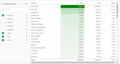
Chart exploration allows users, who are in analysis mode, to add and remove columns from the straight table they are viewing by checking or unchecking them in the Chart exploration panel (see image below). Any users viewing the sheet can customize the straight table. Users cannot see layout changes made by other users using the app, unless they opt to share the visualization or create a public bookmark with the layout saved.
Another new feature for developers is the ability to set the column width. By default, the column width is set to Auto, but developers can set it to Fix to content, Pixels or Percentage. Pagination is another new feature that can be enabled in a Straight table. With pagination, a specified number of rows are displayed at once and the user can navigate through the pages using arrows or selecting the page.
Many of the properties for the straight table are familiar but the new ones are moving the straight table to a new level. Learn everything you need to know about the straight table in Qlik Help and add one to your next app. Also check out the SaaS in 60 video for a quick video overview:
Thanks,
Jennell
-
Unlocking Opportunities with Online Resources in Data Analytics
In today’s digital-first world, access to knowledge has never been more within reach. From video tutorials to interactive platforms, online resources are transforming how we learn and apply data analytics. -
【オンデマンド配信】DX - 建設業界の迅速な経営・現場判断の実現に向けて
前回の第一回では「DX:建設業界の IT 課題と解決の方向性」と題し、建設業界特有の課題を考察した上で、複合検索条件検索の可能性を探りました。第二回では、一度マクロな視点で日本が置かれているデジタル変革の外観を押さえつつ、DX を進めるためにはどのようなマインドセットを持てば良いか、キーパーソンは誰か?をまず見ていきます。その上で、生成 AI など最新技術を活用し、複雑な条件下でも最適な情報を即座に抽出・活用し、進捗管理やリスク低減、迅速な経営・現場判断の必要性に対し、どのように支援できるのかを考察します。 ※ パソコン・タブレット・スマートフォンで、どこからでもご視聴いただけます。今すぐ視聴する 今すぐ視聴する -
【オンデマンド配信】金融業界向けレガシーシステムを「負債」から「資産」へ
金融業界のメインフレームは、長年の事業を支える重要なシステムである一方、DX 推進のボトルネックとなりがちです。しかし、Vanguard 社の事例は、メインフレームを「負債」ではなく「資産」に変える道筋を示しています。同社は、Qlik Replicate を用いたリアルタイムなデータレプリケーションにより、メインフレームの安定性を維持しつつ、データをクラウド上で自由に活用する環境を構築しました。このアプローチは、コスト削減とイノベーションを両立させ、データドリブン経営を実現する、金融機関にとって現実的な解決策となり得ます。 ※ パソコン・タブレット・スマートフォンで、どこからでもご視聴いただけます。今すぐ視聴する 今すぐ視聴する -
Round Two! More September Updates on the Qlik Community
September Updates on the Qlik Community -
Qlik Stitch: HubSpot API deprecation and Connector Upgrade
As HubSpot plans to sunset the v1 contact lists API on September 30, 2025, any API requests using this version for contacts or lists endpoints will begin to fail after that date. To ensure continuity, Qlik has released a new version, v4, of the connector. The changes in questions are: Schema change, primary key, replication key change for contacts stream Schema change for contact_lists stream What action do I need to take? Upgrade to the new ve... Show MoreAs HubSpot plans to sunset the v1 contact lists API on September 30, 2025, any API requests using this version for contacts or lists endpoints will begin to fail after that date. To ensure continuity, Qlik has released a new version, v4, of the connector.
The changes in questions are:
- Schema change, primary key, replication key change for contacts stream
- Schema change for contact_lists stream
What action do I need to take?
Upgrade to the new version. There are two ways to upgrade.
Upgrade and change the schema name
If you do not mind changing the schema name, you can do so by simply creating a new HubSpot integration and deleting the old one.
This is the recommended method. Creating a new integration with a different schema name means you will also benefit from a free historical re-sync of your data.
Upgrade using the same destination schema
If you prefer to reuse the same destination schema name:
- Pause the existing integration from their Stitch account.
- Wait for any records that are being prepared for loading to be loaded.
- Take note of the tables and fields tracked for replication, as well as the replication methods defined for these tables.
- Delete the existing integration from your Stitch account.
- Drop the schema from your destination data warehouse (or rename it if you'd like to continue working from this data as Stitch completes a new historical replication).
- Contact Qlik Stitch Support to coordinate a manual row-usage exemption for this connection.
- Configure a new integration with the same name, and Stitch will create this schema in your destination during the loading process.
If you have any questions, we're happy to assist. Contact us using chat or ask similar queries in the Qlik Stitch forum.
Thank you for choosing Qlik,
Qlik Support -
Qlik Custom Themes: Overview, Tips, and Tricks
Customizing your Qlik Sense apps not only enhances their visual appeal but also ensures consistency with your organization's branding guidelines. With custom themes you can modify colors, fonts, and layouts on both global and granular levels, giving you complete control over the look and feel of your analytics. In this blog post, we'll dive into the essentials of building a custom theme, dissect the anatomy of the theme's JSON file, and share som... Show MoreCustomizing your Qlik Sense apps not only enhances their visual appeal but also ensures consistency with your organization's branding guidelines. With custom themes you can modify colors, fonts, and layouts on both global and granular levels, giving you complete control over the look and feel of your analytics.
In this blog post, we'll dive into the essentials of building a custom theme, dissect the anatomy of the theme's JSON file, and share some tips and tricks to help you create themes easily.
Bonus: along the way, we will be creating a Netflix inspired theme. We'll go from this:
to this:
Getting Started: The Essentials of Building a ThemeA custom theme in Qlik Sense is a collection of files stored in a folder.
It typically includes:
- Definition File (.qext): This file defines the theme's metadata, such as its name, description, type, and version.
{ "name": "Netflix Theme", "description": "A custom theme inspired by Netflix's branding.", "type": "theme", "version": "1.0.0", "author": "Ouadie Limouni" } - Main JSON File (.json): The core of your theme where you define styles, colors, fonts, and other visual properties.
- Optional Assets:
- CSS Files: For additional styling that can't be achieved through the JSON file alone.
- Font Files: Custom fonts to enhance typography.
- Images: Logos or background images to incorporate into your theme.
Folder structure example:
netflix-theme/
├── netflix-theme.qext
├── theme.json
├── netflix.css (optional)
├── BebasNeue-Regular.ttf (optional)
└── images/ (optional)
    └── background.jpg
Anatomy of the `theme.json` File
(The full theme code is attached at the end of this blog post)- Variables Section (_variables)
Variables allow you to define reusable values (like colors and font sizes) that can be referenced throughout your theme. Variables must be prefixed with `@`.
Example:"_variables": { "@primaryColor": "#E50914", "@backgroundColor": "#141414", "@ObjectBackgroundColor": "#3A3A3A", "@fontColor": "#FFFFFF", "@secondaryColor": "#B81D24", "@fontFamily": "\"Bebas Neue\", Arial, sans-serif", "@fontSize": "14px" } - Global Properties
These properties set the default styles for your entire app.
- Color: Sets the default font color.
- Font Size: Sets the default font size.
- Font Family: Sets the default font family.
- Background Color: Sets the default background color for visualizations.
- Sheet Styling
Customize the appearance of sheets, including the title backgrounds.
- Object Styling
Control the styling of various objects (charts, tables, etc.) in your app.
- Data Colors
Define how data appears in your visualizations, including primary data color, colors for null values, and colors for different selection states.
Learn more here. - Palettes and Scales
Palettes are arrays of colors used for dimensions (categorical data). You can define custom palettes for data and UI elements.
    "palettes": {
      "data": [
        {
          "name": "Netflix Data Palette",
          "scale": [
            "#E50914",
            "#B81D24",
            "#221F1F",
            "#FFFFFF"
          ]
        }
      ],
      "ui": [
        {
          "name": "Netflix UI Palette",
          "colors": [
            "#FFFFFF",
            "#B3B3B3",
            "#333333",
            "#000000"
          ]
        }
      ]
    },
Scales are used for measures (numerical data) and can be gradients or classes.
"scales": [ { "name": "Netflix Red Gradient", "type": "gradient", "scale": ["#B81D24", "#E50914"] }, { "name": "Netflix Grey Gradient", "type": "gradient", "scale": ["#333333", "#B3B3B3"] } ], - Custom Fonts and Styles
To achieve the Netflix-style typography, we can use a font similar to Netflix's branding.
For this example, we'll use "Bebas Neue", a free font that's close in style. - Extended Object Styling
You can apply specific styles to individual chart types, overriding global settings.
Example for a Bar Chart:
      "barChart": {
        "label": {
          "value": {
            "color": "@fontColor",
            "fontSize": "12px",
            "fontFamily": "@fontFamily"
          }
        },
        "bar": {
          "fill": "@primaryColor"
        },
        "outOfRange": {
          "color": "#404040"
        }
      },
Tips and Tricks
Creating custom themes can be a rewarding experience, and here are some tips to help you along the way:
1. Use Variables for Consistency
Defining colors, font sizes, and other reusable values as variables ensures consistency across your theme and makes updates easier.
"_variables": {
  "@primaryColor": "#E50914",
  "@fontSize": "14px"
}
2. Leverage Inheritance
The `_inherit` property allows your theme to inherit properties from the default theme, reducing the amount of code you need to write.
{
  "_inherit": true,
  // Your custom properties here
}
3. Test Incrementally
Apply your theme during development and test changes incrementally. This approach helps you catch errors early and see the immediate impact of your changes.
4. Organize Your Theme File
Keep your `theme.json` file organized by grouping related properties. This practice makes it easier to navigate and maintain your theme.
5. Prefix Your Variables and Themes
To avoid conflicts with other themes or variables, use unique prefixes.
"_variables": {
  "@netflix-primaryColor": "#E50914",
}
6. Validate Your JSON Files
Always validate your JSON files to prevent syntax errors. Use online tools like JSONLint.
7. Utilize Custom Fonts Carefully
Don't overuse custom fonts and ensure that any custom fonts you use are properly licensed for use in your application.
8. Use High-Quality Images
If you're incorporating images (like backgrounds or logos), make sure they are high-quality and optimized for web use.
-> Stay up-to-date with the latest on qlik.devApplying the Netflix Theme to Your App
Once you've created your custom theme, you can apply it to your Qlik Sense app:
1. Upload the Theme: Upload the zipped folder to the Themes section in your Console.
2. Apply the Theme: In your app, go to the App options menu, select Appearance, and choose your custom theme from the list.📌 If you are an advanced developer, checkout the following blog posts that tackle theming in an embedded context:
- Theming with Picasso.js
- Qlik Embed (theming section towards the end)Happy theming!
- Definition File (.qext): This file defines the theme's metadata, such as its name, description, type, and version.
-
Qlik の無料トライアルが新しくなりました!パワフルな機能と直感的な操作性をお試しください
Qlik Talend Cloud® は14日間、Qlik Cloud Analytics は30日間無料でお試しいただけます。「実際の操作感を確かめてみたい」「導入前に自社データで試してみたい」など、実際の環境をご体験いただけます。Qlik 製品のパワフルな機能と直感的な操作性を、今すぐ無料でお試しください。 無料トライアルを試す クリックテック・ジャパンの技術部門が解説しているハンズオン Web セミナーも併せてご参考ください。Qlik Analytics | Qlik Sense 入門 ハンズオン Web セミナー Qlik Cloud Analytics | Qlik Sense アプリ開発ベーシックトレーニング Qlik Analytics | Qlik Sense データ分析の魅力を底上げ!映えるダッシュボード作成術 無料トライアルを試す -
Audit Events Not Tracked After Fresh Installation of NPrinting (February 2025 SR...
Description of the Issue We have identified a degradation in the event auditing functionality in NPrinting, tracked in QCB-32819. Specifically, audit events are not being tracked after a fresh installation of the following versions: February 2025 SR2 February 2024 SR6 It is important to note that this issue only occurs with new installations of these versions. If the system is upgraded from a previous version, the problem does not manifest. E... Show MoreDescription of the Issue
We have identified a degradation in the event auditing functionality in NPrinting, tracked in QCB-32819. Specifically, audit events are not being tracked after a fresh installation of the following versions:
- February 2025 SR2
- February 2024 SR6
It is important to note that this issue only occurs with new installations of these versions. If the system is upgraded from a previous version, the problem does not manifest.
Effects Observed
- Audit events are not being tracked.
- The following API endpoints fail with the error:
- api/v1/audit/logs
- api/v1/audit/events
500 Internal Server Error : An unhandled exception occurred; check the log for more information.- The log file located at %ProgramData%\NPrinting\Logs\nprinting_audit.log shows this error message:
Unable to start Audit service. ERROR: System.AggregateException: One or more errors occurred. ---> System.InvalidOperationException: Could not export the testing database. ---> Npgsql.PostgresException: 42501: permission denied for schema publicWorkaround
In addition to performing an upgrade from a previous version instead of a fresh installation, the following steps can be taken to work around the issue:
1. Stop all NPrinting Server services except QlikNPrintingRepoService (otherwise PGAdmin will not find the connection to the DB).
2. Download and install PGAdmin, and connect to the NPrinting Server database.
3. Navigate to the nprinting_audit database and execute the following command:
GRANT ALL PRIVILEGES ON SCHEMA public TO nprinting_audit;4. Run the following command as administrator:
net start QlikNPrintingAuditService /setup5. Start all NPrinting server services.
This will allow the audit service to start correctly and resume tracking audit events.
-
Qlik Security Advisory: Salesloft and Drift
Salesforce recently identified a security incident involving the Drift app (published by Salesloft). For additional details, see Security Advisory: Unusual Activity in a Third Party Connected App | status.salesforce.com. Are Qlik customers affected by the security vulnerability? Qlik does not use the Salesloft Drift application. Although Qlik uses the Salesloft platform, Salesloft has stated there is no evidence of any unusual or malicious acti... Show MoreSalesforce recently identified a security incident involving the Drift app (published by Salesloft). For additional details, see Security Advisory: Unusual Activity in a Third Party Connected App | status.salesforce.com.
Are Qlik customers affected by the security vulnerability?
Qlik does not use the Salesloft Drift application. Although Qlik uses the Salesloft platform, Salesloft has stated there is no evidence of any unusual or malicious activity with the Salesloft platform.
Is Qlik monitoring the situation?
Yes. We are monitoring the situation closely, where the privacy and security of your data are our highest priority.
To stay up to date, review the Salesforce Informational Message ID 20000217: Security Advisory: Unusual Activity in a Third Party Connected App | status.salesforce.com.
Thank you for choosing Qlik,
Qlik Support -
【オンデマンド配信】製薬業界向けサイロ化したデータの高度活用について
製薬業界が抱える「データのサイロ化」課題に対し、Qlik による統合情報基盤の構築と高度活用をご提案します。創薬から市販後調査までの業務改善を支援し、AI や自動化によるデータドリブン経営を実現します。 ※ パソコン・タブレット・スマートフォンで、どこからでもご視聴いただけます。今すぐ視聴する 今すぐ視聴する -
Join Our Next Learning Experience
A Learning Experience is a live, one-time, instructor-led session created exclusively for Passport holders.
-
Custom Report Extension
A couple of years ago I wrote a blog on customizing straight tables in QlikView explaining how you can add an ad-hoc report to your QlikView app. So, I thought I would share how you can now create a custom report in Qlik Sense using the Climber Custom Report extension. The Climber Custom Report is an extension that can be added to your Qlik Sense app to give users the ability to create their own ad-hoc reports. In this blog, I will show you ho... Show MoreA couple of years ago I wrote a blog on customizing straight tables in QlikView explaining how you can add an ad-hoc report to your QlikView app. So, I thought I would share how you can now create a custom report in Qlik Sense using the Climber Custom Report extension. The Climber Custom Report is an extension that can be added to your Qlik Sense app to give users the ability to create their own ad-hoc reports. In this blog, I will show you how easy it is to add a custom report to your app using Qlik Sense Desktop.
- The first step is to download the Climber Custom Report extension from Qlik Branch, unzip it and put it in your Extensions folder (C:\Users\xxx\Documents\Qlik\Sense\Extensions).
- In your Qlik Sense app, create a table with all the possible dimensions and measures a user may want to see in a report and then add the table to master items. The table may look something like this:
- Add the Climber Custom Report extension to a sheet in your app and then you are ready to create a report.
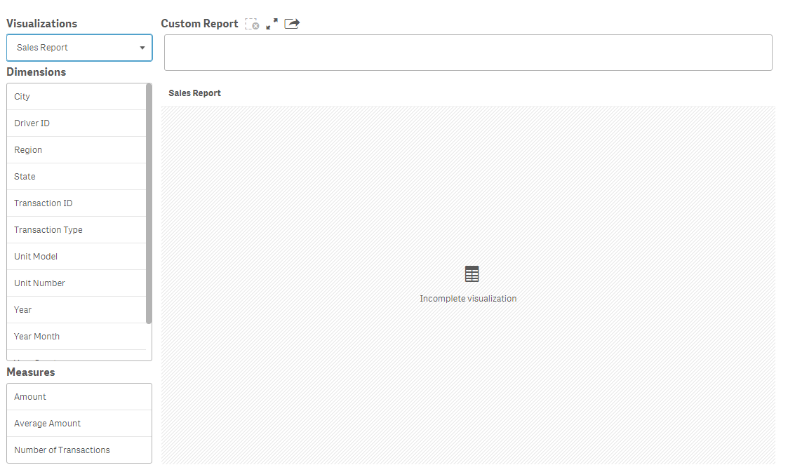
- In the Visualizations drop down, select the report you just created. All tables that are in your visualization master items will be listed in the drop down. Once the table is selected, the dimension and measure lists will be populated with the dimensions and measures that are used in the table as seen below.
- Select the dimensions and measures you would like to add to your report by clicking on them. Your report will look something like the image below after you make some selections. The dimensions are blue and the measures are orange.
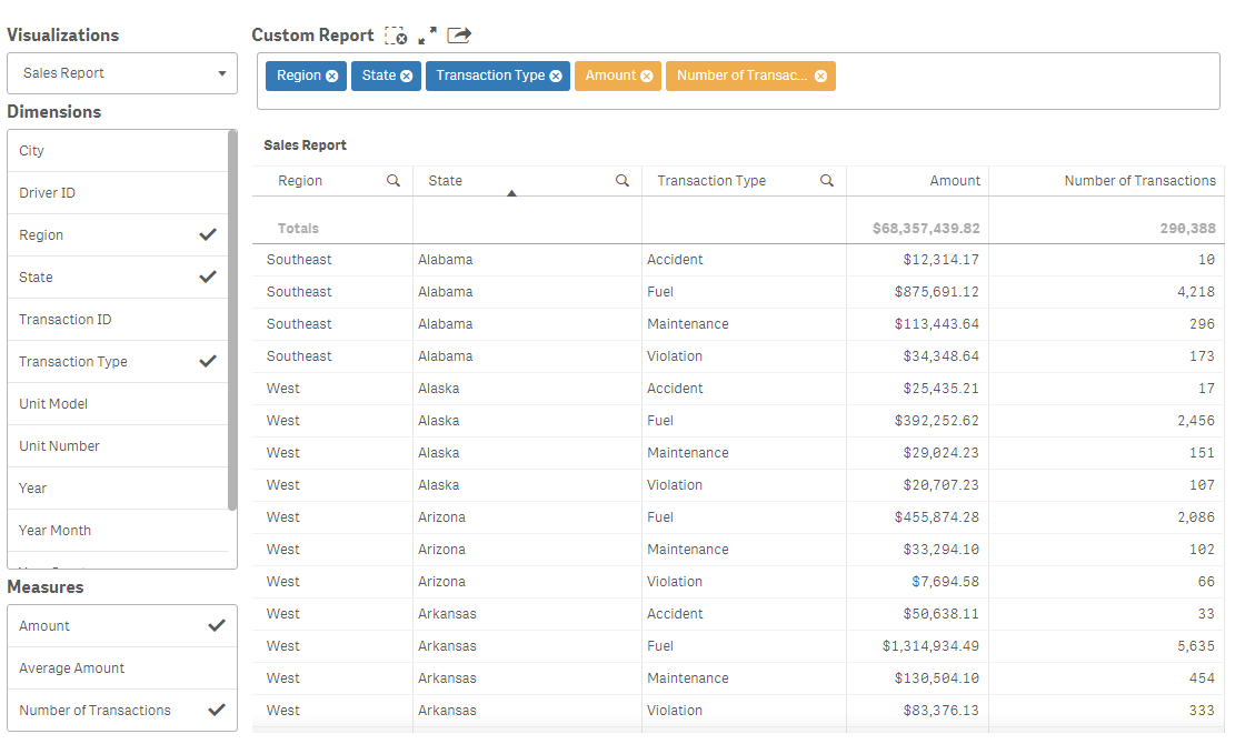
- From the custom report bar above the chart, you can remove a dimension or measure by clicking the x and you can change the order of the columns by dragging and dropping the dimensions and measures into the order you would like them to appear in the report.
And that is it - it is that simple to add a custom report to your Qlik Sense app. With Qlik Sense self-service, a user can create a report by dragging and dropping dimensions and measures into a table but what I like about the Climber Custom Report extension is it makes everything available to the user with a clean, professional and organized look. Download it now and test it out for yourself. See the extension in action in the Situational Awareness demo. Note - the Climber Custom Report extension works in Qlik Sense 3.0 and higher and, like all extensions, are not supported by Qlik.
Thanks,
Jennell
-
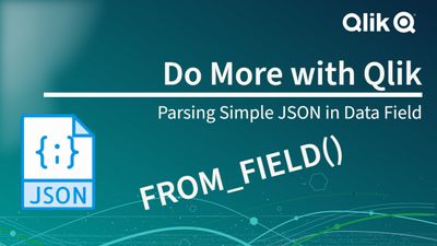
FROM_FIELD() - Is very powerful! It helped me parse JSON data stored in a field!
See how powerful FROM_FIELD() is. It helped me extract a simple JSON data structure from a field into it's own dimension table.
-
Techspert Talks - Qlik Cloud Admin 201
Hi everyone, Want to stay a step ahead of important Qlik support issues? Then sign up for our monthly webinar series where you can get first-hand insights from Qlik experts. Our most recent Techspert Talks session was Qlik Cloud Admin 201. But wait, what is it exactly?Techspert Talks is a free webinar held on a monthly basis, where you can hear directly from Qlik Techsperts on topics that are relevant to Customers and Partners today. In this se... Show MoreHi everyone,
Want to stay a step ahead of important Qlik support issues? Then sign up for our monthly webinar series where you can get first-hand insights from Qlik experts.
Our most recent Techspert Talks session was Qlik Cloud Admin 201.But wait, what is it exactly?
Techspert Talks is a free webinar held on a monthly basis, where you can hear directly from Qlik Techsperts on topics that are relevant to Customers and Partners today.In this session we will cover:
- Troubleshooting entitlement allocation
- Exploring Capacity Consumption
- Leveraging Qlik APIs for User Management

-
【オンデマンド配信】食品製造業界向けサイロ化したデータの高度活用について
食品製造業界では、部門間のデータ分断や非構造化データの活用不足が大きな課題となっています。Qlik の統合情報基盤と AI 活用により、現場から経営までをつなぐ高度なデータ活用を実現する方法をご紹介します。 ※ パソコン・タブレット・スマートフォンで、どこからでもご視聴いただけます。今すぐ視聴する 今すぐ視聴する -
-
Dynamic Zone Visibility
Dynamic Zone Visibility Lupus Analytics Dynamic Selections Discoveries How to dynamically switch between charts Dynamic Zone post Impact Small space, bigger impact on user engagement Audience All users Data and advanced analytics Recipe:1. Layout Container2. Three Buttons3. Line Chart, map and two bar charts4. Add your data, mix with variable and good color pallet. 5. Style with Inter, sans-sarif. Show More
Dynamic Zone VisibilityLupus Analytics Dynamic Selections
Discoveries
How to dynamically switch between charts Dynamic Zone post
Impact
Small space, bigger impact on user engagement
Audience
All users
Data and advanced analytics
Recipe:
1. Layout Container
2. Three Buttons
3. Line Chart, map and two bar charts
4. Add your data, mix with variable and good color pallet.
5. Style with Inter, sans-sarif. -
Are You Ready to Become a Qlik Academic Program Educator Ambassador?
The Qlik Academic Program provides educators, students, and researchers from accredited universities with free Qlik software and learning resources to educate and train the next generation of experts leading with data. Our Educator Ambassador Program aims to shine the spotlight on our most active educator members. Our ambassadors will champion our vision to make more students data literate and to prepare them for the data-driven workplace. Are y... Show MoreThe Qlik Academic Program provides educators, students, and researchers from accredited universities with free Qlik software and learning resources to educate and train the next generation of experts leading with data. Our Educator Ambassador Program aims to shine the spotlight on our most active educator members. Our ambassadors will champion our vision to make more students data literate and to prepare them for the data-driven workplace.
Are you a current educator member who is:
- Passionate about the Qlik Academic Program and all of the program resources
- Dedicated to preparing students for the data-driven workplace
- An active promotor of the Qlik Academic Program to academic peers as well as students
- Willing to share your experience of the Qlik Academic Program at (virtual) events, in forums, on social media, and in the press
- A contributor to blogs, forums, university publications, professional journals, papers, or other materials that promote the Qlik Academic Program
If you answered YES to one or more of the above, then we encourage you to apply to the Educator Ambassador Program! Learn more and apply now!
All current educator members are eligible to apply. If you have not already signed up for the Qlik Academic Program, you can do so at https://www.qlik.com/us/academicprogram and then check out our current 2025 Educator Ambassadors.
Application Deadline: The application deadline is November 14 , 2025, and the new class of ambassadors will be announced in early 2025.
Ambassador Benefits:
If you are selected as a Qlik Academic Program Educator Ambassador, you will receive a host of benefits including:
- Insight: Exclusive webinars with Qlik leaders, customers, and partners covering the latest trends in analytics and other industry topics
- Credibility: A digital badge to certify ambassador status and a featured online profile
- Exposure: Outreach opportunities to showcase your experience with the Qlik Academic Program via Qlik marketing channels or speaking engagements
- Perks: Discounts on Qlik events and other exclusive rewards
- Community: Network and collaborate with other educators across various fields and geographies
- Opportunity: Potential to advance your career, including meeting university requirements for scholarly contribution beyond the classroom
Apply to become an Educator Ambassador today!