Unlock a world of possibilities! Login now and discover the exclusive benefits awaiting you.
- Qlik Community
- :
- Discover
- :
- Blogs
- :
- Non-Technical
- :
- Community Manager Blog
- :
- Community Enhancements (2021 - 8)
- Subscribe to RSS Feed
- Mark as New
- Mark as Read
- Bookmark
- Subscribe
- Printer Friendly Page
- Report Inappropriate Content
Hello Qlik Community!
This is always a fun time of year. The work should slow down but never does. In all seriousness, while we continue to push this sprint into production (and a 2nd one is already planned for later this month) December we will go on a freeze. Unless it's a bug fix of critical nature or something else profound we will go on a much needed break. Instead, we will use the time to reflect on the past year while building plans for 2022. A freeze allows us time to ensure for community stability and work on site performance improvements.
Updates today include the following:
- Right Rail Navigation Updates
We deliver consistency to community pages by streamlining the right-side navigation (what we call the 'right rail') so that as users navigate from page to page things are consistent.
Right rail setup will primarily include:
- Moderator (or for Groups we note the Group Admins)
- Upcoming Events
- Labels (may be referred to as: "Subscribe by Product or Subscribe by Topic ")
- Tag Cloud
- Recent Documents
- Community Browser
2. New Label Design when Inside a Post
It's the little things in life that please this nerd 🤓
Labels help us keep all our content organized and serve a vital purpose in our community. Members often subscribe to labels as a way to only receive notifications on content they truly care about.
A UI improvement to labels went into production today making them easier to see and more appealing to the eye. You will notice the redesigned labels when creating a new post. When you select a label it will turn green (of course we chose green!).
Old Design
New design for labels
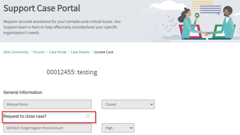
3. 'Request to Close' on Case Portal
When updating a case you have the option to request to close your case. A simple UI improvement to left justify and bold the text and checkbox make this feature a bit more intuitive and noticeable for our users.
We have a lot of big plans for you in 2022! Yet, I can't help but wonder... if you can request just one change to the Community what would it be? Tell us in the comments ⬇️ !
Wishing all our Community Members a wonderful day, week and month ahead.
All the best,
Melissa, Sue and Jamie
You must be a registered user to add a comment. If you've already registered, sign in. Otherwise, register and sign in.


