Unlock a world of possibilities! Login now and discover the exclusive benefits awaiting you.
- Qlik Community
- :
- Blogs
- :
- Technical
- :
- Design
- :
- Chart Dimensionality
- Subscribe to RSS Feed
- Mark as New
- Mark as Read
- Bookmark
- Subscribe
- Printer Friendly Page
- Report Inappropriate Content
In a simple chart with one dimension and one measure, the number of data points is determined by the number of possible values in the dimension. For example, a bar chart with Month as dimension typically has twelve bars – one per month.
If you want to add complexity to your chart, you can choose between adding a dimension and adding a measure. Whichever you do, the chart will increase its rank – or dimensionality – and change appearance.
Below you have two bar charts: The left chart has two dimensions and one measure, while the right chart has one dimension and three measures. Yet, they are almost identical.
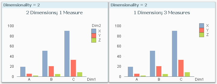
The left chart has Sum(Amount) as measure, while the right has Sum({$<Dim2={X}>} Amount) as first measure, and similar expressions for the additional two measures.
The reason why they look identical is that they have the same dimensionality: An array of measures can be regarded as a virtual dimension, and if so, both charts have two “dimensions”, i.e. a dimensionality of two.
This property is not unique for bar charts. Most charts can be altered this way, e.g. pie charts:
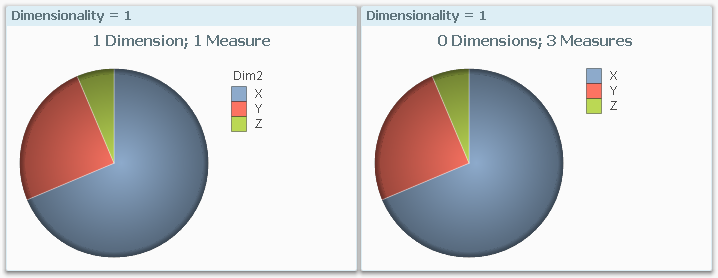
Notice that the pie chart to the right has zero dimensions. It is a dimensionless chart with several measures. Several chart types can display relevant information without having a dimension: e.g. the Pie chart, the Bar chart, the Funnel chart, the Radar chart, the Pivot table and the Straight table. Try it, and you’ll see.
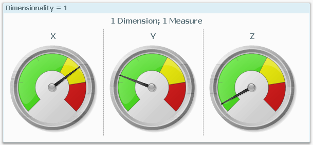
There are some charts that don’t fit the above description though. First of all, the Gauge is a dimensionless chart that always has zero as dimensionality.
Secondly, the Trellis chart is just a container for multiples of another chart type. By using a Trellis, you effectively can add one or two dimensions. For example, you can add a dimension to a Gauge using a Trellis chart:
Further, the Scatter chart is different from other charts in that it always needs one dimension to define the number of data points, and two measures to define the coordinates. The dimension cannot be replaced by an array of measures.
With the above knowledge, it is easier to describe the limits of different chart types:
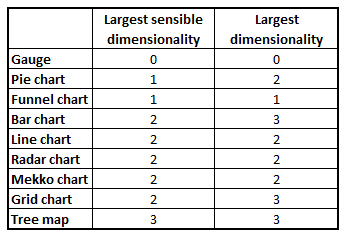
The first number is the largest dimensionality for which the chart makes sense. However, some charts can be made to display a higher dimensionality (number to the right), but it is rarely easy to understand such a chart, so I don’t recommend it.
Finally, the conclusion from the above is that you have a choice of displaying the last dimension either as dimension or as an array of measures. If you choose a dimension, then you have the advantage that the user can select in this dimension by clicking in the chart. But if you instead choose an array of measures, you have a greater flexibility for customizing the measures. You can for instance add a measure which is different than the first ones; e.g. in addition to ‘Sales 2014’ and ‘Sales 2015’ you can display the relative change.
With this, I hope that you have some new ideas for visualizations.
Further reading related to this topic:
You must be a registered user to add a comment. If you've already registered, sign in. Otherwise, register and sign in.