Unlock a world of possibilities! Login now and discover the exclusive benefits awaiting you.
Recent Documents
-
Gradient color palette with the ColorMix2() function
Hi qlik community members, 👋 Check out this solution to create your own gradient color palette with the ColorMix2() function. Resolution in stages Le... Show MoreHi qlik community members, 👋
Check out this solution to create your own gradient color palette with the ColorMix2() function.
Resolution in stages
Let's see how we can achieve this result, in a simple data model.
1 – Find the largest and smallest value of your measurement.
max(total aggr(Sum([Total value]),Customer))

min(total aggr(Sum([Total value]),Customer))
2 – Calculate the difference between these values
max(total aggr(Sum([Total value]),Customer))
-
min(total aggr(Sum([Total value]),Customer))
3 – Now we will create a range, where we will identify positions 0 and 1 of the indices, or basically the values from 0% to 100%.
(sum([Total amount])
-
min(total aggr(Sum([Total amount]),Customer)))

/

(max(total aggr(Sum([Total amount]),Customer))
-
min(total aggr(Sum([Total amount]),Customer)))
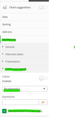
4 – To apply the gradient, in your graph go to the Presentation window -> Colors and Legend -> Colors Customize by expression. In the check box, leave the option selected as shown below:5 – Finally, in the expression insert your calculation within the ColorMix2() function.
ColorMix2((sum([Total amount])
      -
min(total aggr(Sum([Total amount]),Customer)))

/
(max(total aggr(Sum([Total amount]),Customer))
-
min(total aggr(Sum([Total amount]),Customer))),red(),blue(),yellow())
For more details see this and other color functions in the qlik help.
https://help.qlik.com/en-US/sense/November2023/Subsystems/Hub/Content/Sense_Hub/ChartFunctions/ColorFunctions/color-functions-charts.htmI hope you like it! 🙂
Attached is the qvf for anyone who wants to see the example model exposed.
Yours sincerely, Matheus -
Technical Brief: QlikView November 2018 Skia Rendering Library
This technical brief provides an overview of the new Skia graphics rendering library, which was implemented in QlikView in the November 2018 release. Show MoreThis technical brief provides an overview of the new Skia graphics rendering library, which was implemented in QlikView in the November 2018 release.


