Unlock a world of possibilities! Login now and discover the exclusive benefits awaiting you.
- Qlik Community
- :
- Blogs
- :
- Technical
- :
- Design
- :
- More visualization extensions for Nebula.js
- Subscribe to RSS Feed
- Mark as New
- Mark as Read
- Bookmark
- Subscribe
- Printer Friendly Page
- Report Inappropriate Content
Nebula.js and its ecosystem with extensions is growing and is growing fast. In the past, I have covered some of the available charts like bar-chart, funnel-chart, line-chart, mekko-chart, pie-chart, sankey-chart and a simple table.
Today I will go over some of the latest editions, a simple Filter, based on a field, a KPI object and a Combo chart.
Let's start with the Nebula.js configuration and the connection to our Qlik Sense server.
The code is in observablehq, for framework specific, check links at the end of this blog post.
nebula = require("@nebula.js/stardust")
n = {
  const { embed } = nebula;
  const config = {
    host: 'qlik-sense.your-server.com',
    appId: 'xxxxxxxx-xxxx-xxxx-xxxx-xxxxxxxxxxxx’,
  }
  const enigmaApp = await enigma
    .create({
      schema,
      url: `wss://${config.host}/app/${config.appId}`,
    })
    .open();

  const app = await enigmaApp.openDoc(config.appId);

  const n = await embed(app, {
      context: {
        theme: 'light',
        language: 'en-US',
        constraints: {
          active: false,
          passive: false,
          select: false,
        },
      },
      types: [
        // We will add the charts later on
      ],
  });

  return n;
}
Ok we have Nebula.js configured and a Websocket connection to the engine. We start with a simple Filter. All you have to do is get the Field Name from Qlik Sense and then add the following code into your js page. All of these examples are using the default Helpdesk app.
const field = await n.field('Case Owner Group');
field.mount(filterElement, { title: 'Department' } );
And here is the rendered object
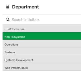
Live example: https://observablehq.com/@yianni-ververis/nebula-js-filter
Ok, we’ve got the simple filter, lets see how to get a KPI object.
In the previous example add the sn-kpi and then render it
nebula = require("@nebula.js/stardust")
kpi = require("@nebula.js/sn-kpi")
…
types: [
      {
        name: 'kpi',
        load: () => Promise.resolve(kpi),
      }
],
…
  n.render({
    element: kpiElement1,
    type: 'kpi',
    fields: ["=Count( {$<Priority={'High'}, Status -={'Closed'} >} Distinct %CaseId )"],
  });
This is what we get
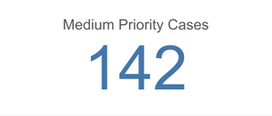
Live Example: https://observablehq.com/@yianni-ververis/nebula-js-kpi?collection=@yianni-ververis/nebula
That was easy, right?
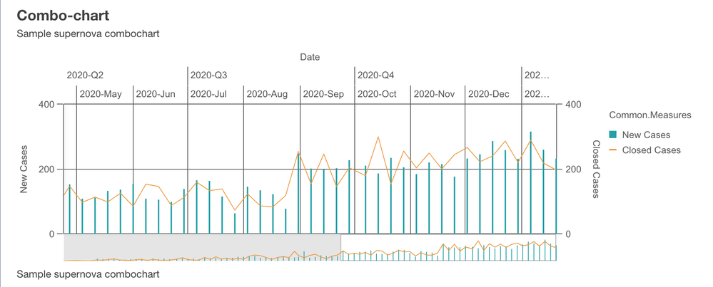
Now let’s get into a more complicated one, the Combo Chart.
In the previous example add the sn-combo-chart and then render it but with a hyperCube this time so we have more fine control over the labels, type bar/line etc.
nebula = require("@nebula.js/stardust")
comboChart = require("@nebula.js/sn-combo-chart")
…
types: [
      {
        name: 'comboChart',
        load: () => Promise.resolve(comboChart),
      }
],
…

  n.render({
    element: chartElement,
      type: 'comboChart',
      properties: {
        qHyperCubeDef: {
          qDimensions: [
            {
              qDef: {
                qFieldDefs: ['Date.autoCalendar.Date'],
                qFieldLabels: ['Date']
              },
              qNullSuppression: true,
            },
          ],
          qMeasures: [
            {
              qDef: {
                qDef: 'Sum([Number of New Cases])',
                series: { type: "bar", axis: 0 },
                qLabel: 'New Cases',
                // autoSort: false
              },
              qSortBy: { qSortByNumeric: -1 },
            },
            {
              qDef: {
                qDef: 'Sum([Number of Closed Cases])',
                series: { type: "line", axis: 1 },
                qLabel: 'Closed Cases',
              },
              qSortBy: { qSortByNumeric: -1 },
            },
          ],
          qInitialDataFetch: [{ qWidth: 3, qHeight: 1000 }],
          qAlwaysFullyExpanded: true,
          qSuppressMissing: true,
          qSuppressZero: true,
        },
        scrollStartPos: 1,
        showTitles: true,
        title: 'Combo-chart',
        subtitle: 'Sample supernova combochart',
        footnote: 'Sample supernova combochart',
      },
});
And this is the rendered object
So, what if we want to change this to a stacked bar chart and the x-axis labels underneath? We specify the "type" to be "bar" on the second measure and the "dock" to "near"
...
     series: { type: "bar", axis: 1 },
...
  dock: 'near',
...
and we should see this
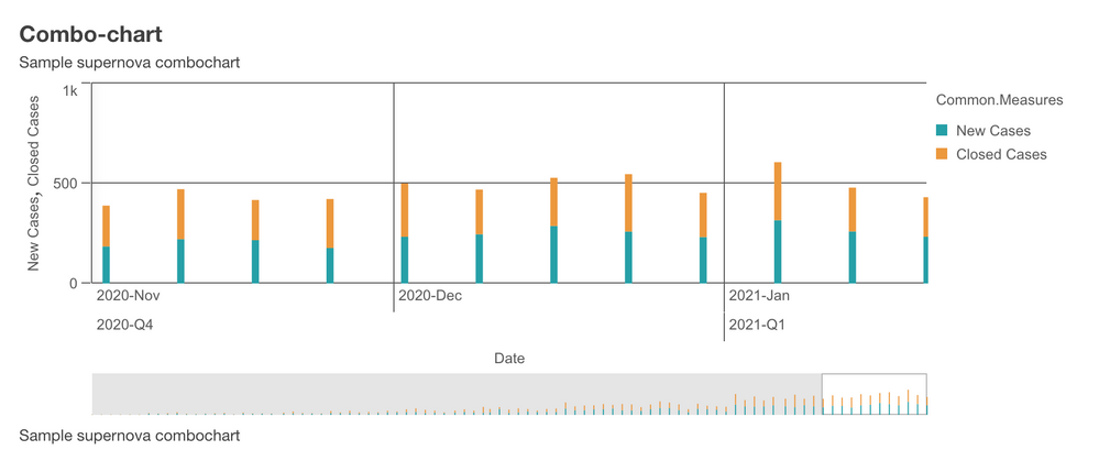
Live example: https://observablehq.com/@yianni-ververis/nebula-js-combo-chart?collection=@yianni-ververis/nebula
That's it for today! Make sure you check out my previous articles with different framework implementations and some visualizations
https://community.qlik.com/t5/Qlik-Design-Blog/Using-Nebula-js-with-React-js-or-in-Simple-html-pages...
https://community.qlik.com/t5/Qlik-Design-Blog/Using-Nebula-js-with-Angular-or-Svelte/ba-p/1764361
https://community.qlik.com/t5/Qlik-Design-Blog/Sn-table-Nebula-js-latest-extension/ba-p/1780153
Described extensions in the above blogs with live examples
Selections

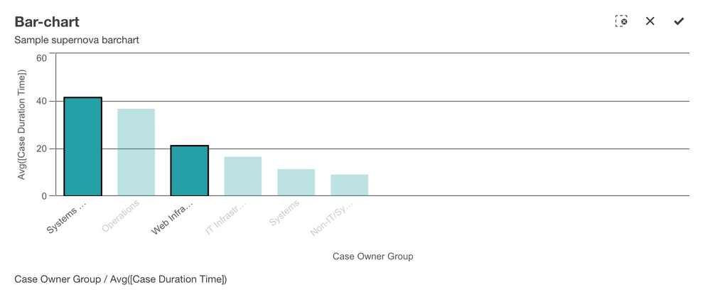
https://observablehq.com/@yianni-ververis/nebula-js-barchart?collection=@yianni-ververis/nebula

https://observablehq.com/@yianni-ververis/nebula-js-funnel-chart?collection=@yianni-ververis/nebula
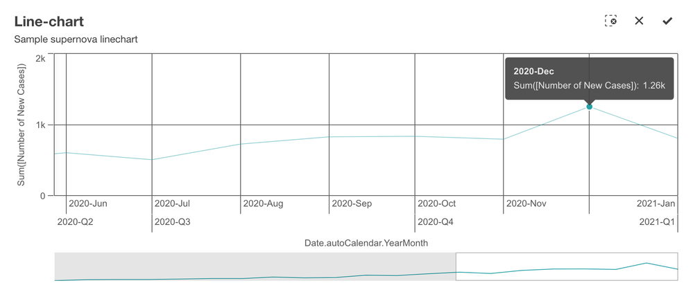
https://observablehq.com/@yianni-ververis/nebula-js-line-chart?collection=@yianni-ververis/nebula
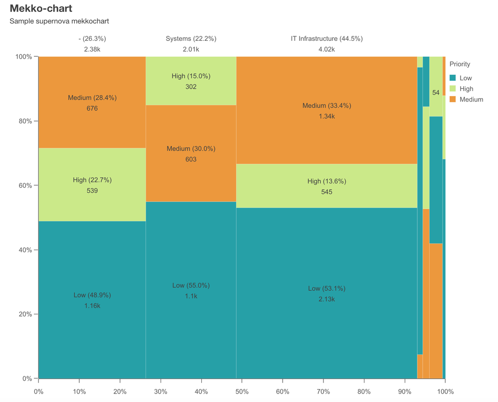
https://observablehq.com/@yianni-ververis/nebula-js-mekko-chart?collection=@yianni-ververis/nebula
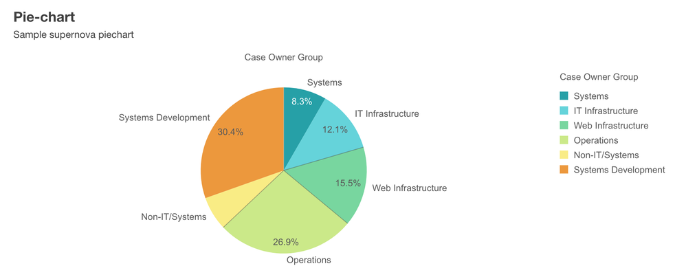
https://observablehq.com/@yianni-ververis/nebula-js-pie-chart?collection=@yianni-ververis/nebula
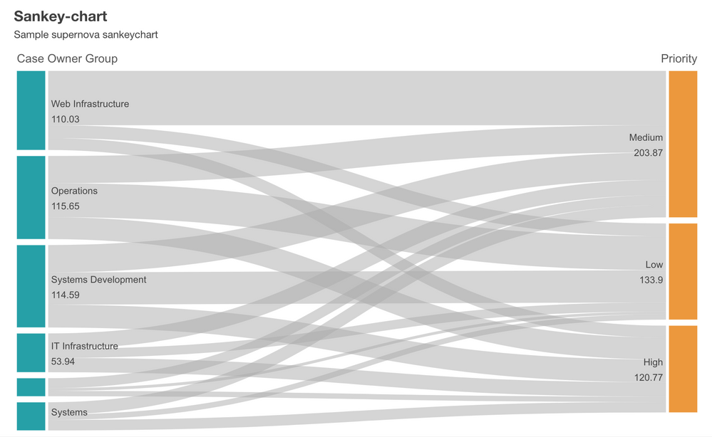
https://observablehq.com/@yianni-ververis/nebula-js-sankey-chart?collection=@yianni-ververis/nebula

https://observablehq.com/@yianni-ververis/nebula-js-table?collection=@yianni-ververis/nebula
Specific Framework templates:
React: https://github.com/yianni-ververis/nebula-react
Angular: https://github.com/yianni-ververis/nebula-angular
Svelte: https://github.com/yianni-ververis/nebula-svelte
Coming up, Grid chart and Bullet chart.
/Yianni
You must be a registered user to add a comment. If you've already registered, sign in. Otherwise, register and sign in.