Unlock a world of possibilities! Login now and discover the exclusive benefits awaiting you.
Analytics & AI
Forums for Qlik Analytic solutions. Ask questions, join discussions, find solutions, and access documentation and resources.
Data Integration & Quality
Forums for Qlik Data Integration solutions. Ask questions, join discussions, find solutions, and access documentation and resources
Explore Qlik Gallery
Qlik Gallery is meant to encourage Qlikkies everywhere to share their progress – from a first Qlik app – to a favorite Qlik app – and everything in-between.
Qlik Community
Get started on Qlik Community, find How-To documents, and join general non-product related discussions.
Qlik Resources
Direct links to other resources within the Qlik ecosystem. We suggest you bookmark this page.
Qlik Academic Program
Qlik gives qualified university students, educators, and researchers free Qlik software and resources to prepare students for the data-driven workplace.
Recent Blog Posts
-
Alternate States and Capability APIs
Here are some useful topics related to alternate states and the Capability APIsCreating Alternate StatesCreating an alternate state with the Capabilit... Show MoreHere are some useful topics related to alternate states and the Capability APIs
Creating Alternate States
Creating an alternate state with the Capability APIs is easy. Just do the following
app.addAlternateState('StateName');
Alternate states created through the Capability APIs can be saved in the app or created every session. If you try to add an alternate state that already exists though, you may get some unexpected behavior. That's why I would recommend using something like the following when adding an alternate state:
app.getAppLayout(function(layout) {
     if(layout.qStateNames.indexOf('StateName') === -1) {
          app.addAlternateState('StateName');
     }
});
This will check to make sure the alternate state doesn't already exist before adding it to the app.
Alternate States and Session Objects
For session objects, such as lists and hypercubes, it's super easy to assign them to an alternate state. All you need to do is include the 'qStateName' parameter in your object definition. Below is an example of a list object that fetches 10 rows from the field 'SomeField', and is assigned to the state 'StateName'.
app.createList({
    'qDef': {
        'qFieldDefs': ['SomeField'],
    },
    'qInitialDataFetch': [
        {
            'qHeight': 10
        }
    ],
    'qStateName': 'StateName'
}, function(reply){});
Alternate States and Qlik Sense Objects
You can't assign a Qlik Sense object directly to an alternate state, but with a bit of set analysis, you can make an object respond to selections on an alternate state. Let's take, for example, a measure that is simply the sum of some field name, and add the set analysis needed to make it respond to selections on an alternate state.
Sum( {$< FieldName = P( {StateName} FieldName ) >} FieldName)
Making Selections on Alternate States
Making selections on alternate states is as simple as passing an extra parameter to the Field API methods. Example below
app.field('FieldName', 'StateName').select([0], false, false);
The above example would select the first row in the "FieldName" field, on state "StateName". The important part of the above is the second parameter to the app.field() method. Utilizing that second paramter, you can apply just about any method in the Field API to an alternate state.
-
How I used Aggr() and Above() in a KPI Object
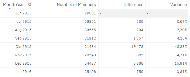
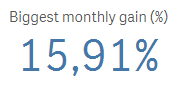
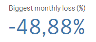
I ran into an interesting dilemma last week when trying to create a measure for a KPI object in Qlik Sense. Let me set the scene. I was working on a... Show MoreI ran into an interesting dilemma last week when trying to create a measure for a KPI object in Qlik Sense. Let me set the scene. I was working on an app that tracks organization members and activities. The requirement was to look at the number of members in the organization over time and identify the largest and lowest monthly gain and loss. I was able to build the table below to see how the number of members varied over time and where the largest gain and loss were. The largest gain was from Nov 2015 to Dec 2015 with a 15.91% member increase. The largest loss was Sept 2015 to Oct 2015 with -48.88% member decrease.
The measures for this table looked like this:
Number of Members – count the number of distinct members

Difference – count the difference between this month and the previous month using the Above() function to capture the previous month’s number of members

Variance – show the difference as a percentage
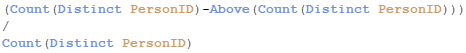
Now here is where my dilemma began. I needed to capture the percentage and number of the gains and losses in a KPI object and I was not sure how to do that. I knew there had to be a way to do it in Qlik Sense so I turned to my colleague Arturo Munoz who enlightened me to the fact that when I use the Aggr() function, it creates a temporary staged result set, like a table, similar to what I was doing in the table above. So I tried this out in a KPI object using the Variance expressions above and aggregating the results by MonthYear. Since I wanted the largest gain and loss, I also used the Max() and Min() functions. Here is what my KPI measures looked like when I was done:
Largest Gain %

Largest Loss %

I was able to use the Above() function in my KPI measure to get the variance and then I aggregated the result by MonthYear and captured the maximum and minimum variance. I was able to apply this to my app for other KPIs as well. It was brilliant. I never thought that I could use the Above() function outside of a Table object but I was very happy to find out I was wrong. In order for the Aggr() function to work as I expected, I needed to make sure the MonthYear field was sorted properly in ascending order so I handled this in my script. Note that if the MonthYear field was not in ascending order, the Above() function may not always return the previous month thus returning the wrong results.
Henric Cronstrom has blogged about the Aggr() function in his blog Aggregations and Function Classes as has Adam Bellerby in his AGGR... blog. The Aggr() function can be quite helpful and while I have gotten use to using it, I realized that there are still so many other ways it can be used. I hope you find this way of using it as helpful as I did.
Thanks,
Jennell
-
New Course Available: Reporting with QlikView® NPrinting
The Reporting with QlikView NPrinting course is based on QlikView NPrinting v17. This course is intended for business users and business analysts who ... Show More
The Reporting with QlikView NPrinting course is based on QlikView NPrinting v17. This course is intended for business users and business analysts who need to be able to build and distribute static reports from QlikView. The course will cover the generation of reports based on (multiple) QlikView applications, options for distribution to users and groups, and scheduling options.
Please note that this course is only suitable for those wishing to learn specifically about the features of QlikView NPrinting v17. This course is not compatible with earlier versions QlikView NPrinting.
How Can You Learn NPrinting?
Visit http://inter.viewcentral.com/reg/qlik/ReportQVNPrinting to register today!

-
Training That Cuts To The Chase
For most of us, information that is not put to action quickly is simply forgotten. If the information is not practical or relevant immediately to you... Show More
For most of us, information that is not put to action quickly is simply forgotten. If the information is not practical or relevant immediately to your job, chances are, you won’t remember it. The solution to this is what is known as “just-in-time” learning. Just-in-time learning can provide you with all the training you need, right at your fingertips, through a self-service learning platform.
Here are a few situations where the learner would benefit from just-in-time learning.
- Keeping up with new product features
- Spacing out your learning
- Refreshing your knowledge
- Learning task-based solutions
To read the full blog visit Training That Cuts To The Chase | Qlik and don't forget to check out the our self-service learning platform Qlik Continuous Classroom.
-
Enhancing the User Experience Using Conditional Expressions
As QlikView developers, one of our main focuses is on the user experience. There are many instances where objects only need to be shown upon the user’... Show MoreAs QlikView developers, one of our main focuses is on the user experience. There are many instances where objects only need to be shown upon the user’s request. An example of this is list boxes (filters). With the use of conditional expressions, a QlikView developer can make the list boxes available when the user needs them.
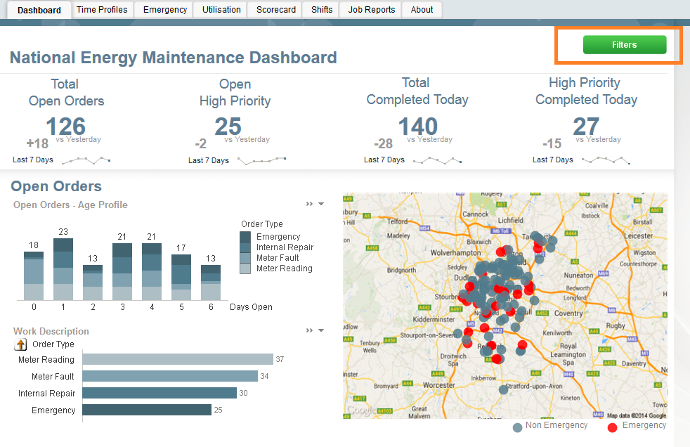
I have seen too many applications where list boxes take up most of the design area available to the developer. Invariably you get the same response, “It is what the users want”. And while I am sure they “need” all of the list boxes, they just do not need them on the screen the entire time. So how do you get around this demand for list boxes? Create a “Filters” button and have the user show and hide the list boxes whenever they want.
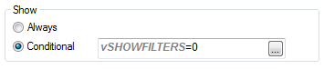
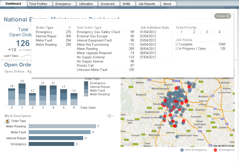
For this first example, I will reference the Workforce Management demo. On the dashboard below there are no visible list boxes. The lack of list boxes opens up more space to the developer. Instead of making the list boxes available at all times, we have a Filters button which, when invoked, will display the filters over top of the visualizations. Once the user makes the appropriate selections, he/she can close the filter panel and continue with his/her discovery. This is done by setting a variable and conditionally showing the objects based on the current value of the variable. The beauty of this approach is that the user gets to have the filters that he/she needs and the developer does not lose any display area.
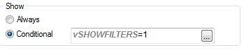
Here you can see the filter button with a conditional show. When invoked, there is an action to change the variable to 1 which makes the filters button disappear and makes the filter objects appear.
All of the filter objects have the same show conditional. When the user selects the close button, the variable is changed back to 0 which makes the filter objects disappear and the Filters button reappear.
This approach can also be used if you need to show/hide help/information pop-ups as shown here in the IT Asset Management demo.
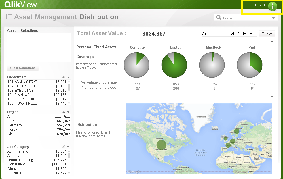
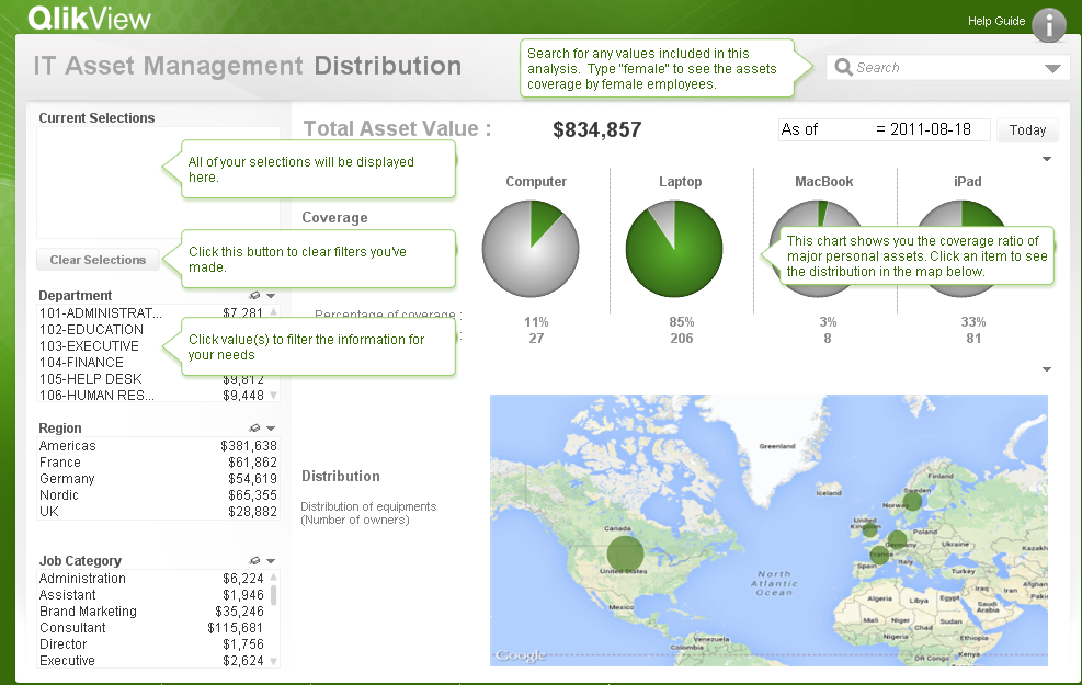
If you would like to see how the filter and the help/information buttons were developed, the QVWs can be downloaded from the demo site. As was stated earlier, the filter example referenced the Workforce Management demo and the Help/Info button referenced the IT Asset Management demo. Happy Qliking!

-
Accumulations
When building analytical applications you very often encounter cases where you want to accumulate numbers inside a chart. It could be that you want ... Show MoreWhen building analytical applications you very often encounter cases where you want to accumulate numbers inside a chart. It could be that you want to calculate a Year-to-date number, or a rolling 6 month average, or a moving annual total.
When creating an accumulation, there are two fundamental challenges. First, there is the question on how to treat dimensional values with no data. The tables below illustrate the problem:
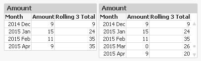
In this example, there is no data for the month of March. The default behaviour is that this row then is omitted, see left table. This leads to an incorrect accumulation – the rolling 3 total for April includes January, which it shouldn’t. The table to the right however treats missing months correctly.
Secondly, there is the question on how to treat the first dimension when there are several dimensions. The tables below illustrate the problem:
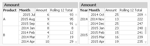
In the left table, you want the accumulation to re-start for each new product. You do not want the accumulation to continue from the previous product. Note that for ‘2014 Jan’ the accumulation is reset.
But in the right table, it is the other way around: A moving annual total should span over two calendar years, so you want the accumulation to continue over into a new value of the first dimension.
In QlikView and Qlik Sense there are several ways to create accumulations, each with its own pros and cons.
1. Using the control in QlikView charts
In a QlikView chart, you can easily create an accumulation just by selecting the right chart setting:
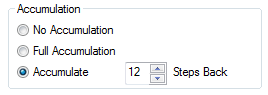
This method will however fail both the above challenges. Also, an accumulation can only be made over the first dimension, and the accumulation will always be reset for a new value in the second dimension.
Further, you cannot use it to calculate moving averages. It only works for calculations of sums.
2. Using the Above() function
If you use the Above() function in a chart table like
RangeSum(Above(total Sum(Amount) , 0, 12))
or in an Aggr() table like
Only(Aggr(RangeSum(Above(total Sum({Amount),0,12)), YearMonth))
you will get a 12-month moving total. It will pass the “multiple dimensions” challenge: By using – or not using – the total specifier in the Above() function you can decide which behaviour you want.
But it will fail the “no data” challenge. There is a however a way to make an accumulation in an Aggr() table work also for this problem: Trick the QIX engine to show all rows by adding a zero term for all dimensional values:
Only(Aggr(RangeSum(Above(totalSum(Amount) + Sum({1} 0),0,12)), YearMonth))
and enable the display of zero values. Then you will get the right numbers also when some dimensional values are excluded.
3. Using an As-Of table in the data model
The As-Of table, is an excellent solution that will pass both challenges. Here you must set the condition using Set Analysis:
Sum({$<MonthDiff={"<12"}>} Amount)
However, it has one drawback: When a user clicks in the chart, a selection will be made in the AsOfMonth. But you don’t want the user to make selections here: You want month selections to be made in the real month field. So I usually make my charts read-only if they use the AsOfMonth as dimension.
With this, I hope that you understand accumulations better.
Further reading related to this topic:
Calculating rolling n-period totals, averages or other aggregations

-
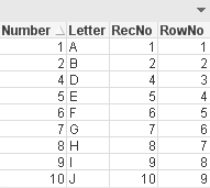
RecNo or RowNo?
Do you know the difference between the RecNo() and the RowNo() functions? You may think that you can use these interchangeably to count the records o... Show MoreDo you know the difference between the RecNo() and the RowNo() functions? You may think that you can use these interchangeably to count the records or rows in a table but these functions differ slightly. The RecNo() function will return an integer for the record currently being read from the source table starting with number one. The RowNo() function also returns an integer but it represents the position of the row in the resulting QlikView internal table. So while RecNo() counts from the source table, RowNo() counts from the resulting table.
In the script below the fields from the Temp table are loaded along with fields to represent the RecNo and the RowNo. A Where clause is used to load all records where Number does not equal 3.
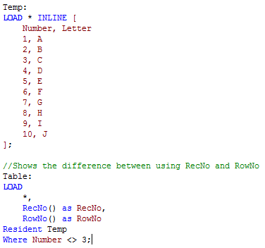
The resulting table below shows the results of this script. In the RecNo field we see values 1 through 10 excluding 3. This is because the script excluded records where Number = 3 so while that record was read, it was excluded from the results. In the RowNo field we see values 1 through 9 for the position of each row in the results table. The fact that some rows were excluded does not affect the RowNo field because we are only looking at the internal table that is created. The RecNo field indicated the order in which the records were read from the source table and the RowNo field indicates the positon of the record in the internal table.
To see an example, check out my technical brief that includes the QVW and detailed descriptions of these functions. In the technical brief, I also discuss the IterNo() function and the FieldValueCount() functions.
Jennell
-
Text searches
One of the strengths of QlikView is its search engine. With it, you can find pieces of information in a fraction of a second and select the found fiel... Show MoreOne of the strengths of QlikView is its search engine. With it, you can find pieces of information in a fraction of a second and select the found field values. The response is immediate, which is necessary for the user experience. Without it, you would easily get an empty result set without understanding why.
Search strings can be made in many different ways, and QlikView will respond differently depending on how the search string is defined. Normally you just enter a text, and QlikView will match this against the beginning of the words in the field values. If several strings are entered, QlikView will return the union of the matches of each of the strings.
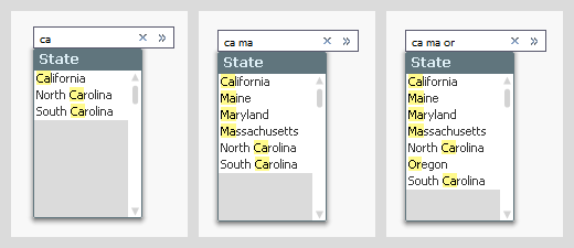
But if you instead use a wildcard in your search string, the evaluation of the search string will be made in a different way: the entire search string with the wild card will be matched against the entire field value, sometimes yielding more matches, sometimes fewer.
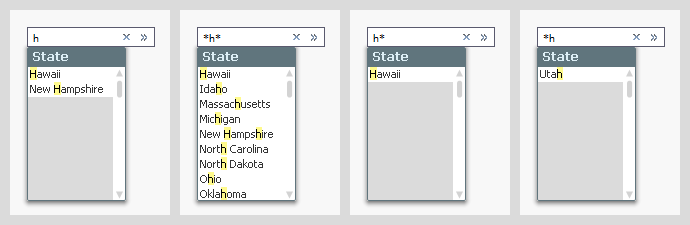
If you want to create more complex search strings (and e.g. store them in actions or bookmarks) you can do this too. Just use (, |, & and double quotes to define the syntax.
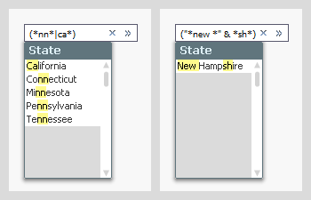
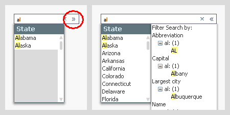
In all the above cases, the search and the selection are made in one and the same field. But sometimes you want to make the selection in one field, but make the search in another. This can be done using the associated search, which is an indirect search method. Start with the field where you want to make the selection, enter the search string, and click on the small chevron to the right. You will then get a list of other fields containing this search string. By clicking the desired match, you will narrow down the number of matches in the primary list to show just the relevant values. You can then make your selection by hitting Enter.
Further, did you know that
- In the user preferences and in the list box properties, you can define how a default search string should be created, but this does not affect how it is evaluated – only how it is created. Once created, you can add or remove wild cards as you please.
- When you make a search and save the resulting selection in a bookmark, the bookmark will contain the search string and not the list of selected values. When the bookmark is applied, it will perform the search and select the found values. If data has changed, this may imply a different search result than before.
- You can use the same search string in many places: In list boxes, in Set analysis, in the Advanced search dialog, in actions and in bookmarks.
Bottom line: The search string is a powerful tool that helps you find the values you want. Use it.
Further reading related to this topic:
-
A few templates
Recently, I put together three simple templates for use in the dev hub. Check out where to find them and more below.Blank Bootstrap TemplateThe "Blank... Show MoreRecently, I put together three simple templates for use in the dev hub. Check out where to find them and more below.
Blank Bootstrap Template
The "Blank Bootstrap Template" download and installation instructions can be found at Qlik Branch - Blank Bootstrap Template. This template is simply a blank template, with boilerplate html, css, and javascript for creating a webapp or mashup using the Qlik Capability APIs. The template loads Bootstrap for you, and takes care of some conflicting css issues between bootstrap and the css used for the Capability API. If you'd like to build your own web app or mashup and use bootstrap, this is a good place to start.
Bootstrap Tabs Template
The "Bootstrap Tabs Template" download and installation instructions can be found at Qlik Branch - Bootstrap Tabs Template. This template builds on the blank bootstrap template, and includes bootstrap tabs and qvplaceholders so you can easily drag and drop objects and create a mashup or web app from an existing Qlik Sense app within minutes. A demo can be found here, and a video demo is below.
Bootstrap Off-canvas Menu Template
The "Bootstrap off-canvas menu template" download and installation instructions can be found at Qlik Branch - Bootstrap off-canvas menu template. This template also builds on the blank bootstrap template, and includes a very simple off-canvas menu so you can stash a filter pane or anything else you'd like in an off-canvas menu, as well as qvplaceholders, allowing you to quickly create a web app or mashup from an existing Qlik Sense app within minutes. A demo can be found here.
-
Merging Data from Multiple Sources
A common situation in Business Intelligence is that you have data in different data sources. It could e.g. be that you have several data systems withi... Show MoreA common situation in Business Intelligence is that you have data in different data sources. It could e.g. be that you have several data systems within your company or that you have some data in an Excel spreadsheet in addition to the data in your database.
In any case, you want to load data from several sources and view them in a coherent way. This is sometimes referred to as merging data or blending data.
Not all BI tools can do this – you sometimes have to rely on external tools or SQL to do this prior to loading the data into your BI tool. QlikView, however, can do this easily.
If you have two different database systems, you need two different connect strings in the script:
ODBC CONNECT TO <Database 1>;
SQL SELECT * FROM TableA;
ODBC CONNECT TO <Database 2>;
SQL SELECT * FROM TableB;
At any place in the script, a SELECT statement will use the latest CONNECT string. In addition, LOAD statements will load data from files, disregarding the CONNECT statement. This way you can merge data from any number of databases and any number of files. Simple!
The next question is how to merge the two tables. In principle there are two ways to do this: Concatenating them (a union) or linking them (joining). Which one to use, depends on the situation.
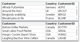
Concatenation should be used, if you have two tables with basically the same type of entity, but different data sets; for example “Customers in Europe” and “Customers in North America”. In this case, you want both tables to be merged into one. See picture above. The script then becomes:
ODBC CONNECT TO <Database 1>;
SQL SELECT * FROM Customers;
ODBC CONNECT TO <Database 2>;
Concatenate SQL SELECT * FROM Customers;
But if you instead have a situation where the tables contain different entities, and a selection of an entity in one of the tables should imply one or several entities in the other table, then you should usually link the tables.
The script then becomes:
ODBC CONNECT TO <Database 1>;
SQL SELECT * FROM Customers;
ODBC CONNECT TO <Database 2>;
SQL SELECT * FROM Orders;
Linking tables is from a logical-mathematical perspective identical to an outer join, but QlikView keeps the two tables separate. Keeping them separate has the advantage that calculations are made in the “right table”.
Not all BI tools can perform an outer join as easily as this. I recently read an article about how to join an “Opportunities” table with a “Leads” table using a competing tool, and it was all but simple. But with QlikView, it is straightforward: Just make sure that the linking key field is named the same in both tables (and that no other fields are) and it will work right away.
The ability of QlikView to load data from any number of sources and merge it any way you want is one of the major strengths of QlikView and its script. Use it.
See also Wizards vs. Scripts
-
New Year: Time to Get Your Organization in Shape
How social learning environments can help maximize your ROI in 2016!The new year is upon us and many of you may have selected your personal new years ... Show MoreHow social learning environments can help maximize your ROI in 2016!

The new year is upon us and many of you may have selected your personal new years resolutions but have you stopped to think about your professional resolutions?
Education Services would like you to consider another type of resolution: adopting the right learning approach for you and your organization – and making your business more successful as a result. To do this you must first focus on social learning, and how it can have a dramatic impact on your ROI!
To learn more visit the Qlik Blog at New Year: Time to Get Your Organization in Shape | Qlik
-
Mode Function
Have you ever heard of the Mode function? Until recently, I was not aware of this function. The Mode function can be used in the script or in a char... Show MoreHave you ever heard of the Mode function? Until recently, I was not aware of this function. The Mode function can be used in the script or in a chart to find the most commonly-occurring value in aggregated data. I will show you how it works by loading the small data set below.
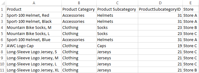
Now that I have loaded this data, I may want to see which Product Category or Product Subcategory occurs the most. To do this in Qlik Sense, I can add a Text & image object to a sheet and add the measure Mode([Product Category]) or Mode([Product Subcategory]).
- Mode([Product Category]) returns Clothing because it is the most common value in the Product Category field.
- Mode([Product Subcategory]) returns Jerseys because it is the most common value in the Product Subcategory field.
Making selections can affect the data returned by the Mode function. For instance, if I selection Store A, Accessories will be the most common product category and Helmets will be the most common product subcategory. If I want to avoid these values changing when I make selections, I can simply use the set analysis expression {1} which will evaluate all records and ignore any selections I have made.
- Mode({1} [Product Category])
- Mode({1} [Product Subcategory])
The Mode function can also be used in the script to determine the most commonly-occurring value. The key to remember when using the Mode function in the script is to use the Group By clause. By using the Group By clause, you are indicating what field the values should be aggregated by. In the script below, I am loading the products in the first load script and then in the second load script, I am using the Mode function to determine the most commonly-occurring store by Product Category.
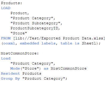
The results will look like this:
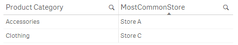
For the Accessories product category, Store A is the most common and for Clothing, Store C is most common. If there is not one single value that occurs more than the others, then the Mode function will return NULL.
The Mode function provides a quick way to see which value occurs the most in aggregated data. It can be used with text data, as done in the examples show here, or with numeric data. Hopefully, you learned something new as I did about one of the many functions offered in Qlik Sense and QlikView.
Thanks,
Jennell
-
Year in review. 2015 top posts
By today an ordinary human being would had been exposed to probably dozens of lists about several and arbitrary topics. For sure we all have read clas... Show MoreBy today an ordinary human being would had been exposed to probably dozens of lists about several and arbitrary topics. For sure we all have read classics lists such as the best movies of 2015, the 25 books of the year, or top 10 songs of 2015, but on the internet, we can go much further than that and even have a list of lists.
I don’t want this year to end without sharing with you a list of the best posts of the year. But let me give you some numbers first.
This year 2015, 10 authors wrote 72 posts (not including this one) and a total of 36.756 words were written. We wrote the word "Qlik" 323 times during 2015 making an impressive average of 4.5 times per post! You, on the other hand, participated by commenting 619 times (8.6 comments per post of average), thanks a lot for that, we really appreciate your comments.
Most popular posts in 2015
Most read/visited posts
- A Primer on Set Analysis. Set analysis, the most powerful and sometimes complex thing in Qlik, in this post, HIC brilliantly explains what Set Analysis is and walks us through it with simple examples.
- Using Qlik Sense Analytics to Get in Shape. Jason Yeung reveals how he used Qlik Sense to track and better understand his fitness activity.
- Qlik Sense – Date & Time. Jennell describes what is and how to work with the new Date and Time fields in Qlik Sense.
- The search string. QlikView search capabilities illustrated with detail, I bet you didn't know a bunch of the available search modifiers.
- How to embed a Qlik Sense Chart on your website. When I wrote this post it was the best way to share a chart, now it's still a good way to share it internally within your company or integrate it in a web page, but since the introduction of Qlik Cloud, we have better sharing options available.
Most commented posts of the year
Something interesting is going on in these posts.
- The search string.
- A Myth about the Number of Hops. HIC tears down a false myth once again, really interesting lecture.
- Excluding values in Set Analysis. Including values in Set Analysis conditions is easy but what about excluding values?
- Evaluate() Function. Discover what's Evaluate(), how to use it, explore examples, and more.
- The As-Of Table. Are you trapped in calculating rolling averages and other accumulations? Then, don't miss this post.
Most liked and bookmarked content
Both strongly correlated.
- A Primer on Set Analysis.
- The As-Of Table.
- The search string.
- Dates in Set Analysis. Yet another post on Set Analysis, this time, HIC gets inside out with dates.
- Excluding values in Set Analysis.
The underdogs 2015
I can't finish the last post of the year without a selection of not-so-popular posts (yet), that deserve some more attention.
- Mode Function. Do you know what Mode() does? well, it's simple but might be an interesting addition for your next project.
- Qlik Sense Search Cheat Sheet Some of the information needs we face every day don't require complex expressions or customized charts, sometimes a good use of search can help you to visualize what you was looking for.
- Qlik Dev Hub replaces Qlik Sense Workbench in Qlik Sense 2.1 Maybe a small step but a very important one in Developers' world.
- Mashup Editor - Toggle charts with jquery Do you miss the good old QlikView container object? Well, Yiannis have created a tutorial to bring it back to life in Qlik Sense.
- Qlik Sense SAML - A standardized approach to authentication Learn what SAML is and how to implement it with Qlik Sense
Hope you all have a great end of the year!
AMZ

-
Qlik Partners IIM Bangalore for BAICONF
Qlik partnered Indian Institute of Management, Bangalore for its 3rd International Business Analytics event,BAICONF held on its campus from 17-19 Dec... Show MoreQlik partnered Indian Institute of Management, Bangalore for its 3rd International Business Analytics event,BAICONF held on its campus from 17-19 December 2015. Around 350 participants registered for this event which included corporates, research institutes and members of the academic community from across the country. The conference was successful in creating a platform and facilitate knowledge sharing on advanced data analysis, business analytics, big data and business intelligence for academicians, practitioners and researchers.
Qlik India MD, Souma Das presented on Data Visualisation in Business Analytics during this event. The academic community showed keen interest on the Academic Program offered by Qlik which gives free licenses to accredited educational institutions. IIM Bangalore has also signed for this program. Along with this, there was a good amount of interest around Qlik's products and their capabilities.
This event also generated a good amount of buzz in the press:
Qlik clicks with IIM Bangalore for BAICONF 2015 - Analytics India Magazine
Qlik partners Indian Institute of Management Bangalore for BAICONF 2015
-
Qlik Continuous Classroom Data Architect user role is now available!
The Qlik Continuous Classroom is expanding to serve another user role, the Qlik Sense Data Architect. Data architects manage and consolidate data fro... Show More
The Qlik Continuous Classroom is expanding to serve another user role, the Qlik Sense Data Architect. Data architects manage and consolidate data from different tables and sources to be integrated into clean dashboard interfaces.
This new user pathway for the Qlik Sense Data Architect provides an introduction to the Qlik Sense data model structures, connections, data loading, data management, and data modeling capabilities within a Qlik Sense app. Other modules cover acquiring data, associating tables, transforming data, resolving data model issues, debugging the script, validating the model, and much, much more.
This launch represents the foundation upon which future modules covering more advanced data modeling techniques will be built. For more information and to try the new Data Architect Modules for free, please visit http://qcc.qlik.com
-
Solving the Challenge of Unused Software
How custom application training can help increase user adoption of unused software within your organizationIt’s an all too frequent tale. You invest ... Show More
How custom application training can help increase user adoption of unused software within your organization
It’s an all too frequent tale. You invest in great software to drive progress and innovation within your business. But fast forward to a few months later, and you’re faced with lack of user adoption within your organization. The product is up and running. You may have even invested in training for your technical users, to make sure they got the knowledge they needed to keep their system up and running and to build out their analytic applications. But what about the employees who were to be the actual users of these applications? They have been forgotten....
It’s not human nature for most people to simply change course and adopt a new way of doing things. They need to see what is in it for them, and how it will make their jobs easier or more effective. So, how do you make sure that the users of the applications embrace change? The best way is to provide the user with application specific training. This type of training does not focus on the product, but how to use the application that is powered by the product. That’s because these users do not need to learn features and functions in a generic way. They need to learn exactly what they need to do with the application when it becomes part of their standard toolbox.
To read the full article visit Solving the Challenge of Unused Software | Qlik
-
Qlik Community Missions and Badges Updates
Hello Qlik Community Members, We have just launched updates to our existing Missions and Badges which include: Redesigned Mission Badges updated with ... Show MoreHello Qlik Community Members,
We have just launched updates to our existing Missions and Badges which include:
- Redesigned Mission Badges updated with the Qlik look and feel
- Additional descriptions for more complicated missions
- Qlik Community Tip document outlining Navigation, Mission details, Available Missions, and Difficulty Ratings
- New Missions: Document Rater and Personable
We will be launching additional missions in the coming months to encourage more complicated activities and recognize special contributors. New missions will be applied on a going forward basis to encourage and reward associated actions. So if you completed the required actions before the Mission was created, you will need to complete them again to receive the badge. As new missions launch we will announce them here and also update the associated Qlik Community Missions and Badges Resource Document.
-The Qlik Community Team

-
My Personal Use of QlikView
Most people who create a QlikView application do so to help analyze their business data. And while business is the main focus when analyzing data, the... Show MoreMost people who create a QlikView application do so to help analyze their business data. And while business is the main focus when analyzing data, there is an equally important segment of data that gets overlooked and that is personal or recreational data. Many times this data is captured in an Excel spreadsheet and beginner QlikView users might need to know how to load their spreadsheets into QlikView. In this blog I want to run through two scenarios of how I used QlikView to help me analyze some recreational data.
Scenario 1 - In my personal life I am a coach. I coach youth football, basketball and baseball. This past spring, while coaching my son’s 9-10yr old baseball team, I had the grand idea to analyze the team’s game data in QlikView. So, after each game, I took the data that I captured on our scorebook and entered it into an Excel spreadsheet. Each game had its own tab within the spreadsheet. After entering the data in to Excel, I would then load it into QlikView. Once the data was in QlikView, I created calculations that analyzed the productivity of my hitters. I tracked On-Base %, Batting Average, In-Play% and K/AB%.
As the season progressed, and I had more game data to analyze, I started using QlikView to create my batting order. My mindset was that my top on-base hitters batted 1-3, my top in-play hitters batted 4-7, and my weaker hitters batted 8-11. It was a youth version of Moneyball and I was the team’s Billy Beane. So what did all of the data crunching get us? Well, while we averaged over 9 runs per game during the season, we did not win the championship. My next order of business is to see how QlikView can help my team improve our fielding.

Scenario 2 – As I mentioned previously, I volunteer my time with youth sports organizations. Many of you know that youth organizations are administered by volunteers, many of whom have full-time jobs and families. So any amount of added help is greatly appreciated. Many of these organizations use Excel spreadsheets to keep track of the finances. Trying to analyze that data takes lots of time and energy from volunteers who are already stretched too thin. This is where QlikView can help. QlikView allows the administrators to visualize expenses and revenues to get a better understanding of the money flow within the organization. I helped one youth organization complete this task and it was a real eye-opener to see just how much money was brought into the organization and where it was all spent.
Those are just two ways that I have utilized QlikView to help me analyze recreational data. And for those of you wondering how I loaded my Excel spreadsheets into QlikView, I wrote a technical paper that will explain the process.
-
When the going gets Flat, the Flat gets going…
When Microsoft unveiled its Windows 8 UI, which they called the ‘Metro’ style, there were whispers of a new underlying design concoction which was hap... Show MoreWhen Microsoft unveiled its Windows 8 UI, which they called the ‘Metro’ style, there were whispers of a new underlying design concoction which was happening in an effort to set a trend. The whispers quickly turned into a buzz when Google switched their visual design and UI for all its platforms to bold and contemporary. Then came Apple with its iOS 7 designed flat as paper which turned the big buzz into what was being called a design revolution which was the antithesis of faux bevels, shadows and the real world lookalikes.
“There is a profound and enduring beauty in simplicity, in clarity, in efficiency, true simplicity is derived from so much more than just the absence of clutter and ornamentation. It’s about bringing order to complexity” these are words from Sir Jony Ive, the chief designer of all the beautiful Apple products we own. It was just déjà vu for some of us who thought it was like the return of the BAUHAUS.
So what exactly are we talking about?
It is about a Design style, an approach to UI that has become a mainstream and what everyone seems to be following these days. It can be seen in websites, mobile apps, print, branding, logos, icons and even in dashboards. It is called Flat design.
So what exactly is a Flat design and what is not a Flat design?
Flat design is essential visual elements that are literally flat, they are without any shadows, bevels and gradients. Apart from its elements Flat is minimalistic in its style and places greater emphasis on colors, typography and imagery as core design principles. Basically it is striping off the ornamentation which doesn’t support the UI and doesn’t mimic real-life objects. Something like this...
And this..
What is not flat design is obviously completely the opposite, and the word for it is “Skeuomorphism”. Skeuomorphism is something that mimics a real-life object, just like the previous Apple UIs before iOS7. Something like this
…As opposed to this.

It is obviously a design language of the present times but there are certain pitfalls that come along with it that are hard to ignore. They tend to blur the line between navigational elements and aesthetic elements within a design. This means certain UI elements like buttons and toggles merge into the background and cannot be recognized quickly as action items. But again, it depends on how they are designed.
Design is a combination of science and aesthetics; however, visual design is also a lot of personal aesthetic choices we make to support the user interface in becoming seamless. My style choice may not be someone else’s. As a designer, I like following the trends to avoid looking like a pair of bell bottom pants in the age of skinny jeans.
Another argument for moving away from the age old Skeuomorphism is that we have come such a long way in the digital world that the need to relate to real-life objects in the digital sense seems redundant.
So, what should one follow? You can follow your own style of design as long as it justifies the purpose. And if you are the fashionable type then just remember to do a contextual based design, which means do it where necessary and strip off where unnecessary. Just like how Google gets it right, a little shadow where needed but mostly flat.
-
Using RGB() and ARGB() to define colors
There are many different areas in QlikView where the developer can define a specific color to be used. Most times developers will simply navigate to t... Show MoreThere are many different areas in QlikView where the developer can define a specific color to be used. Most times developers will simply navigate to the color picker and select the color that is closest to the color that they are looking for.
QlikView also offers the user ways to define what the color should be based on the result of an expression. This gives the developer the ability to change the color at will. QlikView also gives the developer the ability to define the opaqueness of a specified color as well. This is particularly useful when scatter chart coordinates fall within the same intersection. The two functions that I want to talk about are RGB() and ARGB().
To show the RGB() and ARGB() functions in action I will run through a couple of examples from the Pharma Sales Demo on demo.qlik.com.
Scenario 1 – Coloring the background in a table based on an expression result using RGB()
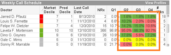
On the Expressions tab within the Object Properties, we are going to create the expression in the Background Color area that will prompt QlikView to set the background color of the Quarter cells.
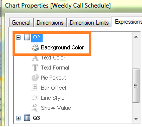
We need to fill the background color with green if the quarter is greater than the previous quarter, to fill the background with yellow if the quarter is equal to the previous quarter and fill the background with red if the quarter is lower than the previous quarter.
The expression looks like this:
If([Q2]>[Q1], rgb(108,179,63),
If([Q2]=[Q1], yellow(),
If([Q2]<[Q1], rgb(255,110,110))))
Because we are filling the background with a specific color based solely on the result of the calculation, we used the RGB() function.
Scenario 2 – Specify the colors of data points on a scatter chart based on an expression using ARGB()
In this chart we will use ARGB() to show multiple plot points on a scatter chart that are placed on top of each other.
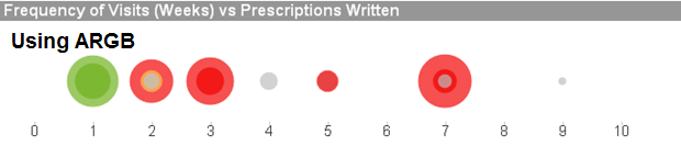
If we used RGB() in this chart, we would not be able to see the different levels of the same color on one plot point.
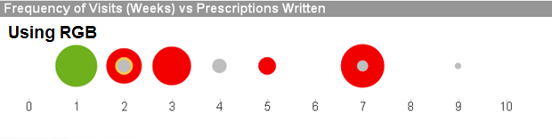
The requirement is to fill the background and the text color as follows:
Must Call = Red
Need To Call = Yellow
Recent Call = Green
Not Targeted = Grey
The expression looks like this:
if([Call Priority]='Must Call', argb(175,242,0,0),
if([Call Priority]='Need To Call',argb(175,254,197,80),
if([Call Priority]='Recent Call', argb(175,111,176,29),
if([Call Priority]='Not Targeted',argb(175,190,190,190) ))))
The expression result shows how the opaqueness allows the user to see multiple intersecting plot points, helping the user to get a clearer picture of all of the data points. As is shown above, without the opaqueness, the green plots on the plot of 1 would look like a solid green dot instead of showing that there is more than one plot point.
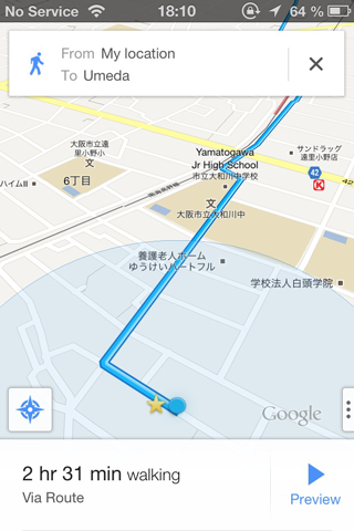
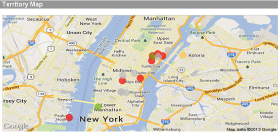
We can also use the ARGB() function with maps as well. Using the same expression as above we can see how the opaqueness allows the user to see multiple intersecting plot points as well as original map data such as city names, street names, etc.
In conclusion, if you want to specify the color of your backgrounds, text colors, data points, etc, you can with QlikView. The take away from this should be to think before you color. If you are coloring a background or text, use RGB(). If you are coloring data points on a scatter chart and some or many of the data points will overlap, you may want to consider ARGB(). I wrote a technical paper about this that goes into a little more detail. You can find it here.
Happy Qliking!!


