Unlock a world of possibilities! Login now and discover the exclusive benefits awaiting you.

Analytics & AI
Forums for Qlik Analytic solutions. Ask questions, join discussions, find solutions, and access documentation and resources.
Data Integration & Quality
Forums for Qlik Data Integration solutions. Ask questions, join discussions, find solutions, and access documentation and resources
Explore Qlik Gallery
Qlik Gallery is meant to encourage Qlikkies everywhere to share their progress – from a first Qlik app – to a favorite Qlik app – and everything in-between.
Qlik Community
Get started on Qlik Community, find How-To documents, and join general non-product related discussions.
Qlik Resources
Direct links to other resources within the Qlik ecosystem. We suggest you bookmark this page.
Qlik Academic Program
Qlik gives qualified university students, educators, and researchers free Qlik software and resources to prepare students for the data-driven workplace.
Recent Blog Posts
-
4 Pieces of (basic) Design Advice
The Demos & Best Practices team are often asked to look at applications built by third parties and give feedback. This feedback covers technical QlikV... Show MoreThe Demos & Best Practices team are often asked to look at applications built by third parties and give feedback. This feedback covers technical QlikView recommendations as well as design & usability best practices. Being on the outside looking in our team tends to approach these apps in ways their developers usually haven't considered. Very often these apps are being built by developers who have been so focused on making sure the data is correct they haven't stopped to consider the user experience until they are almost finished.
With that in mind the following are a four pieces of design advice that we tend to give fairly often.
Boxes boxes everywhere.
Many developers leave borders, shadows, and caption backgrounds on their charts and list boxes. These are some of the first things the Demos & Best Practices team remove when we are overhauling an app. When every object is fenced in it makes the entire app look very boxy where all of the objects are their own little entities isolated from the other charts. Even if you aren't convinced by this reasoning the question we would pose is "how are these borders, shadows, etc. helping the app?"
No 3D charts … ever.
Like something out of Mommie Dearest you shouldn't use 3D charts. Ever. Aside from the fact that they are "aesthetically unappealing" they make reading the data difficult. In a 3D vertical bar chart does the bar terminate at the front/bottom of the top plane, the middle of the top plane, or the back/top of the plane? How are shadows in a line chart helping you to analyze your business? Is a 3D pie chart tilted into perspective easier to understand than a standard pie chart? There are ways to be creative and add some visual fun into your design (backgrounds, slight shadows dividing up the space of an app, a few icons, etc) but 3D charts isn't one of them.
Include a Dashboard page
Under the pressure to develop an app that works many developers focus on creating a variety of ways to analyze the data but forget to have a page that summarizes the data. Include a Dashboard page that gives the summary of the app. If the app is about sales include the major sales figures as well as reference sales goals and whether or not those goals were met. Who were the top five sales people? Who were the lowest five? Give a list of your top selling items as well as your worst selling ones. If it is a medical application give some high level numbers about the number of patients, doctors, hospital staff and if they are up or down from this time last year/quarter/month etc. What is the average wait time to see a doctor? How many procedures have been ordered lately and what are they costing? There are unlimited possibilities of what you could include but the idea is to give your users an overall summary of the status of things before they go into a deep dive and analyze the numbers.
Be Consistent
If you have reoccurring objects that are on many pages keep them in the same location on each page. Use the same colors and font sizes for like minded labels, captions, and text. Design all of your pages to the same width. When things jump around it creates dissonance and users have to adjust and learn how to navigate each page. This process takes time & cognitive effort and is detracting from the time & effort they should be dedicating to using your application. Pick a style and stick to it.

-
Monte Carlo Methods
In some situations in Business Intelligence you need to make simulations, sometimes referred to as "Monte Carlo methods". These are algorithms that us... Show MoreIn some situations in Business Intelligence you need to make simulations, sometimes referred to as "Monte Carlo methods". These are algorithms that use repeated random number sampling to obtain approximate numerical results. In other words – using a random number as input many times, the methods calculate probabilities just like actually playing and logging your results in a real casino situation: hence the name.
These methods are used mainly to model phenomena with significant uncertainty in inputs, e.g. the calculation of risks, the prices of stock options, etc.
QlikView is very well suited for Monte Carlo simulations.
The basic idea is to generate data in the QlikView script using the random number generator Rand() in combination with a Load … Autogenerate, which generates a number of records without using an explicit input table.
To describe your simulation model properly, you need to do some programming in the QlikView script. Sometimes a lot. However, this is straightforward if you are used to writing formulae and programming code, e.g. Visual Basic scripts.
The Rand() function creates a uniformly distributed random number in the interval [0,1], which probably isn’t good enough for your needs: You most likely need to generate numbers that are distributed according to some specific probability density function. Luckily, it is in many cases not difficult to convert the result of Rand() to a random number with a different distribution.
The method used for this is called Inverse Transform Sampling: Basically, you take the cumulative probability function of the distribution, invert it, and use the Rand() function as input. See figure below.
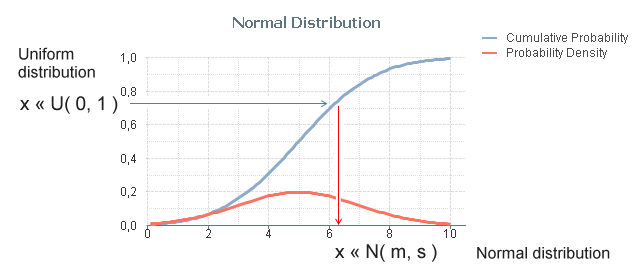
The most common probability distributions already exist in QlikView as inverse cumulative functions; Normal T, F and Chi-squared. Additional functions can be created with some math knowledge. The following definitions can be used for the most common distributions:
- Normal distribution: NormInv( Rand(), m, s )
- Log-Normal distribution: Exp( NormInv( Rand(), m, s ))
- Student's T-distribution: TInv( Rand(), d )
- F-distribution: FInv( Rand(), d1, d2 )
- Chi-squared distribution: ChiInv( Rand(), d )
- Exponential distribution: -m * Log( Rand() )
- Cauchy distribution: Tan( Pi() * (Rand()-0.5) )
Finally, an example that shows the principles around Monte Carlo methods: You want to estimate π (pi) using a Monte Carlo method. Then you could generate an arbitrary position x,y where both x and y are between 0 and 1, and calculate the distance to the origin. The script would e.g. be:
Load *,
Sqrt(x*x + y*y) as r;
Load
Rand() as x,
Rand() as y,
RecNo() as ID
Autogenerate 1000;
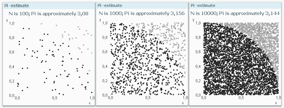
The ratio between the number of instances that are within one unit of distance from the origin and the total number of instances should be π/4. Hence π can be estimated through 4*Count( If(r<=1, ID)) / Count(ID).
Bottom line: Should you need to make Monte Carlo simulations – don’t hesitate to use QlikView. You will be able to do quite a lot.
See also the Tech Brief on how to generate data.

-
It’s Natural to Want to Be Heard! Call for Speakers for the Qlik Conference 2014...
Submit your abstract for consideration todayWe are pleased to announce that the Qlik Conference 2014 will be held from Monday, November 17 through Thu... Show MoreSubmit your abstract for consideration today
We are pleased to announce that the Qlik Conference 2014 will be held from Monday, November 17 through Thursday, November 20, 2014 at the beautiful Shingle Creek Resort in Orlando, Florida. This event will provide a wide range of options that will ensure that all attendees maximize their time and investment. The conference will include keynote speakers, Qlik subject matter expert presentations, a Partner Showcase and multiple opportunities to network and have some fun with old and new friends. It will also feature session tracks that highlight our customers’ experience, expertise and success with QlikView.
Our Call for Speakers is now open and we urge you to engage. Your peers are interested to know what you have discovered and how you are solving business problems with QlikView. We are leaving the topics up to you, but here are some ideas for your consideration:
- Use cases by industry including healthcare, life sciences, financial services, manufacturing, high tech, and retail.
- Details on how you are making business decisions leveraging data and analytics in your company
- Technical talks regarding deployment strategies, growth strategies, and application and development
- How you are creating a culture in your organization of asking questions and making decisions around data
- Industry leading dashboard design
- Communicating with your executives using data stories
- Any talk track that you think your peers will appreciate and learn from
We will be accepting submissions on a rolling basis. For best chance of selection, we encourage you to submit early. The call will close on May 16 and selection decisions will be communicated by May 23. The submission form will allow you to submit your session abstract and screenshots of sample dashboards. Special consideration will be given to those submissions that include real-world examples of QlikView in use.
Customers who are selected to speak at the Qlik Conference 2014 will receive a complimentary conference pass. Only one complimentary pass will be provided per session.
Submit your abstract today for consideration.
Questions?
For all questions on customer speaker submission, please email: Donna.Edwards@qlik.com
-
QlikView Expressor RESTful API Extension
Starting with version 3.9.1 of QlikView Expressor we released a new capability that allowed developers to extend, share and package custom functionali... Show MoreStarting with version 3.9.1 of QlikView Expressor we released a new capability that allowed developers to extend, share and package custom functionality using the QlikView Expressor Extensions SDK. The Extensions SDK is a facility that creates new QlikView Expressor artifacts such as operators, connections, schemas and more. Extensions can range from connectivity and transformation to Dataflow coordination and orchestration. Under the covers, the appropriate and desired operations would need to be coded using QlikView Expressor Datascript, but as you can see from some of the samples these can vary in degrees of complexity.
Prior to the release of the Extensions SDK - extending QlikView Expressor required Datascript within Expression Rules, Custom Read / Write Operators as well as reusable QlikView Expressor Datascript modules. This continues to work well, but is not as structured or portable. With the Extensions SDK, extensions can be packaged and shipped to other environments to be installed with the QlikView Expressor Extensions Manager; allowing easily installation and sharing of the new custom functionality without having to maintain or use any Datascript.
Attached to this post I am providing a packaged developmental extension ( that currently supports a RESTful API response in the form of JSON. The extension could be enhanced to to support other result formats such as CSV and XML.
Watch this companion video to learn how to use it and see it in action.
Note in order to use this, you should be familiar with RESTful APIs and there methods of querying and retrieving the results response/
An introduction to the QlikView Expressor Extensions SDK along with detailed information, tutorials and samples are available at the references listed below:
- QlikView Expressor RESTful API Read Extension - workspace, more samples and source code
- Introduction to the Extensions SDK
- Geocoding by IP Address using a QlikView Expressor Extension
Michael Tarallo
Senior Product Marketing Manager
QlikView and QlikView Expressor
Follow me - @mtarallo

-
Enhancing the User Experience Using Conditional Expressions - Part II
In my last blog I explained how, using conditional expressions, a developer could enhance the experience of a user. And based on some feedback, I hav... Show MoreIn my last blog I explained how, using conditional expressions, a developer could enhance the experience of a user. And based on some feedback, I have decided to continue the discussion of conditional expressions. In this blog, I want to discuss another area within QlikView where a developer can use conditional expressions to his/her advantage.
Using Conditional Expressions to Show/Hide Sheets
There are times when, as developers, we need to tailor the user experience based on a device (i.e. Desktop vs Mobile). In the GPS – Store Finder app on demo.qlik.com, we do just that. Based on the values of conditional expressions on the sheet properties, we can give the user a more desired experience.
The version of the app on the demo site uses a mobiledetect extension that checks to see through which device type the user is accessing the application. It then sets a variable (vStyle) to either Mobile or Desktop.
The app also uses non-traditional navigation by hiding the Tabrow.
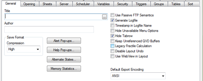
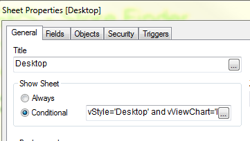
Setting the conditional show sheet expression to only show when the variable vStyle=’Mobile’ hides the sheets designed for the Desktop and allows the user to experience the Mobile version of the app.
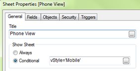
Mobile Version
This is set up to fit nicely on a mobile phone with a vertical scroll and larger fonts to assist in better navigation.
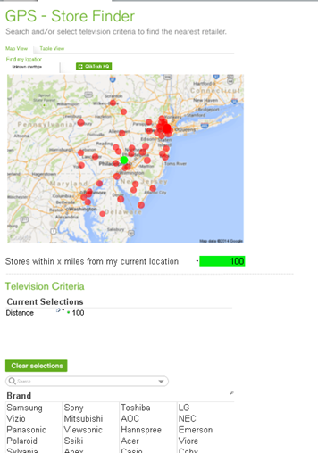
Conversely, setting the conditional show sheet expression to only show when the variable vStyle=’Desktop’ hides the sheet designed for Mobile and allows the user to experience the Desktop version of the app.
Desktop version
Designed with a more traditional approach with the list boxes on the left and the viewing area set within the 1024x768 screen resolution.
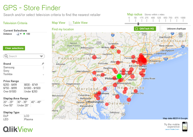
By taking advantage of the conditional expression for a sheet, we were able to customize the user experience and, in essence, create one application to handle multiple client types. Another example of the use of conditional expressions to show/hide sheets based in device is the Insurance Demo which can also be found on demo.qlik.com.

-
A Historical Odyssey: The Doctors’ Special
Already when we were selling QlikView 3, we had received a fairly advanced customer demand from pharmaceutical companies. We solved it. And here’s how... Show MoreAlready when we were selling QlikView 3, we had received a fairly advanced customer demand from pharmaceutical companies. We solved it. And here’s how we did it. But first some background:
In the pharmaceutical industry, the sales reps are not the ones that sell the products. Instead, they visit physicians and demonstrate one or several products. Days, weeks or months later, the physician prescribe the demonstrated medicine to a patient, and the actual sale takes place when the patient buys the drug at a pharmacy.
The demand on QlikView was to show pharmacy sales data, not only per physician, but also per physician visited once, twice, three times, etc. In other words, the physicians should be grouped by number of visits, and this number should be used as dimension in a QlikView chart. A nested aggregation.
For QlikView 4 we had a solution for this. Well, solution is perhaps not the right word… There was a kludgy, hidden feature with which you could use a count of a field as dimension. Internally it was called the Doctor Controls.
First you had to enable this feature in the list of hidden settings.
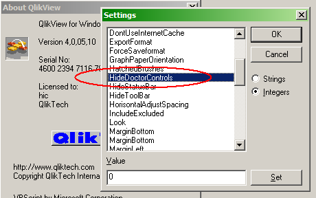
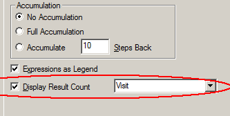
Then you could create your chart: Count(Visit) per Physician. After that, you needed to enable the “Display Result Count” in the chart:
The left graph shows graph as-is – without the “Display Result Count” enabled. It shows the distinct count of visits per physician, just as the dimension and expression of the chart are defined.
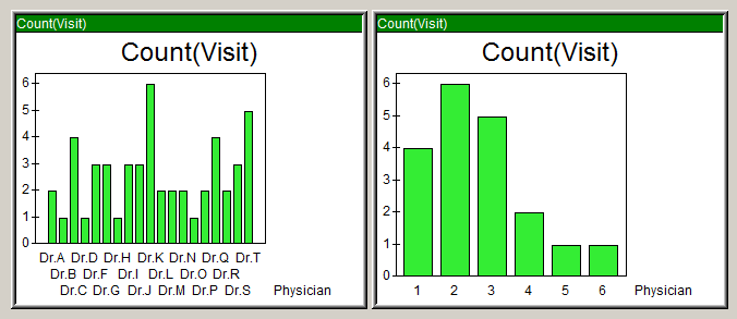
But, by turning on the “Display Result Count”, the chart transformed into the right graph: The displayed dimension was now the equivalent to an Aggr(Count(Visit),Physician) and the displayed expression was Count(Physician).
We solved a customer’s problem at the time, but this was not a good, long term solution. And it was nothing we wanted to support. Instead we wanted a general solution for nested aggregations. Six years later – after much thinking – Håkan (the Inventor) came up with the Aggr() function for QlikView 7. It is a general function for nested aggregations that made the Doctors’ Special redundant.

But like a relic from the past, the Doctor Controls setting can still today be found in the QlikView 11 list of hidden settings. It doesn’t affect anything - I hope.
Further reading on the Qlik history:
A Historical Odyssey: Quality - Learning - Interaction - Knowledge
-
“Attractive things work better”
“Attractive things work better” says usability expert Don Norman in his article Emotion & Design. I fully agree with this statement since I have seen ... Show More
“Attractive things work better” says usability expert Don Norman in his article Emotion & Design. I fully agree with this statement since I have seen and experienced myself how something that is attractive can turn on a switch inside my brain by which I tend to overlook flaws and problems and re-prioritize what I want.
I use the iPhone analogy a lot but have you ever thought why the iPhone is so popular among people? It is not only because of its colorful and seamless interface but also because of the way the body of the phone is crafted that you feel like you want own it. And why do we want to own those expensive, sleek cars that don’t give a good mileage and also aren’t very economical? Because they make us feel good and attract people around us which makes us feel even better since it reflects something about our personality.
So we all know that attractive things are certainly more preferred than not so attractive things, but why would they work better? In many of the experiments that scientist have conducted to study the human psychology, they have all found that emotion has a huge role to play in how we perceive things and how we solve problems. Positive emotions broaden the thought processes and enhance creative thinking. So how does that make something easier to use? Simple, when people feel good about something it makes it easier for them to find solutions to the problems they encounter.
Considering the theory above, QlikView applications that we design should work the same way. The more attractive they are the more the customers will like them, will like to own them, and will like to use them. And the most important of all, they will be more tolerant to minor difficulties and issues. But that certainly doesn’t imply that it is okay to ignore the usability quotient. As I quote Don Norman “True beauty in a product has to be more than skin deep, more than a façade. To be truly beautiful, wondrous, and pleasurable, the product has to fulfill a useful function, work well, and be usable and understandable.”
To hear more on this topic you can watch this video.
-
Qlik Community gets a new look!
You may have noticed that we updated the look of Qlik Community over the weekend. This was part of a larger digital presence overhaul to refresh and s... Show MoreYou may have noticed that we updated the look of Qlik Community over the weekend. This was part of a larger digital presence overhaul to refresh and synchronize our online brand. You will notice that Qlik Community is two words and we have included our logo on the persistent banner. There were no functionality updates so you should not experience any difference performance, loss of content, bookmarks etc.
We hope you like like this updated and fresher visual experience.
Best Regards, The Qlik Community Management Team
-
Segmentation and custom dimension grouping
Custom dimension groupingPicture this situation: Your company has a long list of products in its catalog, and you want to compare sales per product. F... Show MoreCustom dimension grouping
Picture this situation: Your company has a long list of products in its catalog, and you want to compare sales per product. Further, the company has recently created a promotional pack with 4 products and you want to see this as one product in your QlikView app. As this is a limited time only situation there’s no need to create a permanent group in your system.
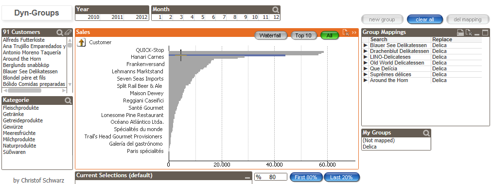
If you ever faced a situation as described above, you will probably already have found several approaches in our community. Most of them will imply a reload process to store the new groups in the backend.
This time Christof Schwarz has created a different method using a combination of the functions PICK () and MATCH () allowing the users to create and administer the grouping on the fly without reload the entire app.
You can find an example and an explanatory video at http://community.qlik.com/docs/DOC-6086
This way to group items is especially well conceived for those situations where users need that flexibly of creating and administering non-persistent groups on the fly, and letting them to check individual items within the group itself.
For those occasions where users’ needs to be able to store new groups to make them available for later analysis sessions and\or dealing with large data sets it still makes sense to go through a different approach that in most of the cases will involve a script process.
ABC Analysis
ABC analysis is also based in groups, but this time we'll be using three alternate states and Pareto-Select action to solve the ABC customer classification.
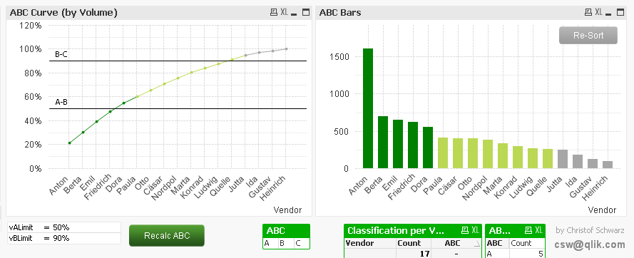
Christof’s ABC analysis approach comes with two significant features: It classifies the ABC relatively to the current selection and it stores those classes as is they were normal dimensions until the user recalculate ABC.
Check it out at http://community.qlik.com/docs/DOC-6088
This is a very simple and performant way to implement an A/B/C classification letting users to generate the ABC groups dynamically based on their business needs and to compare those values with other elements in the app.
Enjoy Qliking!
AMZ

-
When being correct is not always correct
When you start getting into the Data Visualization field you quickly learn that there are good visualizations and there are bad visualizations. Most s... Show MoreWhen you start getting into the Data Visualization field you quickly learn that there are good visualizations and there are bad visualizations. Most scorned are probably the horrible pie chart and its cousin the donut chart. Should we follow Stephen Fews advice and save the pies for dessert or is there a time and place for sub-optimal visualizations?
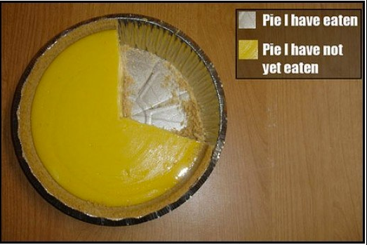
With data visualization celebrities such as Edward Tufte and Stephen Few being very vocal in their crusade against bad visualizations the rest of the industry has started to follow suit. BI vendors have slowly adopted and almost everyone is promoting data visualization best practices now a days.
I'm not saying they are wrong, a bar chart or line chart for time series are always a better option than one or several pie charts when the core objective is to compare data points.
But is that always the core objective?
Sometimes we build QlikView apps for very large audiences, apps they might only use once in a while, apps that aren't critical for them to perform their job and sometimes we build apps that contain downright “boring” data. It’s still an important app; the users would more than likely gain additional insight from the data or the app would help them perform their job more efficiently.
Looking at myself I know there are probably several applications that Qlik has deployed internally that could help me in my job. They aren’t critical for me, I would probably only look at them once a quarter or less but still I don’t open them at all.
These would be apps with “boring” data, apps built according to every best practice in the book. Absolutely no pie/donut charts, muted downplayed color series from http://colorbrewer2.org/ and consisting to 99% of bar charts and data tables. They are in no shape or form bad apps, they are built around solid best practices, every data point is correct and every visualization carefully selected to achieve the maximum efficiency but still I can’t get myself to spend more than 15 seconds in them.
What they are lacking is attention.
Attention vs Accuracy
I want to make the case that sometimes it’s appropriate to sacrifice a certain degree of accuracy for attention. Sometimes you need some sex and sizzle to get your users to care at all.
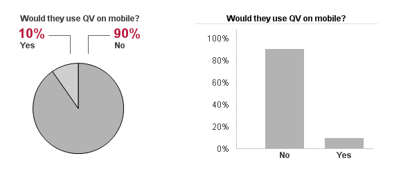
For example, humans are naturally drawn to rounded objects versus squared yet our brains are not wired to quickly grasp the sizes of a pie chart. Despite the logical part of my brain telling me that the bar chart would be a more optimum medium to display the information my eyes are still drawn to the pie chart.
The Bar Chart makes it easier to compare the individual values against each other but for me the pie chart is more inviting.
This holds true for pie charts and it also is true for maps. In this day and age as soon as we have an address or a location in our data we are compelled to put it on a map. Why? Most of the time the geospatial dimension is totally irrelevant to our analysis but we still squeeze a map in every application that we can. Because maps engage the users - you can put almost any boring data set on a map and I would still explore it, I will most likely not gain the most knowledge out of the map BUT my interest has been sparked and I might explore the data and the app further.
So should we go wild and crazy, sprinkle every app with pie charts, donut charts, bubble charts or maps?
Absolutely not, while at the same time we need a certain degree of attention to get our users to take interest in the data; we also have a responsibility to represent the data in the most accurate way possible. But what good is the data if people won’t take any interest in it at all?
I say it’s okay to stray from the path of best practice as long as you are aware why you are doing it.
Michael Anthony has previously blogged about Progressive Disclosure which can be used to overcome the initial attention hurdle while the rest of the application can focus on delivering as accurate representation of the data as possible.
TL;DR Pie charts - bad. But sometimes good.

-
Trust between services in a QlikView installation
When you use a platform that consists of several services such as QlikView, you need to build trust into the platform to make it secure. The trust wi... Show MoreWhen you use a platform that consists of several services such as QlikView, you need to build trust into the platform to make it secure. The trust will protect the platform from external threats pretending to be part of the QlikView installation to get access to information.
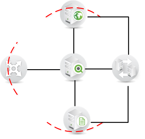
Every time you go from one trust zone to another you need to cross a trust boundary and that means that you need to authenticate. Examples of when you cross trust boundaries in QlikView include going from your computer trust zone to the application using the browser, using the browser to access the administrative interface, loading data from a data source into QlikView, and each time you need to authenticate.
In QlikView, there are two ways to create the internal trust zone between the QlikView Services:
- Windows Integrated Security: the services will authenticate to each other through the use of Windows built in Security.
- Certificate Security: each service needs to have a valid certificate from the QlikView installation to be allowed to communicate.
Both of these create trust between the services and hinder unauthorized computers from being able to interact with the QlikView Services, but there are situations where one is better than the other.
You need to protect the communication between the QlikView services from eavesdropping
In this case you should choose certificate trust because that also enables encryption of all traffic between services using SSL/TLS.You only use Windows infrastructure
Choose Windows Integrated Security as this will be where you have knowledge and it is easiest for you to setup.All QlikView services do not have access to the Active Directory or you don’t have an Active Directory
Use certificates these will function without a Windows Active Directory.It is also important to understand that you cannot mix how you create trust in QlikView; either you use Windows Integrated Security or you use Certificates.
When you have chosen the most appropriate way of creating trust, look through the technical requirements found in the Server reference manual before installing to make sure it fits your needs and environment.
To summarize, QlikView has two ways to create trust between services. Both have their benefits; however there are use cases when one is preferred over the other. Which have you used and what benefits have you seen? I would be interested in your comments and questions!
-
Popular Data Visualization - Intuitive and Unintuitive
Bar charts, pie charts, Speedometer gauges, Traffic Light gauges – These are some of the visualization objects that come to the mind when one think’s ... Show MoreBar charts, pie charts, Speedometer gauges, Traffic Light gauges – These are some of the visualization objects that come to the mind when one think’s of designing a Dashboard to show KPIs. Some are used for their grandeur and others simply because they show the data very clearly.
Now, let’s take a step back and rethink on what is the main purpose of Visualization objects within the Dashboard. When there is a large amount of data, it becomes difficult to scan through it in the form of a table and recognize a pattern or select that data which is useful to make sense of situation. This is when visualization objects help the user understand the data clearly in a quick and easy way and enable recognition of the underlying patterns by giving out the big picture and pointing precisely to deviations, outliers and connections.. So, if we take some of the charts that we frequently use in our dashboards and analyze them for their intuitiveness, the answer might not always be positive.
Some visualization objects that have proven to be intuitive in showing the data clearly are sometimes embellished with ornate presentation techniques that compromise the ability of the data visualization to focus on the data itself, while other visualization objects commonly used are not intuitive at all in the first place.
The Speedometer Gauge is a classic example of a visualization object that is used very frequently in Dashboards, the use of which can be arguable. The speedometer Gauge is drawn as a metaphor in the BI industry from the dashboard of a car. In the dashboard of the car, the speedometer does absolute justice in showing the current state. The driver is only required to know the current situation at any given time. Thus, the speedometer solves the main purpose. In a Business Dashboard however, the user more than often times needs to know a whole lot of other things which support the current state like historical trends and other things for purpose of comparison. In which case, the speedometer gauge, which can show only one data point, fails to show the complete picture.
On the other hand, the most simple and extremely popular objects like bar charts and pie charts display the data in a highly intuitive way. They are easy to understand and can inform the user about the patterns and trends. However, if these intuitive charts are not presented well, they can hamper the user’s ability to quickly grasp information and sometimes even mislead the user.
As QlikView application Designers, we are always thinking of ways in which we can represent the data in the most simple and intuitive form for our users. As a result we sought to various resources for references and ideas and often times we come across snazzy looking displays, but it might be of great help to take a step back and analyze whether the representation of the data that we put across is easily understandable by the user or not.
A detailed description with examples of this excerpt can be found in the technical brief here.
-
Pre-attentive processing for Dashboard design
Pre-attentive processing, as the name suggests is the initial stage of processing information by our brain where certain characteristics are immediate... Show MorePre-attentive processing, as the name suggests is the initial stage of processing information by our brain where certain characteristics are immediately detected without focusing on an object. This act is done quickly and effortlessly where the brain tries to recognize certain visual attributes that make things stand out or show groupings of similar objects. Color, shapes, position, orientation, proximity, size and motion are some of the elements that can be easily detected pre-attentively by the human mind. The examples below show how the brain immediately spots anomalies because of their attributes.

While designing a dashboard we rely a lot on showing visual attributes of data for quick and easy detection so pre-attentive processing becomes an important aspect to consider. The ability of the human mind to recognize and process information at light speed can be used advantageously in order to show data outliers and similarities in data in a dashboard.
Applying visual attributes to a dashboard like a bright color or an icon that stands out from the rest of the information can justify the purpose of a dashboard making it easy for a user to gauge the situation at a glance. As shown in the example below, color and icon is used as an attribute to highlight numbers that need attention.
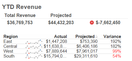
Color is a strong perceptive attribute but there are others that vary in intensity, like difference in shape is not as striking as contrasting colors. Depending on what information needs to be shown, whether qualitative or quantitative, various attributes can be applied.
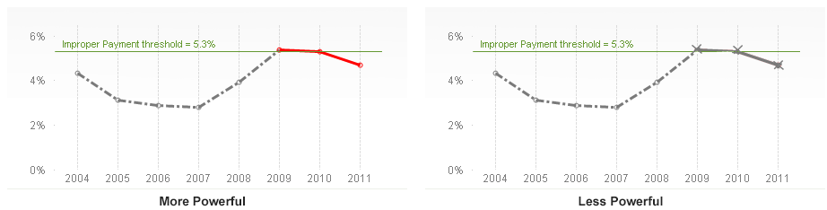
Visually encoding data for rapid perception can make information consumption in a dashboard extremely easy and convenient for a user. And since a dashboard is a summary or high-level information providing system, it is important to strive to be as visually informative as possible to target the pre-attentive senses in a user.
So, the use of pre-attentive information processing techniques while designing dashboards can not only justify the purpose of the dashboard but also help in projecting information as needed.
-
AGGR...
The AGGR Function.....I thought I would start this blog post with a simple multiple choice question:Is AGGR.....a - Used in many QlikView applications... Show MoreThe AGGR Function.....
I thought I would start this blog post with a simple multiple choice question:
Is AGGR.....
a - Used in many QlikView applications to great effect
b - Mis-used in many QlikView applications
c - Used to return an answer without really knowing why you get the answer
d - Not used at all because we're "not quite sure what is does"
e - All of the aboveThe answer in my opinion is "e - All of the above".
When I came to write this post and indeed the technical brief, the hardest part of all was actually coming up with a really good, easy to understand description of AGGR, as it has to make sense to both "technical" and "not so technical" people. I finally settled on the one below...
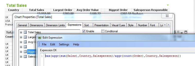
When it is used, the AGGR function produces a virtual table, with one expression and grouped by one or more dimensions. The contents / result of this virtual table can then be used / aggregated by a further outer aggregation function(s).
With this definition in mind, I have produced a Technical Brief and application which can be found here and here. In this document I have tried to provide an overview of the function and provided some examples of where it can be used to great effect.
So, when should you use AGGR? The answer is: Whenever you want to perform an aggregation in two steps. In the technical brief we show you some scenarios like.....
- Largest average order value for each Salesperson for each Country, where average order value for each Salesperson is the first calculation and the largest in each Country is the second.
- The Salesperson responsible for the largest average order value in each Country
- How many Salespeople have average order values of less than $100 in each Country
I would also be interested in any other creative and powerful uses of AGGR you may have.
Thanks.
ABY
-
(un)originality
Who you are is the product of all of the experiences you have had, and not had, throughout your lifetime. Nobody operates in complete isolation. Every... Show MoreWho you are is the product of all of the experiences you have had, and not had, throughout your lifetime. Nobody operates in complete isolation. Everyone is influenced by sources outside of themselves. We take those experiences and internalize them with our other memories in our own way but ultimately everything you come in contact with serves as material for the future you. So it stands to reason that new ideas & creativity are also the result of taking existing ideas and transforming them.
People frequently talk about ideas/people as being "totally original," but the truth is that originality is rather unoriginal. People with seemingly totally new ideas are really just the result of taking existing concepts and bringing them together in new ways. Perhaps you can identify the original source material, perhaps you can not, but everyone is influenced by ideas outside of themselves and nobody creates something entirely new.
The 4 part video series Everything is a Remix is a fantastic exploration of this in action. From music, to film, to mechanical invention everyone is influenced by the work of others.
-
Left or Right side navigation?
I have received a few emails from QlikView developers asking what the best practice is for placing list boxes. There are two arguments that you may t... Show MoreI have received a few emails from QlikView developers asking what the best practice is for placing list boxes. There are two arguments that you may think of right away.
In information design, left-side, top-left to be precise, is always used for the most important information. It is because as a human-nature that’s the space people pay attention to first. So why should I waste the space for placing the navigation pane there? I should place it on the right.
Another argument is that people are used to use left navigation because most of the web sites have menus on the left. Think about a shopping web site. All departments, categories, genders, sizes… whatever you think of usually on the left hand side. So why should I go against human’s habit and place it on the right-side? People will get confused.
I can buy both arguments. But then how about placing it at the top? I have seen QlikView applications that have navigation pane at the top. Is this the best of all? Let’s think about this in QlikView usability, with an elimination method.
Right-pane
We create a demo application for 1024px width so that it will fit nicely with any devices you may have including a projector. But some users may have a wider screen or higher resolution screen. If for some reason if I want to expand the line chart at the bottom to see more in detail or utilizing the space of my screen, I will need to overlap the navigation section with my chart by extending the width. Then, when I want to make a selection in Expense Category, I need to either move the chart or resize it to do so. If the navigation pane was on the left hand side, you could resize the width with no problem, and you still could make selections in Expense Category list box. So the right-pane is out.
Top-pane
I have seen applications with list boxes at the top. This may be a good idea because then the ‘body’ part can be used only for information display. Is this the best of the all world? Let’s think about it for a second. We all know that you will get a request of adding more list boxes on the screen. Eventually you will run out of the room towards the right, and you will consider adding a second row of list boxes. Then will you shift everything down? You are losing the important real-estate to display information by the navigation pane. So that doesn’t work well.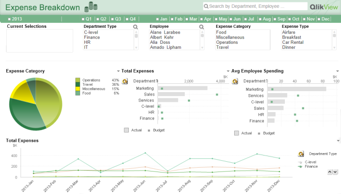
That being said, I personally think that having the left-side pane works the best in QlikView applications, and here are the benefits.
Left-pane
- People are already used to look at the left side to navigate a web site. So why not also for QlikView? Also remember that QlikView is also a web page.
- QlikView tabs as well as clear button navigation bar are at the top starting from the left. So it is the best to keep the navigation elements on the left hand side so that when a user looks at the top left corner, all navigation related items can be seen easily. It’s all about where your eyes start on the screen.
- If a user wants to expand the width of an object on a wide screen, there is no disturbance with other objects.
- The area to display the information is consistent. Even if I add more list boxes, I do so within the left pane. So there is no need to shift the information display area.

Lastly, you may wonder why I have the timeline list box at the top. This is my 11-year QlikView habit. I believe it is the best to keep the timeline list boxes separated from other selection categories.
If you cannot give up the top-pane option or wish to have many list boxes on user’s figure tip, then you can use a trick. Here is an example. When you click on the ‘filter’ button, then there is a drop panel with list boxes. I recommend you using this in dashboard where you need lots of real-estate for important information. Or also you can use this together with the left-pane navigation. In this case, create list boxes for the most frequently used fields on the left for easy navigation (accessibility), and you can create the hidden panel for additional list boxes.Now it is up to you what method you will use in your QlikView application. Will you go with a top, left, right or hidden pane?
You can also download the technical paper on this topic here.
-
“Just make it look pretty!"
There are some common misconceptions that surround the field of Visual Design. One of them is that visual design is just the act of making something l... Show MoreThere are some common misconceptions that surround the field of Visual Design. One of them is that visual design is just the act of making something look pretty or to make something pop. However, Visual Design is more than that.
While making something looks aesthetically pleasing is one of the important parts of Visual Design, it goes beyond that to effectively communicate to people what the product or the application is all about. Visual Design if not done well cannot help the user to answer basic questions like – What is this? How do I use it? Why should I care?
These are some crucial questions that a design needs to answer in order for it to be user friendly and seamless.
For instance, Figure 1 below shows information about Silicon Yogurt stores in the United States of America and a comparison between other brands. The information below is visually appealing but the problem is that I don’t get the story.
Figure 1
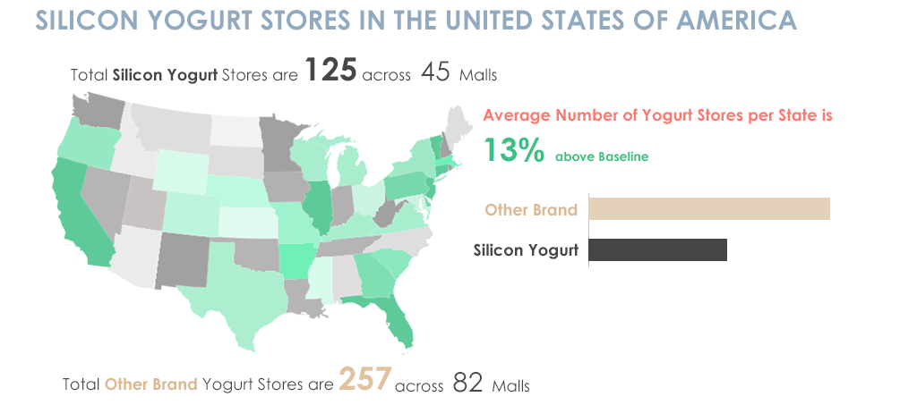
In Figure 1, the first set of information tells me about the total number of Silicon Yogurt stores and across how many malls, then my eyes go down to the average number of yogurt stores per state which is a high level information then a comparison is made between other brands and Silicon brand which again is something that talks about the detailed statistics and then it gives me information about other brands. All this information is delivered in bits and pieces and it is hard for someone to understand the point of this material as it is not organized in a proper high-level to low-level sequence.
Whereas in Figure 2 below, all elements of the visual design are the same but the information is organized is in a way that tells a story and the info graphic makes more sense.
Figure 2
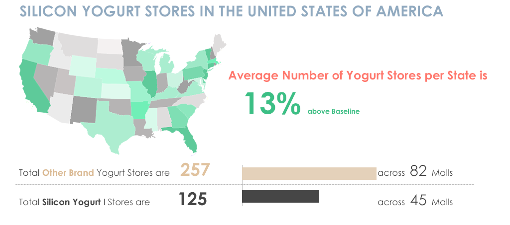
The Title introduces the topic, the map and piece of information goes hand in hand by giving a high level summary of Yogurt stores per State. Once a high level summary is given, my eyes then go to the details and a comparison is made side by side which is useful to understand instantly?
The difference between Figure 1 and 2 was only about content organization which made a huge difference in creating a story to the article, something which is an important part of visual design.
This is just one part but there are a number of other things that need to be thought about along with the look and feel of something.
- Organizing information in an effective way
- Looking at the design problem holistically so that everything works in conjunction with each other
- Balancing the look and feel such that no element in the design pops up unless intentional
- Choosing the right colors, fonts and other UI elements
These are some considerations that need to be taken care of while working on the visual design of something. And then of course there is making everything look neat and pretty.
-
Cyclic or Sequential?
Calendar fields and time fields can be either cyclic or sequential. The sequential fields have values that are consecutive, never repeat themselves ... Show MoreCalendar fields and time fields can be either cyclic or sequential. The sequential fields have values that are consecutive, never repeat themselves and have an open range. Examples of sequential fields are
Year [.., 2011, 2012, ..],
YearMonth [.., 2011-Dec, 2012-Jan, ..] and
Date [.., 2011-12-31, 2012-01-01, ..].This is in contrast to the cyclic fields that have a limited number of values in a closed range, where the values are repeated after a time. Examples of cyclic fields are
Month [Jan..Dec],
WeekDay [Mon..Sun] and
WeekNumber [1..53].This may seem obvious. Why do I write a blog post about this?
Because I think that we often are caught in the conventional. As QlikView developers, we tend to use the existing functions as they are, without questioning what we really want to show. However, we can create any fields we want. It’s all about how data is best visualized and how the user can best interact with data. Your role as a QlikView developer is to create a user interface that supports a good user experience and enables the user. How the field values are constructed is a very important part of the user experience.
This post is about encouraging you to use your imagination to create customized calendar fields.
First of all, the same field can be created in two versions: as a cyclic field and as a sequential field. Think of the difference between Month and YearMonth, for example. The first contains cyclic months, the second contains sequential months:
Month(Date) as Month // Cyclic
MonthName(Date) as YearMonth // Sequential
Date(MonthStart(Date), 'YYYY-MM') as YearMonth_Alt2 // Sequential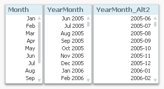
The above is true for most calendar and time fields: they can be created in pairs – one cyclic and one sequential. For example
Quarters:
Dual('Q' & Ceil(Month(Date)/3), Ceil(Month(Date)/3)) as Quarter // Cyclic
QuarterName(Date) as YearQuarter // Sequential... or Week numbers:
Week(Date) as WeekNumber // Cyclic
Dual(WeekYear(Date) & '-W' & Week(Date), WeekStart(Date)) as YearWeek // Sequential... or Hours:
Hour(Date) as Hour // Cyclic
Timestamp(Round(Date,1/24), 'MMM DD, hh:mm') as DateHour // Sequential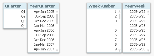
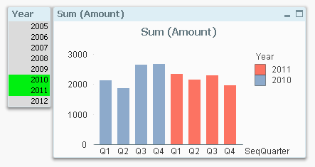
Secondly, you can use the Dual function to create fields that are cyclic and sequential at the same time, i.e. they have a cyclic textual (display) value, but an underlying sequential numeric value. This means that the same cyclic value, e.g. ‘Q1’, will be shown several times in the sequence.
Dual(Month(Date), MonthStart(Date)) as SeqMonth
Dual('W' & Week(Date), WeekStart(Date)) as SeqWeek
Dual('Q' & Ceil(Month(Date)/3), QuarterStart(Date)) as SeqQuarterSuch fields are very useful in charts. The chart below uses such a field (SeqQuarter) as first dimension and Year as second dimension. This way the color coding and the Year legend are created automatically.
Recommendations:
- Create many fields in your master calendar. A few extra fields in the calendar table don’t cost very much – neither in terms of script execution time, nor in terms of memory usage.
- Create both cyclic and sequential fields in your master calendar
- Use cyclic fields in list boxes
- If you have a chart with a single dimension, a sequential field is often preferable
- If you have a chart with several dimensions, cyclic fields are often preferable
Further reading related to this topic:
-
QlikView 11.2 and Direct Discovery
Yesterday we announced the beta version of QlikView 11.2. QlikView 11.2 is a new release of QlikView that will be available in December 2012. The main... Show MoreYesterday we announced the beta version of QlikView 11.2. QlikView 11.2 is a new release of QlikView that will be available in December 2012. The main new capability of this release is QlikView Direct Discovery. We are very excited about this capability as it truly expands the potential use cases for Business Discovery, enabling business users to conduct associative analysis on big data.
Today there are many QlikView customers that use QlikView to analyze terabytes of data. QlikView’s patented in-memory data engine compresses data by a factor of 10 allowing associative in-memory analysis on very large data sets. King.com is one of these customers analyzing billions of rows of online gaming data with QlikView on top of Hadoop system.
Now with QlikView Direct Discovery, QlikView users can do Business Discovery on the external data sets without loading the data into QlikView in-memory data model. What’s really special here is that with this unique hybrid approach business users get the QlikView associative experience even with data that is not stored in memory. This is amazing!
One thing I would like to emphasize is the real value of QlikView Direct Discovery is its hybrid approach. It allows users to seamlessly analyze data from multiple sources (with the in-memory data) within the same interface without any size limitations. The users can associatively make selections in any of the data sets (in-memory or Direct Discovery) and always see what is associated and not associated with the same meaningful QlikView colors: green, white, and gray.
Another great advantage of QlikView Direct Discovery is the capability to query data for more up to date information in the use case scenarios where recency really matter.
How does QlikView Direct Discovery work? QlikView determines which data resides in-memory and which data is direct discovery data by using special script syntax, “DIRECT SELECT”. This allows certain data elements dictated by the script syntax not to be loaded into the QlikView data model during the script reload process, but still be available for query purposes in QlikView objects in the user interface and to be combined for analysis with the QlikView in-memory dataset. The video provides a short introduction on how to set up direct discovery. I highly encourage you to read the technical addendum paper to understand the best practices and some of the limitations that exist with the initial release.
I am personally very excited about this capability and cannot wait to get my hands dirty to try out different use case scenarios where the query results from big data sources can be leveraged with unique QlikView in-memory features!

-
Extracting Data from a QlikView Application
As QlikView Developers, we are often asked to supply the source data files for applications on the demo.qlik.com site. Since most applications are abl... Show MoreAs QlikView Developers, we are often asked to supply the source data files for applications on the demo.qlik.com site. Since most applications are able to be downloaded locally, I figured I would let you in on a little secret. You can create the data files yourself and it is a fairly simple process. The QlikView scripting statement that will help you achieve your desired results is the STORE statement.
QlikView help states that a QVD or a CSV file can be created by a store statement in the script. The statement will create an explicitly named QVD or CSV file. The statement can only export fields from one logical table. The text values are exported to the CSV file in UTF-8 format. A delimiter can be specified, see Load. The store statement to a CSV file does not support BIFF export.
Examples:
Store mytable into xyz.qvd (qvd);
Store * from mytable into xyz.qvd;
Store Name, RegNo from mytable into xyz.qvd;
Store Name as a, RegNo as b from mytable into xyz.qvd;
store mytable into myfile.txt (txt);
store * from mytable into myfile.txt (txt);
(The two first examples have identical function.)
So let’s walk through the process.
1. Open a new QVW and binary load the original app.
2. Identify the table(s) that you would like to extract. (Table viewer).
3. In the script you will either have to enter a Store statement for every table that you would like to extract.
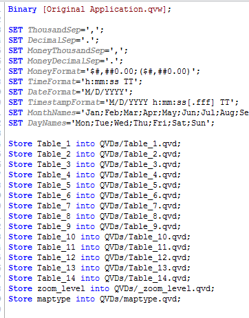
Or you could use this snippet of script that will extract all tables from the original app
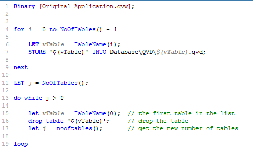
4. Reload the application.
After the reload, the extracted files will be placed in the same folder as the reloaded QVW. Now go ahead and try it for yourself.
Happy Qlikking!


