Unlock a world of possibilities! Login now and discover the exclusive benefits awaiting you.

Analytics & AI
Forums for Qlik Analytic solutions. Ask questions, join discussions, find solutions, and access documentation and resources.
Data Integration & Quality
Forums for Qlik Data Integration solutions. Ask questions, join discussions, find solutions, and access documentation and resources
Explore Qlik Gallery
Qlik Gallery is meant to encourage Qlikkies everywhere to share their progress – from a first Qlik app – to a favorite Qlik app – and everything in-between.
Qlik Community
Get started on Qlik Community, find How-To documents, and join general non-product related discussions.
Qlik Resources
Direct links to other resources within the Qlik ecosystem. We suggest you bookmark this page.
Qlik Academic Program
Qlik gives qualified university students, educators, and researchers free Qlik software and resources to prepare students for the data-driven workplace.
Recent Blog Posts
-
Cyclic or Sequential?
Calendar fields and time fields can be either cyclic or sequential. The sequential fields have values that are consecutive, never repeat themselves ... Show MoreCalendar fields and time fields can be either cyclic or sequential. The sequential fields have values that are consecutive, never repeat themselves and have an open range. Examples of sequential fields are
Year [.., 2011, 2012, ..],
YearMonth [.., 2011-Dec, 2012-Jan, ..] and
Date [.., 2011-12-31, 2012-01-01, ..].This is in contrast to the cyclic fields that have a limited number of values in a closed range, where the values are repeated after a time. Examples of cyclic fields are
Month [Jan..Dec],
WeekDay [Mon..Sun] and
WeekNumber [1..53].This may seem obvious. Why do I write a blog post about this?
Because I think that we often are caught in the conventional. As QlikView developers, we tend to use the existing functions as they are, without questioning what we really want to show. However, we can create any fields we want. It’s all about how data is best visualized and how the user can best interact with data. Your role as a QlikView developer is to create a user interface that supports a good user experience and enables the user. How the field values are constructed is a very important part of the user experience.
This post is about encouraging you to use your imagination to create customized calendar fields.
First of all, the same field can be created in two versions: as a cyclic field and as a sequential field. Think of the difference between Month and YearMonth, for example. The first contains cyclic months, the second contains sequential months:
Month(Date) as Month // Cyclic
MonthName(Date) as YearMonth // Sequential
Date(MonthStart(Date), 'YYYY-MM') as YearMonth_Alt2 // Sequential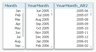
The above is true for most calendar and time fields: they can be created in pairs – one cyclic and one sequential. For example
Quarters:
Dual('Q' & Ceil(Month(Date)/3), Ceil(Month(Date)/3)) as Quarter // Cyclic
QuarterName(Date) as YearQuarter // Sequential... or Week numbers:
Week(Date) as WeekNumber // Cyclic
Dual(WeekYear(Date) & '-W' & Week(Date), WeekStart(Date)) as YearWeek // Sequential... or Hours:
Hour(Date) as Hour // Cyclic
Timestamp(Round(Date,1/24), 'MMM DD, hh:mm') as DateHour // Sequential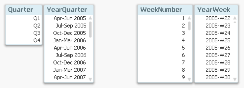
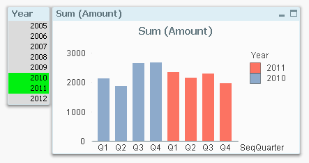
Secondly, you can use the Dual function to create fields that are cyclic and sequential at the same time, i.e. they have a cyclic textual (display) value, but an underlying sequential numeric value. This means that the same cyclic value, e.g. ‘Q1’, will be shown several times in the sequence.
Dual(Month(Date), MonthStart(Date)) as SeqMonth
Dual('W' & Week(Date), WeekStart(Date)) as SeqWeek
Dual('Q' & Ceil(Month(Date)/3), QuarterStart(Date)) as SeqQuarterSuch fields are very useful in charts. The chart below uses such a field (SeqQuarter) as first dimension and Year as second dimension. This way the color coding and the Year legend are created automatically.
Recommendations:
- Create many fields in your master calendar. A few extra fields in the calendar table don’t cost very much – neither in terms of script execution time, nor in terms of memory usage.
- Create both cyclic and sequential fields in your master calendar
- Use cyclic fields in list boxes
- If you have a chart with a single dimension, a sequential field is often preferable
- If you have a chart with several dimensions, cyclic fields are often preferable
Further reading related to this topic:

-
QlikView 11.2 and Direct Discovery
Yesterday we announced the beta version of QlikView 11.2. QlikView 11.2 is a new release of QlikView that will be available in December 2012. The main... Show MoreYesterday we announced the beta version of QlikView 11.2. QlikView 11.2 is a new release of QlikView that will be available in December 2012. The main new capability of this release is QlikView Direct Discovery. We are very excited about this capability as it truly expands the potential use cases for Business Discovery, enabling business users to conduct associative analysis on big data.
Today there are many QlikView customers that use QlikView to analyze terabytes of data. QlikView’s patented in-memory data engine compresses data by a factor of 10 allowing associative in-memory analysis on very large data sets. King.com is one of these customers analyzing billions of rows of online gaming data with QlikView on top of Hadoop system.
Now with QlikView Direct Discovery, QlikView users can do Business Discovery on the external data sets without loading the data into QlikView in-memory data model. What’s really special here is that with this unique hybrid approach business users get the QlikView associative experience even with data that is not stored in memory. This is amazing!
One thing I would like to emphasize is the real value of QlikView Direct Discovery is its hybrid approach. It allows users to seamlessly analyze data from multiple sources (with the in-memory data) within the same interface without any size limitations. The users can associatively make selections in any of the data sets (in-memory or Direct Discovery) and always see what is associated and not associated with the same meaningful QlikView colors: green, white, and gray.
Another great advantage of QlikView Direct Discovery is the capability to query data for more up to date information in the use case scenarios where recency really matter.
How does QlikView Direct Discovery work? QlikView determines which data resides in-memory and which data is direct discovery data by using special script syntax, “DIRECT SELECT”. This allows certain data elements dictated by the script syntax not to be loaded into the QlikView data model during the script reload process, but still be available for query purposes in QlikView objects in the user interface and to be combined for analysis with the QlikView in-memory dataset. The video provides a short introduction on how to set up direct discovery. I highly encourage you to read the technical addendum paper to understand the best practices and some of the limitations that exist with the initial release.
I am personally very excited about this capability and cannot wait to get my hands dirty to try out different use case scenarios where the query results from big data sources can be leveraged with unique QlikView in-memory features!

-
Extracting Data from a QlikView Application
As QlikView Developers, we are often asked to supply the source data files for applications on the demo.qlik.com site. Since most applications are abl... Show MoreAs QlikView Developers, we are often asked to supply the source data files for applications on the demo.qlik.com site. Since most applications are able to be downloaded locally, I figured I would let you in on a little secret. You can create the data files yourself and it is a fairly simple process. The QlikView scripting statement that will help you achieve your desired results is the STORE statement.
QlikView help states that a QVD or a CSV file can be created by a store statement in the script. The statement will create an explicitly named QVD or CSV file. The statement can only export fields from one logical table. The text values are exported to the CSV file in UTF-8 format. A delimiter can be specified, see Load. The store statement to a CSV file does not support BIFF export.
Examples:
Store mytable into xyz.qvd (qvd);
Store * from mytable into xyz.qvd;
Store Name, RegNo from mytable into xyz.qvd;
Store Name as a, RegNo as b from mytable into xyz.qvd;
store mytable into myfile.txt (txt);
store * from mytable into myfile.txt (txt);
(The two first examples have identical function.)
So let’s walk through the process.
1. Open a new QVW and binary load the original app.
2. Identify the table(s) that you would like to extract. (Table viewer).
3. In the script you will either have to enter a Store statement for every table that you would like to extract.
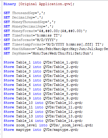
Or you could use this snippet of script that will extract all tables from the original app
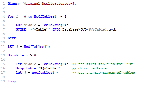
4. Reload the application.
After the reload, the extracted files will be placed in the same folder as the reloaded QVW. Now go ahead and try it for yourself.
Happy Qlikking!

-
Data Modelling: Clarity vs. Speed
Now that the waves from last week’s post about Count(distinct …) have settled, it is time for me to draw some conclusions. First, I must say that it... Show MoreNow that the waves from last week’s post about Count(distinct …) have settled, it is time for me to draw some conclusions.
First, I must say that it is astonishing that no one – including myself – sooner openly questioned the assertion that Count(distinct) is single-threaded and slow. We have all had plenty of time to do so: It is true that Count(distinct) was single-threaded and slow in version 7.52, but it was fixed already for version 8 (I double-checked it), which was released in 2007.
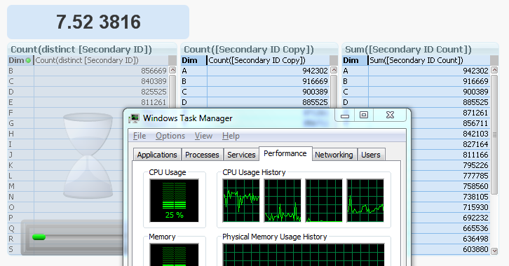
By the way, you can see what it looks like in 7.52 in the picture below. The two charts to the right are both finished, but the Count(distinct …) to the left is still calculating, using only one of the four cores (CPU usage = 25%). Hence, slow and single-threaded.
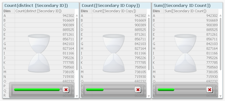
Compare this with the corresponding screen dump from 11.20, where it is obvious from the progress bars that Count(distinct...) is faster than the alternative ways to calculate the same number.
My first conclusion is that we need to sometimes challenge “the truth”. Because, in the software world, the truth changes. What was true yesterday is not necessarily true tomorrow. And if the map and the reality conflict, one must never forget that the map is only an incomplete model of the real world...
Further, from a technical perspective, we can see that:
- Charts are calculated faster if the fields used for the aggregation reside in the largest table, in the fact table. This becomes especially true when the fact table is large.
- Charts are calculated slightly faster if also the dimension fields reside in the fact table.
- The above conclusions are valid only if there is an “external” dimension involved, i.e. that the chart needs to make the calculation linking over the fact table. A single number in a text box, or chart where the fact table isn't involved, will not be affected the same way.
Does this mean that you should join everything together into one, single, de-normalized fact table? For fact tables with very many records, the answer is probably “Yes”. In such cases, you will most likely need to optimize for speed, and then you should probably put everything in one table.
But when doing so, the app uses more RAM. Further, you lose clarity, as Jay Jakosky points out already in a comment of the previous blog.
A normalized model usually has a simpler script, and is easier to understand for the person that has to maintain the application or develop it further. It is simpler to make modifications, to add tables or calculations, and to create correct formulae, if the data model and the script are conceptually simple. So for smaller data sets, where the chart response time already is acceptably low, I claim that you should not optimize for speed.
Instead, you should optimize for clarity and maintainability, which means keeping things simple; i.e. keeping the data model normalized. See more in To Join or not to Join.
Bottom line: Keep it as simple as possible, and don’t make unnecessary optimizations.
"Premature optimization is the root of all evil." - Donald Knuth
-
The coffee analogy of UX design
This analogy gives an example of what UX design could be. As you know, an analogy is not the complete truth. The personas (Eileen, Linda and Brandon) ... Show MoreThis analogy gives an example of what UX design could be. As you know, an analogy is not the complete truth. The personas (Eileen, Linda and Brandon) used in this analogy are just examples and made up by me. Read more about personas and how we use them:
So maybe you’ve heard of the Kano model which is a theory for user satisfaction..? If not, google it and you’ll find plenty of diagrams. Basically it says that there are some basic needs that our users expect us to meet, but it’s the “exciters” that will make our users truly delighted. The users may not have asked for such “exciters”, but once in their hands they love it.
When Eileen, Linda and Brandon decide to have a cup of coffee, they probably have the same basic expectations: it should kind of taste like coffee and it should be hot. For Eileen, the taste might not be crucial, all she wants is caffeine and she wants it now. She is happy with instant coffee prepared in her own office. Linda has slightly higher demands; she drinks several cups a day by her desk. She is happy using the coffee machine near her cubicle and she’s perfectly fine with that as long as the machine works.
Brandon wants his coffee to taste really good. He wants more than the regular coffee provided in the machines. He goes to the local coffee shop at lunch.
Then one day, Eileen, Linda and Brandon find a new, top-of-the-line coffee maker in their office kitchenette. There is also a coffee grinder and beans. Someone has brewed them fresh coffee with such a fantastic taste that Eileen usually only enjoys at breakfast on Saturday mornings, that Linda did not even knew existed, and that Brandon now has access to in his office.
For Eileen, it was such a delight that someone had prepared for her what she really wanted and with no extra time or hassle.
For Linda, it was such a delight to discover what “real” coffee tastes like.
And for Brandon, it was such a delight to be able to drink really good coffee together with his colleagues. Brandon now brings different kind of beans, so that everybody gets to try different roast flavors. After all, sharing is caring

So how can this be translated into UX design? Well, first of all, whenever we're designing a QlikView app, a QlikView extension or a new generation of the QlikView platform, we need to accomplish a hygiene level that our users expect. Hygiene features refer to basic operations that the users must be able to do in order to complete their tasks, complying to standard interaction techniques, factors that facilitate learnability etc. If done well, the hygiene features won’t even be noticed because it just works. On the other hand, when poorly done, users will notice them because they cause frustration or dissatisfaction.
But to offer our users a world class experience, we need to turn our innovation, passion and leading-edge technology into really useful, nifty solutions that will make our users go “wow”! In order to do this, we need to truly understand the driving forces and contexts of our users. So you could say that UX design is about being the users’ advocate, being someone who realizes that Eileen, Linda and Brandon needed a Moccamaster.


-
Mental Models and Usability design
I recently updated to iOS7….hmm...The new look and feel is certainly delightful, although, one particular thing really got me frustrated. While explor... Show MoreI recently updated to iOS7….hmm...The new look and feel is certainly delightful, although, one particular thing really got me frustrated. While exploring Apple’s new eye candy, I was trying to delete an email from my phone by the usual way, which is by swiping my thumb from left to right. Obviously, I was expecting a delete button to show up. I tried once, twice and several times, it just wouldn’t do anything and the most frustrating part was that it opened the email instead of deleting it. At this point, I gave up and went into my setting to see if something was turned off…and nothing! Finally I decided to do a web search and AHAA!....They actually switched the whole interaction paradigm of deleting an email from swiping from left to right to now swiping from right to left.

This was the complete opposite of the model that I had carried in my mind for all these years. This was just a small example of a mismatch in the user’s mental model to the designer’s mental model which caused some degree of frustration and took some time and efforts in figuring out. In this instance, the learning curve was quite low, but what happens when there are so many things in an interface which throw you off because what you expect it to do, is not what it does in reality. This not only causes frustration but a repulsion effect and even the things that work well go un-noticed spoiling the whole experience.
A designer’s goal should be to keep the learning curve as smooth as possible. This is when the concept of mental models comes into play. A mental model is a person’s perception and an understanding of how something works based on prior knowledge and experience, it is based on beliefs not facts. These mental models are very loose and keep evolving over time; they cannot be visualized and often times aren’t accurate.
Today, we are constantly surrounded by different systems and interfaces that we have to keep adapting to. Although, these interfaces differ from one another, there are certain design standards that have evolved over time, which they all follow. People form a mental model of how these interfaces work. For example, one of the reasons why we place our Filters on the left side of the sheet in a QlikView application is because we are all used to the web where mostly the navigation panel is always on the left side. Leveraging these already formed mental models in our designs can be very useful in creating a seamless interaction pattern and creating a good user experience.
However, sometimes, it becomes necessary to challenge the standards in order to keep up with the changing technological landscape. This needs a seamless transition of the already formed mental models to new and evolved paradigms. As we move slowly into the phase of designing QlikView applications in the 'Next' version, these considerations will become vital to ensure a smooth transition. The below mentioned design considerations can be helpful in achieving this -
- Providing subtle cues so that users don’t get lost
- Frequently used functions to be easily accessible
- Providing certain familiarity aspects in the new design which users can recognize easily
- Providing flexibility
- Always providing a feedback from the system to the user
More information on this topic can be found at http://www.nngroup.com/articles/mental-models/.
-
A short history of Data Visualization & BI
Modern data visualization and business intelligence has its roots in the very ancient organization methods of information itself. One of the earliest ... Show MoreModern data visualization and business intelligence has its roots in the very ancient organization methods of information itself. One of the earliest forms of organization was simply drawing lines in the dirt or sand. This gave way to using beans or stones moved around in grooves in the dirt/sand and eventually on stone or wooden boards. This became what we now know as the abacus between 2700–2300 BC with the Sumerians. The abacus was then adopted by cultures all around the Mediterranean. As written languages developed and matured there became written records of information regarding a variety of fields such as commerce, taxation, the sciences, etc. This information remained as written text however. There was no easy way to see trends or outliers in the data collected.
Data visualization really took off in the 18th century when William Playfair, a Scottish engineer & political economist, brought the intellectual enthusiasm of the Enlightenment to data. Playfair went on to invent the line, bar, pie, and circle charts. Other notable visualizations followed such as Dr. John Snow's 1854 dot distribution map of cholera cases in London, Florence Nightingale's polar area diagram visualizing mortality rates in the field hospitals she managed during the Crimean war, and Charles Minard's 1869 flow map of Napoleon's failed Russian campaign of 1812.
Fast forward to the 1950s when IBM researcher Hans Peter Luhn coined the term "business intelligence" in his 1958 paper A Business Intelligence System. His work laid the groundwork for modern information sciences. What we largely recognize as modern BI really developed over the years beginning in the 1960s right up through the 1980s. Statistician Francis Anscombe helped demonstrate the value of data visualization in his 1973 Anscombe's quartet which is a series of four datasets with nearly identical properties but look very different when visualized. He was making the point that relying solely on a table of values wasn't enough to fully understand the data. Visualizing the data was crucial to seeing trends and outliers.
Our modern tools for Business Intelligence have never been more powerful. The challenge of taking action on your data though is largely the same today as it was thousands of years ago. Businesses and individuals are increasingly looking for ways to not only see their data but understand it in ways unimaginable to our ancestors drawing lines in the sand.
-
4 tips to start working with QlikView - Developer edition
My first blog post was about 4 tips to start working with QlikView, the title was right but it was incomplete in a way. I was referring to 4 tips for ... Show MoreMy first blog post was about 4 tips to start working with QlikView, the title was right but it was incomplete in a way. I was referring to 4 tips for designers. Koen left a comment pointing that it would be nice to have a version for developers. I agreed, so I contacted Luis Cortizo one of our best consultants, to have a conversation about the most frequently asked questions that came up during the first days of QlikView training. Here are some tips:
1. Forget everything you knew about data modeling.
Ok, you don't need to forget everything, but you better be open minded to learn a new way to see and work with your data. There are some SQL modeling rules, constraints and hierarchies that you won't need anymore, QlikView is a lot easier than that. And yes, you will need to learn how to work with the script but trust me, this is about common sense rather than strong data base skills.
If you are looking at the best way to create your data model, best practices will guide you to Star or Snowflake models. But remember, always start by understanding the business needs, then you will know what tables makes sense to have in your app and how you can join them. By doing that your data model will often look like a star or snowflake.
2. Practice with your personal data.
QlikView is probably one of the most comprehensive tools in the data visualization market. It could be used for creating corporate apps with billions of rows of data and thousands of users or it could be used to visualize your personal music library or your file system.
When starting to create an app, frequently the hardest task will be to understand the business needs, particularly if you are in a complex corporate environment or if you are dealing with incomplete requirements.
If you are a QlikView novice, my advice is to practice by loading some personal data and by trying to create something with meaning for you, that way you could practice with data modeling and visualization and you will learn how both are related.
For example, I just moved to the US from Spain so lastly I use Skype to talk with family. Understand that talking on the telephone is not one of my favorite things to do so, if during the day I have to make several calls, I try to keep the call duration as short as possible. Intuitively I think I should see an inverse correlation in my call history, in other words, the more calls per day the shorter average duration will be.
To prove my intuition, I just downloaded several CSV files from the Skype website which contained call activity historical data for the last 8 months. Once the data was loaded into the QlikView app, I used a scatter chart to see if I could prove my theory.
Because real data is (sometimes) ugly I had to transform the call duration from HH:MM:SS to seconds to normalize it and typically I want to work with dates in a human readable format rather than computer timestamps.
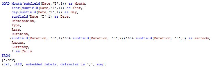 The fact that I had my goal well defined - to show if there´s a correlation or not - helped me to identify what I had to have as an output from my model. In this example I needed to count the number of calls per day and this business requirement forced me to create a new field named "Calls". Later on using an expression like sum(Calls) I could obtain the number of calls per day (or any other dimension).
Finally and after a few transformations I was able to produce the chart I was looking for:
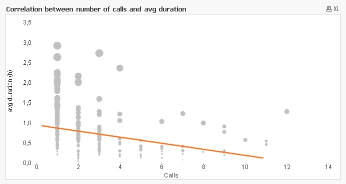
Looking at the chart, I can see that there is a non-strong (how close the points are to a straight line) inverse correlation between X and Y axis. Note: remember that correlation does not imply causation.
Unfortunately, the data did not support my hypothesis. I did, however, learn how to show correlation and next time I will need to show how two variables are related I will always remember what I did with my personal data.
3. Start simple.
The QlikView approach to app development is based on quick iterations, small steps that put all together will let you build amazing apps. To start working in a new data model, you better start by loading a couple of tables and then create some list boxes with the fields you has just loaded. This will help you to experiment with QlikView Associative experience.
Green, Gray and White color code will provide you with a great feedback. If everything is working fine, then is time to start with the second phase of your development including a new table or data source, remember that a QlikView app can contain data coming from multiple sources, inside and outside your organization.
The more time you invest in a good data model the less you will spend on design, that´s the golden rule. And again having well-defined business goals will help you to collect, normalize or denormalize data to specifically respond to that business needs. This for sure will simplify the development process.
4. Search, copy, reuse… and share.
QlikView functions set is one of the most powerful data transformation sets in the market, it's important to get familiarized with it, every time you get stacked on how to achieve a complex calculation, use the search function in QlikView Help (F1).
It’s also crucial to get involved in the QlikView Community - one of the most vibrant websites to discuss about data modelling and visualization - by searching, reading, asking and answering questions, but also by sharing… what makes unique our Community is the ability to share apps and get feedback from other business users.
Enjoy Qliking!
AMZ

-
Content Organization for better Storytelling in Design
In a presentation, or a seminar or just a conversation, the speaker starts presenting the topic by introducing the title of the topic, then gives a br... Show MoreIn a presentation, or a seminar or just a conversation, the speaker starts presenting the topic by introducing the title of the topic, then gives a brief overview, the background and then gently flows into talking about the details of the topic and concludes with the summary or an inference.
Similarly, when writing an article, one first starts with an abstract, an introduction, then writes the details of the topic in the body and ends by writing a summary or a conclusion.
Order and organization of information from a reference point to the last detail, in sequence, is the most crucial part of effective and seamless communication and storytelling.
Design, like writing, or a verbal presentation, or even a casual conversation is a medium of communication and a channel for storytelling. It follows the same principles of hierarchy and order as in any method of communication. Only when information is organized in a good hierarchical manner, the story is told most effectively.
Most people are visual thinkers, chances of people understanding a set of images and text put together in a grid with no starting or an end point are very slim, instead, going through and comprehending information which is ordered in a top to bottom approach is much more meaningful.
For instance, the design of a newspaper is a classic example of using hierarchy in the most effective way to help people read highlights and pick information they want to read. Hierarchical patterns in design can not only aid comprehension but also enable quick scanning of information, guide the user through the story and improve usability.As time becomes an increasingly valuable commodity, grabbing the user’s attention and retaining it has become the most important and the most challenging thing today. Designing information in a way that calls for the user’s attention and retains it is the key to a successful communication strategy and Hierarchy forms one of the most important ingredients for effective communication.
In a QlikView application the D-A-R concept (Dashboard, analysis, report) is a great method to provide contextual hierarchy where the content is presented in a top down approach. This makes it easier for the user to grasp the data from start to finish and also enables them to pick out information that they intends to drill down to and analyze.
However basic and overemphasized these principles may seem, the fact is that they always seem to work and give rise to good user experience. Research and usability tests prove that when a design layout adheres to the basic principles of design, the design becomes more user-friendly, simple and obvious. Hierarchy is one of the most important principles of basic design and should be applied to all designs from simple to complex.
A technical brief can be found here which expands more on this topic.
-
Handling many tabs in QlikView
We sometimes suffer from trying to show as much information as possible in QlikView. In order for us to categorize the information so the users can c... Show MoreWe sometimes suffer from trying to show as much information as possible in QlikView. In order for us to categorize the information so the users can consume it more easily and smoothly, the first option you may consider is using tabs.
Tabs are a great way to categorize the information for users; however, if you abuse the tab system in QlikView, users may get confused or miss some important information that is available for them. This is why.
• When there are too many tabs, then QlikView wraps the tabs and creates multiple rows of tabs in QlikView Desktop.

• The point above is a different usability in AJAX client when many tabs exist. QlikView creates buttons to navigate the rest of the tabs that are hidden, just like MS Excel. As you can imagine, this can be a risk of users missing some information.

Have you seen an application like this? Well, I have. Yes, in a real life use case.
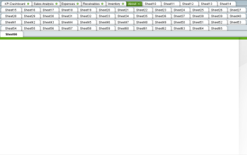
In this extreme case, rows of tabs can be as many as the example above. This is an example with 1024x768 screen resolution. As you can see, we are losing the real estate for information display for the tabs. It is about 1/3 of the entire real state for tabs.
In order to avoid this tab nightmare, you have a few options to overcome this situation. First, think about the hierarchy of your information categories. Then, consider using 1) a container object, 2) sub-tabular system, 3) a multi-box or 4) combination of these options.
This is one example of using the Option2: sub tabular-system.
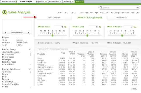
If you are curious to know more about this topic, you can see the tech brief here. More example snapshots and how each option works are documented in detail.
I hope you have a better understanding on how to deal with many tabs in QlikView.

-
Usability Recommendations
Usability engineers & researchers are crucial parts of User Experience. While not as "glamorous" as designers they bring evidence to the world of desi... Show MoreUsability engineers & researchers are crucial parts of User Experience. While not as "glamorous" as designers they bring evidence to the world of design. Through observation of heuristic tests they offer empirical evidence that a design is working, failing, what users like, what users aren't finding, what users are doing that they don't even realize they are doing it, etc. Usability is the closest thing design has to being a science.
The attached technical paper goes through a variety of topics with usability in mind and makes recommendations. It links out to studies and research already done supporting best practices.
The basic findings and recommendations in this document are that:
• People don’t read everything online, they skim
• Paragraph width impacts comprehension
• Scrolling is good
• Monitor Resolution: design for 1024x768
• Ipads: design for 1024x768 and allow scrolling
• Icons don’t necessarily help usability
• Filters should be on the left
-
Creating a Trial Balance Sheet in QlikView
When using QlikView, sometimes we are faced with challenges such as how do we transform an Excel spreadsheet that looks like the image below into a tr... Show MoreWhen using QlikView, sometimes we are faced with challenges such as how do we transform an Excel spreadsheet that looks like the image below into a trial balance chart that allows us to see the monthly activity for each company and account.
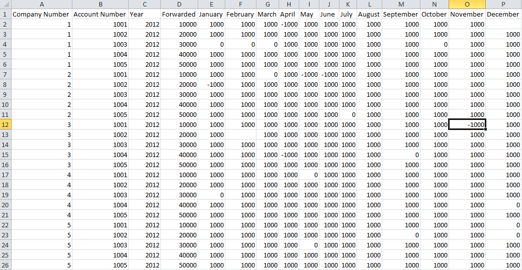
Well using various functions and features of QlikView such as:
• CrossTable Load of Excel spreadsheet
• IsNull() function
• RowNo() function
• Peek() function
• Date functions
• Preceding load
We can create a trial balance sheet that looks like this:
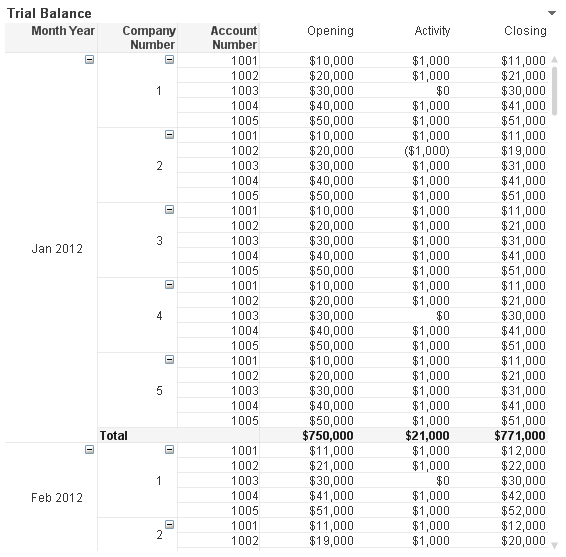
Creating this chart involves loading the Excel spreadsheet into QlikView in a format that works best for us using a CrossTable load. After sorting this data by Company Number, Account Number and Month Year, we are ready to create the Opening and Closing fields that we will need for the trial balance chart. Using the RowNo() and Peek() functions, we are able to create the opening and closing balance fields for each account number on a monthly basis allowing the user to see what the activity was like during any given month. Here is a snippet of what that script looks like:
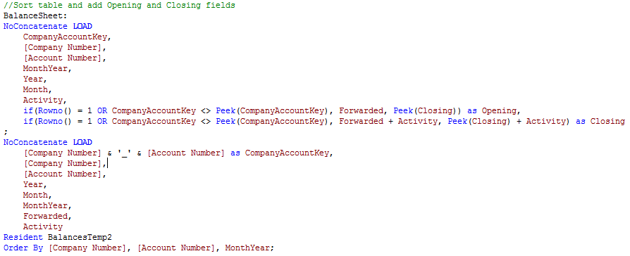
You can view the step by step details of how the trial balance chart was created in this technical brief.
Jennell
-
A Historical Odyssey: QlikView 7, QVD files and the Aggr() function
For QlikView 7 we developed a number of features that would enable developers to make even more advanced applications. One such feature was the Buffer... Show MoreFor QlikView 7 we developed a number of features that would enable developers to make even more advanced applications. One such feature was the Buffer prefix – a prefix that you could put in front of a Load or a SELECT that would store the data on the local machine and automatically use the local data when appropriate. With it, you could e.g. load data from a slow ODBC connection just once a day and for other script runs use the buffer.
The buffered data needed to be compact and something that QlikView could load fast. So, the QVD file was invented to solve this need. Today, hardly anyone uses the Buffer prefix, but QVD files created with the Store command are often used.

Another new feature was the Aggr() function. Already for QlikView 4 we had a solution for having an aggregation as dimension. Well, solution is perhaps not the right word… There was a kludgy, hidden feature with which you could use a count of a field as dimension. Internally it was called the Doctors’ Special. We solved a customer’s problem at the time, but we were not satisfied: we instead wanted a general, good solution for nested aggregations.
Six years later – after much thinking – Håkan (the Inventor) came up with the Aggr() function. It is a general function that can be used both as dimension and as measure. It can be nested and it can internally use any aggregation. In other words: it is a general function for nested aggregations. A by-product was the calculated dimension, which was necessary in order to use the Aggr() as dimension.
The Intel Itanium processor was first released in 2001, but its sales had still not picked up when QlikView 7 was released four years later in 2005. Instead, a new kid appeared on the block: The AMD X64 architecture. The X64 turned out to be both cheaper and faster than the Itanium, and as a consequence it sold better.
We already had an Itanium edition of QlikView and we realized that we also needed an X64 edition. Porting the code was straightforward and QlikView 7 was now shipped in three editions: X86, IA64 and X64.
 QlikView 7 also brought the calendar object, the block chart, the box plot, the expression overview, the variable overview, the alerts and the reports.
As a curiosity, I can also mention that QlikView 7 was the first version with scroll bars for the sheet. None of the previous versions had had this. We had always had the opinion that scroll bars would steal screen space and not add any relevant functionality. Instead we had a zoom function so that you could fit the work area to the screen. But - it’s never too late to change one’s mind…
Further reading on the Qlik history:
A Historical Odyssey: QlikView 6 and Multi-threading
-
Extending QlikView Expressor with the New Extensions SDK
Last month QlikTech released QlikView Expressor 3.9 which introduced some key features that not only strengthen data governance practices within a Qli... Show MoreLast month QlikTech released QlikView Expressor 3.9 which introduced some key features that not only strengthen data governance practices within a QlikView deployment, but also enable developers to extend QlikView Expressor functionality.
Enhancements include:
- Conformance Mapping - enables consistent naming of attributes representing a given data element. It reduces the proliferation of unnecessary variations that can cause inconsistent results in data processing. Conformance Mapping makes it simple to unify the attributes mapped to fields in a Schema.
- Metadata Analysis Search and Usage - helps locate QlikView Expressor artifacts (dataflows, schemas, types, connections, attributes, fields, etc.) within workspaces, projects and libraries that are used to manage and prepare data for QlikView and other data targets.
- The Extension SDK - enables a set of toolkits and wizards that provide a framework with common functions for developing Extensions for QlikView Expressor.
In this article I will briefly cover the QlikView Expressor Extension SDK and provide a supporting reference with examples that demonstrate how it can be used. (You can learn more about these features in this Technical Brief.)The Extension SDK
Typically, software packages provide a method to extend their functionality using a development kit or API. This allows a developer to build in new capabilities that otherwise would not be available in the out-of-the-box software. The QlikView Expressor Extension SDK enables a set of toolkits and wizards that provide a framework with common functions for developing extensions for QlikView Expressor. With extensions, developers can provide clients with tools to integrate data from specialized sources and perform specialized transformations on data. An extension’s operators, connections and schema integrate into the QlikView Expressor Desktop interface and seamlessly work in conjunction with other standard, enterprise artifacts and operators.
The Extensions SDK provides a set of compilation, utility, and data type conversion functions using built-in Datascript Modules (DSM). DSMs are the standard QlikView Expressor scripting module for Datascript, based on the Lua open-source scripting language. Extensions built on these common functions add functionality to QlikView Expressor Desktop to support custom data sources and specialized transformations.
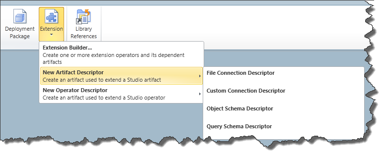
Figure 1 - The Extension Builder
What is a QlikView Expressor Extension?
A QlikView Expressor Extension is a plug-in (or add-on) that adds new Operators and Metadata artifacts to those already included in the core QlikView Expressor product. Extensions can provide read,write,transform and work-flow-like operations that are not available with the standard operators and artifact types. Once developed they can be easily packaged and distributed with the QlikView Expressor Extensions Manager.
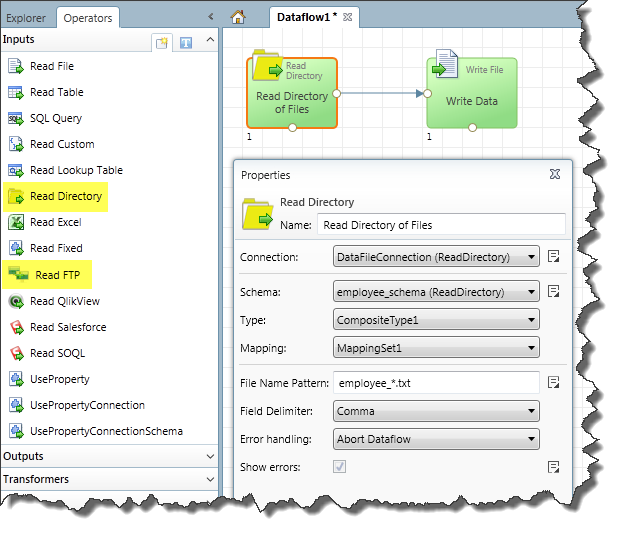
Figure 2 - Custom Operators for reading files from a directory or FTP
The Extension SDK Tutorial
Want to give it a try? Check out this tutorial and sample project to learn how extensions are built using QlikView Expressor.
NOTE: Please make sure you have QlikView Expressor 3.9.1 installed.
Samples available in the project include:
- Reading Fixed Width Files
- Reading delimited files from a directory
- Reading a data file via FTP
- Encrypting and Decrypting Data with a custom transform
Regards,
Michael Tarallo
Senior Product Marketing Manager
QlikView and QlikView Expressor
@mtarallo
-
Why is the question "Why" important in a design process
When we start working on a new project, the customer requirements form the guiding rails for us to begin the process of designing. As we start brainst... Show MoreWhen we start working on a new project, the customer requirements form the guiding rails for us to begin the process of designing. As we start brainstorming and throwing out ideas, we begin to fill the empty spaces with uncertain experiments. We then start making tiny decision which we stitch together part by part in trying to complete the big picture.
Initially to get started with drawing an outline of the project, we naturally tend to ask ourselves the basic questions of why, what, where, how. As the project progresses, we come across unforeseen hurdles, feedback, opinions and try to work our way through it to achieve the big goal. However, in the process of doing so, there are very strong chances of digressing from the main purpose of the project. In trying to put the small pieces together, and focusing on how to make it happen, we sometimes tend to lose the purpose of why we are doing what we are doing. This is when the question “Why” always comes handy to validate our work.
A design can never be a solution if it doesn’t fulfill the underlying purpose of its existence. Asking the question “Why” each time we complete our little milestones, that we set for ourselves, can do wonders to the final solution.
In the book called “The Shape of Design”, Frank Chimero points out - “Our mistake was the same as that of the creative person who places too much focus on How to create her work, while ignoring Why she is creating it. Questions about How to do things improves craft and elevates form, but asking Why unearths a purpose and develops a point of view. We need to do more than hit the right note. The creative process, in essence, is an individual in dialogue with themselves and the work. Why is usually neglected, because How is more easily framed.”
The process of design is most successful when it is an iterative process rather than a linear one. Asking the question “Why” at every stage to validate your work can not only help in creating a strong argument for your work but also help in delivering a legitimate story. So, a reality check by asking the question “why” at every stage of the process can help in creating the solution that one set out to provide in the first place.
-
Storing and Reusing QlikView Specific Expressions with QlikView Expressor
"Good Data"Cultivating culture that emphasizes consistency and reusability is vital when introducing successful data governance practices. Common prob... Show More"Good Data"

Cultivating culture that emphasizes consistency and reusability is vital when introducing successful data governance practices. Common problems with many decision support systems are the amount of variation, redundancy and overlap that exists within the data models and business logic used across multiple analytical applications. These problems can delay critical decisions and disrupt IT operations while users struggle to verify the truth in data. Having data is one thing, having “good data” is another. With the volume of data increasing it is important to create a structured and consolidated data management layer that contains reusable and consistent definitions. This in turn gives developers and business users assurance that the data they are using, whether to develop applications or make decisions, is “good data”. It also expedites the process of creating new applications and eliminates much of the guesswork in maintaining applications as business requirements evolve over time.
Storing and Reusing QlikView Expressions
Using QlikView Expressor (QVE) to manage and prepare data for QlikView is a great step towards adding data governance and data management to your QlikView deployment. Not only can you visualize where data originates and its final destination, but you can also create reusable parameterized business rules that can be shared across multiple applications.
By design QVE uses a Transform Operator to store Expression and Function rules to manipulate and add data. When transforming data - a simple QVE expression is used. The results yield transformed and/or new data columns to be used in the final output of the QlikView table model.
But what if you want to store and reuse an actual QlikView specific scripted expression and not just the resulting column output? This would be an ideal method to reference a single version of that expression in a unified manner. In turn it could reduce maintenance significantly if changes are made since there is only one place to make modifications, QlikView Expressor. This approach would also increase productivity and data confidence as it creates a single common expression stored in a centralized reusable repository.
Want to learn more and see it in action? Download the complete document and sample below.
If you are viewing this from http://community.qlik.com/blogs - you must click this link to get the sample:
(http://community.qlik.com/blogs/qlikviewdesignblog/2013/04/24/defining-qlikview-expressions-with-qlikview-expressor)The document is also available here: http://community.qlik.com/docs/DOC-4214
Regards,
Michael Tarallo - Senior Product Marketing Manager
Bill Kehoe - Product Manager and founder Expressor
-
Show More, Show Less: Progressive Disclosure in Business Intelligence
Knowing when to show more information and when to show less is not only good design it's good usability. The more information you present the greater ... Show MoreKnowing when to show more information and when to show less is not only good design it's good usability. The more information you present the greater the cognitive load a user has to juggle to accomplish a task. Sometimes you want to have lots of information visible to make the best choice but other times you don't. There is a point of diminishing returns where you have given your users too much information too soon. Sometimes people need to ease into an application, get acquainted with it, and then proceed to learn more.
Progressive disclosure is when information is sequenced out across several pages or screens to help a user process information and to avoid overwhelming them with too much information. Additional information, or more advanced or rarely used features, are hidden away until needed. This is a technique that was used by IBM in the 1980's when developing user interfaces. They realized that progressively disclosing additional tasks and information through a series of menus was better than having everything present up front. It managed complexity by clearing up clutter. It helped new users get familiar with the UI and as they became more savvy users they used the menu systems to find more advanced functionality.
The attached Technical Paper discusses a bit more how progressive disclosure is useful in BI. Progressive disclosure helps the DAR methodology to give users the general summary on the Dashboard, more advanced functionality on the following pages, and then the real deep dive information for Reporting. Progressive disclosure helps you design for other people at a variety of skill levels to get the most out of your applications.
-
Use of Icons in Design
Have you ever noticed how information is constantly communicated to you via icons in the world of electronic media?Right from the first screen that ap... Show MoreHave you ever noticed how information is constantly communicated to you via icons in the world of electronic media?

Right from the first screen that appears after you start your computers, tablet or phone to checking your emails and then moving on to surfing the web, you are constantly being informed by these little visuals which help you navigate your way through information and effectively alert you of various situations.Icons are a great way of communicating information quickly and precisely.
 If we look at some of the top usability rated websites and applications, we will find that they rely very heavily on the use of icons to facilitate excellent user experience. For instance, Dropbox uses icons for almost every function which not only makes it quick to grasp but also makes it visually appealing.In our case as QlikView application designers, we need to consider the use of icons as a way to draw the users’ attention, to alert them of a situation or to alarm them of an impending. Also icons can be used very effectively to display priorities for KPIs which can be used in combination with the traffic light chart (Red, yellow, green).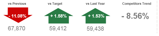
The other part to the story is that the use of icons has become very popular in the industry today, especially the web world, so people tend to associate certain actions to certain icons. In our case, while designing application, it becomes important to consider the fact that the users’ psychological paradigm works in alignment to the surfing the web when trying to work with an application. They try to find similarities between using a website and using an application. So, the use of icons becomes all the more relevant in designing applications for us.
So, what are some of the reasons that can justify why icons can be effective in designs? There are a few:-
•Effective visual communication
•Easy identification of information
•Draw users’ attention and alert them of a given situation – this is especially important in dashboards
•To provide a visual relief and enhance visual display of information
•To save screen real estate by replacing text with iconsAlthough icons can be a great way of conveying an idea, their use, in design can be slightly tricky. There are a few dos and don’ts that one needs to keep in mind when incorporating icons in design. That said, Icons can enhance the look and feel of a design and at the same time can enhance the readability of content and thus the usability of an application.
A detailed description with examples of best practices of using icons can be found in the technical brief here.
-
Personas in UX Design
When UX professionals get together to redesign a service or product a common practice they will employ will be the use of personas. Personas are repre... Show MoreWhen UX professionals get together to redesign a service or product a common practice they will employ will be the use of personas. Personas are representations of different kinds of people / users of the thing you are redesigning. They are the archetypal kinds of people using the thing you are looking to improve. They are the novices, the savvy experts, the casual users, the die-hard fans, the skeptics, etc. You give them names, you describe what their current needs are, how they use the product today, as well as their expectations for the future.
While you can't please all the people all the time, this exercise forces you to account for a variety of users and to remember that you are designing for a variety of needs and expectations and not just your own. It pushes you to step outside of yourself. Personas have the added benefit of putting a face to a series of requirements. It helps everyone involved keep organized by having a name to go with a list of features & requirements.
So where to begin?
You can start a few ways. If you have the luxury of time & access you can interview stakeholders in the project from a variety of levels. From the hands-off to the hands-on users, from the executives down, you will gain insights from people all along the way. If you don't have that sort of time, brainstorm the kinds of users you are designing for. What will the executive level user want or do with your application? What about the person who is doing the day-to-day maintenance of the app? Create lists of the kinds of users, how they are doing things today, what they want in a future design, what their roll will be, their level of technical sophistication, etc. From here you can begin to design for a variety of consumers.
A word of caution.
Personas aren't real people. It seems obvious but it is worth mentioning. Personas are a great way to get organized and remember to account for a variety of users but they aren't the same as actually testing your design with real people. You should still validate your ideas with a variety of people and see what's working and what isn't. A persona will guide you to a solution but you still need to confirm, with real people, if that solution works.
-
4 tips to start working with QlikView
A few weeks ago a former colleague, who has recently started to work with QlikView, contacted me and was wondering how to start with QlikView and how ... Show MoreA few weeks ago a former colleague, who has recently started to work with QlikView, contacted me and was wondering how to start with QlikView and how to help his team to better visualize data, here are some tips I shared with him that could help you to start too:
1 Find inspiration and reuse
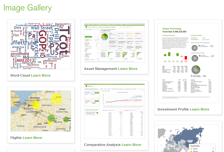
Make sure you visit QlikView Demo site prior to starting your project. One of the best things about the site is the fact that you are able to download one app and reuse the content for your own. Don’t forget to check the brand new demo image gallery with visualization highlights and samples of QlikView’s unique approach to data viz.
If you need advice on when to use which chart, take a look at Data Visualization App, it has specific information and best practices on how to show your data in the most effective ways.
2 Identify the needs
You need to understand the business process that is behind the analysis first. The more you know about the business needs the more easily you will be able to design for the business by choosing the appropriate KPIs. So your first task is to identify the KPIs for your new dashboard and assign them a relative weight so later on you will be able to use hierarchy to emphasize the heaviest, most important ones - this is key.
3 Use pen and paper
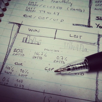
To create a QlikView app start by picking a piece of paper and your favorite pencil and drawing your best approach to the dashboard, you don’t need to be very specific, just sketch it out and create the basic layout to emphasize the main KPIs and comparisons that are need in your project. Don’t forget to validate your design with other users and add their feedback to your design.
4 Choose a leitmotiv
Think of the fashion designers. They base their collections on a certain decade or style and then they are consistent in applying that style to the entire collection. When working with QlikView you can be a fashion designer in a way, choose a theme, your leitmotiv for the app, and keep it in mind when creating charts and when choosing the color palette. Despite using your corporate branding, it could be a mess if you mix several colors, just keep neutral colors for backgrounds and main elements and use contrast to emphasize the most important KPIs.
Some good examples of thematic design could be founded in QlikView Developer Toolkit App, an excellent starting point for your next QlikView App, you will also find many design elements as buttons, grids, shadows and rulers and lines.
These are just some basic tips to start working with QlikView but if you want to go further in the design process to developing QlikView applications, then you should review Michael’s technical papers you will find at the bottom of his post called How To Improve Your Design Process Working With Qlikview.
Enjoy Qliking!
Arturo Muñoz


