Unlock a world of possibilities! Login now and discover the exclusive benefits awaiting you.

Analytics & AI
Forums for Qlik Analytic solutions. Ask questions, join discussions, find solutions, and access documentation and resources.
Data Integration & Quality
Forums for Qlik Data Integration solutions. Ask questions, join discussions, find solutions, and access documentation and resources
Explore Qlik Gallery
Qlik Gallery is meant to encourage Qlikkies everywhere to share their progress – from a first Qlik app – to a favorite Qlik app – and everything in-between.
Qlik Community
Get started on Qlik Community, find How-To documents, and join general non-product related discussions.
Qlik Resources
Direct links to other resources within the Qlik ecosystem. We suggest you bookmark this page.
Qlik Academic Program
Qlik gives qualified university students, educators, and researchers free Qlik software and resources to prepare students for the data-driven workplace.
Recent Blog Posts
-
Community Enhancements (2021 - 6)
Hello Members! How is it August already? This year is flying by! July’s release brought some fantastic enhancements for our end users. This month’s re... Show MoreHello Members!
How is it August already? This year is flying by!
July’s release brought some fantastic enhancements for our end users. This month’s release is more focused on improving the accessibility of the Qlik Community, along with a few additional enhancements.
Here are a few of the enhancements that went live on August 3rd, 2021:
1. Product Support Lifecycle
Do you ever have questions on when a specific product release will reach the end of support? Look no further! We’ve added a new Product News section under Support with a new Product Support Lifecycle page. You can look up your product, the release and find the end of support date.
Currently, only Data Analytics products are available. We are working with Product Management to add the Data Integration products so check back soon!
Also, stay tuned to find out more about the new Product News section!
2. Qlik Professor Ambassadors and Qlik Partner Ambassadors added to the Qlik Greenway
Two additional programs are available on the Qlik Greenway: Qlik Professor Ambassadors and Qlik Partner Ambassadors!
Qlik Professor Ambassadors is a part of the Qlik Academic program. These individuals champion our Academic Program resources to promote data literacy among students.
Qlik Partner Ambassadors is a new program that focuses on our exceptional Qlik technologists within the Qlik Partner ecosystem.
3. Product Icons on the Data Integration Documents board
The Product Icons allow you an easy way to filter out the board by selecting a specific product. The icons have only been rolled out to the Data Integration Documents board to pilot. We are thinking of adding the icons to the Knowledge Base and the new Product Support Lifecycle page. Let us know what you think or if you have any suggestions on where else they should go!
4. Updated Support and About Navs
Along with adding Product News to the Support nav, we simplified Knowledge Base to Knowledge. Don’t worry about any articles you may have bookmarked – any saved links will auto direct!
To better align with Product News, we renamed the Community Manager Blog to Community News.
We hope you enjoy these new enhancements! We would love to hear from you so let us know what you think or if there is anything you would like to see using the comments below.
We will not have an official release next month but will be sprinkling a few updates here and there. We will be back in October with some exciting new features!
Thank you for being a part of the Qlik Community!
Stay well,
Melissa, Sue and Jamie
-
Create a Slope chart with tooltips and brushing using Nebula.js and Picasso.js
In this article, we will explore creating a slope chart extension using Nebula.js and the Picasso.js charting library. We will walk through the proces... Show MoreIn this article, we will explore creating a slope chart extension using Nebula.js and the Picasso.js charting library. We will walk through the process, explain the different Picasso components that make up the chart, and introduce a few concepts along the way including tooltips and brushing.
Documentation for both libraries can be found here:
The slope chart we're about to create was featured on the 2021 Fortune 500 app. It visually explains how sectors have been impacted by the COVID-19 pandemic by ranking the sectors of the Fortune 500 list and showing their increase or decrease between 2020 and 2021.Connecting to the Qlik Sense app
First things first, let's connect to our QS app using Enigma.js. We create a QIX session using "Enigma.create" then use the "Session.open" function to establish the websocket connection and get access to the Global instance. We use the "openDoc" method within the global context to make the app ready for interaction.
// qlikApp.js
const enigma = require('enigma.js');
const schema = require('enigma.js/schemas/12.170.2.json');
const SenseUtilities = require('enigma.js/sense-utilities');

const config = {
  host: '<HOST URL>',
  appId: '<APP ID>',
};
const url = SenseUtilities.buildUrl(config);
const session = enigma.create({ schema, url });

session.on('closed', () => {
  console.error('Qlik Sense Session ended!');
  const timeoutMessage = 'Due to inactivity, the story has been paused. Refresh to continue.';
  alert(timeoutMessage);
});

export default session.open().then((global) => global.openDoc(config.appId));
Configuring Nebula
Now that we have successfully connected to the QS app, let's move on to configuring Nebula.js. In this step, we use the "embed" method to initiate a new Embed instance using the enigma app. We then register the chart extension named "slope" (the actual creation of this extension is covered further down).
// nebula.js
import { embed } from '@nebula.js/stardust';
import qlikAppPromise from 'config/qlikApp';
import slope from './fortune-slope-sn';

export default new Promise((resolve) => {
  (async () => {
    const qlikApp = await qlikAppPromise;
    const nebula = embed(qlikApp, {
      types: [{
        name: 'slope',
        load: () => Promise.resolve(slope),
      }],
    });
    resolve(nebula);
  })();
});
Rendering the chart
In our "Slope" react component, we proceed to render the visualization into the DOM on the fly. We use the "render" method and pass configuration options that include a reference to the HTML element, the type (we named it "slope" in the previous step), and the array of fields. In this case, we use 2 dimensions (Year, Sector) and 2 measures (Set Analysis that returns the ranking by sector profits as well as the actual profit numbers for the two years we're interested in).
import React, { useRef, useEffect } from 'react';
import useNebula from 'hooks/useNebula';

const Slope = () => {
  const elementRef = useRef();
  const chartRef = useRef();
  const nebula = useNebula();

  useEffect(async () => {
    if (!nebula) return;
    chartRef.current = await nebula.render({
      element: elementRef.current,
      type: 'slope',
      fields: [
        '[Issue Published Year]',
        '[Sector2]',
        '=Rank(Sum({$<[Issue Published Year]={2020, 2021}>} [Inflation Adjusted Sector Profit]))',
        '=Sum({$<[Issue Published Year]={2020, 2021}>} [Inflation Adjusted Sector Profit])',
      ],
    });
  }, [nebula]);

  return (
    <div>
      <div id="slopeViz" ref={elementRef} style={{ height: 600, width: 800 }} />
    </div>
  );
};

export default Slope;
The slope chart extension
This is where the magic happens! Let's explore different sections of the file and go through them (the full project can be found at the end of the article).
In the following code snippet, we make use of the q plugin that makes it easier to extract data from a QIX hypercube (or alternatively a list object). Notice the values of the initial fetch and the min and max properties of the dimensions and measures, these should match the number of fields we previously set in our Slope react component.
export default function supernova() {
  const picasso = picassojs();
  picasso.use(picassoQ);

  return {
    qae: {
      properties: {
        qHyperCubeDef: {
          qDimensions: [],
          qMeasures: [],
          qInitialDataFetch: [{ qWidth: 4, qHeight: 2500 }],
          qSuppressZero: false,
          qSuppressMissing: true,
        },
        showTitles: true,
        title: '',
        subtitle: '',
        footnote: '',
      },
      data: {
        targets: [
          {
            path: '/qHyperCubeDef',
            dimensions: {
              min: 1,
              max: 2,
            },
            measures: {
              min: 1,
              max: 2,
            },
          },
        ],
      },
    },
...
Scales
Our x scale is related to the year field, the color scale represents our second dimension - sectors, and lastly the y and y-end scales use custom "ticks" values because we would like to show labels in the format "rank # - sector".
Both "yaxisVals" and "yaxisendVals" arrays have been constructed by manipulating the data extracted from the layout object (see lines 76 to 92 of the slope-sn.js file).
You can learn more about scales and the different types of scales that the Picasso library offers here.
scales: {
    x: {
      data: {
        extract: {
          field: 'qDimensionInfo/0',
        },
      },
      paddingInner: 0.8,
      paddingOuter: 0,
    },
    color: {
      data: {
        extract: {
          field: 'qDimensionInfo/1',
        },
      },
      range: ['#5D627E'],
      type: 'color',
    },
    y: {
      data: {
        field: 'qMeasureInfo/0',
      },
      invert: false,
      expand: 0.03,
      type: 'linear',
      ticks: { values: yaxisVals },
    },
    yend: {
      data: {
        field: 'qMeasureInfo/0',
      },
      invert: false,
      expand: 0.03,
      type: 'linear',
      ticks: { values: yaxisendVals },
    },
},
...
Components
The components that make up the chart are:
- Type "axis" - notice that we have two y-axes that use two different scales covered above
- Type "lines" - notice that we're using the series prop that represents sectors
- Type "point" - this represents the circles at the edges of the slope lines, notice that we're extracting some additional data here since we're gonna be using it for the tooltip component.
- Type "tooltip" - there are three aspects to rendering tooltips:
- Interaction to bind events to the chart. We use 'mousemove' and 'mouseleave' to show or hide the tooltip.
- Extracting the relevant data from the hovered node, in this case we're filtering to look for nodes with key 'point', then we manipulate this data to return an object containing the values we will be displaying
- Generating content using the 'content' setting to format the information from the object we previously constructed and generate virtual nodes using the HyperScript API.
components: [ { type: 'axis', key: 'x-axis', scale: 'x', dock: 'bottom', settings: { labels: { show: true, fontSize: '10px', mode: 'horizontal', }, }, }, { type: 'axis', key: 'y-axis', scale: 'y', settings: { labels: { show: true, mode: 'layered', fontSize: '10px', filterOverlapping: false, }, }, layout: { show: true, dock: 'left', minimumLayoutMode: 'S', }, }, { type: 'axis', key: 'y-axis-end', scale: 'yend', settings: { labels: { show: true, mode: 'layered', fontSize: '10px', filterOverlapping: false, }, }, layout: { show: true, dock: 'right', }, }, { type: 'line', key: 'lines', data: { extract: { field: 'qDimensionInfo/0', props: { y: { field: 'qMeasureInfo/0', }, series: { field: 'qDimensionInfo/1', }, }, }, }, settings: { coordinates: { major: { scale: 'x', }, minor: { scale: 'y', ref: 'y', }, minor0: { scale: 'y', }, layerId: { ref: 'series', }, }, orientation: 'horizontal', layers: { sort: (a, b) => a.id - b.id, curve: 'monotone', line: { stroke: { scale: 'color', ref: 'series', }, strokeWidth: 2, opacity: 0.8, }, }, }, brush: { consume: [{ context: 'increase', style: { active: { stroke: '#53A4B1', opacity: 1, }, inactive: { stroke: '#BEBEBE', opacity: 0.45, }, }, }, { context: 'decrease', style: { active: { stroke: '#A7374E', opacity: 1, }, inactive: { stroke: '#BEBEBE', opacity: 0.45, }, }, }], }, }, { type: 'point', key: 'point', displayOrder: 1, data: { extract: { field: 'qDimensionInfo/0', props: { x: { field: 'qDimensionInfo/0', }, y: { field: 'qMeasureInfo/0', }, ind: { field: 'qDimensionInfo/1', }, rank: { field: 'qMeasureInfo/0', }, rev: { field: 'qMeasureInfo/1', }, }, }, }, settings: { x: { scale: 'x' }, y: { scale: 'y' }, shape: 'circle', size: 0.2, strokeWidth: 2, stroke: '#5D627E', fill: '#5D627E', opacity: 0.8, }, brush: { consume: [{ context: 'increase', style: { active: { fill: '#53A4B1', stroke: '#53A4B1', opacity: 1, }, inactive: { fill: '#BEBEBE', stroke: '#BEBEBE', opacity: 0.45, }, }, }, { context: 'decrease', style: { active: { fill: '#A7374E', stroke: '#A7374E', opacity: 1, }, inactive: { fill: '#BEBEBE', stroke: '#BEBEBE', opacity: 0.45, }, }, }], }, }, { key: 'tooltip', type: 'tooltip', displayOrder: 10, settings: { // Target point marker filter: (nodes) => nodes.filter((node) => node.key === 'point' && node.type === 'circle'), // Extract data extract: ({ node, resources }) => { const obj = {}; obj.year = node.data.x.label; obj.industry = node.data.ind.label; obj.rank = node.data.rank.value; obj.rankchange = rankChange[obj.industry]; obj.profitsChange = profitsChange[obj.industry]; obj.profits = resources.formatter({ type: 'd3-number', format: '.3s' })(node.data.rev.value); return obj; }, // Generate tooltip content content: ({ h, data }) => { const els = []; let elarrow = null; let rankCh = ''; data.forEach((node) => { // Title const elh = h('td', { colspan: '3', style: { fontWeight: 'bold', 'text-align': 'left', padding: '0 5px' }, }, `${node.year} ${node.industry}`); const el1 = h('td', { style: { padding: '0 5px' } }, 'Rank'); const el2 = h('td', { style: { padding: '0 5px' } }, `#${node.rank}`); // Rank Change if (node.rankchange > 0 && node.year !== '2020') { rankCh = `+${node.rankchange}`; elarrow = h('div', { style: { width: '0px', height: '0px', 'border-left': '5px solid transparent', 'border-right': '5px solid transparent', 'border-bottom': '5px solid #008000', }, }, ''); } else if (node.rankchange < 0 && node.year !== '2020') { rankCh = node.rankchange; elarrow = h('div', { style: { width: '0px', height: '0px', 'border-left': '5px solid transparent', 'border-right': '5px solid transparent', 'border-top': '5px solid #FF0000', }, }, ''); } else { rankCh = ''; elarrow = ''; } // Rest of Info const el3 = h('td', { style: { display: 'flex', alignItems: 'center', }, }, [rankCh, elarrow]); const elr1 = h('tr', {}, [el1, el2, el3]); const elr2 = h('tr', {}, [h('td', { style: { padding: '0 5px' } }, 'Profits:'), h('td', { style: { padding: '0 5px' } }, node.profits.replace(/G/, 'B')), h('td', {}, (node.year !== '2020') ? `${numeral(node.profitsChange).format('+0a').toUpperCase()}` : '')]); els.push(h('tr', {}, [elh]), elr1, elr2); }); return h('table', {}, els); }, placement: { type: 'pointer', area: 'target', dock: 'auto', }, }, }, ], interactions: [ { type: 'native', events: { mousemove(e) { this.chart.component('tooltip').emit('show', e); }, mouseleave() { this.chart.component('tooltip').emit('hide'); }, }, }, ],Brushing
In the code above, you will notice 'brush' settings on both the "lines" and "point" type components. We observe changes of a particular brush context (in this case we have two contexts, one named "increase" to show increasing lines and one for "decrease" to show lines that represent sectors that have fallen in ranks).
The active and inactive properties contain styles to be applied to the component when it is brushed.
In our scenario, we want to programmatically control these brushes from our Slope react component through a toggle button. Let's modify the Slope.jsx file to reflect that.
Notice that we are accessing the "increase" and "decrease" brushes through the global window object containing the Picasso chart instance (we assign this on line 456 of slope-sn.js). We then use a combination of the "start", "clear", "end", and "addValues" methods to react to our "toggleBrush" state changes when one of the buttons is clicked.
import React, { useRef, useEffect, useState } from 'react';
import useNebula from 'hooks/useNebula';
import Button from '@material-ui/core/Button';

const Slope = () => {
  const elementRef = useRef();
  const chartRef = useRef();
  const nebula = useNebula();

  const [toggleBrush, setToggleBrush] = useState(false);

  const increaseValues = [11, 16, 17, 5, 8, 12];
  const decreaseValues = [4, 6, 19];

  useEffect(async () => {
    if (!nebula) return;

    chartRef.current = await nebula.render({
      element: elementRef.current,
      type: 'slope',
      fields: [
        '[Issue Published Year]',
        '[Sector2]',
        '=Rank(Sum({$<[Issue Published Year]={2020, 2021}>} [Inflation Adjusted Sector Profit]))',
        '=Sum({$<[Issue Published Year]={2020, 2021}>} [Inflation Adjusted Sector Profit])',
      ],
    });
  }, [nebula]);

  useEffect(() => {
    if (!nebula || !window.slopeInstance) return;
    const highlighterIncrease = window.slopeInstance.brush('increase');
    const highlighterDecrease = window.slopeInstance.brush('decrease');
    highlighterIncrease.start();
    highlighterIncrease.clear();

    highlighterDecrease.start();
    highlighterDecrease.clear();

    if (toggleBrush) {
      highlighterIncrease.addValues(increaseValues.map((val) => ({ key: 'qHyperCube/qDimensionInfo/1', value: val })));
    } else {
      highlighterDecrease.addValues(decreaseValues.map((val) => ({ key: 'qHyperCube/qDimensionInfo/1', value: val })));
    }
  }, [toggleBrush]);

  const handleClearBrushes = () => {
    if (!nebula || !window.slopeInstance) return;
    const highlighterIncrease = window.slopeInstance.brush('increase');
    const highlighterDecrease = window.slopeInstance.brush('decrease');

    highlighterIncrease.clear();
    highlighterIncrease.end();

    highlighterDecrease.clear();
    highlighterDecrease.end();
  };

  return (
    <div>
      <div id="slopeViz" ref={elementRef} style={{ height: 600, width: 800 }} />
      <Button onClick={() => setToggleBrush(!toggleBrush)}>{toggleBrush ? 'Highlight Decrease' : 'Highlight Increasae'}</Button>
      <Button onClick={() => handleClearBrushes()}>Clear Brushes</Button>
    </div>
  );
};

export default Slope;
You can check out the full project code on Github.
Don't forget to take a look at this year's Fortune 500 and Global 500 apps that feature this chart as well as other custom ones all made possible with Nebula.js and Picasso.js!
-
Qlik Sense Qualification Exams - 2021 Update
The exams are accessed from Qlik Continuous Classroom in the Qlik Learning Portal, where all the latest Qlik training is available on demand, 24/7. Wh... Show MoreThe exams are accessed from Qlik Continuous Classroom in the Qlik Learning Portal, where all the latest Qlik training is available on demand, 24/7.
What is a Qualification Exam?
Qualification exams enable you to validate your fundamental level of Qlik Sense skills. To earn a qualification, you will build a Qlik Sense application, then take a multiple-choice exam.
What do you receive after you pass?
After you receive a passing score, you will be awarded a certificate and digital badge for sharing on social sites.
Who can take a Qualification Exam?
Qlik Continuous Classroom subscribers and students who attend Create Visualizations with Qlik Sense or Data Modeling with Qlik Sense instructor-led training. Academic Program students also have access to the Qualification exams.
For more information
Visit the Qlik Sense Business Analyst or Qlik Sense Data Architect Learning Plans, or contact Education@qlik.com.
*Don’t worry – you can still take our exams using Qlik Sense Desktop. See Appendix A in the Application Requirements for details!
-
Using webpack with Capability APIs
I've seen a few people asking recently if and how they can use webpack to build their mashup. The answer is yes, and I'm gonna discuss a few implement... Show MoreI've seen a few people asking recently if and how they can use webpack to build their mashup. The answer is yes, and I'm gonna discuss a few implementation details and provide some example code.
So to use the Qlik Capability APIs, you're probably already aware that you need to load the Qlik Capability API code, which includes loading a custom require.js file, and then requiring the qlik.js file through the loaded instance of require.js. The thing is, there's really no way to get around this, that's how the Qlik Capability APIs are loaded.
But you can still use webpack for all of your own project code, you just have to decide how you are going to load the custom require.js file and where you'll use the require.js instance to require qlik.js. This is how I've been doing it.
First, I load the Qlik custom require.js file in a script tag in the head of the document. Can you get fancier if you'd like with something like the script-loader, yea sure you can, but the goal here is to load that Qlik custom require.js file in a global context, and to me the simplest way to do it is to just include it in a script tag in the head of my html document.
Then, you'll need to set the require.js config and require the qlik.js file through require.js somehow. The trick here is that the require.js instance can be accessed with window.require. Also, since requiring files with require.js is asynchronous, and you'll almost certainly want to return some stuff when qlik.js is done loading, it's useful to use a promise here. This is what my module looks like for this in ES2015 -
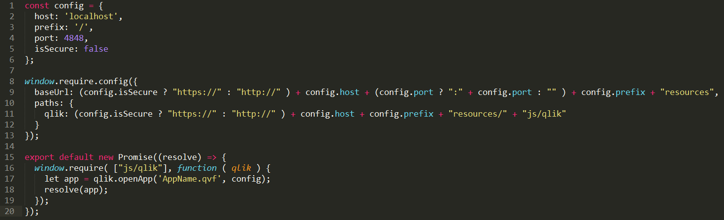
You'll notice the config object which you should be used to for mashups, then how I'm using window.require.config to set the require.js config. Also, I explicitly set the path for 'qlik' because I find this helps avoid some errors, especially with regards to loading extensions. Then, I export a promise which resolves with the app from the openApp() method as the value. You can resolve this promise with the 'qlik' object, or multiple apps, or whatever your needs are, but for myself, most of the time, I'm just opening 1 app and I just resolve the app.
So in summary, if you want to use webpack with the Capability APIs then the Qlik custom require.js file will need to be loaded in a global context in some way, and then you'll be able to access the require.js instance on 'window.require' (but not just simply 'require' since webpack will use that keyword).
-
Earn a Qlik Sense Qualification – New Exams Available!
The Qlik Academic Program is excited to announce that we have launched new Qlik Sense 2021 Qualification exams! What are Qlik Sense Qualification Exam... Show MoreThe Qlik Academic Program is excited to announce that we have launched new Qlik Sense 2021 Qualification exams!
What are Qlik Sense Qualification Exams?
After learning skills in the Qlik Learning Portal, and applying your skills using Qlik products, you can test your knowledge to earn a Qlik Sense Qualification! Two qualifications are currently available: Business Analyst Qualification and Data Architect Qualification. After passing a two-part exam, you will receive a printable certificate and a digital badge to share on your resume, LinkedIn, and other social sites!
What has changed in the exams?
The exams have been updated and are now based on the SaaS editions of Qlik Sense. However, you may still use the Windows edition when taking the exams.
To ensure your current exams are not interrupted, we will temporarily keep both the previous February 2020 exams and the new Qlik Sense 2021 exams available to you until August 31st. After August 31st, the February 2020 exams will be retired.
Where do I take the exams?
The exams are available for free to Qlik Academic Program members and can be taken in the Qlik Learning Portal through the Qlik Continuous Classroom! Simply log into the portal using your Qlik Account, select Programs, go to the Academic Program section and then select Access Resources. The exams are available under the Assessments icon.
If you are currently an active member of the Qlik Academic Program, you automatically have access to the new qualification exams.
If you previously earned a Qualification, you can still access your certificate and digital badge in the Qlik Learning Portal by selecting My Account in the top right-hand corner and selecting the badge icon.
If it has been more than a year since you last applied, we recommend you reapply as an educator or student by visiting qlik.com/academicprogram. As an approved member you will receive another full year of access to these qualification exams and other amazing resources!
If you are an educator or student and you are not part of the program, visit the Qlik Academic Program website and apply today!
If you have questions please email academicprogram@qlik.com

-
Peek() vs Previous() – When to Use Each
As many QlikView developers have grown accustomed to, QlikView offers developers more than one way to accomplish a task. Knowing when to use each fun... Show MoreAs many QlikView developers have grown accustomed to, QlikView offers developers more than one way to accomplish a task. Knowing when to use each function is half of the battle. For example let’s take a look at Peek() vs Previous().
There are certainly some similarities between the two functions but there are also distinct differences that need to be taken into account when deciding which function to use.
The Similarities
- Both allow you to look back at previously loaded rows in a table.
- Both can be manipulated to look at not only the last row loaded but also previously loaded rows.
The Differences
- Previous() operates on the Input to the Load statement, whereas Peek() operates on the Output of the Load statement. (Same as the difference between RecNo() and RowNo().) This means that the two functions will behave differently if you have a Where-clause.
- The Peek() function can easily reference any previously loaded row in the table using the row number in the function e.g. Peek(‘Employee Count’, 0) loads the first row. Using the minus sign references from the last row up. e.g. Peek(‘Employee Count’, -1) loads the last row. If no row is specified, the last row (-1) is assumed. The Previous() function needs to be nested in order to reference any rows other than the previous row e.g. Previous(Previous(Hires)) looks at the second to last row loaded before the current row.
So, when is it best to use each function?
- The previous() and peek() functions could be used when a user needs to show the current value versus the previous value of a field that was loaded from the original file.
- The peek() function would be better suited when the user is targeting either a field that has not been previously loaded into the table or if the user needs to target a specific row.
I wrote a technical brief that shows you how and why to use the Peek() and Previous() functions. You can see it here.
Happy Qliking!

-
PurgeChar and KeepChar Functions
Do you even need to delete or keep some characters in a string field? The PurgeChar and KeepChar functions allow you to purge and keep characters tha... Show MoreDo you even need to delete or keep some characters in a string field? The PurgeChar and KeepChar functions allow you to purge and keep characters that are in a string. The PurgeChar function takes two parameters. The first is the string and the second is the character(s) that are to be removed from the string. The KeepChar function also takes two parameters but in this case the second parameter is the character(s) that are to be kept in the string. Let’s take a look at some examples.
Sometimes you may have a dataset that has garbage in it like in the FirstName field below.
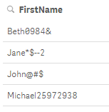
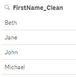
In this case there are characters after each name that I do not need. In order to remove these characters from the field, I can use the PurgeChar function in my script (see below) to remove all the unwanted characters from the FirstName field.

Once I run the script the names look like this:
The KeepChar function works similar except in this function you indicate what characters you would like to keep. This may be helpful when you have field that includes a mix of numbers and letters but you only want to keep the numbers or the letters. In this example, I have a ProductCode field that has codes that are made up of numbers and letters but I only want the numeric data.
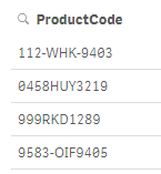
In my script, I can use the KeepPurge function and use the second parameter to list all the numbers since those are the characters I want to keep in the string.

The end result looks like the image below. The product codes are now all numeric and the letters have been removed.
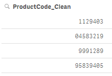
There are a host of string functions that can be used to clean up or modify a string but when there are specific characters that you need to remove or keep, PurgeChar and KeepChar can be helpful and easy to add to your script or chart expression. These functions work well when you need to remove or keep ALL references to a character in a string.
Thanks,
Jennell
-
NEW Qlik Sense Feature!
This spring, Qlik announced the addition of collaborative notes which I believe is an academics dream. Collaborative notes will allow Qlik Academic P... Show MoreThis spring, Qlik announced the addition of collaborative notes which I believe is an academics dream. Collaborative notes will allow Qlik Academic Program members to add context to their visualizations which is a huge benefit for students working on group projects and educators looking to provide their students feedback in real time!
Click here to view the transcript.
If you would like to take advantage of this feature in Qlik Sense and you are a student or educator within higher education, visit the Qlik Academic Program and apply today!
-
Repeat Function
The Repeat function can be used in both Qlik Sense and QlikView to repeat an input string a defined number of times. It can be used in both the scrip... Show MoreThe Repeat function can be used in both Qlik Sense and QlikView to repeat an input string a defined number of times. It can be used in both the script and a chart expression. This is how the Repeat function is defined in Qlik Sense Help:
Repeat() forms a string consisting of the input string repeated the number of times defined by the second argument.
Syntax:
Repeat(text[, repeat_count])
The function takes 2 arguments. The first argument is the text that you would like to repeat. This can be a single character or a combination of many characters. It can be text defined in single quotes or a field name or variable. The second argument is the repeat count which is the number of times the first argument should be repeated. In the example measure below, the text to repeat is ‘My name is Jennell.’ along with chr(13) which represents a carriage return. The second argument is 5 indicating that this input string should be repeated 5 times.
Here are the results in a Text & image object:
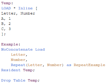
Simply enough, right? In the example, the repeat count argument was set to 5 but I also could have used a variable or a numeric field to indicate the number of times the text should be repeated. Let’s look at an example that uses Repeat in the script using field names. In the script below, I am loading an inline table with a Letter field and a Number field. In the Example table that I load, I am using the Repeat function to create the RepeatExample field which will repeat the string in the Letter field the number of times specified in the Number field.
Here is a preview of the Example table once the script is executed:
By using the fields, Letter and Number, for the arguments, the Repeat function is dynamic based on the data being loaded. The Repeat function is a basic, easy-to-use function that can manipulate your data. I am sure there are many other ways this function can be used. Feel free to share how you use the Repeat function.
Thanks,
Jennell
-
Using Color Functions in Qlik Sense
When developing a Qlik Sense app, there will come a time where you are going to want to define your own colors for certain values in a visualization. ... Show MoreWhen developing a Qlik Sense app, there will come a time where you are going to want to define your own colors for certain values in a visualization. Did you know that Qlik Sense offers many ways to achieve your desired outcome? In this blog, I will talk through the different color functions, and show an example for each color function.
RGB()
RGB() is used in expressions to set or evaluate the color properties of a chart object, where the color is defined by a red component r, a green component g, and a blue component b with values between 0 and 255.
Syntax: RGB(r, g, b)
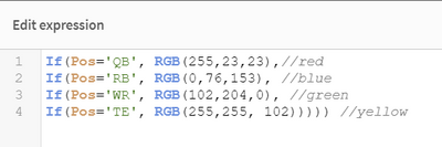
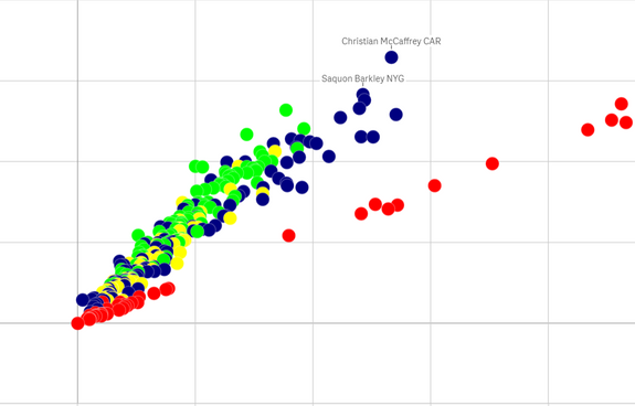
For this example, I am going to use fantasy football data. Let’s say I have a scatter plot and I want to color the values on the scatter plot a specific color based on player position. I can create an expression to target each position:
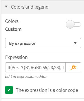
First thing that I need to do is open the chart properties and navigate to the Colors and Legend section and select by expression as my custom color property.
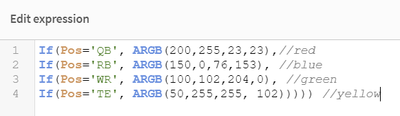
My expression:
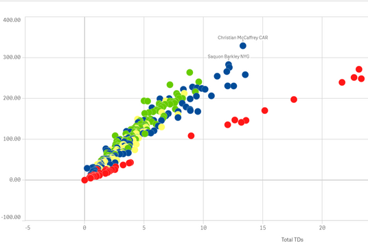
Result:
Now let’s say that I want to soften my colors by adding some opacity to them. For that, we’ll use ARGB().
ARGB()
ARGB() is used in expressions to set or evaluate the color properties of a chart object, where the color is defined by a red component r, a green component g, and a blue component b, with an alpha factor (opacity) of alpha.
The first value is the opacity. The lower the number, the more the color will look faded.
Syntax: ARGB(alpha, r, g, b)
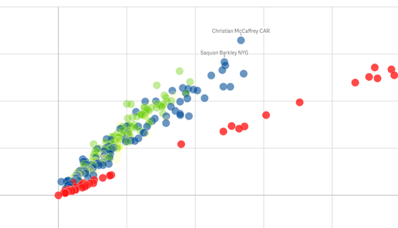
My expression:
Result:
Red has a high alpha factor, which means it maintains more of the red color. Conversely, the yellow has a very low alpha number and renders as the most faded color.
Another way to color your values is the HSL() function.
HSL()
HSL() is used in expressions to set or evaluate the color properties of a chart object, where the color is defined by values of hue, saturation, and luminosity between 0 and 1.
Syntax: HSL (hue, saturation, luminosity)
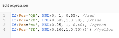
This one is tougher to understand and you will need to perform some calculations in order to arrive at the correct HSL values. For example: The color blue that we used in the RGB function is RGB(0,76,153) after using an online RGB to HSL converter, we find that the new value for HSL is HSL(210 degrees, 100%, 30%). To make this a valid value for Qlik Sense we need to do some conversion. First we take the 210 degrees and divide that by 360 to get 0.583. We then convert the percentages to decimals. Our final value for the HSL for blue is HSL(0.583, 1, 0.30).
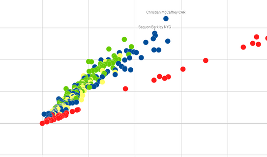
My expression:
Result:
Color Function
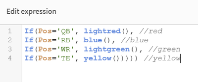
We can also use the many color functions defined in Qlik Sense. There are 16 defined colors: black(), darkgray(), lightgray(), white(), blue(), lightblue(), green(), lightgreen(), cyan(), lightcyan(), red(), lightred(), magenta(), lightmagenta(), brown(), yellow(). One thing to be aware of when using the predefined color functions is that you will lose the ability to match exactly to the color that you are envisioning.
My expression:
Result:
As you can see, there are many ways to achieve your desired color palette. Becoming familiar with these powerful functions can help to take you Qlik development skills to the next level. Happy Qlikking!
-
Coalesce and EmptyIsNull Functions
There are two script and chart functions that I recently became aware of that I will start to use in future scripts. They are: Coalesce and EmptyIsNul... Show MoreThere are two script and chart functions that I recently became aware of that I will start to use in future scripts. They are: Coalesce and EmptyIsNull. In this blog, I will explain how they both can be used. Let’s start with the Coalesce function.
Coalesce
coalesce(expr1[ , expr2 , expr3 , ...])
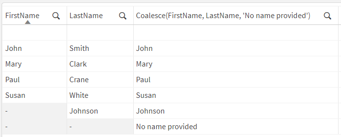
According to Qlik Help, the Coalesce “function returns the first of the parameters that has a valid non-NULL representation.” This function can take an unlimited number of parameters. Let’s see it in action. In the table below, there are two fields: FirstName and LastName. The last column uses the Coalesce function to check first the FirstName field and then the LastName field for any non-NULL values. The first one found is returned. If neither the FirstName or LastName fields contain a value, then the last parameter (the default) is returned. In this example, that is “No name provided.”
You can see that when there is a first name in the FirstName field, it is returned and when there is not a first name but just as a last name in the LastName field, the last name is returned as seen with Johnson. The last row in the table did not have a first name or last name, so the default “No name provided” is returned. The first row has an empty string in both the FirstName and LastName fields, so an empty string is returned by the Coalesce function.
In the future, I will use the code below when I want to replace fields that are empty with a value.
I would replace expressions like this:
If(Len(Gender)>0, Gender, ‘Unknown’)
With this expression:
Coalesce(Gender, ’Unknown’)
EmptyIsNull
EmptyIsNull(exp )
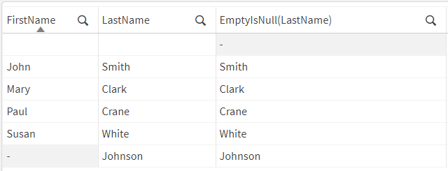
The EmptyIsNull function converts empty strings to NULL. In the first row of the table below, FirstName and LastName are empty strings. When using the EmptyIsNull function in the last column, you can see that it returns NULL in place of the empty string in the LastName field. Whereas in the other rows (rows 2-6), the last name is returned.
When I have a field that is not 100% populated, I sometimes replace the empty strings with NULL. In the past, I would use an expression like this:
If(Len(Gender)=0, Null(), Gender) or If(IsNull(Gender) or Gender=’’, Null(), Gender)
Now, using the EmptyIsNull function, I can shorten my expression to this:
EmptyIsNull(Gender)
The Coalesce and EmptyIsNull functions are less complex and effective for use in chart expressions and in the script. Test them out the next time you need to replace empty strings in a field.
Thanks,
Jennell
-
Students securing opportunities after learning from the Qlik Academic Program
Increasingly, students enrolled into the Qlik Academic Program have at their disposal various opportunities to forward their career. Students are secu... Show MoreIncreasingly, students enrolled into the Qlik Academic Program have at their disposal various opportunities to forward their career. Students are securing internships and jobs within Qlik and with customers and partners of Qlik across the globe.
The academic program provides free resources in the form of online training, qualifications and certification to students and professors. The program offers structured pathways to become a Qlik Sense Business Analyst and Qlik Sense Data Architect after which students can appear for the exams and get their certifications. This program has been quite popular with more than 26,000 students from 2400+ Universities leveraging these free resources. Being industry developed makes it more relevant to the market demands.
Relationship between National University of Singapore ( NUS) has been thriving and students from National University of Singapore (NUS) have enrolled into the program quite regularly. The Singapore office of Qlik has recruited from the University which has resulted in a successful partnership between Qlik and NUS. The academic program continued to build engagement with NUS with various initiatives.
Another recent example is that of Sri Vishnu Educational Society ( SVES) in India which has more than 250 students and Professors enrolled into the Qlik Academic Program. Data analytics start up Diagonal wanted to recruit Qlik trained students for its expansion plans. The company consults technology clients in data analytics and for its projects and they wanted students who are up to speed in analytics and Qlik technologies so that they could be deployed on their projects immediately. The academic program was supportive of this initiative and facilitated the engagement between BVRIT and Diagonal.
Qlik has an R&D Centre in Bangalore and they have a continuous requirement of qualified candidates. Recently, they advertised their requirement for interns for their R&D projects. These projects are great opportunities for students to learn latest advancements in analytics technologies and fast forward their career. With the help of the academic program, the R&D team at Qlik are able to meet their requirements.
Many such opportunities are sprouting for students across the globe and the Qlik Academic Program continues to bridge the skills gaps for analytics trained resources. If you are a student or Professor and wish to know about the academic program and learn from its free resources, visit: qlik.com/academicprogram or email: academicprogram@qlik.com
-
Move QlikView Bookmarks to the Qlik Sense Hub to Accelerate Your Cloud Transitio...
When modernizing your analytics, it’s key to balance the value you derive from current solutions, while taking advantage of the latest technology. The... Show MoreWhen modernizing your analytics, it’s key to balance the value you derive from current solutions, while taking advantage of the latest technology. The goal of modernization is to expand capabilities, enhance performance and governance, and decrease the total cost of ownership for analytics.
For QlikView customers like you, our Analytics Modernization Program is the simplest and most economical path to adopting Qlik Sense, our next-generation analytics platform, without impacting QlikView. With your new Qlik Sense entitlement, your users will be able to upload and consume QlikView apps alongside Qlik Sense apps in the Qlik Sense Enterprise SaaS hub.
As you begin using Qlik Sense, you will be able to enhance your analytical capabilities in a variety of scenarios. Therefore, when you’re ready to move some of your QlikView apps, the QlikView Object Migration for Cloud utility automates the transition of bookmarks from QlikView apps in the Qlik Sense Enterprise SaaS hub. It does this by gathering user ID and e-mail addresses via Active Directory and mapping bookmark ownership between QlikView Server users and Qlik Sense Enterprise SaaS users. QlikView Object Migration for Cloud simplifies and expedites access to the data insights your users require. Additional details on ways the utility works can be found on Qlik Help.
We encourage you to save time and drive faster and more relevant insights with QlikView Object Migration for Cloud. We plan to also migrate additional objects in the future. QlikView Object Migration for Cloud is available for download here.
-
Building a Visual Text Analytics app using Qlik and Machine Learning techniques ...
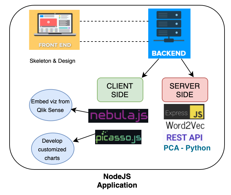
Welcome to the 2nd part of developing a Visual Text Analytics app using Qlik’s open-sourced solutions and a Word embedding technique(Word2Vec). In our... Show MoreWelcome to the 2nd part of developing a Visual Text Analytics app using Qlik’s open-sourced solutions and a Word embedding technique(Word2Vec). In our previous tutorial , we designed a simple architecture(seen below) for the application that we will learn to develop today.
Now, let us try to understand the need for each of these components and their role in our app.
Front-end : This is the UI of the app that will help the user interact and derive insights.
Back-end : Consists of 2 sub-components.
Client-side - This is where we have the Qlik’s visualization libraries Nebula and Picasso.js.
Server-side - develop the APIs here.
CLIENT-SIDE:
So, why do we use two charting libraries from Qlik? Let’s break it down.
For me, when I develop a full-stack solution, I think one of the things that I look into is how to build things quickly and efficiently. Since I have a lot of other components to develop or work with, I want to make sure I don’t end up devoting a significant amount of time to building things from scratch. Nebula.js helps me in this case. It allows me to quickly embed a chart that has already been developed in a Qlik Sense app and use it in my way. All I have to do is to render it in my Visual Analytics app with something like this -
nuked.render({

    element: document.querySelector(".object"),

    id: "XHRqzeG"

  })
The second visualization library that I leverage here is Picasso.js. Picasso enables me to build custom, interactive, component-based visualizations. One of the things that I was looking for with this specific solution was to process textual data, specifically do the word embeddings and return the result of the word embedding to a chart so it helps me in presenting the data visually (note that we are developing a Visual Analytics app).
This is where Picasso.js fits in. It has a similar way of working as D3.js and allows me to work with 2D matrix and array of Objects. I can also use the data as I want in various components of the chart, making it very flexible. Here’s a snippet of how I used my transformed data in a Bar chart.
.then(response => response.json())

      .then(data => {

        var js_data = [data];

picasso.chart({

          element: document.querySelector(".container"),

          data: [{

              type: "matrix",

              data: data

            }]

})

});
Great! So, the gist is -
Nebula.js - embed already developed Qlik Sense charts (it is quick and easy). Also allows for selections & Qlik specific features.
Picasso.js - develop a customized chart (use data as we would like to build various chart components)
SERVER-SIDE:
The major chunk of our backend is the Server-side component where we develop our APIs. We use the Express.js framework here that helps us to manage routes, requests, etc.
What specific APIs do we have in this app?
/wordembed : This is the API to perform word embedding using Word2Vec. In this case, we take advantage of the NPM package(https://www.npmjs.com/package/word2vec) which provides a Node.js interface to Google’s Word2Vec implementation. We will be sending the results of the embedding to a Picasso Bar chart.
/data : Read data processed from Python’s implementation of Principal Component Analysis(PCA) and send it back to a Picasso Scatter plot to visualize the principal components.
Alright! So, we have everything that we need component-wise. Now, let’s quickly understand two things and their need in this solution -
Word Embedding - Word2Vec
Principal Component Analysis(PCA)
This is where the Machine Learning part comes to play and is key to developing a Visual Text Analytics app like this one.
Since this tutorial is not focused on the implementation of word embeddings/Word2Vec but rather touches upon it from more of an application perspective, we will not delve into details. Simply put, word embedding captures the essence of a word, i.e. their meanings, context, and semantic relationships and converts them into numerical representation (a vector).
For e.g. the word ‘sativa’ can be represented by something like this :
sativa -0.441052 -0.247968 0.463302 0.086262. Please note that the vectors are generally very high-dimensional (in our case we have 300 dimensions).
So, how do we get these vectors?
To derive the vectors, we use the word2vec function like below where
const w2v = require("word2vec");
w2v.word2vec("cleared_word_embedding.txt", "vectors.txt",
{ size: 300 }, () => {
console.log("generated");
}
);
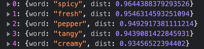
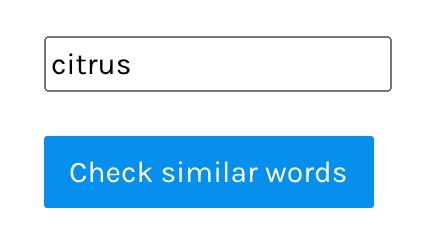
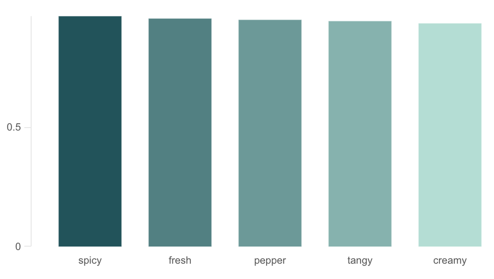
These vector representations can then be applied to some interesting use-cases. One of the key tasks that we do by using the vectors in this project is to calculate similarities between words (commonly calculated using cosine_similarity). So, in the front-end, we allow users to input any word of their choice and they will be visually presented with a chart representing the most similar words. Something like this:
This is extremely beneficial for performing text-based analysis. For example, if a user searches for the word ‘citrus’, our Visual Analytics app will present something like this:
Here we can see that the context of the word is maintained by the word embedding model and the user is returned with the top 5 most similar words(in descending order) - which are flavors again. If the user wants to then continue their analysis with any other flavor, they can start with the relevant & similar ones. Our API looks like below:
app.post("/wordembed", (req, res)=>{

  var val = req.body.hi

  const w2v = require("word2vec");

  w2v.loadModel("vectors.txt", (error, model) => {

  var sim = model.mostSimilar(val, 5)

 res.send(sim);

});

})
The second part is the Principal Component Analysis(PCA) part. PCA is a technique used to reduce the dimensionality of a high-dimensional dataset (like text, images). As high-dimensional data is very difficult to analyze and visualize, an ideal choice would be to reduce the dimensions by preserving as much information as possible.
Right, but why do we use it in this project?
I wanted to allow users to visualize the words in our vocabulary in 2-dimension so they can explore similarities between them effectively. The best way was to present this information in a Scatter plot. For this specific project, I used the sklearn’s python implementation of PCA and imported the coordinates in my /data API like below:
app.get("/data",(req, res)=>{

const path = require('path');
const csv = require('fast-csv');
const data = []
fs.createReadStream(path.resolve(__dirname, '../pca_words.csv'))
    .pipe(csv.parse({ headers: true }))
    .on('error', (error) => console.error(error))
    .on('data', (row) =>
        data.push(row)
    	)
    .on('end', () => {
  res.send(data);
  })

})
Here is the visualization for the PCA projection.
As you can see, words such as ‘depression’, ‘appetite’, ‘relief’ are in close proximity since they are similar. Logically that makes sense as well since these are a couple of things that can be treated using the strains.
Here is the application in action:
This brings us to the end of this tutorial on developing a Visual Text Analytics app using Qlik’s open-sourced solutions and Machine Learning techniques such as Word embeddings.
Want to get started building such an app? Here is a Glitch for developers to remix.
PS: you will not be able to see the visualizations when you open the Glitch due to authentication reasons. This code is expected to serve as a boilerplate for developing visual text analytics app using Qlik OSS.
-
Building a Visual Text Analytics app using Qlik and Machine Learning techniques ...
Qlik Full-stack? APIs? Machine Learning?If these topics sounds interesting to you, this series(Part-1 & 2) might be your starting point.Today, we are ... Show MoreQlik Full-stack? APIs? Machine Learning?
If these topics sounds interesting to you, this series(Part-1 & 2) might be your starting point.
Today, we are going to talk about one particular area within Visual Analytics i.e., Visual Text Analytics. This tutorial will focus on the nitty-gritty of this area of research and in my next post, I will do a step-by-step tutorial of how you can actually develop the application.
VISUAL TEXT ANALYTICS:
With the surge in the generation of digital text on the web in the form of product reviews, descriptions, feedback, etc., there has been a demand for leveraging text mining techniques to understand and analyze these unstructured data. Typically organizations would like to be able to identify patterns, specific keywords(that make an impact), similarities, etc. through text mining. However, the challenge in analyzing hidden patterns from a large noisy text corpora can be huge and at times daunting for analysts. To mitigate the challenge in the discussion, this research area aims to bring text mining, text visualization, and Human-Computer interaction together to make sense of the data.
SOLUTION:
In the past, I have built a couple of Visual Text Analytics applications using technology stack such as - D3.js, Plotly/Dash, Python Flask(for APIs), etc., and thought it might be interesting to try developing an app using Qlik Sense’s open-sourced solutions. Primarily, for this blog, we will be looking at two of Qlik’s frameworks - Nebula.js and Picasso.js. If you are not aware of them, here is a quick gist:
So, what will be building?
My idea is to build an Exploratory visual analytics app to discover insights from a Cannabis dataset. This will be a full-stack application to analyze the various components such as ‘Effects’, ‘Flavors’, ‘Type of cannabis strains’ and ‘Description’. In this particular dataset, the ‘Description’ field is textual and contains a particular strain’s summary. So, this field will be our focus for the textual analytics part. Below is an example of the ‘Description’ field:
Strain(A-10): A-10 has an earthy, hashy taste that provides a very heavy body stone. frequently used to treat insomnia and chronic pain.
To start developing the application, I have designed a high-level architecture to portray the various components involved in building the app. Hopefully, this will give a better picture for our next steps.
We will understand each of these components in details in our next tutorial and see them in action as we finish developing the app.
-
Free Workshops: Build Your First Qlik Sense App
In this workshop, you will learn how to build a Qlik Sense application and experience some of the functionality and add on products that will increase... Show MoreIn this workshop, you will learn how to build a Qlik Sense application and experience some of the functionality and add on products that will increase data awareness and availability in your company.
Learn how to accelerate your ramp up and implementation of Qlik Sense through various Qlik training options...with a special offer at the end of the workshop. 3-hour sessions will be held weekly in multiple time zones and languages.
Space is limited, so register today using below link to secure your spot!
Receive 50% off coupon for a public, instructor-led training class at the end of the workshop!

-
Qlik Sense for Project Portfolio Management
Happy Tuesday Qlik Community!! This week on the Design Blog I have the pleasure of introducing our newest guest blogger, Lee Matthews. Lee comes to us... Show More
Happy Tuesday Qlik Community!! This week on the Design Blog I have the pleasure of introducing our newest guest blogger, Lee Matthews. Lee comes to us from the opposite side of the world, well at least from where I am anyway.
 I mean really, as I get ready for winter he is getting ready for summer. Lee is a Principal Solution Architect with Qlik and is based in Melbourne, Australia. He joined Qlik in 2011 but has been working in the Business Intelligence field with various ERP and CRM vendors for over 20 years. Prior to that he was a management accountant. He therefore has a long history of working with data and reporting systems for organizations. When not tinkering with Qlik applications for clients, he enjoys tinkering with robots, making things out of wood and teaching these skills to his two boys. We are excited to have your contribution on the Design Blog Lee!
Effectively managing your projects with Qlik Sense
As a Solution Architect with Qlik I get the opportunity to work with many different organizations and to show them how Qlik can solve their problems and add value to their business. One common problem I see across larger enterprises is the need to effectively manage projects and to monitor resourcing for those projects. Often the reporting capability of project management systems is limited, or reporting across the entire portfolio of projects is something they are not designed to do.
This is where Qlik can add great value, in answering questions such as:
- Which resources are over or under utilized?
- Are there any project managers or locations that seem to be struggling to deliver successful projects?
- Are there any projects that should be cancelled, as they are not delivering value?
Below is a video I created that demonstrates a Project Portfolio Management application while covering many of the unique and powerful capabilities available in Qlik Sense. This application was developed as an example of how you might use Qlik Sense to analyze your entire project portfolio. It takes some concepts and approaches that different clients use in their businesses. Also worth highlighting is that this app uses a custom KPI object developed using the Widgets functionality built into Qlik Sense. Widgets allow you to develop your own visualizations with just a bit of HTML and CSS. You can learn more about Widgets in this quick video primer created by Mike Tarallo here: Qlik Sense 3.0 - Widget
(I attached this widget for you to play with. If using Qlik Sense Desktop 3.X, just extract the .zip file to your C:\Users\<user_id>\Documents\Qlik\Sense\Extensions directory. Qlik Sense Enterprise Server users will want to use the QMC to import the widget using the Extensions import utility.)
Regards,
Lee Matthews
Qlik
Using Qlik Sense for Project Portfolio Management
NOTE: To increase resolution or size of the video, select the YouTube logo in the bottom right of the player. You will be brought directly to YouTube where you can increase the resolution and size of the player window. Look for the 'settings' gears icon in the lower right of the player once at YouTube. If you cannot see the video, you can download the .mp4 file attached to this post.

-
Retail challenge for University of Alcalá students
Yesterday the Qlik Academic Program ran a workshop for students at the University of Alcalá in Spain to get their first experience with Qlik Sense. A ... Show MoreYesterday the Qlik Academic Program ran a workshop for students at the University of Alcalá in Spain to get their first experience with Qlik Sense. A group studying for master’s degrees in Data Science and Business Intelligence participated in the hands-on workshop which focused on a case study using Qlik in a fictitious retail company. The Head of Sales, Marketing, IT and the CEO all had questions that they wanted the data to answer, so the students were tasked with creating a Qlik Sense application and story to meet the various stakeholder’s requirements. Also, at the end of the session the students participated in a quick fire Kahoot quiz to test their abilities to make quick discoveries in their data using Qlik Sense.
For many of the students, this session was their first introduction to Qlik, so they were provided with a written step by step guide to the exercise, plus a live demo by Qlik instructor Sara Del Pino, with support from Laura Gutierrez. These sessions are a great way for students to get practise using Qlik Sense with guidance from experts. Also they are a good opportunity for students to experience the types of requirements that they could face in a business analyst position.
Did you know that Qlik hosts a Build Your First Qlik Sense App webinar every week? These sessions are completely free of charge, hosted by our brilliant instructors and a great introduction for anyone starting out with Qlik.
If you are a university student or educator you can also join our Qlik Academic Program for free, to get access to Qlik Sense software, training and qualifications as well as access to our live webinar series. For more information or to sign up visit qlik.com/academicprogram.
-
How To Use NPrinting APIs In A Qlik Load Script
Task chaining is here! We are delighted to announce that one of the most requested features for Qlik NPrinting is now available with our February 2018... Show MoreTask chaining is here! We are delighted to announce that one of the most requested features for Qlik NPrinting is now available with our February 2018 release.
If you thought that Qlik NPrinting 17 triggers were only time-based and prevented you from creating event-based dependencies on other Qlik tasks, (such as app and data reloads) then think again. This functionality is now available out-of-the-box using the Qlik NPrinting APIs and a Qlik load script!
You can now seamlessly run tasks that represent the typical workflow for a Qlik NPrinting report. Using the publicly available APIs, you can reload Qlik NPrinting connection metadata, update user information and run a publish task, all following a Qlik data and/or app reload.
You can also institute a poling mechanism to ensure that one task is complete before starting a subsequent one.
The technical details and examples can be found here: https://community.qlik.com/thread/292037 (even though the example uses Qlik Sense, this can be done just the same in a QlikView load script).
Please note that this functionality was made possible by the resolution of a bug related to the Qlik REST connector. You will need the REST connector v1.3 which is part of the February 2018 release of Qlik Sense, or it can be downloaded separately and copied over the old REST connector.
Our long-term vision for reporting involves exposing the Qlik NPrinting tasks in the QMC, however this is a first major step toward integrated scheduling

-
Price Monitoring App
The app was built to monitor price positioning on the market and shows the comparison with other players on the perimeters of interest.