Unlock a world of possibilities! Login now and discover the exclusive benefits awaiting you.

Analytics & AI
Forums for Qlik Analytic solutions. Ask questions, join discussions, find solutions, and access documentation and resources.
Data Integration & Quality
Forums for Qlik Data Integration solutions. Ask questions, join discussions, find solutions, and access documentation and resources
Explore Qlik Gallery
Qlik Gallery is meant to encourage Qlikkies everywhere to share their progress – from a first Qlik app – to a favorite Qlik app – and everything in-between.
Qlik Community
Get started on Qlik Community, find How-To documents, and join general non-product related discussions.
Qlik Resources
Direct links to other resources within the Qlik ecosystem. We suggest you bookmark this page.
Qlik Academic Program
Qlik gives qualified university students, educators, and researchers free Qlik software and resources to prepare students for the data-driven workplace.
Recent Blog Posts
-
Community Enhancements (2021 - 5)
Hello Members! The last few months have been loaded with enhancements and we hope that you continue to enjoy the Qlik Community space. There has been... Show MoreHello Members!
The last few months have been loaded with enhancements and we hope that you continue to enjoy the Qlik Community space. There has been no shortage of work requests for our small Community team that boasts one new member - please help me welcome @Jamie_Gregory, to the Qlik Community family! Jamie will be focusing on managing the back end of our Khoros platform ensuring website reliability, scalability and top notch performance.
The month of July has been busy!
- We featured the one and only @rwunderlich. Rob is known for more than his cool and stylish hats - he has helped thousands of our members! He is remarkable in many ways and we can't thank him enough for all he does for our Qlik Community.
- We also are starting to infuse more 'fun' into the community. This month @t_schueller was our first Talk to Experts SWAG winner! Congratulations and thank you for participating in one of our Talk to Experts events!
- Up next... help us rename the Qlik Community Daily Digest! Contest details to roll out soon.
Below are the community enhancements that rolled out on Tuesday, July 13, 2021:
- Product Mentions
Be still my heart ❤️ product mentions is here to stay and we just LOVE this new feature. In community posts, you can now use hashtags to mention products in the message body. These product mentions then appear as hyperlinks and take users to a Product page in the community. Read this to learn more about how to use this new feature or watch below.
2. Event Content on Forum Pages
Our product forums are our most heavily visited pages in the community so it was a no-brainer to add event information here making it easier for members to stay informed. In this limited deployment, you will see event information on the right navigation of all Data Analytics product forums and yes we have plans to expand to other forums over time. Product mentions, guest information, and RSVP capability is now possible. You need to still click into the event to register and add-to-calendar.Coming soon to Qlik Community... Livestreaming! 😀 😎
3. Event Subscription Badge
Another new gamification badge has been added to the Qlik Community. To earn it all you have to do is subscribe to the Events and Webinars page. Go!
4. Error Message Updated
We have corrected an error message users would receive when attempting to access a post that has been archived. The error message previously did not make much sense or prove very helpful. Now, it will better explain that the post has been archived and will tell you who to contact if more help is needed.5.Qlik Academic Program
Sporting a fresh new look and located on the navigation under "Forums / Learn" is where you can find details about the Qlik Academic Program. There is something for everyone here and we encourage you to check it out! If you have any questions about the program please contact @Sarah_Miller.6. Release Notes (updated)
We continue to listen to feedback and make improvements to the Release Notes page on Qlik Community. This month, we:- Added more filtering capabilities
- Renamed column "Release No" to "Patch"
- Created a How-To guide for new members
- More language options (Japanese added)
We hope you love all the updates this month. Let us know what you think by leaving a comment or you can private message us @Melissa_Potvin @Sue_Macaluso @Jamie_Gregory
Stay well everyone and thank you for being a part of our Qlik Community.

-
Qlik Replicate BETA Certification Exam - Be the first to get certified!
Important Details of this BETA Exam:Purpose of BETA Exam: to gather statistics on the new exam questions, which will be used to create the final, prod... Show MoreImportant Details of this BETA Exam:
Purpose of BETA Exam: to gather statistics on the new exam questions, which will be used to create the final, production exam.
Audience: The BETA exam is open to Qlik employees, partners and customers with Qlik Replicate expertise. This BETA exam is not intended for new Qlik Replicate users.
Cost: Only $75 and seats are limited
Important Dates:
- Exam registration opens: July 15th
- Exam registration closes: August 20th
- Available for testing**: August 9th
- Last day to take test**: August 27th
**Exams can only be taken in a Pearson Vue Test Center; Online proctoring will not be available. PLEASE REGISTER IMMEDIATELY to ensure availability in your local test centers.
Exam length: 3 hours (180 minutes)
Promo code REQUIRED: QREP@2021 - This code is entered on the final payment screen.
You are encouraged to add comments during the exam to help us select the best questions. You will have 3 hours to complete 100 questions.
After the final exam has been developed, your beta results will be scored against the final exam questions. (Only 50 questions are scored based on how they perform during the BETA exam.)
If you receive a passing score, you will be among the first to be awarded the certification for Qlik Replicate – February 2021 Release.
CALL TO ACTION: Reserve your seat immediately at Pearson VUE with the promo code QREP@2021 to ensure test center availability. For questions, please contact Certification@qlik.com.
-
This week on Do More with Qlik - Share, Deliver, Collaborate June 15th 10AM
RegisterThis week on the next Do More with #Qlik - 7/15 10AM ET Learn how collaborative notes allows users to add narrative and context to their analy... Show MoreRegister
This week on the next Do More with #Qlik - 7/15 10AM ET
Learn how collaborative notes allows users to add narrative and context to their analytics by creating discussions with others actively around data and see how easy it is to schedule document delivery of your most important insights directly to your inbox.You won’t want to miss these, so be sure to register today!

-
Combo Chart Enhancements
There have been many improvements made to the combo chart in the SaaS edition of Qlik Sense this year. In this blog, I will review some of the highlig... Show MoreThere have been many improvements made to the combo chart in the SaaS edition of Qlik Sense this year. In this blog, I will review some of the highlights. My favorite improvement of them all is the ability to view the combo chart horizontally. Some other enhancements include:
- the ability to have a bar on the secondary axis
- the ability to have reference lines for both dimensions and measures
- the ability to style each measure with an unique color
- additional styling capabilities
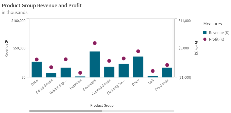
If you have used a combo chart in the past, you may remember that you were only able to view the chart vertically. For example, in the combo chart below, I am showing the revenue and profit for the Product Groups. Revenue and Profit each have their own axis. This vertical layout works well when looking at measures over time, but it is not always ideal when showing longer x-axis labels as seen below.
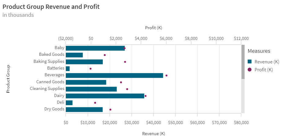
Now, imagine this chart in a horizontal position. When the x-axis has text that can be lengthy, I like to view it horizontally because it is easier to read the labels on the y-axis and they often do not get truncated. See the image below of the same chart viewed horizontally. Here the y-axis labels are easier to read.
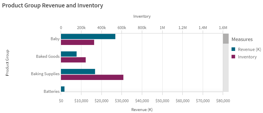
In the SaaS edition, you can also view bar charts on the secondary axis in a combo chart. In the past, line and markers were the only options for the secondary axis. In the chart below, the Revenue and Inventory measures are both bars and have two separate axes allowing me to compare them along the same dimension (product group).
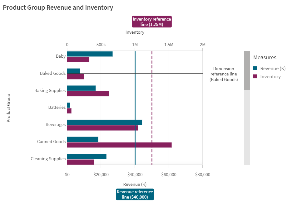
Reference lines can be added to the primary and secondary axes as well as to dimensions in the Add-ons section in the properties panel. In the chart below, a reference line is added to both measures and the dimension.
There are also a few style preferences that can be set for reference lines. The color of the line can be set, the style of the line can be solid or dashed and a background can be added to the reference line label. If a background is selected, it will have the same color as the reference line. Regardless of what you use for your measure (bar, line or marker), each can be colored by selecting a single color or by using an expression.
The improvements made to the combo chart so far this year are great. Consider using one the next time you need to compare two measures on the same dimension. Check out Qlik Help to learn more about the combo chart and click here for more details about the combo chart properties.
Thanks,
Jennell
-
Qlik Community - Working together to achieve greater success
The Qlik Community currently has 97,142 register members from around the world. In which over 2,000 could be online almost at any time! We are s... Show MoreThe Qlik Community currently has 97,142 register members from around the world. In which over 2,000 could be online almost at any time! We are seeking answers to questions, helping others find solutions, informing the Qlik team of product issues, or simply browsing the extensive library in search of valuable content. Qlik Community members have varying skills that range from newbies to “Jedi Masters” 😀 . BUT – our members are not just limited to posting questions and providing answers to one another, they also post solutions and helpful tutorials about various Qlik products, deployment scenarios and situations.
Which brings me to introducing @rohitk1609 (Rohit Kumar). Rohit has reached out to me in an effort to highlight and share some of the fantastic information he has created when working with the Qlik Analytics Platform.
Rohit is a Sr. Business Intelligence Administrator in New Delhi, India and is ranked as a Contributor III in the Qlik Community. His 8+ years of experience with Qlik products, consulting and implementing BI solutions has prompted him to create and share what he has learned when deploying many instances of Qlik Sense. Currently, his primary role is to deploy and manage Qlik multi-node sites - which are robust, scalable and highly reliable. Rohit did not find a particular document that explained everything he needed to know when it came to deploying a Mulit-node Qlik Sense site and thus made an effort to publish the steps he followed, including consolidating many of the Qlik Help materials to help guide you towards a successful multi-node deployment. He also has answered many questions posted to his document thread and will be happy to answer any of yours.
• Best Practices of Qlik Sense Multi-Node Setup, Load Balancing & MaintenanceI'd like to thank Rohit for his contribution and I encourage all of you to share what you have learned when working with Qlik so others may also benefit from it. The Qlik Community – works together to achieve successful outcomes through conversation and collaboration.
Do you have a valuable Qlik product contribution or solution? Contact me and I will share it on the Qlik Design Blog.
Regards
Mike Tarallo - follow
Senior Product Marketing Manager
Qlik
-
Qlik Sense Tips and Tricks!
Great news for new Academic Program students and educators, back by popular demand, the Qlik Sense tips and tricks webinar has returned! Join Qlik exp... Show MoreGreat news for new Academic Program students and educators, back by popular demand, the Qlik Sense tips and tricks webinar has returned! Join Qlik experts on July 8th for the lowdown on how to get the most out of your data. Register today https://lnkd.in/dv9reyM
If you aren't already part of the Qlik Academic Program, visit us to learn more and apply today! https://www.qlik.com/us/company/academic-program . Qualified students and educators will receive a year of FREE Qlik Sense, a year of FREE product and data literacy training, opportunities to earn certificates, and more!

-
Qlik's Data and Analytics Product Release - May 2021
Starting with Data Integration, this release delivers key capabilities that expand business value across multiple use cases. Qlik Replicate May 2021 ... Show MoreStarting with Data Integration, this release delivers key capabilities that expand business value across multiple use cases.
- Qlik Replicate May 2021 now has more endpoints (data connectivity) including SAP HANA log-based CDC, SAP mainframe RDBMS support, Kafka improvements with Confluent Schema Registry, Google Big Query support for cluster tables, and new global transformation capabilities.
- Qlik Enterprise Manager introduces new audit trail APIs for greater governance.
- Qlik Compose focuses on improving the user experience and performance of Data Warehouses and Data Lakes, and adding support for Azure Synapse data types such as NVARCHAR.
Within Data Analytics, today’s release of Qlik Sense Enterprise Client-Managed edition (Windows / on-premise) provides some of the same great innovations recently released to Qlik Sense SaaS, but there are also some unique platform updates specific to Windows that provide expanded support, better performance, and improved UI.
Much of today’s release offers features and capabilities hat have already released into our SaaS edition over the past few months. These include improvements to Insight Advisor Search and Chat, visualizations, connectors, and more. Since the transition to continuous delivery, we are hearing positive feedback from our customers on our accelerated delivery to cloud approach, offering new capabilities each week to drive greater value from our SaaS offering. For a complete recap of recent features delivered to SaaS, subscribe to RSS SaaS change log on our help site. You can also quickly experience some of these features for yourself by viewing our SaaS in 60 Playlist on YouTube.The May 2021 release helps our customers continue their journey to Active Intelligence evolving from passive data consumption to informed action – starting with data working with any Qlik Sense Edition.
To stay informed on “what’s new” and what’s next, check out qlik.com/roadmap – our one-stop web page for everything related to product innovation and direction.
NOTE: During QlikWorld, don’t miss the product strategy and roadmap breakout session with Kathy Hickey, Ian Crosland, and Bob Vecchione to better understand how we are delivering on our vision of Active Intelligence.Don't forget to register to become a Qlik Insider for more detail on this release and a peek into what is next. Register Here.
- Qlik Replicate May 2021 now has more endpoints (data connectivity) including SAP HANA log-based CDC, SAP mainframe RDBMS support, Kafka improvements with Confluent Schema Registry, Google Big Query support for cluster tables, and new global transformation capabilities.
-
Qlik Sense Business Analyst Certification BETA Exam - Now Full!
For questions, please contact Certification@qlik.com. -
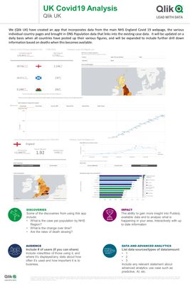
UK Covid19 App
Using data from Public Health England and other publically available datasets, bringing more analysis and insight into what is happening across the va... Show MoreUsing data from Public Health England and other publically available datasets, bringing more analysis and insight into what is happening across the various countries in the UK in relation to Covid19, predominately looking at case information at Health Region / Local Authority level (depending on country) and deaths across time at country level. Will be updated daily once the various countries have produced their updates.
Please find a link below:
-
Qlik - Job History Dashboard (Blendr)
Download the latest version from GitHub: Dashboard (qvf) and blend w/ Amazon S3 (json): https://github.com/apamo/blendr_job_logs_s3 Dashboard and bl... Show MoreDownload the latest version from GitHub:
- Dashboard (qvf) and blend w/ Amazon S3 (json): https://github.com/apamo/blendr_job_logs_s3
- Dashboard and blend w/ Dropbox (json): https://github.com/apamo/blendr_job_logs_Dropbox
*The blend is a json file you can upload to your SaaS tenant in Blendr (Qlik's application integration platform) to fetch all your customers data and send it to a file storage like Amazon S3 or Dropbox.
I hope you find this monitoring solution useful.
-
Xi’an Jiaotong-Liverpool University in China promotes the Qlik Academic Program
Xi’an Jiaotong-Liverpool University (XJTLU is an international joint university based in Suzhou, Jiangsu, China. Founded in 2006, it’s a partnership b... Show MoreXi’an Jiaotong-Liverpool University (XJTLU is an international joint university based in Suzhou, Jiangsu, China. Founded in 2006, it’s a partnership between the University of Liverpool and Xi'an Jiaotong University and is the first Sino-British joint venture between research led universities.
The University primarily focuses on science, technology, engineering, architecture, and business with a secondary focus in English. It is recognized by the Chinese Ministry of Education as a "non-profit" educational institution.
Within XJTLU, there is International Business School Suzhou (IBSS) which has a Data Mining Lab to promote initiatives in Learning & Teaching in the field of Data Analytics.
The IBSS Data Mining Lab was established in November 2015 in order to support research-led initiatives in data technology driven management and accounting practices related for Research, Learning and Teaching.
As a part of its initiatives to promote data analytics, the data mining lab organized a “Summer School Bootcamp” where students were required to create a dashboard using a data analytics software solution using Qlik Sense. Participants were required to demonstrate the benefits of data analytics technologies for implementation of a strategic plan for MPP, a private company. There are plans to organize a similar boot camp this year.
Professor Yves-Jean LeCorre leads the initiatives of this lab and is promoting the Qlik Academic Program in IBSS Data Mining Lab. To learn about this lab, visit: https://connect.xjtlu.edu.cn/user/jeanyves-lecorre/datamininglab-ibss
To know about the Qlik Academic Program and its free data analytics resources, visit: qlik.com/academicprogram
-
Fact Table with Mixed Granularity
A common situation when modeling the data for a Qlik application is that you have several fact tables and the fact tables have mixed granularity. An... Show MoreA common situation when modeling the data for a Qlik application is that you have several fact tables and the fact tables have mixed granularity. An example is budget vs. actual numbers, where the budget typically is made on a higher level than the actual numbers, e.g. the budget has regions instead of specific customers and months or quarters instead of specific dates.
It could also be that you want to have different granularity in a mixture, e.g. you want full details for the numbers for the current year, but – due to the amounts of data – you want to compare these to aggregated numbers from previous years.
In a Qlik data model, it is possible and not very difficult to use a fact table with mixed granularity. Say for instance that you have a detailed fact table with the numbers for current year:
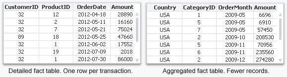
In addition, you have an aggregated fact table for previous years: Instead of CustomerID, ProductID and OrderDate, you have Country, CategoryID and OrderMonth as foreign keys.
The solution is to concatenate these two tables into one common fact table and use generic keys for the three dimensions.
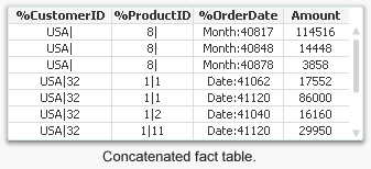
The generic keys contain information about both the higher and lower levels of the dimensional hierarchy and can be used for either the higher level only or for both levels. This way, the detailed records of the fact table link to customer, product, and date, while the records with aggregated numbers link to country, but not to customer; to product category but not to individual products; and to order month but not to individual dates.
It can sometimes be tricky to create the generic keys because the detailed fact table lacks direct information about the higher levels in the dimensional hierarchies, e.g. country and product category. But this can be solved using the function Applymap. For the detailed part of the fact table, the generic keys can be defined as:
Applymap('MapCustomerToCountry',CustomerID) & '|' & CustomerID as %CustomerID,
Applymap('MapProductToCategory',ProductID) & '|' & ProductID as %ProductID,
'Date:' & Num(OrderDate)) as %OrderDateAnd in the aggregated part of the fact table, the corresponding definitions could be:
Country & '|' & Null() as %CustomerID,
CategoryID & '|' & Null() as %ProductID,
'Month:' & Num(MonthStart(OrderMonth)) as %OrderDateThe generic keys must be mapped to the real keys using a dimensional link table, but once this is done the application will work like a normal QlikView app.
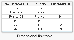
This method can be used in a number of cases where you want to define keys that link to several values simultaneously, the most common one being comparison of actual numbers with budget.
Read more about generic keys in the Technical brief on Generic Keys.

-
Qlik Compose Certification BETA Exam - Registration Extended!
Important Details of this BETA Exam:Purpose of BETA Exam: to gather statistics on the new exam questions, which will be used to create the operational... Show MoreImportant Details of this BETA Exam:
Purpose of BETA Exam: to gather statistics on the new exam questions, which will be used to create the operational exam form.
Audience: The BETA exam is open to Qlik employees, partners and customers with Qlik Compose expertise. This BETA exam is not intended for new Qlik Compose users.
Cost: Only $75 and seats are limited
Important Dates:
- Exam registration open now
- Exam registration closes: August 20th
- Available for testing**: July 14th
- Last day to take test**: Now August 27th
**Exams can only be taken in a Pearson Vue Test Center; Online proctoring will not be available. PLEASE REGISTER IMMEDIATELY to ensure availability in your local test centers.
Exam length: 3 hours (180 minutes)
Promo code REQUIRED: QCOM@2021 - This code is entered on the final payment screen.
You are encouraged to add comments during the exam to help us select the best questions. You will have 3 hours to complete 85 questions.
After the final exam has been developed, your beta results will be scored using that form. (Only 50 questions are scored based on how they perform during the BETA exam.)
If you receive a passing score, you will be among the first to be awarded the certification for Qlik Compose – February 2021 Release.
CALL TO ACTION: Reserve your seat immediately at Pearson VUE with the promo code QCOM@2021 to ensure test center availability. For questions, please contact Certification@qlik.com.
-
To Join or not to Join
The QlikView internal logic enables a data model with several associated tables. It not only allows – it encourages you to use several tables when bui... Show MoreThe QlikView internal logic enables a data model with several associated tables. It not only allows – it encourages you to use several tables when building a data model.
This is very different from many other BI or query tools where, when several tables are used, they are all are joined together into one table. The most obvious example of this difference is a simple SELECT statement. With it, you can use several tables as input and join them, but the output is always one single, denormalized table.
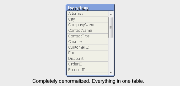
With QlikView, in contrast, you can have a multi-table relational data model that is evaluated in real-time. The associations are evaluated as joins at the moment when the user makes a selection in the application. At the same time, all objects, some with complex calculations based on these joins, are recalculated.
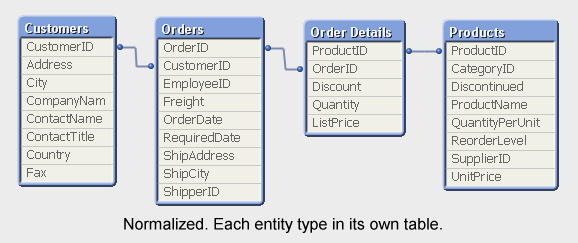
When creating the QlikView data model, you have a choice of loading the tables as several entities or joining some of them together. Joining in the script means that the result of the join is stored in the QlikView data model as one single table.
So what should you do? Is it better to keep the data model normalized (many tables) or is it better to de-normalize (fewer tables)?
My view is that it usually is better to keep the data model as normalized as possible. A normalized model has many advantages:
- It is memory efficient.
It is, by definition, the data model that uses least memory. - It is CPU efficient.
In most cases, QlikView calculations in a normalized model are as efficient - or only marginally slower - as in a denormalized model. In some cases the normalized model is faster. - It is easier to understand and manage.
It should be possible for other developers to read your script: A simple script with as few transformations as possible, is a script that is easy for other developers to understand and maintain. - It minimizes the risk for incorrect calculations.
Joins potentially change the number of records in the tables, which means that a normal Sum() or Count() function cannot always be used – they would sometimes return an incorrect result. You may counter that there is always a way to write a correct formula, but my point is that it should also be easy. Expressions in server objects will be written by users that do not have special knowledge about the data model in the app.
But it is not a clear-cut case.
Often there is a trade-off between memory efficiency and CPU efficiency. In other words, there are cases where you can decrease response time by letting the data model use more memory; where performance will be better if you make the join in the script.
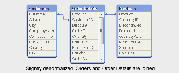
One such case is if you have two very large fact tables, like Order Headers and Order Details. An other is if you have chart expressions containing fields from different tables. Then QlikView has to perform the join in memory generating a virtual table over which the summation will be made. This can be both memory and CPU demanding, so you might get a better performance if you have made the join already in the script. But the difference is sometimes only marginal. You need to test, to be sure.
Bottom line is that you’ll have to weigh pros and cons. Don’t join unless you have to. If performance is important and you experience a noticeable improvement when you join, then you probably should join. But ask yourself what the implications are. Is the script still manageable? Can a user understand how the formula should be written?
The best join is often the one that never is made. Often – but not always.
See more about this topic in the Technical Brief about Joins and Lookups
- It is memory efficient.
-
New Member of the Qlik Community Team!
@Jamie_Gregory is a name you are sure to recognize as she has been blogging in the Qlik Community for quite some time delivering important news and i... Show More@Jamie_Gregory is a name you are sure to recognize as she has been blogging in the Qlik Community for quite some time delivering important news and information via the Support Updates Blog.
Happy to share that Jamie has transferred over to the Customer Marketing organization within Qlik, working on Qlik Communities Team. Jamie came to us from Qlik Support, where she has been since 2017. Jamie has been instrumental in driving Community-related programs from the Support side, including updates on the Qlik Support blog, interacting directly with customers and partners, and you may have seen her hosting our Community’s Talk to Experts Tuesday webinar series. Jamie also co-leads the Women In Technology ERG at Qlik!
Jamie will be responsible for managing our Khoros platform, which powers the Qlik Community. @Sue_Macaluso has been filling the role of both content moderator AND platform manager for quite some time now and we can't thank Sue enough for all her hard work and dedication to the Qlik Community.
Jamie grew up in Michigan and migrated south to attend the University of South Carolina (Go Gamecocks!), where she double-majored in Entrepreneurship and Business Information Systems. She started her career supporting target site and marketing software before supporting BI technologies. Early on, Jamie recognized the importance of building relationships with customers to ensure their happiness and confidence in the organization, skills she uses today inside the Qlik Community.
Jamie currently resides close to Qlik's Raleigh, NC office with her two fur babies, Harry Potter (miniature dachshund) and Finn (Ragdoll mix). She spends her time enjoying life with her family, including going to the pool, hiking, arts and crafts, and bike rides. As a serial hobbyist, she loves sewing and other crafts when time permits.
Qlik Community, please help me extend a warm welcome to Jamie!
All the best,
Melissa Potvin
Director, Qlik Communities
-
A Different Look on the Use of Repository Panel, Container Object and Alternate ...
After doing a couple demos recently, I noticed that some of our customers are not aware of the repository panel. It came to me as a surprise as reposi... Show MoreAfter doing a couple demos recently, I noticed that some of our customers are not aware of the repository panel. It came to me as a surprise as repository panel was introduced with QlikView 10. The repository is a QlikView app level entity that lists all sheet objects, dimensions and expressions that have been used within the current app.
The repository panel is an AJAX client only entity. A user can view the content of the repository and elect to reuse any existing chart or definition by dragging and dropping that definition out on to a sheet. A chart can be pulled from the repository panel. Exposing its properties, a user can then change the dimensionality or measures within the chart. Instant feedback gives the user immediate insight into what they have created.
How does using the repository panel benefit the users? A common reaction from IT and business process owners alike is that they may not trust their users to have the know-how to create QlikView objects. The repository panel aims to eliminate these fears by giving an opportunity to train users to reuse what is already in their app.
On my previous blog post, I explained how to setup comparative analysis on a QlikView app. I have been thinking on how to make it easier for the business users to assign QlikView objects to different alternate states and I came up with this idea of using the container object and the repository panel. The video shows the details of setting up the solution.
In the solution, I used multiple container objects where each of them is assigned to a different state. I set the presentation type of the container objects to grid mode. By using the repository panel, the users can drag and drop different objects into the container objects. As objects in a container object inherit the alternate state, the user can then create different selection states in each container object and visually compare the charts for these different selections.
This solution is a great example of showing how QlikView enables business users to remix and reassemble data in new views and create new comparisons on the fly for deeper understanding!

-
Deloitte, QUBData - Risk Monitor (analytics of world economy in COVID-19 pandemi...
You can access the English version of Risk Monitor application by the link (better from the desktop, as you'll want to dig deeper inanalytics): https... Show MoreYou can access the English version of Risk Monitor application by the link (better from the desktop, as you'll want to dig deeper inanalytics): https://riskmonitor.deloitte.ru/hub/
For Russian-speaking audience we have a short introductory video (3,5 munites, in Russian, basics on how to work with Risk Monitor app): https://youtu.be/ZRmzP6mhqxk
"Risk Monitor" is a joint project of Deloitte CIS, Qlik Russia and CIS, QUBData. The application is available both in Russian and in English, and integrates 47 data sources (open data and Deloitte’s data) and provides monitoring for Covid-19 pandemic impact on demographics, economics and manufacturing trends throughout the world.
-
Calling all Educators, do you need data sets?
One of the frequently asked questions from educators is, where can I get free data sets? That question can be difficult to answer because most analyt... Show MoreOne of the frequently asked questions from educators is, where can I get free data sets? That question can be difficult to answer because most analytics company cannot share customer data.
As a result, we have shared many free websites over the years but I wanted to remind you of a wonderful website that we partnered with called the Hub of Analytics. The Hub is a free organization founded by educators who saw the need for free data and met that need. Its free and easy. Just create an account and check it out.
For data, log into your account and go to the DATVIRONMENT and select one of the pretend companies. Then on the tab beneath you can select data, exercises and supporting materials.
The site also shares information on analytics companies and Qlik is featured!
If you are an educator or student, visit the Qlik Academic Program and apply for a year of free analytics software, training and more!
-
Is Real-Time Data Ingestion Enough?
Hey Guys! I am pleased to introduce you to today's guest blogger, Tim Garrod. Tim is an Analytics Data Architect at Qlik where he helps customers in ... Show MoreHey Guys! I am pleased to introduce you to today's guest blogger, Tim Garrod. Tim is an Analytics Data Architect at Qlik where he helps customers in their journey to modern data analytics architectures. He brings 20 years’ experience in the data and analytics space with all the satisfaction (and scars) that come from leading transformational efforts in financial services and other industries. His passion for solving complex data problems and bringing automation to the forefront of data pipelines is only surpassed by his love of family, friends, bicycling and craft-beer in Colorado. 😁
Tim has prepared a paper on how the drive to embrace a data driven culture is impacting data architectures. In this attached paper (PDF) - he identifies some key needs and common practices along with how Qlik's Data Integration platform addresses them.
Read the attached paper to learn more about:
- The Need for Automated Ingestion
- Beyond Data Ingestion
- Flexible, Centralized Real-Time Acquisition
- Automated Data Processing
Thanks for the contribution Tim!