enigma.js implements an interceptor pattern that can be useful for all kinds of stuff. The basics of interceptors is that when a message is sent or received the interceptor is invoked and the message cycle suspended. Then you can perform some actions and/or modify the request or response, and then continue the message along its journey. You can find the docs for enigma.js interceptors atenigma.js interceptors.Let's take a look at an example from the enigma.js docs which you can find atenigma.js/toggle-delta.js. This example implements a request interceptor which modifies the request and then passes it along.onFulfilled: function toggleDelta(sessionReference, request) {
// check if the request is something we want to modify:
if (request.method === 'EngineVersion' && request.handle === -1) {
// we toggle the delta protocol flag off for this request specifically:
request.delta = false;
}
return request;
},Notice that the request is mutated, and then returned. If the request is not returned, then no message requests will make it to their destination, so remember to return the request so it can continue along.Now let's take a look at a response interceptor example. You can find the full example atenigma.js/retry-aborted.jsonRejected: function retryAbortedError(sessionReference, request, error) {
console.log('Request: Rejected', error);
// We only want to handle aborted QIX errors:
if (error.code === schema.enums.LocalizedErrorCode.LOCERR_GENERIC_ABORTED) {
// We keep track of how many consecutive times we have tried to do this call:
request.tries = (request.tries || 0) + 1;
console.log(`Request: Retry #${request.tries}`);
// We do not want to get stuck in an infinite loop here if something has gone
// awry, so we only retry until we have reached MAX_RETRIES:
if (request.tries <= MAX_RETRIES) {
return request.retry();
}
}
// If it was not an aborted QIX call, or if we reached MAX_RETRIES, we let the error
// trickle down to potential other interceptors, and finally down to resolving/rejecting
// the initial promise that the user got when invoking the QIX method:
return this.Promise.reject(error);
},This interceptor is triggered when a request is rejected and retries the request a set number of times before finally returning the reject promise with the error if all the retries fail.Does anyone have any clever things they're doing with enigma.js interceptors?
...View More
Hi Guys, happy Tuesday and thanks for joining me this morning in the Qlik Design Blog. Recently at a customer site I presented a demonstration of the Associative Difference- NOT using colors, movies or fruits and vegetables - but rather, within the context of a vertical that was familiar to the customer, sales. Upon completion, the furrowed brows turned to expressions of understanding and delight. They got it and were excited to put it in to action. They were ready to freely search, explore and discover those hidden insights without being restricted, without fear of leaving any data behind. In this video I present to you a simple demonstration that has resonated very well with those I have presented it to. Enjoy.
Regards,Mike TaralloQlik
A Practical Example of the Associative Difference
Sample App is attached. You can:
import into your Qlik Sense Enterprise environment using the QMC
import into Qlik Sense Cloud
copy toC:\Users\<user>\Documents\Qlik\Sense\Apps if using Qlik Sense Desktop
...View More
Microsoft is launching a new export format for Azure Logging in the next weeks (https://docs.microsoft.com/en-us/azure/kusto/concepts/) and guess what, Power BI can already natively import this, so I wanted Qlik to read this, too.
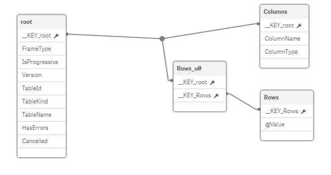
The result of the Kusto POST-Call comes as JSON (see here for a sample) but the data model created by the Qlik's REST Connector "select data" wizard was sub-optimal: All values of all tables come in just one column, while you hoped to get n tables with x columns each. So I had to massage the initial data returned.
I spare you the details on how I made the script, you can check yourself in the attached .qvf file if you like. Basically, I had to
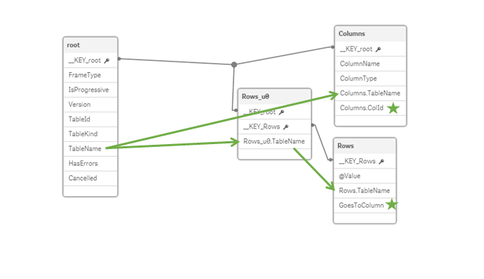
join tablename information from the root table down to other tables and
to add an auto-increment number in two tables which restarts at 1 when the foreign key changes
This is what the REST-Connector Wizard creates for you ...
After my massage with Qlik Scripting I have added necessary fields:
My script computes the correct ultimate load-statement itself, something like this (dont worry if you can't read it, it "pivots" rows into columns 🙂
LOAD Only(If(GoesToColumn = 1, @Value)) AS [Timestamp], Only(If(GoesToColumn = 2, @Value)) AS [ClientRequestId], Only(If(GoesToColumn = 3, @Value)) AS [ActivityId], Only(If(GoesToColumn = 4, @Value)) AS [SubActivityId], Only(If(GoesToColumn = 5, @Value)) AS [ParentActivityId], Only(If(GoesToColumn = 6, @Value)) AS [Level], Only(If(GoesToColumn = 7, @Value)) AS [LevelName], Only(If(GoesToColumn = 8, @Value)) AS [StatusCode], Only(If(GoesToColumn = 9, @Value)) AS [StatusCodeName], Only(If(GoesToColumn = 10, @Value)) AS [EventType], Only(If(GoesToColumn = 11, @Value)) AS [EventTypeName], Only(If(GoesToColumn = 12, @Value)) AS [Payload] RESIDENT Rows WHERE Rows.TableName = '$(vTable)' GROUP BY __KEY_Rows;
Finally, I drop all the tables created by the REST Connector wizard, to get this nice to read format:
With the release of Qlik Sense February 2019 comes the Visualization Bundle which includes seven popular visualization extensions. Today, I will blog about one of these extensions - the Funnel chart. As described in Qlik Sense Help, the Funnel chart can “show values across multiple stages in a process. They can represent anything that is decreasing in size. The funnel chart shows a process that starts at 100% and ends with a lower percentage. The decrease of each stage is noticeable and at what rate. Each chart segment represents the value of a specific item and can influence the size of other segments.”Let’s take a closer look at the Funnel chart and how we can use this visualization in our apps. The Funnel chart requires one dimension and one measure. In the example Funnel charts below, I will use the Lead Status dimension and Number of Leads as the measure. This will allow me to illustrate the number of leads in each stage of the sales process. The Funnel chart can be presented in 4 different funnel modes:AreaHeightWidthOrderingLet’s review the differences between these funnel modes.AreaWhen using the Area funnel mode, the area of each item is proportionate to the measure. In this case, each stage is proportionate to the number of leads in that stage. I can visualize the percentage of leads in each stage noting how the value decreases as the leads move from one stage to another.HeightHeight funnel mode looks very similar to the Area funnel mode except when using height funnel mode, the height of each item is proportionate to the measure. In the example, the larger the number of leads in a stage, the taller the stage in the Funnel chart.WidthThe Width funnel mode has a different look. When using the width funnel mode, the width of the upper edge is proportionate to the max value of the measure so in the example the Initial contact stage has a value of 100% therefore the width of that segment will be 100%. Note when using the width funnel mode, the top segment is always 100% and the following segments are relative in size to the first. The lowest segment will always appear as a rectangle as seen in the Deal Won stage.OrderingWhen using the ordering funnel mode, the shape of the funnel does not change only the order of the segments. The order is based on the value so in the example the stage with the largest number of leads will appear at the top and the stage with the lowest number of leads will appear at the bottom.Giuseppe Panella put together this great video specific to the Funnel chart. Watch the Funnel Chart video for use case examples of when to use the Funnel chart and step-by-step instructions on how to create a Funnel chart.The Funnel chart is one of many new features included in the Qlik Sense February 2019 release. Check out the many resources available to learn more about the Visualization Bundle and other features available in Qlik Sense February 2019:Demo - What’s New – Qlik Sense February 2019Qlik Product Innovation Blog - New on the scene – Qlik Sense February 2019!Thanks,Jennell
...View More
Hey guys - a few valued Qlik Community members and contributors (@millerhm@juraj_misina ) brought to my attention an interesting topic after we released the February 2019 release of Qlik Sense.
What if I want those exciting, sexy, awesome, new visualizations I just saw....BUT I am not ready to upgrade to February 2019?
Since we don't offer the Visualization Bundle as a separate installation package, I guess you could find them individually in the Qlik Branch Garden- as I originally suggested, but@millerhmpointed out that they wanted the "certified extensions" that were part of the February 2019 release. That's when@juraj_misinamade mention of a simple work-around involving "stealing them" from the February 2019 release of Qlik Sense Desktop. I thought this was a great topic to produce a quick video on to show others whom might not be familiar with how that process might look.
Watch this quick video to see how I "stole" the visualization bundle from the February 2019 release and added it to my Qlik Sense Enterprise November 2018 release.
Thanks@millerhmand@juraj_misinafor your contribution!
Note: I cannot attach the .zip file here at this time. It is possible if you have any issues with these extensions while being used with an older release, our support team may ask you to reproduce the issue within the February 2019 release, so please be aware.
Can't see the video? YouTube blocked by your region or organization?
Download the .mp4 to watch on your computer or mobile device.
Thanks,
Mike Tarallo
Qlik
Follow me
...View More
There's a lot of content written about the Aggr function in the Qlik Community and in this blog as well. No doubt why, Aggr is one of the most powerful, and sometimes intriguing, functions we have in Qlik.Today, I would like to explain the use of nodistinct and Aggr and the importance of granularity with a simple example.I have a table containing sales data, I load that table like this:ProductData:
LOAD * inline [
Customer|Product|UnitSales|UnitPrice
Astrida|AA|4|16
Astrida|AA|10|15
Astrida|BB|9|9
Betacab|BB|5|10
Betacab|CC|2|20
Betacab|DD|25|25
Canutility|AA|8|15
Canutility|CC||19
] (delimiter is '|');My goal is to display a table in Qlik (Sense or QlikView) that shows the sales by customer and product. I need to add a column that contains the percentage that each product represents over the total sales to each customer, I called it Share, the resulting table should look like this:To create a table like that, I could use the Aggr function, and I could write an expression thatcalculates the sales amount for each pair “customer product” and then divide that number by the total sales amount by customer.sum(UnitSales*UnitPrice)/only(aggr(sum(UnitSales*UnitPrice), Customer))If I use that expression, then the resulting table looks like the picture below, where only the first pair "customer product" contains a valid result.Understanding granularityThe issuehere is granularity. My chart has more dimensions -is more granular, contains Customer and Product - than my Aggr function, only contains Customer.The expression only(aggr(sum(UnitSales*UnitPrice), Customer) returns an array of three values, one for each customer.As you can see in the table above, when an aggr array containing three values goes into the chart with higher granularity, only the fist row for the parent dimension contains a valid expression. The rest of the rows are performing a calculation that returns null. Is performing something like "sum(UnitSales*UnitPrice) divided by null"Using nodistinctQlik's Aggr help page: If the expression argument is preceded by thenodistinctqualifier, each combination of dimension values may generate more than one return value, depending on underlying data structure. If there is only one dimension, theaggrfunction will return an array with the same number of elements as there are rows in the source data.In other words, if the nodistinct qualifier is used, then our example's aggr array will contain 7 rows of data, it will repeat the value for each customer across the rows that contain that customer:Finally, to complete our example and to get a table that looks exactly as the one requested, we just need to add the nodistinct qualifier to our Aggr function:sum(UnitSales*UnitPrice)/only(aggr(nodistinct sum(UnitSales*UnitPrice), Customer))I hope this makes sense and you find it useful.Arturo (@arturoqv)
...View More
Hi Guys - each week I'll be releasing a brief video and blog entry introducing various modules from our newly released Enterprise Data Management platform - Qlik Data Catalyst.Qlik Data Catalyst builds a secure, enterprise-scale catalog of all the data your organization has available for analytics, no matter where it is. We include powerful, automated data preparation and metadata tools to advance the transformation of raw data into analytics-ready information assets. All data is governed and readily available so business users get a single, go-to data marketplace to find, understand, and use any enterprise data source to gain insights.
My first video in this series introduces you to the Catalog module. The Data Catalyst Catalog is an interactive Marketplace Dashboard that provides immediate insight and actions on entities across your data ecosystem. Here you can see all the data entities that are part of the Qlik Data Catalyst catalog. Every tile represents a different entity or table of data. These entities were either onboarded into the catalog from an enterprise data source, or even created directly through a Qlik Data Catalyst data preparation job.
Watch or download the below video to learn more.
Can't see the video? YouTube blocked by your region or organization? Download the attached .mp4 to view on your computer or mobile device.
The rest of the videos in this series can be found here:https://community.qlik.com/t5/Qlik-Data-Catalyst-Documents/tkb-p/qlik-data-catalyst-documents
We want to hear from you. What do you think of our new Enterprise Data Management Platform, Qlik Data Catalyst? Have a comment or question? Post it below.
Regards
Mike Tarallo
Follow here: https://twitter.com/mtarallo
Qlik
...View More
Hi guys, today I am proud to share and showcase our newly updated Associative Difference web app.
The Associative Difference is a very unique and patented capability of the Qlik Associative Engine. It combines elements of free exploration and discovery along with uncovering findings that would most likely go unnoticed with traditional query-based and SQL tools. Qlik's Associative Difference allows you to start your analysis from any direction using search and selection while automatically associating every dimension in the data model and visually revealing how it is related, with automatically linked visualizations and a selection color scheme that uses green white and shades of grey. Prompting you to ask that very important next question, unlike query-based technology which restricts you to linear exploration within in subsets of data and actually removes values from your view restricting how much you can explore.
Watch this video to learn more and click this link to the web app for yourself.
Have a comment or question? Leave it in the comments section below, we want to hear from you.
Regards,
Mike TaralloSenior Product Marketing ManagerQlik
Follow me for immediate Qlik insights and updates:https://twitter.com/mtarallo
...View More
I’m going to walk through creating a custom table with some sparklines from scratch using Qlik’s open source libraries enigma.js and Picasso.js in just a few steps to show you just how quick and easy it is! This is what the (unpolished but) finished table looks like:Step 1) Scaffold a projectYou’ll need a dev server. I’m going to use ES6 modules, const and let, and arrow functions, but these aren’t requirements. For simplicity, I’ll assume you are using webpack-starter. You can fork or download it athttps://github.com/wbkd/webpack-starter.(Note: You may need Ruby and Python 2.7 installed because webpack-starter uses sass)If you’re rolling your own, I assume you know what you’re doing. If you’re using webpack-starter then runnpm installand thennpm startto boot up your project.Step 2) Install librariesYou’ll need to install enigma.js and Picasso.js. Just runnpm install --save enigma.js picasso.jsStep 3) Prepare the HTML, CSS, and JS filesIn the index.html file, the only thing you want in the body is a blank table element. Simple enough. For the CSS, we’ll add a border to the table, limit the width of the second td element a bit, and add a few styles for what will be our sparkline container. We'll do all the work in a single JavaScript file which we can get ready now by importing the stuff we'll need. Check out the full html and css below, and the imports for the JavaScript file.<!DOCTYPE html>
<html lang="en">
<head>
<meta charset="UTF-8">
<meta name="viewport" content="width=device-width, initial-scale=1">
</head>
<body>
<table></table>
</body>
</html>table, tr, th, td {
border: 1px solid black;
border-collapse: collapse;
}
td:nth-child(2) {
width: 50px;
}
.sparkline {
position: relative;
width: 50px;
height: 50px;
margin-left: 40px;
}import enigma from 'enigma.js';
import schema from 'enigma.js/schemas/12.20.0.json';
import SenseUtilities from 'enigma.js/sense-utilities';
import picasso from 'picasso.js';
import '../styles/index.scss';Step 3) Connect to a Qlik Sense appWe’ll connect to the Helpdesk Management demo app.In our JavaScript file we'll need to define a config object which contains the information to connect toaQlik Sense engine and our app id, and then use SenseUtilities to create a url from the config. Then we can define our session, open it up, and connect to an app.const config = {
host: '<host>',
secure: true,
port: 443,
prefix: '',
appId: '<app id>',
};
const url = SenseUtilities.buildUrl(config);
const session = enigma.create({ schema, url });
session.open().then((global) => global.openDoc(config.appId)).then((doc) => {
// do stuff here
});Step 4)Create a hypercube and get dataWe want to show a table with a sparkline chart using the Helpdesk Management app, so we can display a table of depratments with the sparkline being a barchart of number of cases by priority, and we'll tack on average case duration just because. We have to define a hypercube and get the data.// Create Cube
const qObjectPromise = doc.createSessionObject({
qInfo: { qType: 'data' },
qHyperCubeDef: {
qDimensions: [{
qDef: { qFieldDefs: ['[Case Owner Group]']}
}],
qMeasures: [{
qDef: { qDef: "Count( {$<Priority={'High'}, Status -={'Closed'} >} Distinct %CaseId )" }
}, {
qDef: { qDef: "Count( {$<Priority={'Medium'}, Status -={'Closed'} >} Distinct %CaseId )" }
}, {
qDef: { qDef: "Count( {$<Priority={'Low'}, Status -={'Closed'} >} Distinct %CaseId )" }
}, {
qDef: { qDef: "Avg([Case Duration Time])" }
}],
qInitialDataFetch: [{
qWidth: 5,
qHeight: 10,
}]
}
});
// Get Data
qObjectPromise.then((qObject) => qObject.getLayout()).then((layout) => {
const { qMatrix } = layout.qHyperCube.qDataPages[0];
drawTable(qMatrix);
});Step 5) Create a table with dataNow we can create the table. Notice in the function to get the data above I call a function called 'drawTable' and pass it the qMatrix. Let's define that function.// Draw Table function
function drawTable(data) {
let table = document.querySelector('table');
let tableContents = '';
tableContents += `<thead>
<tr>
<th>Department</th>
<th>High/Medium/Low Priority Cases</th>
<th>Average Case Duration (days) </th>
</tr>
</thead>`;
tableContents += `<tbody>`;
for (let row of data) {
tableContents += `<tr>
<td>${row[0].qText}</td>
<td>
<div id='row${row[0].qElemNumber}' class='sparkline'></div>
</td>
<td>${row[4].qNum}</td>
</tr>`;
}
tableContents += `</tbody>`;
table.innerHTML = tableContents;
for (let row of data) {
drawSparkBars(row[0].qElemNumber, [
{type: 'matrix', data: [
['Priority', 'Number of cases'],
['High Priority', row[1].qNum],
['Medium Priority', row[2].qNum],
['Low Priority', row[3].qNum]
]}
]);
}
}Pretty straightforward. We just build up the html for the table, then add it to the table element. Notice the second td we add a unique id we can reference later and our .sparkline class. This element is where we will add the sparkline for each row. Also notice at the end of the drawTable function we loop through each row and call another function called drawSparkline, with the first parameter being the elementId it should render in, and the second parameter being a data array formatted for Picasso.js. Let's define the drawSparkline function now.Step 6)Create Picasso.js sparklineAll we have to do in this function is use the elementId and data array passed to it to create a Picasso.js chart. Creating Picasso.js charts is really easy since its just configuration. Below is what this function looks like.function drawSparkBars(elementId, data) {
picasso.chart({
element: document.querySelector(`#row${elementId}`),
data,
settings: {
scales: {
y: {
data: { field: 'Number of cases' },
invert: true,
include: [0]
},
x: { data: { extract: { field: 'Priority' } }, padding: 0.3 },
},
components: [{
key: 'bars',
type: 'box',
data: {
extract: {
field: 'Priority',
props: {
start: 0,
end: { field: 'Number of cases' }
}
}
},
settings: {
major: { scale: 'x' },
minor: { scale: 'y' },
box: {
fill: (d) => {
if (d.datum.label === 'High Priority') { return 'red'; }
if (d.datum.label === 'Medium Priority') { return 'yellow'; }
if (d.datum.label === 'Low Priority') { return 'green'; }
}
}
}
}]
}
});
}And that's it! So in just a few steps you can create a totally custom table with some sparklines from scratch using enigma.js and Picasso.js. Give it a try, and if you have any questions just let me know.
...View More
Wow! - feels so weird to be back in the saddle after some much needed time off. Happy New Year everyone! I hope you all had a wonderful holiday season and that 2019 proves to be a wonderful year for you all.
Similar to the Twitter contest I ran last year – I’d like to do the same this year as well. I want you to share your most interesting Qlik highlights or discoveries during 2018! We want to know what excited you about Qlik in 2018. It could be your favorite feature, capability, product release, event,industry success, team member etc. - whatever you feel made a difference for you, for others, for an industry or organization.
Of course you can post them here in the comments below - BUT if you would like to participate in my personal giveaway, for a chance to win a $50 Amazon Gift Code, post a tweet using Twitterhttp://twitter.com/with your 2018 Qlik highlight or discovery and tag me using @mtarallo along with the hashtag: #QlikHighlights2018. You will then be entered into a reviewed, random drawing to receive a $50 Amazon Gift Card(claim code). Make it interesting, share a screenshot (if you can), even post one of those Twitter .GIFs expressing your feelings. Keep it clean, engaging and sophisticated.
Example pre-filled status:
Click here and copy the text to post in your own tweet with an image or GIF
My 2018 Qlik Highlight - Data Literacy
Now of course I can't end this without sharing my 2018 Qlik Highlight. This is the hard part. There were so many things I can select from - oh and I'll be mentioning many of them in my year in review post later this month, but I think the Qlik 2018 highlight for me was not about a product or new feature or technology but rather Qlik's initiative to focus on improving Data Literacy in the workplace for many organizations. Data literacy can be defined as the ability to read, work with, analyze and argue with data. It's a skill which empowers workers to ask the right questions of data and machines, build knowledge, make decisions and communicate meaning with others. Yet research shows that those leading the business are struggling to master it, and there's a widespread deficiency in data confidence. Qlik along with other partners has participated in the Data Literacy Project; a global community dedicated to building a data-literate culture for all. Each partner has created resources and programs to help one improve their data skills, or nurture expertise inside your organization. Qlik has created a series of free courses designed to make you data literate so you can analyze data with confidence. I think this speaks volumes about how Qlik engages with its employees, customers and partners by not only making data analytics software but by providing assistance and resources on a topic that is designed to help you work with the great technology it produces.
If you would like to learn more about Qlik's Data Literacy Initiative check out these great resources:
https://qcc.qlik.com/course/view.php?id=811
https://www.qlik.com/us/services/training/data-literacy-program
https://www.qlik.com/bi/data-literacy
https://thedataliteracyproject.org/
Thanks guys - let's toast to a great 2019! Cheers!
Regards,
Mike Tarallo (Tweet me)
Qlik
Twitter Giveaway Official Rules
Winner will be announced on Twitter by @Anonymous onFebruary 5th 2019in the Tuesday edition of the Qlik Design Blog. Entry must be an interesting or valid Qlik highlight or discovery. Non-qualifying entries will be discarded and the next entry will be selected at random. Contest starts Tuesday Jan 8 2019 and ends on Thursday Jan 31 2019. We want to hear from you so get to tweeting! Only valid to participants where Amazon shipping is available.
...View More