Unlock a world of possibilities! Login now and discover the exclusive benefits awaiting you.
Welcome to
Qlik Community!
Recent Discussions
-
Date field to Month Year field
Hello, I am trying to get a Month-Year field from SCHEDULEDDTM, see below. An example of the format for SCHEDULEDDTTM is 2022-01-01 00:00:00.000000... Show MoreHello, I am trying to get a Month-Year field from SCHEDULEDDTM, see below. An example of the format for SCHEDULEDDTTM is 2022-01-01 00:00:00.000000
I am only able to get the first row to display correctly:
My code to get this is:
date(monthstart(SCHEDULEDDTTM), 'MMM-YYYY') as SCHEDULED_YEAR_MONTH
How do I achieve this? Please help, thank you!
-
While 20 minutes of diference
Hello, I have a issue with these data, i need to create Cumple? field, the rules is with the same id_vehiculo, with different CodTransito and PuntoCob... Show MoreHello,
I have a issue with these data, i need to create Cumple? field, the rules is with the same id_vehiculo, with different CodTransito and PuntoCobro, the difference between fechahora(1) and fechahora(2) is <= 20 minutes
How can i do these?
CodTransito ID Vehiculo PuntoCobro FechaHora Cumple? 20056995 V2 201 11-03-2024 08:57:14 No 20063584 V2 101 11-03-2024 12:23:42 No 20072249 V2 201 11-03-2024 16:33:01 Yes 20072418 V2 101 11-03-2024 16:37:43 Yes 20092881 V2 201 12-03-2024 09:55:24 No 20099617 V2 101 12-03-2024 13:30:57 No 20110838 V2 201 12-03-2024 18:42:12 Sí 20110960 V2 101 12-03-2024 18:46:33 Sí -
Qlik Replicate Select ALL Tables in a Database
From UI, it is easy to select all tables. However, if I manually input a json task file, is there a way to define migrating all tables? Instead of add... Show MoreFrom UI, it is easy to select all tables.
However, if I manually input a json task file, is there a way to define migrating all tables? Instead of adding a list of tables to "explicit_included_tables"?
-
Finding Null/Empty values in the web view
Hello. I am looking to be able to search for null/empty values in the web view. *string* works for everything, but I cannot figure out a way to searc... Show MoreHello. I am looking to be able to search for null/empty values in the web view.
*string* works for everything, but I cannot figure out a way to search for nulls.
I want to filter to the values equal to dash/hyphen/null
Any help would be great
-
When Sheet Headers are disabled for an app, the sheet navigation arrows disappea...
Hello, Just wondering if this "works as designed" or if it's a bug. In Qlik Sense Enterprise, when you go into an app's settings and select Disable Sh... Show MoreHello,
Just wondering if this "works as designed" or if it's a bug. In Qlik Sense Enterprise, when you go into an app's settings and select Disable Sheet Header, the nav icons "<>" are no longer present. This may seem obvious, but I was told by someone that in Qlik Sense Cloud, they appear in a different location. So I was wondering if that claim was true and if they should also be visible in Qlik Sense client-managed as well.
Thank you
Steve

-
Action for On Open Document
Hello, I am working on converting a QlikView Dashboard to Qlik Sense. In the QlikView Dashboard they have a trigger on the Open Document to select val... Show MoreHello,
I am working on converting a QlikView Dashboard to Qlik Sense.
In the QlikView Dashboard they have a trigger on the Open Document to select values into fields.
I don't see this option in Qlik Sense Aug 2022. I know that we can use Actions on sheets but this is not an exact match.
Is there a good work around?
Thank You,
Michael

-
Run .Bat External task
hi all, I am trying to set up an external task to run .bat file from the qmc but not working for me nor I can see why. I am able to run the task by ... Show Morehi all,
I am trying to set up an external task to run .bat file from the qmc but not working for me nor I can see why.
I am able to run the task by double clicking to it using the Qlik service account with no issues. Any idea what do I need t do differently?
-
Customers as map chart data points
Hi, I'm trying to build a map to display the location of our customers. Initially, I was trying to use the density layer, but the result kinda sucks a... Show MoreHi,
I'm trying to build a map to display the location of our customers. Initially, I was trying to use the density layer, but the result kinda sucks and when zoomed out it displays a big symmetric colorful circle (idk if I did something wrong, but I was hoping it'd properly fill the map, instead of overflowing to the sea).
Then I tried to use the point layer, which did the job and I found to be better to our purposes, but is limited to 50k point. At this point we have 500k+ customers, and even tho I could filter the data (I have 2 area layers that I uploaded as GeoJSON and works), it'd be cool to view the frequency in the whole country when nothing is selected).
Having so many data points makes my map laggy so it does make sense limiting to 50k. I saw some stuff about clustering the data with GeoOperations. Tried that aswell, without success because it's limited to a 100k rows table (my geo table has 1.5kk rows and carries most of the zip codes, streets, etc.)
I'm just not sure how to proceed. If anyone could give me a direction I'd be thankful.
So far, the map looks like this when unfiltered and zoomed out (displaying every store and max customers possible):
When zoomed in and with a state selected it will show the second area layer (the state "intradivision"):
This is the best I could do, but it's very laggy and therefore useless.
How can I achieve something similar and have a better performance? Should I cluster the customers by proximity? How? Should I use density layer instead? Why?
Any help is appreciated.
-
Count occurrences based on dates
Team, I am new to Qlik and I am struggling on functions e.g. aggr() and count() not sure how to achieve the following? Data: 1, PERSON1, 4/1/2024 2,... Show MoreTeam,
I am new to Qlik and I am struggling on functions e.g. aggr() and count() not sure how to achieve the following?
Data:
1, PERSON1, 4/1/2024
2, PERSON1, 4/3/2024
3, PERSON1, 4/10/2024
4, PERSON2, 4/1/2024
5, PERSON2, 4/2/2024
6, PERSON1, 4/11/2024
Below is the desired output:
Person1: 5 Occurrences in April
Person2: 2 Occurrences in April
Similarly for the other months......
Any help would be appreciated! Thanks in advance 🙂
-
Create a Visualization dashboard in Qlik Sense from Tableau
Kindly advise which kind of charts should I use for getting these box containers in Qlik sense. Need this kind of box chart which contains Circle wi... Show MoreKindly advise which kind of charts should I use for getting these box containers in Qlik sense.
Need this kind of box chart which contains Circle with color and scale with Avg and reporting month


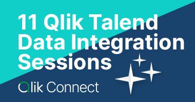
Lots of Qlik Talend Data Integration Sessions!
Wondering about Qlik Talend Data Integration Sessions? There are 11, in addition to all of the Data & Analytics. So meet us in Orlando, June 3 -5.

Qlik Community How To's
Browse our helpful how-to's to learn more about navigating Qlik Community and updating your profile.

Your journey awaits! Join us by Logging in and let the adventure begin.


Customer Story
Qlik Data Integration & Qlik Replicate story
Qlik enables a frictionless migration to AWS cloud by Empresas SB, a group of Chilean health and beauty retail companies employing 10,000 people with 600 points of sale.
Customer Story
Building a Collaborative Analytics Space
Qlik Luminary Stephanie Robinson of JBS USA, the US arm of the global food company employing 70,000 in the US, and over 270,000 people worldwide.
Location and Language Groups
Choose a Group
Join one of our Location and Language groups. Find one that suits you today!
Healthcare User Group
Healthcare User Group
A private group is for healthcare organizations, partners, and Qlik healthcare staff to collaborate and share insights..
Japan Group
Japan
Qlik Communityの日本語のグループです。 Qlik製品に関する日本語資料のダウンロードや質問を日本語で投稿することができます。
Brasil Group
Brazil
Welcome to the group for Brazil users. .All discussions will be in Portuguese.
Blogs
Community News
Hear from your Community team as they tell you about updates to the Qlik Community Platform and more!