Unlock a world of possibilities! Login now and discover the exclusive benefits awaiting you.
All Forums
- Qlik Community
- :
- All Forums
- :
- popularResources
popularResources

How To / Missing Manual
| Header 1 | Header 2 |
|---|---|
1 2 3 4 5 6 7 8 9 10 11 12 13 14 15 16 17 18 19 20 21 22 23 24 | Do you Qualify?- How to use QUALIFY statement MaxString & MinString - How to + examples Missing Manual - Below() and Above() |
How To / Missing Manual
Did You like it?
- Tags:
- above
- after
- before()
- below
- bottom
- chart
- cyclic group
- dimensionionality
- double gauge
- dual
- dynamic background
- dynamic measures
- dynamic picture
- dynamic_color
- fieldindex
- fieldvalue
- functions explained
- gauge chart
- gauge with gaps
- gauge_chart
- getcurrentfield
- getfieldselections()
- help
- look and feel
- lookup()
A question that gets asked regularly is how to calculate a rolling measure over a period of N-months (or weeks or days). For example a 12-month rolling total or a 4-week rolling average. There are several ways to do this. But these approaches have so
...A question that gets asked regularly is how to calculate a rolling measure over a period of N-months (or weeks or days). For example a 12-month rolling total or a 4-week rolling average. There are several ways to do this. But these approaches have some limitations that need to be kept in mind. I'll try to explain these approaches and some of their limitations.
- Accumulation
- RangeXXX functions
- Set analysis
- AsOf tables
First let's load some sample data. The SalesData table below will contain sales amount values for twelve consecutive months.
SalesData:
load * inline [
Month, Amount
1,6
2,4
3,7
4,3
5,4
6,9
7,5
8,7
9,8
10,6
11,9
12,7
];
This is a very simple table with little data, but this enough for demonstration purposes.
Once this data is loaded it's possible to create a straight table chart object to display the amount per month and a running total. As expected Month is used as dimension. The expression sum(Amount) will display the amount per month. Now let's add an expression to calculate a running total over three month periods.
This can be done in two ways. The first uses the Accumulation option for expressions. The same expression sum(Amount) is used, but now the Accumulation option is set to 3 Steps Back:
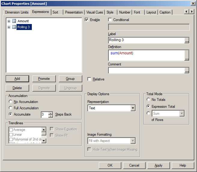
The second option uses the rangesum function. That expression looks like this:
rangesum(above(sum(Amount),0,3))
This sums the Amount value on current row and on the previous two rows. The resulting straight table looks like this:
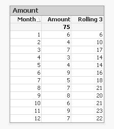
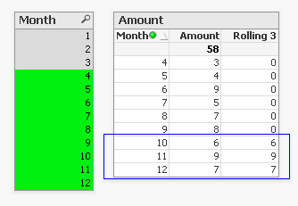
This looks good. The rolling 3 months amount is calculated correctly. But what happens if a selection of months is made?
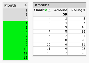
The rolling 3 month amount for month 4 is now 3 instead of 14. This is because month 1,2 and 3 are no longer included in the calculation for the rolling 3 month total.
The accumulation option has another issue. It only works when only one dimension is used in the straight table. The rangesum expression can be modified so it can calculate across dimension borders, but the accumulation option can't. The modified rangesum expression adds the total keyword to the above() function:
rangesum(above(total sum(Amount),0,3))
This goes some way to doing what we want, but the issue of displaying the wrong rolling 3 month amount for month 4 isn't solved yet. Contrary to what I first thought there is a solution for this, as Henric pointed out to me in the comments below. By combining the rangesum with the aggr function it's possible to calculate the correct rolling 3 month amounts for each month. The expression needed for that looks like this:
sum(aggr(rangesum(above(total sum({<Month=>}Amount),0,3)),Month))
Read Elif's blog post Accumulative Sums for a more complete explanation.
How about set analysis expressions?
This expression should calculate the sum of amount for the three month period:
sum({<Month={'>=$(=only(Month)-2)<=$(=only(Month))'}>}Amount)
But notice the only() function. This requires that only one month value is selected. After selecting month 4 the result looks like this:

This shows the selected month, but also the two previous months. And the values are not accumulated.
Ok, but what about the max function instead of only?
sum({<Month={'>=$(=max(Month)-2)<=$(=max(Month))'}>}Amount)
That gives a different result, but still not what we're looking for:
Now only the last three months are shown and again the values are not accumulated.
The 'problem' is that the set is calculated once for the entire chart, not per row. This means that it's not possible here to use Month both as a dimension and in the set modifier in the expression.
There's still an option left to discuss: AsOf tables.
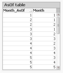
The AsOf table links a period with all the periods in the rolling period. In this example months are used, but it can be applied to any type of period like hours, days or weeks.
For the three month periods needed for a rolling 3 month total this means a month should be linked to itself, the previous month and the month before the previous month. The only exceptions are the first month, which is itself the rolling 3 month period, and the second month that together with the first month is its rolling 3 month period. There are no months before the first month so the first two months cannot run over 3 months.
The AsOf table needed for the rolling 3 month calculations looks like this:
This table can be created like this:
AsOfMonth:
load
Month as Month_AsOf,
Month + 1 - IterNo() as Month
Resident SalesData
while IterNo() <= 3;
right join load Month Resident SalesData;
What this does is create three records for every month using the while statement. But that also creates three records for month 1 and 2. This would create a month 0 and a month -1. The right join is used to remove those incorrect month values.
Now that the AsOfMonth table is created the Month_AsOf field can be used instead of the Month field in the straight table. The expression for the straigh table is simply sum(Amount).
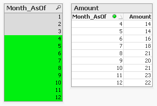
The straight table now shows the correct rolling 3 month total for month 4.
This can be expanded a little so not only the rolling 3 month can be shown, but also the amount for the month itself. To achieve this the AsOf table is modified by adding a field to label the type of period. And records are added to the table so each Month_AsOf value is linked to the matching Month value:
AsOfMonth:
load 'Current' as Type,
Month as Month_AsOf,
Month as Month
Resident SalesData;
Concatenate (AsOfMonth)
load 'Rolling 3' as Type,
Month as Month_AsOf,
Month + 1 - IterNo() as Month
Resident SalesData
while IterNo() <= 3;
right join load Month Resident SalesData;
There are now two types of periods available: Current and Rolling 3. Additional period types can be added for example for Rolling 6, Rolling 12 month and Year-to-Date periods. You can find examples of these types in the attached AsOf Table Examples.qvw document.
The period type can be used in the chart expressions to calculate the amount for the wanted period:
Current amount: sum({<Type={'Current'}>}Amount)
Rolling 3 month amount: sum({<Type={'Rolling 3'}>}Amount)
Concluding, there are two solutions that do what we want:
1. The rangesum-aggr combination
2. The AsOf table
The first has the advantage that no changes to the data model are needed. It's also possible to dynamically change the period to aggregate over by using a variable instead of a hardcoded number of periods. A disadvantage is that that it's a somewhat complicated expression that also comes with a performance cost.
The AsOf needs changes in the data model to create the AsOf table and fill it with the necessary records. The advantage is that it likely performs better on large data sets. It's also quite versatile since you can add several sets of records to meet different scenario's. The expressions you end up with in the charts are also less complicated. That said, it will likely take you some time to fully understand the AsOf table concept and realize all the places where you can put it to good use.
In the end you'll have to decide for yourself which solution is appropriate in your situation. With regards to the performance of one or the other solution, you will simply have to test to discover if the performance is acceptable. But of course such testing is already part of your development process, right?
I'd like to thank John Witherspoon for introducing me to the AsOf tables concept and Henric for pointing out the solution using the rangesum function in combination with the aggr function.
- Tags:
- asof
- creating_analytics
- Labels:
-
Creating Analytics
-
QlikView
Definition:
Returns the number of dimension columns that have non-aggregation content. i.e. do not contain partial sums or collapsed aggregates.
A typical use is in attribute expressions, when you want to apply different cell formatting depending on ag
...Definition:
Returns the number of dimension columns that have non-aggregation content. i.e. do not contain partial sums or collapsed aggregates.
A typical use is in attribute expressions, when you want to apply different cell formatting depending on aggregation level of data.
This function is only available in charts. For all chart types except pivot table it will return the number of dimensions in all rows except the total, which will be 0.
What does it mean?
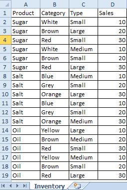
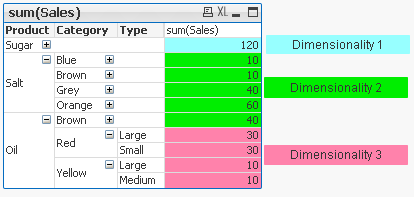
We have Table with 4 dimensions(columns): Product,Category,Type,Sales
 |
Now we want to create Pivot Table by using those Dimensions.
We are going to use only 3 of them(Product,Category,Type) and use 4th(Sales) in our expression.
The result is shown below:
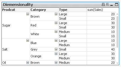
This Pivot Table has 3 dimensions so its maximum dimensionality is 3.
For better understating please see table below.
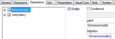
The function is used to show on which dimensionality level each of the Pivot Table row is:
 |
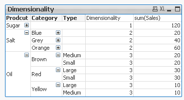
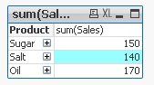
'Sugar' has dimensionality of 1 which is Total for that 'Product'.
'Salt' has dimensionality of 2 which is Total for each 'Category' of that 'Product'.
'Oil' has dimensionality of 3 which is single value for each 'Type' of the 'Product's' 'Category'.
So then more Dimension we use the greater dimensionality of our Pivot Table is.
Practical use:
1) To show the level of dimensionality:
Expression:
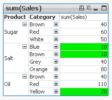
if(Dimensionality()=1 ,RGB(151,255,255),if(Dimensionality()=2 ,RGB(0,238,0),if(Dimensionality()=3,RGB(255,130,171))))
 |
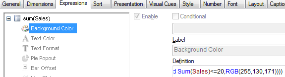
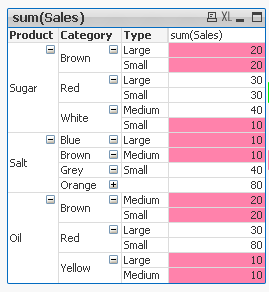
2) Highlight background of rows which on each level fall into certain condition:
Expression:
if(Dimensionality()=1 and sum(Sales)<150,RGB(151,255,255),if(Dimensionality()=2 and sum(Sales)<=20,RGB(0,238,0),if(Dimensionality()=3 and Sum(Sales)<=20,RGB(255,130,171))))
| LEVEL1 --> Values <140 | LEVEL 2 --> Values <=20 | LEVEL 3 --> Values <=20 |
|---|---|---|
 |  |  |
Remember ![]()
- To use the script below the Excel file must be saved in the same folder that your qvd file
Otherwise you will need to make changes the this path - [Dimensionality.xlsx]
Directory;
LOAD Product,
Category,
Type,
Sales
FROM
[Dimensionality.xlsx]
(ooxml, embedded labels, table is Sheet1);
Felling Qlingry?
- What techniques are there to generate “new” tables; tables that don’t exist in the source data?
- How do I loop over one and the same record in source data?
- How do I propagate a value from above record to the current one?
- How do I populate a sparsely popu
- What techniques are there to generate “new” tables; tables that don’t exist in the source data?
- How do I loop over one and the same record in source data?
- How do I propagate a value from above record to the current one?
- How do I populate a sparsely populated field?
- How do I generate all combinations – the Cartesian product – of two or more fields?
- How do I make simulations in QlikView?
These questions and others are answered in this Technical Brief.
- Labels:
-
App Development
-
Scripting
-
Technical Brief
- What is the difference between a NULL and a missing value?
- How are NULLs propagated in expressions?
- How does QlikView display NULLs?
- How do I make NULLs selectable?
- How do I search for NULLs?
- Can NULLs be used in key fieds to link tables?
- What is Te
- What is the difference between a NULL and a missing value?
- How are NULLs propagated in expressions?
- How does QlikView display NULLs?
- How do I make NULLs selectable?
- How do I search for NULLs?
- Can NULLs be used in key fieds to link tables?
- What is Ternary Logic?
These quesions and others are answered in this Technical Brief.
Thank you, mellerbeck and Matthew Fryer for idea and inspiration.
See also
NULL – The Invisible Nothing and
2012-12-18: Fixed an error in the section about NULL propagation pertaining to relational operators. Added examples in the same section. /HIC
2012-12-20: Added information about ideographic space. Changed layout of some truth tables (images). /HIC
2013-04-46: Added section about How QlikView displays NULLs
2016-10-13: Corrected a sentence about the result of <Product = {}>
- Labels:
-
Creating Analytics
- What techniques are there to match a number with an interval?
- How does the IntervalMatch prefix work?
- Should I join the interval match table with the event table?
- How do I generate an interval from a single change date?
- What is a Slowly Changing Dim
- What techniques are there to match a number with an interval?
- How does the IntervalMatch prefix work?
- Should I join the interval match table with the event table?
- How do I generate an interval from a single change date?
- What is a Slowly Changing Dimension?
- How do I model a multi-level Slowly Changing Dimension?
These questions and others are answered in the attached Technical Brief.
See also the following blog posts:
- IntervalMatch
- Creating a Date Interval from a Single Date
- Creating Reference Dates for Intervals
- Slowly Changing Dimensions
- Labels:
-
App Development
-
Scripting
-
Technical Brief
How could I make sure that certain data are only for certain users available?
The answer is SECTION ACCESS. Section access is a connection between an authorization table (commonly placed in a hidden script and/or outsourced in an include-variable)
...How could I make sure that certain data are only for certain users available?
The answer is SECTION ACCESS. Section access is a connection between an authorization table (commonly placed in a hidden script and/or outsourced in an include-variable) and the application data (most to a dimension table).
Further you need to enable section access within the document properties in tab open and especially to enable the strict exclusion is important then without this is section access more a comfortable usability function to avoid confusing by the users which needs only a small data-area from the application but not more suitable for real confidential data.
Introduction to Section Access
Data Reduction – Yes, but How?
Section Access: Strict Exclusion
QlikView Section Access Examples
Data Reduction Using Multiple Fields
Section Access (Data Reduction) using Active Directory
In addition to these there are more complex restrictions possible but before you build one think on alternatives like Document chaining whereby those applications then have a specialized and simpler section access.
Basics for complex authorization
Authorization using a Hierarchy
Restrictions based on section access could be applied on sheets and objects.
Sheets Security with Section Access
Sheets Security with Section Access File
Sometimes there is a need to mask or de-identify data for certain users, for this see: Mask or de-identify data for certain users using Section Access.
At least the most important remark: before thinking on section access makes one or more BACKUP's from your applications then there aren't any go backs by mistakes! One exception (which don't nullified the suggestion of having Backup's) could you find here: Bypassing QlikView Section Access – Infinity Insight Blog.
There is some content-overlapping within the above used links but I think the complement to each other is useful and of course you will find many more interesting postings here within the qlik community to these topic - the notes here are a good starting point to go further.
Have fun!
- Labels:
-
Application Development
-
QlikView

At Qonnections 2019 I hosted a session called "273367 Qlik Sense Visualizations, best practice and top tricks". Here's the app I used with all tips including test data. Tip titles, more details in app:
* Chart and UI *
Butterfly chart
Gantt chart
Grid
At Qonnections 2019 I hosted a session called "273367 Qlik Sense Visualizations, best practice and top tricks". Here's the app I used with all tips including test data. Tip titles, more details in app:
* Chart and UI *
Butterfly chart
Gantt chart
Grid chart
Dynamic charts
Map image background
Previous/next in selection
Cyclic groups
Dividers
Date search filters
Dynamic bookmark
Select null
* Add ons *
Above and below
Color above average
Bell curves
Trendlines
Accumulation
Top 5 lines
Offset measures
* Table *
Custom report
Change null color
Sum with null
Subtotals and empty rows
Indentation
Indicators and symbols
Traffic lights
Pajama striping
Sparklines
Link to app
There is also video available: https://www.youtube.com/watch?v=fIOcb_JGNb4&t=3s
I want to emphasize that many of the tips are discovered by others than me, I tried to credit the original author at all places when possible. Many of the tips have been published before on the Qlik Community, the app below can be viewed as my current top picks.
If you liked it, here's more in the same style:
- 24 days of visualization Season III, II, I
- Top 10 Tips Part X, IX, VIII, VII, VI, V, IV, III, II , I
- Let's make new charts with Qlik Sense
- FT Visual Vocabulary Qlik Sense version
- Similar but for Qlik GeoAnalytics : Part III, II, I
Thanks,
Patric
- Labels:
-
App Development
-
Visualization
This video gets right to the point and shows you how to get started with Set Analysis. There are various blogs and articles on this topic that go in deeper, but I suggest you start here first.
Also consider this post by hic Natural Sets
Next Video: Set Analysis - Part 2 - Cool Stuff You Can Do (video)
- Tags:
- set_analysis
This document concerns data modelling and joins
- What is the difference between a join using the join prefix and a join using a SELECT statement?
- When should you join and when shouldn't you? Performance considerations?
- Are there alternatives to joins? (Y
This document concerns data modelling and joins
- What is the difference between a join using the join prefix and a join using a SELECT statement?
- When should you join and when shouldn't you? Performance considerations?
- Are there alternatives to joins? (Yes! Applymap!)
- What does the Keep prefix do?
See also my blog post on the same subject: To Join or not to Join.
- Labels:
-
Scripting
If you have never thought about integrating predictive analytics and QlikView, may this article pique your interest on the topic. If you have thought about the potential, but do not know how to get started, may this be the motivation to start your j
...If you have never thought about integrating predictive analytics and QlikView, may this article pique your interest on the topic. If you have thought about the potential, but do not know how to get started, may this be the motivation to start your journey.
This demo example illustrates the art of the possible around the interoperability of the R statistics engine and QlikView 11 for enabling predictive algorithms within QlikView today.
R (http://www.r-project.org/) is a free software environment for statistical computing and graphics, which supports predictive modeling and scoring. The example also introduces Rattle (Rattle: A Graphical User Interface for Data Mining using R -- http://rattle.togaware.com/). Rattle was used to create the predictive model and generate the R code implemented within the example QlikView application. The use of Rattle is not detailed here. It is left up to you to explore.
The example assumes you understand R and how to create predictive models in R and how scoring works in R. If you understand how to do those things in R and you know how QlikView works, this example should give you an idea of how:
- you could implement a compelling QlikView application for discovering trends in data as you have become used to with QlikView
- while adding the ability to predict outcomes using a proven, trained scoring model you have built in R
- and while showing actionable predicted outcomes at the point of decision
-- all without the end user having to leave QlikView.
As in the previous example posted by Elif Tutuk, "Integrating QV with R example kit.zip" (http://community.qlik.com/docs/DOC-2975), the example utilizes statconnDCOM. A slightly different approach in this example overcomes a break in functionality introduced into that earlier example by the changing in the behavior of one of the COM API methods in the most recent releases of statconnDCOM.
The integration is done using QlikView's built-in VBScript support to interoperate with the DCOM-based API. This is just one way to integrate with R. With a little research you can discover other potential opportunities for R integration (e.g., OpenCPU). Also, note that R is just one such example of a statistical engine being integrated with QlikView. Other solutions, such as commercially available statistical engines or predictive scoring engines may also be integrated in similar ways.
To get started with this example, save the attached file, QlikView-R_Predictive_Demo.zip, to your system. Open the zip file, and copy the enclosed folder (QlikView-R_Predictive_Demo) to a location of your choice. The location is not important as the example is portable and has no dependency on being placed in a particular folder on your system. Now navigate into the folder you just extracted and find the document named “Qlikview-R Integration Demo 20170310.pdf”. Open the document and follow the instructions step-by-step.
UPDATE (May 7, 2014): I updated the installation document (Qlikview-R Integration Demo 20140421.pdf) to eliminate the RAndFriends installer as it has been unavailable for some time. This edition of the document references R 3.1.0. Hopefully the instructions will continue to be a good guide for subsequent versions as well. I will continue to monitor for changes in R, statconnDCOM and other R components which could effect how the demo application works going forward. The example QlikView application itself remains unchanged. It is a Personal Edition version, so you should be able to explore it with a licensed QlikView Desktop or the Personal Edition. Thank you for your continued feedback on this demo.
UPDATE (September 21, 2015): Everyone who has been seeing the message "The license that is embedded in this document is not valid": I attached an updated version of QlikView-R_Predictive_Demo.zip. Ensure you overwrite the old QVW with the new one in this package. That is the only change. Please forgive this looooong overdue update. 
UPDATE (October 9, 2016): Updated the embedded license to work with QlikView Desktop Personal Edition.
UPDATE (February 2, 2017): Updated the embedded license to work with QlikView Desktop Personal Edition.
UPDATE (March 10. 2017): A dependency for this particular example is statconnDCOM from the team at autstat (http://www.autstat.com/). If you wish to utilize statconnDCOM, you will need to contact autstat directly and purchase a license or request an evaluation license for testing.
- Labels:
-
QlikView
Hierarchies are an important part of all business intelligence solutions, used to describe dimensions that naturally contain different levels of granularity. Some are simple and intuitive whereas others are complex and demand a lot of thinking to be
...Hierarchies are an important part of all business intelligence solutions, used to describe dimensions that naturally contain different levels of granularity. Some are simple and intuitive whereas others are complex and demand a lot of thinking to be modeled correctly.
- What is the difference between a balanced and an unbalanced hierarchy?
- How can a hierarchy be loaded into QlikView?
- Which data model should be used?
- How do I create an authorization scheme using a hierarchy?
- How can I check for data integrity problems in the hierarchy data?
These questions and others are answered in this Technical Brief. Attached you will also find a sample unbalanced, n-level hierarchy along with the script to load it.
See also the following blog posts:
Unbalanced, n-level hierarchies
Authorization using a Hierarchy
2013-11-26: Added section on authorization.
Hi all,
Mini Charts have always been a good feature in QlikView and It's really 'frustrating' that this has not been added (yet) in Qlik Sense.
With hopes that the Qlik Team will think about such improvements for the next releases, let's discuss here h
...Hi all,
Mini Charts have always been a good feature in QlikView and It's really 'frustrating' that this has not been added (yet) in Qlik Sense.
With hopes that the Qlik Team will think about such improvements for the next releases, let's discuss here how to create our own mini chart in a Qlik Sense Table.
The following expressions might seem 'complicated' at first sight, but remember that It will be generic.
You'll only have to change your : Dimension(s) and Measure to adapt to your need.
Thus, their use will be very easy.
Let's begin :
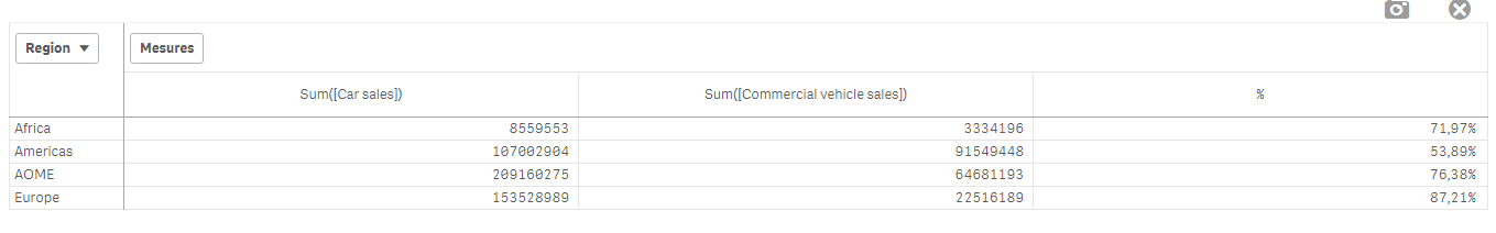
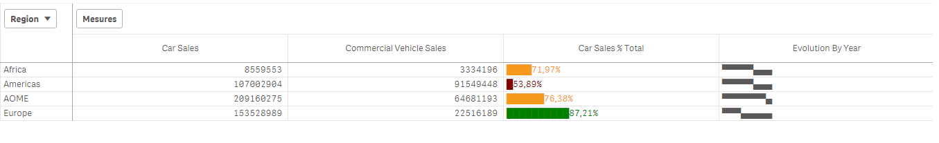
Suppose we have:
As a dimension: OICA Region
As measures:
Sum(Sales)
Sum("Commercial Vehicle Sales")
Sum(Sales) / (Sum(Sales)+Sum("Commercial Vehicle Sales"))
Here is our current table:
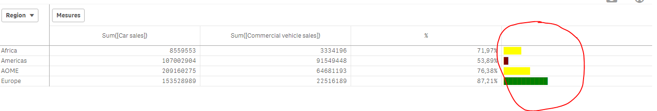
Now, we want to add, a mini 'bar' to represent the %:
How to do so:
As an expression:
=repeat('█',
rangemax(rangemin( ceil(((column(1)/column(2))-1)*2.5),10),0)
)
With that, we repeat the square sign and precise the limits.
And as a text Color expression:
if( (sum([Car sales])/(sum([Car sales])+sum([Commercial vehicle sales])))>=0.8,Green(),
if((sum([Car sales])/(sum([Car sales])+sum([Commercial vehicle sales])))>=0.7,Yellow(),
Red()))
Result:
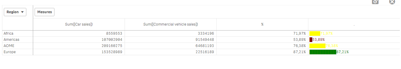
We can also Add the % in front of the bar by adding it in the expression:
From :
=repeat('█',
rangemax(rangemin( ceil(((column(1)/column(2))-1)*2.5),10),0)
)
To:
=repeat('█',
rangemax(rangemin( ceil(((column(1)/column(2))-1)*2.5),10),0)
) & num((sum([Car sales])/(sum([Car sales])+sum([Commercial vehicle sales]))),'# ##0,00%')
Result:
You can even alter it as follow:
repeat(chr(09608),round( sum([Car sales])/(sum([Car sales])+sum([Commercial vehicle sales])) * 10))
&repeat(chr(09617),10-round( sum([Car sales])/(sum([Car sales])+sum([Commercial vehicle sales])) *10))
&num((sum([Car sales])/(sum([Car sales])+sum([Commercial vehicle sales]))),'# ##0,00%')
&if(sum([Car sales])/(sum([Car sales])+sum([Commercial vehicle sales]))>0.7,'▲','▼')
result:
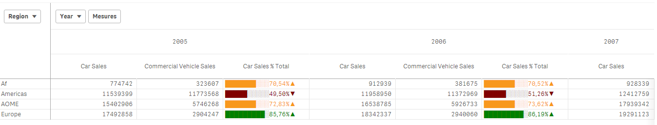
Now, let's suppose we want to add another mini chart, a trend one, to see the % expression by Year:
If it has increased or decreased from a year to the next one.
How to do so?
Expression:
=concat(
aggr(
if((sum([Car sales])/(sum([Car sales])+sum([Commercial vehicle sales]))) > above((sum([Car sales])/(sum([Car sales])+sum([Commercial vehicle sales])))),
'▀',if((sum([Car sales])/(sum([Car sales])+sum([Commercial vehicle sales]))) < above((sum([Car sales])/(sum([Car sales])+sum([Commercial vehicle sales])))),'▄',' ')
)
,[OICA region], (Year,(NUMERIC, ASCENDING))
)
,'',[OICA region])
Wirh:
Red: Our Dimension
Green: The trending dimension
Blue: our expression compared to the previous one (by year, the trending expression)
If expression by Year > expression Previous Year then , Square Up
If expression by Year < expression Previous Year then , Square down
Result:
Special thanks to blog Von Heldendaten in which I found this:
QlikView + Qlik Sense Blog von Heldendaten: Qlik Sense Calendar Measures & "Minicharts" in Tabellen.
Hope you like it !
Omar,
Hi Techies,
Qlik Sense QMC has great feature of QMC resource security where resource is like stream, application and master items(sheets, field, bookmarks, story etc) could be hidden from user or group of users. This document will guide you how to im
...Hi Techies,
Qlik Sense QMC has great feature of QMC resource security where resource is like stream, application and master items(sheets, field, bookmarks, story etc) could be hidden from user or group of users. This document will guide you how to implement resource security in Qlik Sense from QMC to the deepest level which is app objects.
Qlik Sense security hierarchy: Stream => Application => App Objects (sheet, chart, dimension and measure)
My goal is to restrict an user to a particular Stream => application => sheet =>Chart( set of charts).
Note: There is nothing hard coded in Qlik Sense server, you can modify it anyhow by disabling the default rules and write your own custom rules.
Please avoid alter or deletion of any default security rule in QMC. Disable concern security rule and make a new one for testing or production use.
Security to MasterObject or AppObject is the deepest or bottom level security.
.
There are some names I am taking for this exercise:
User: JARVIS
Stream: Jarvis to Stream
Application: Consumer_Sales (Default application comes with installation of Qlik Sense Desktop) which has 5 sheets.
Sheet: Budget Analysis (This sheet which will be visible to our user or set of users only)
AppObject: charts, dimensions, measures, stories etc.
For next step: =>
Implementation Steps:
1. Install Qlik Sense server on your machine(Use a dedicated user as service user). Verify its prerequisites and enable it license then you will find two desktop shortcuts which are QMC and HUB. Please use local administrator account for installation.
1. Open QMC with service account(by which you installed QSE) and go to User Directory Connector and create a new connector, if Active directory is there in network, select add path of AD (active directory), => remove checked sign from sync user data from existing users => click okay and click on SYNC button. You will see all the user will show in USERS tab. If you want to add local server users to Qlik, just hit the MachineName/HUB URL from the concern user and the same user name with machine name as USER DIRECTORY will appear to USER TAB in QMC.
3. Go to Apps tab import your any application (.qvf file), I am importing Consumer Sales(which comes by default with installation of Qlik Sense Desktop and quite famous across everyone ).
4.1 Go to security tab and disable default STREAM rule, This stream says The user should see the resource if he/she has read access to the stream it is published to means if any user or group of user has READ access to the stream then user will see all the Application and AppObjects(All resources) so if we try to restrict any user to any particular application or App Object ,it will always let user to see everything which comes in the stream. So by disabling it we are taking all the access from user to see anything in stream by default.
4.2. Create a new stream with name "Stream for Jarvis" then click on apply => It will give you a warning in yellow color for not to basic securities then click on cancel for not to apply any security rule or user at this time.(Please verify in Security Rule tab that no custom stream security rule is not built automatically )
5. Go back to Apps tab, make a duplicate of your application(We generally first make duplicate then publish to any stream because once we publish we can’t do any changes or development on the same application ).We will use the same application which was duplicated to new one for reload, Here I am making duplicate of Consumer_Sales app and renaming it to Consumer_Sales to Jarvis and publish it to stream Stream or Jarvis.
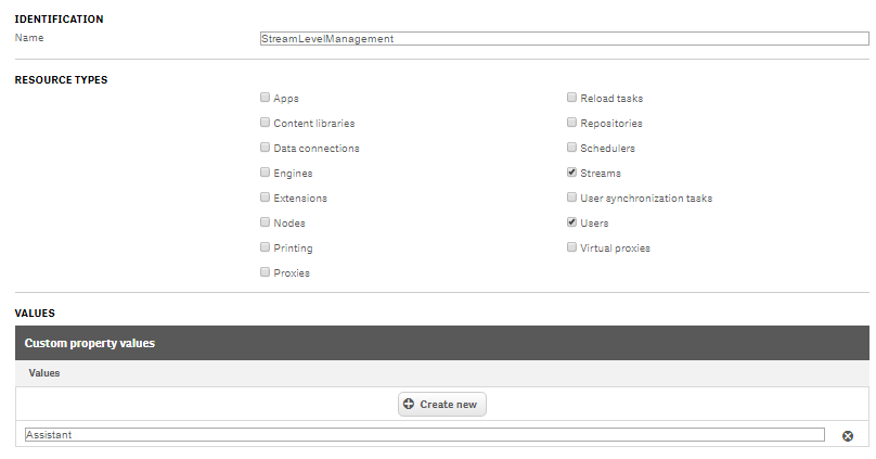
6 Now login with JARVIS (with the concern user), you will see there is no stream with name Stream for Jarvis. So, what is the problem. Problem is, User JARVIS doesn't have connection with Stream for Jarvis. So, we will use custom properties to associate a user to resource(Stream) or I can say we need to write a security rule which will say JARVIS can see the stream Stream for Jarvis. For basic knowledge of custom properties
7. Go to Custom Properties tab, Create new with name StreamLevelManagment with resource type Stream and User and give any sample value like Assistant to it and assign to concern user(JARVIS) by going to USERS tab , select JARVIS and on right side you will find custom property option , click on it and then click on the space bar and you will see that sample value or what I took Assistant is appearing there select it and do the same exercise for stream(Stream for Jarvis) by going to stream tab.
8 Now our task is to map Stream for Jarvis to user JARVIS by creating new security rule (Stream Template) as :
((user.@StreamLevelManagement=resource.@StreamLevelManagement))
I am describing security rules in Basic and Advance mode both to be sure you will not confuse how to make rule in both of Modes.
Now login with user JARVIS, you will find Stream for Jarvis.
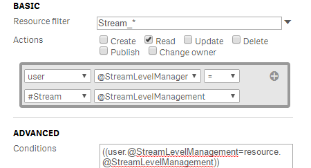
I am describing security rules in Basic and Advance mode both to be sure you will not confuse how to make rule in both of Modes.
Now login with user JARVIS, you will find Stream for Jarvis.
9. Go back to Administrator, create a new custom property AppLevelManagment with resource type User and Apps then give a sample value to it and assigned this custom property to concern Users and Apps which you have been created for this exercise to make JARVIS can see the concern application as:
((user.@AppLevelManagment=resource.@AppLevelManagment))
Note: In this document, I am not focusing on ACTIONS under security rules such create, delete, publish, change owner etc. You need to concern for actions when client ask for it like my first set of user ca edit or duplicate sheet and do self service and another set of user can't.
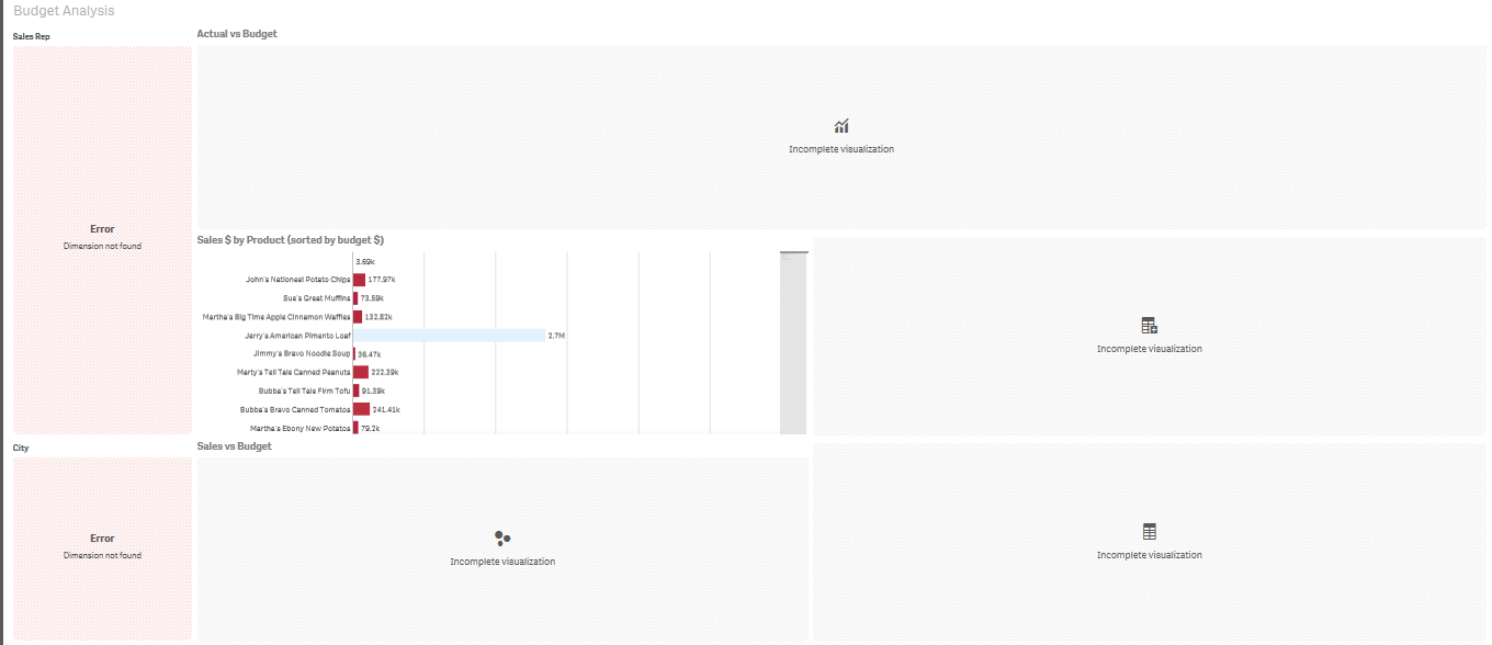
10. Now you will see Jarvis Can see particular application but with all the sheets, but our goal is, to restrict JARVIS to only one sheet, for that create another security rule with App.object template and configure as:
((user.name="Jarvis" ) and resource.name="Budget Analysis")
Above rues says , user JARVIS can see Sheet type object and object is Budget Analysis. Now, login with JARVIS, you will see Jarvis see "Budget Analysis" sheet only.
Important point: Above security rule will disable all the sheets and you will see only "Budget Analysis" sheet, it means those sheet which will be published by your Qlik site member in same application under community section will not be visible to you.
Now if you wana your user see only see "Budget Analysis" sheet and those sheets which is shared by other users(when any user has rights to edit and publish a base sheet ) so here you need to write just opposite condition of what is written above as:
((user.name="Jarvis" ) and resource.name != "KPI Dashboard" and and resource.name != "Sales & Margin Analysis" and resource.name != "Sales Analysis" and resource.name != "Sales Rep Performance" and resource.published="true")
Don't be so happy on this stage, JARVIS is restricted to only one sheet out of 5 sheets but when you open "Budget Analysis" sheet, JARVIS can't see any charts or objects and invalid object error message will be coming on the place of charts.
Here, you have two ways,
1. All the charts will be visible on that restricted sheet("Budget Analysis").
2. You want to restrict your user to any chart particular chart and hide other charts to user(JARVIS).
1. All CHARTS VISIBLE TO USER ON RESTRICTED SHEET
Let’s take all the objects (charts, filters) are supposed be visible on the "Budget Analysis" Sheet.
Create a new security rule:
1. ((user.name="Jarvis" or resource.name="*" and resource.objectType!="sheet"))
Then
2. ((user.name="User1" and resource.objectType="sheet"))
By above set of two security rule this User1 or JARVIS will see all the sheets on which he has access.
Here you need to write the above rule every time for each user to say user can see all the objects rather sheet its better to go with below instruction:
Important Note: Create a new rule with AppObject as resource type:
((resource.resourcetype = "App.Object" and resource.published ="true" and resource.objectType != "app_appscript" and resource.objectType != "loadmodel") and resource.objectType != "sheet" and resource.app.stream.HasPrivilege("read"))
Now, user can see all the charts are visible. First mile stone has been achieved.
Above rule says , anyone who has access to stream and published application, he can view all the application objects except sheet and for sheet you may use POINT NO 10 instruction. This rule will work for all the users , you just need to tell which user can see which sheet and lets say there are other users who can see all the sheets , then you may write one more rule here :
Now, the complex one, what if your client say, I wana my user will restrict to a sheet or set of sheets but he or she can see only one chart on the sheet and rest of the chart will be invisible.
ONLY ONE CHART WILL BE VISIBLE:
After step 10, next step :
Write security rule which grant access of App Objects of this sheet to JARVIS, Create a new security rule and configure it as JARVIS will see only one chart present in BUDGET ANALYSIS, by writing the code as:
((resource.objectType="masterobject" or resource.name="Sales $ by Product Group (sorted by Budget $)" or resource.name="Sales $" or resource.name="Product"))
If you can notice, Now I have taken concern all object Chart Name, Measure and Dimension which made that concern chart as resource.name.
Now you can see JARVIS can view only Sales $ by Product Group (sorted by Budget $) chart and rest are coming as Invalid Objects.
Important Note: Once you configured a Qlik Site for security every time whenever you add new user you have to give access for stream, application and objects(Sheets or Charts) in short need to update the custom security rules in QMC. New user by default can't see anything except STREAM if you add it to any stream as we do generally.
JARVIS stands for Just A Rather Very Intelligent System
After finishing Qlik Sense Enterpise , QAP(Qlik Analytical Platform) comes in picture which is for external users where number of users are in hundred and your client doesn't want buy hundred of token so QAP is the right solution which has core base licencing.
You may get all the information step wise on the following document: QAP (Qlik Analytical Platform)
Other important Qlik Sense solutions:
- Dynamic Sheet Exception With Stream and App Level Security
- Best Practices of Qlik Sense Multi-Node Setup, Load Balancing & Maintenance(Let's Discuss Here)
- How to Design Simple Linear Regression in Qlik Sense with help of Microsoft R(R Integration with Qlik Sense )
- How to delete a sheet via Qlik repository API using Postman Desktop
Reach out to me at kumar.rohit1609@gmail.com if there is need of any clarification or assistance
Connect with me on LinkedIn https://www.linkedin.com/in/rohit-kumar-67ba152b/
To get latest updates and articles, join Qlik community at https://www.facebook.com/QlikIntellectuals
When applicable please mark the appropriate replies as ACCEPT AS SOLUTION and LIKE it. This will help community members and Qlik Employees know which discussions have already been addressed and have a possible known solution. Please mark threads as LIKE if the provided solution is helpful to the problem, but does not necessarily solve the indicated problem. You can mark multiple threads as LIKE if you feel additional info is useful to others.
- Labels:
-
Qlik Sense
Qlik Sense vs Power BI & Tableau.
Qlik Sense vs Power BI & Tableau.
- Tags:
- powerbi
- quicksight
- tableau
A great primer to Section Access by Gustav Guldberg of QlikView Support.
A great primer to Section Access by Gustav Guldberg of QlikView Support.
- Labels:
-
QlikView
Welcome to the QS CSS MasterClass.
‼️Since the article was written a lot of features and settings have been added to Qlik Analytics. For most users it's better to use native functions, easier to apply and doesn't require any effort to maintain. Her
...Welcome to the QS CSS MasterClass.
‼️Since the article was written a lot of features and settings have been added to Qlik Analytics. For most users it's better to use native functions, easier to apply and doesn't require any effort to maintain. Here's a list of common CSS mods and their new setting counter part.
https://community.qlik.com/t5/App-Development/Obsolete-CSS-modifications/td-p/2511714
FYI, the Multi KPI object which can be used to inject CSS will retired in a not too distant future. ‼️
Motivation:
In my career as a PreSales, I need to create quite a few "user-appealing-applications". Sometimes users request a specific design or specific functions I need to implement in Qlik Sense. As we all know, Qlik Sense is built for simplicity & self-service and sometimes it could be challenging to achieve the desired result. But through the last couple of years, there were a lot of tips and tricks around using CSS to create completely new designs and functions to implement a better information design concept.
This is where the MasterClass starts. I have created an application that gathers a couple of these tricks and explains them more in detail. In addition to that, it is very easy to understand because you can see the result directly within a Qlik Sense App. If you think this sounds interesting, take a couple of minutes and join my short tour through the app. I won't cover all aspects in detail. This tour will give you an overview of the documented and used tricks within the app.
Content:
The following list will give you a brief overview of what topics are focused on the specific sheet within the app.
| Sheet | Description |
|
|
You can add CSS definitions to your app by using themes or by using so-called "helper- objects". On this sheet, I will explain when you should use which option. |
 Hide (Helper-) Objects Hide (Helper-) Objects |
A "helper-object" carries and injects the CSS definition on a specific sheet. This sheet helps you to hide this object and which objects can be used for it. |
|
|
This example demonstrates how to add better guidance to your dashboards by segmenting your background. |
|
|
Sometimes selections can be mandatory to consume a dashboard, or the creator likes to guide the user through the filter pane by using colored filter boxes. I show you how. |
 Hiding Button/Options Hiding Button/Options |
How to hide objects like the selection bar or elements within context-menus in case these functions shouldn't be used in the app or on this sheet? |
 Using Background Pictures Using Background Pictures |
Adding background-pictures to your dashboard can spice up the overall flavor of your dashboards. This can be used for segmentation or just to add some style. |
 Table modifications Table modifications |
In this section, we will completely change the look and feel of a straight- and pivot table. |
 Moving Objects Moving Objects |
Let's create an illusion by just moving our objects closer together. After that, I'll look like we just have one. |
 Changing standard fonts Changing standard fonts |
This sheet explains the easiest way to implement your own font by using a custom theme. It's just a few lines of code. |
 Custom Grid Layout Custom Grid Layout |
No matching grid? This trick shows you how to create your own grid for a specific sheet by changing the metadata through Qlik Engine API Explorer. |


Installation:
Under "Attachments" you can find the required package. The zip package includes a qvf file (Qlik Sense - CSS MasterClass V 1.0.qvf) and an extension (ShowHTMLfromMeasure). After importing the extension and app we need to change a quick configuration because the app has a different ID on your system now.
Open sheet called "Using Background Pictures". Normally this sheet has a background image. This gets referenced over the internal app-ID. Click on "Edit Sheet" and select the displayed CSS box ("CSS config HERE"). Navigate to submenu "Styles" and change the used app-ID in "Styles (CSS)" to your app-ID (displayed in the URL). Now you should see a background picture on this sheet.

Usage:
Every sheet has the same structure. First, a description explains the trick in general and how it's working. On most of the sheets, you also get the explanation for the used CSS selectors. On the right-hand side, you can see the used code in a black code box. You can't copy the code from here. To do so enter the "edit-mode" and click on the "CSS config HERE" button. This object is always the "Helper-object" that carries the used and explained CSS code. Navigate to the "Styles" submenu and copy the code from the "Styles (CSS)" window. I recommend using an external editor to modify or review the CSS code.
In case you like to transfer the trick to your dashboard you just need to change the object ID. If you don't know how to find the object ID this will be explained on sheet "Hide (Helper-) Objects".
Have you ever wonder how the examples from the Qlikview help may look like?
Please see below and enjoy responsibly...
Dual()
Definition:
Forced association of an arbitrary string representation s with a given number representation x. In QlikView, when se
...Have you ever wonder how the examples from the Qlikview help may look like?
Please see below and enjoy responsibly...
Dual()
Definition:
Forced association of an arbitrary string representation s with a given number representation x. In QlikView, when several data items read into one field have different string representations but the same valid number representation, they will all share the first string representation encountered. The dual function is typically used early in the script, before other data is read into the field concerned, in order to create that first string representation, which will be shown in list boxes etc.
Syntax:
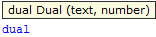
where
text - this is first column of data
number- this is second column of data
![]()
Qlikview has specific way of storing data. Each field is represented by Text and Number data type called dual.
The Text format is visible to user and the Number is being used for calculation and sorting.
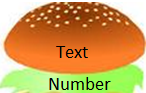
You can imagine that each field has top Text layer and bottom
(like salad in your Hamburger) Number layer.
This association works most of the time and for most of the data type but there are situation that we need to force this association to work the way we want.
Preparation
Remember ![]()
- To use the script below the csv file must be saved in the same folder that your qvd file
Qlik help example contains two tables: inline and from csv file(sample attached)
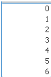
load dual ( string,numrep ) as DayOfWeek inline
[ string,numrep
Monday,0
Tuesday,1
Wednesday,2
Thursday,3
Friday,4
Saturday,5
Sunday,6 ];
Directory;
LOAD Date,
Sales
FROM
afile.csv
(txt, codepage is 1252, embedded labels, delimiter is ',', msq);
//The last line is not part of Qlikview help but you have to have this line to correctly load data into Qlikview
after Reload we have:

As you probably know when Values are on the left hand side they represent Text when on the right Number.
So why we have Text on the right?
In the background (during load) the numbers have been associated with the text.
So what you see is the bun what you do not is the underlay salad:
Practical use:
Example 1
The simple but maybe not the most useful calculation is to add Days of the week from our data =sum(DayOfWeek) |
|

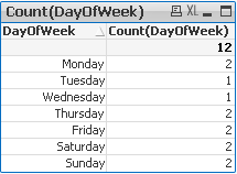
Example 2
Counting days of the week:
Example 3
(please use attached xlsx file and below Script)
A survey has been conducted and the data in Excel file looks like this:
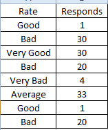
What we want is to assign more meaningful description to the rate numbers.
Script:
Data:
mapping load * Inline
[ Rate,Value
Very Good,5
Good,4
Average,3
Bad,2
Very Bad,1
]
;
Sort:
load
Responds,
dual(Rate,ApplyMap('Data',Rate)) as Rate
FROM
Survey.xlsx
(ooxml, embedded labels, table is Sheet1);
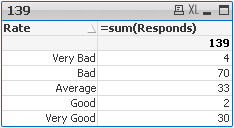
Now we can create Straight Table or bar Bar Chart:
| 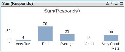 |
This function can be use in many different ways.Please research our community to find more examples.
Still feeling hungry?
Do you Qualify?- How to use QUALIFY statement
Missing Manual - GetFieldSelections() + Bonus Example
MaxString & MinString - How to + examples
The second dimension... or how to use secondarydimensionality()
Everyone knows that sometimes we need to use chr() function to put paragraph sign - chr(13) – or single-quote - chr(39).
But sometimes you need a special symbol, but you don’t know the number. You can find it in the Internet, but I’ve found a Qlik wa
...Everyone knows that sometimes we need to use chr() function to put paragraph sign - chr(13) – or single-quote - chr(39).
But sometimes you need a special symbol, but you don’t know the number. You can find it in the Internet, but I’ve found a Qlik way how to do it.
- Just create a straight table.
- Add Calculated Dimension =ValueLoop(1,100) or even =ValueLoop(1,10000)
- Add Expression chr(RowNo())
- And find a symbol that you need.
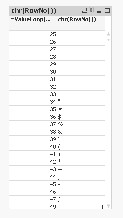
There is a faster way, If you found a symbol in the Internet and would like to know what is the number for this char.
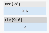
For example delta sign
Δ
Use the ord() function
Ord(‘Δ’) gives you 916. So if you need to put this symbol somewhere you can use chr(916)
Some interesting codes are
=chr(9650) & chr(9651) & chr(9660) & chr(9661)
![]()
=chr(9733) and =chr(9734)
![]()
![]()
Be aware!
in the comments in different discussion jaimeaguilar mentioned that
"using chr() function you can display any ASCII / ANSI character (from chr 0 to 255) or Unicode chars (from chr 256 and up). The corresponding number in chr() function for the Unicode chars is the number referred as decimal, that can be found in plenty internet sites. Almost any Unicode char will display in ajax, but in some cases the correct displaying will depend on the page encoding."
- Tags:
- qlikview
- tips&tricks
- tricks
- Labels:
-
QlikView

At QlikWorld 2020 I'm hosting a session called "Top 10 Visualization tips". Here's the app I used with all tips including test data. Tip titles, more details in app:
* Charts *
Parliament diagram
Scatter with trackline
Calendar Graph - Month view
Cale
At QlikWorld 2020 I'm hosting a session called "Top 10 Visualization tips". Here's the app I used with all tips including test data. Tip titles, more details in app:
* Charts *
Parliament diagram
Scatter with trackline
Calendar Graph - Month view
Calendar Graph - Year view
Meteogram
Spiral plot
Rank chart
Slope graph
Timeline chart
Candlestick chart
Range chart
Ridgeline chart
Stream Graph
Chord diagram
Coxcomb chart
Race chart
* UI tweaks
Toolbar toggle
Hide toolbar
Hide selection bar
Hide sheet title
Hide popup buttons
Hide Pivot buttons
Hide search bar
Hide three nav
Watermark
Center titles
Highlight rows
Larger scrollbars
* Dev tips*
Scatter overlap
Persistent colors
Color thresholds
Trellis container
Responsive and mobile tips
Include from Github
Tooltip table
Radial bar charts
100% bar charts
Title and text matters more than we think
Thumbnails
Quarterly month average
Image to chart
Magic quadrant
Link to app
I want to emphasize that many of the tips are invented by others than me, I tried to credit the original author at all places when possible. Many of the tips have been published before on the Qlik Community, the app below can be viewed as my current top picks.
If you liked it, here's more in the same style:
- 24 days of visualization Season III, II, I
- Top 10 Tips Part X, IX, VIII, VII, VI, V, IV, III, II , I
- Let's make new charts with Qlik Sense
- FT Visual Vocabulary Qlik Sense version
- Similar but for Qlik GeoAnalytics : Part III, II, I
Thanks,
Patric
- Labels:
-
App Development