Unlock a world of possibilities! Login now and discover the exclusive benefits awaiting you.
Product Innovation
By reading the Product Innovation blog, you will learn about what's new across all of the products in our growing Qlik product portfolio.
Support Updates
The Support Updates blog delivers important and useful Qlik Support information about end-of-product support, new service releases, and general support topics.
Qlik Academic Program
This blog was created for professors and students using Qlik within academia.
Community News
Hear it from your Community Managers! The Community News blog provides updates about the Qlik Community Platform and other news and important announcements.
Qlik Digest
The Qlik Digest is your essential monthly low-down of the need-to-know product updates, events, and resources from Qlik.
Qlik Learning
The Qlik Learning blog offers information about the latest updates to our courses and programs, as well as insights from the Qlik Learning team.
Recent Blog Posts
-
Not All Catalogs Are Governance. Not All Governance Is a Catalog
Most governance conversations start with the wrong question. "Which catalog should we use?" treats the problem as an inventory challenge, but governance isn't just about knowing what data you have. It's about making that data trustworthy when it moves. In this article, Don Pinto & Chris Ortega break down the difference between context capture — inventorying schemas, tracing lineage, classifying assets — and context delivery: publishing trusted da... Show MoreMost governance conversations start with the wrong question. "Which catalog should we use?" treats the problem as an inventory challenge, but governance isn't just about knowing what data you have. It's about making that data trustworthy when it moves.
In this article, Don Pinto & Chris Ortega break down the difference between context capture — inventorying schemas, tracing lineage, classifying assets — and context delivery: publishing trusted data products with live trust signals, enforcing contracts, and routing governed data to the analytics and AI agents that depend on it. Both matter. They're not the same thing.
Not all catalogs are governance tools, and not all governance programs deliver outcomes. Learn the difference between context capture and context delivery — and what it takes to make governance actually work.
-
Qlik NPrinting - New Security Patches Available Now
A security issue has been identified in Qlik NPrinting, and patches have been made available. Details can be found in the Security Bulletin High Security fix for Qlik NPrinting (CVE-pending). We've released two releases across the latest versions of Qlik NPrinting to patch the reported issues. All versions of Qlik NPrinting prior to and including these releases are impacted: Qlik NPrinting February 2025 SR5 No workarounds can be provided. Custo... Show MoreA security issue has been identified in Qlik NPrinting, and patches have been made available. Details can be found in the Security Bulletin High Security fix for Qlik NPrinting (CVE-pending).
We've released two releases across the latest versions of Qlik NPrinting to patch the reported issues. All versions of Qlik NPrinting prior to and including these releases are impacted:
- Qlik NPrinting February 2025 SR5
No workarounds can be provided. Customers should upgrade Qlik NPrinting to a version containing fixes for these issues.- Qlik NPrinting May 2026 IR
- Qlik NPrinting February 2025 SR 6
This issue only impacts Qlik NPrinting. Other Qlik products are NOT impacted.
All Qlik software can be downloaded from our official Qlik Download page (customer login required). Follow best practices when upgrading Qlik Sense.
Qlik provides patches for major releases until the next Initial or Service Release is generally available. See Release Management Policy for Qlik Software. Notwithstanding, additional patches for earlier releases may be made available at Qlik’s discretion.
The information in this post and Security Bulletin High Security fix for Qlik NPrinting (CVE-pending) is disclosed in accordance with our published Security and Vulnerability Policy.
Thank you for choosing Qlik,
Qlik Support -
Important update on SAP Data Access Restrictions and your Qlik Integration
Dear Qlik Customers, In April 2026, SAP published a series of updates that will restrict your ability to extract certain SAP data using Qlik products. We are writing to explain what is changing, what it means for your Qlik integration, what you can do next, and how Qlik is responding. SAP Announcement SAP has recently updated SAP Note 3255746 and its API Policy, which together prevent customers from using the ODP-RFC interface to perform bulk d... Show MoreDear Qlik Customers,
In April 2026, SAP published a series of updates that will restrict your ability to extract certain SAP data using Qlik products. We are writing to explain what is changing, what it means for your Qlik integration, what you can do next, and how Qlik is responding.SAP Announcement
SAP has recently updated SAP Note 3255746 and its API Policy, which together prevent customers from using the ODP-RFC interface to perform bulk data extractions to non-SAP systems. Here is what you need to know.
Impacted Qlik Products:
The CDC connectivity via ODP will be at most risk by the implementation of the June 9th SAP security update, as it will be blocked. The main products affected are:
- Qlik Talend Cloud SAP ODP Connector
- Qlik Replicate SAP ODP Endpoint
Other impacted products that also offer ODP functionality are:
- Qlik Analytics (Qlik Sense / QlikView) SAP ODP Connector
- Talend Studio Component tSAPODPInput
The following Qlik Products do not use the ODP-RFC interface and therefore will not be impacted by the June SAP Security update:
- Qlik Gold Client
What's Changing and When:
- June 9, 2026: SAP will release a security patch that will begin blocking “unrestricted” calls from non-SAP applications, including affected Qlik connectors, that rely on the ODP-RFC interface.
- Temporary revert option: In SAP’s Operational Data Provisioning (ODP) Update Public FAQ, it is stated that “SAP provides a time-limited option to revert to unrestricted ODP-RFC calls. This flexibility will expire on December 2026.” This implies that SAP customers may be able to temporarily roll back this restriction, but only until December.
Recommended Next Steps
- Review the SAP Notes: Independently review SAP Note 3255746 (reclassification notice) and SAP Note 3439624 (self-assessment tool) via the SAP Support Portal at support.sap.com. Address your concerns and feedback through the appropriate SAP channels.
- Contract Review: Review your customer agreement and the API Policy, updated in April, 2026, to evaluate SAP’s ability to make unilateral changes to your data access rights, and to require additional purchases and/or charge egress fees.
- Audit your environment: SAP has released a self-assessment tool (SAP Note 3439624, available April 13, 2026) to help you identify all current ODP-RFC usage across your systems.
- The Qlik SAP ODP Connector will show as “unpermitted”, which means it will be blocked by the SAP June Security patch
- The Qlik SAP OData Connector will show as “permitted”, which implies it will continue to work with the SAP June Security
patch
- Evaluate Qlik’s Alternative SAP Connectors: Qlik supports several methods for SAP connectors, including OData and SAP Extractors. We continue to enhance our connectors and are looking to release a new SAP connector due later this year, which may prove a viable alternative.
- Work with Qlik: Reach out to your Qlik representative before implementing the SAP June Security patch, so we can partner with you on alternate Qlik solutions and ways to address these SAP restrictions. Together, we can evaluate your specific environment, understand your connectivity needs, and align on the best path forward before the December 2026 deadline.
Our Commitment
You should be in control of your business-critical data, wherever it creates value. Without interoperable architectures, SAP customers like you face higher costs, performance issues, and less freedom to choose, including loss of flexibility in implementing AI.
Qlik already supports alternatives to ODP and is actively developing additional migration paths and solutions to preserve your flexibility through this transition and beyond. We will continue to work on viable alternatives to our ODP endpoints and help you navigate this change on your terms, not SAP's. To learn more about how Qlik can support your specific environment, please reach out to your Qlik representative.
Additional Resources
- SAP’s Operational Data Provisioning (ODP) Update Public FAQ
- SAP Note 3255746 (reclassification notice) - Accessible via the SAP Support Portal at support.sap.com
- SAP Note 3439624 (self-assessment tool) - Accessible via the SAP Support Portal at support.sap.com
- “Open” on Whose Terms? What SAP Sapphire Won't Say. by Matt Hayes – Qlik GM Data Business Unit
This communication reflects Qlik's current interpretation of SAP's restrictions, which are outside our control and subject to change. Customers should consult SAP's official communications and seek independent guidance on operational and legal impact. Roadmap statements are forward-looking and not commitments; disruptions arising from SAP's decisions do not constitute a defect in Qlik's products or services.
-
Qlik and Starburst: Turn Fragmented Enterprise Data Into Governed, AI-Ready Inte...
Qlik recently announced its partnership with Starburst, combining Qlik data integration, replication, and analytics with Starburst federated query, context, and agentic capabilities to give you more choice across hybrid data estates. For the full press release, see Qlik and Starburst Turn Fragmented Enterprise Data Into Governed, AI-Ready Intelligence. We've also prepared a set of five articles for you to help get you started: Qlik Cloud Analyti... Show MoreQlik recently announced its partnership with Starburst, combining Qlik data integration, replication, and analytics with Starburst federated query, context, and agentic capabilities to give you more choice across hybrid data estates.
For the full press release, see Qlik and Starburst Turn Fragmented Enterprise Data Into Governed, AI-Ready Intelligence.
We've also prepared a set of five articles for you to help get you started:
- Qlik Cloud Analytics and Starburst Galaxy
- Qlik Cloud Analytics and Starburst Enterprise
- Talend Studio and Starburst
- Qlik Sense Enterprise on Windows and Starburst Galaxy
- Qlik Sense Enterprise on Windows and Starburst Enterprise
Thank you for choosing Qlik,
Qlik Support -
Upcoming changes to how CSS for custom Qlik Analytics themes is handled
Edited 2nd of June, 2026: Updated Qlik Cloud date from August 18th.Edited 3rd of June, 2026: Added ?features=CLIENT_TLV_1804_LESS_CARDS,TLV_1804_NEW_DEFAULT_THEME URL for reviewing themes, which replaces the previous URL; clarified top level selector warning. Qlik Cloud will now see the changes on or after August 18th, 2026. Qlik is introducing changes to how custom themes in Qlik Analytics applications are handled, which may impact your CSS-sty... Show MoreEdited 2nd of June, 2026: Updated Qlik Cloud date from August 18th.
Edited 3rd of June, 2026: Added ?features=CLIENT_TLV_1804_LESS_CARDS,TLV_1804_NEW_DEFAULT_THEME URL for reviewing themes, which replaces the previous URL; clarified top level selector warning.Qlik Cloud will now see the changes on or after August 18th, 2026.
Qlik is introducing changes to how custom themes in Qlik Analytics applications are handled, which may impact your CSS-styled themes if they include unsupported CSS modifications. This also applies to other means of modifying the CSS, such as the sheet input box, the Multi KPI CSS input, or any other 3rd party extension that allows CSS input.
These changes will impact both Qlik Cloud Analytics and Qlik Sense Enterprise on Windows.
For more information about custom themes, see Uploading and managing themes.
Why are these changes being made?
These changes improve how theming works in Qlik Analytics applications, which will enable us to deliver better-looking dashboards and generally enhanced theming.
What is being changed?
We’re restructuring theme settings:
- Removal of base card CSS overrides
- A theme with the _cards:true setting gets the base styles imported as JSON into the theme
- Removal of extra title padding for objects without title in a cards theme
- Replace the following with theme JSON settings:
- padding: applied on object level; the gap between border and object
- margin: applied on sheet level; the gap between objects
And we are adding new themes:
- Foundation (default)
- New Horizon
How can I verify if my themes are affected?
- Open any app that uses your custom theme and append the following to the URL: ?features=CLIENT_TLV_1804_LESS_CARDS,TLV_1804_NEW_DEFAULT_THEME
This will enable the flag to run your themes with the changes before they are released. - Verify that everything looks as you expect it to
- Review your browser's developer tools for any eventual JavaScript errors
Future-proof your themes
We’ve compiled a list of supported styling options for you that can already replace the need for custom CSS. See Obsolete CSS modifications.
Additionally, see the table below for an overview of the new theme properties that you can use in your theme instead of CSS. You will first need to enable the /feature/CLIENT_TLV_1804_LESS_CARDS flag to see them in effect in the application.
Theme Option Path in theme JSON Example Sheet background sheet.backgroundColor
"sheet": { "backgroundColor": "#f2f2f2"
}Sheet margin sheet.margin
"sheet": { "margin": "10px"
}Object paddings object.padding
"object": { "padding": "20px" // or "10px 10px 5px 10px"
}Borders
object.borderWidth
"object": { "borderWidth": "1px"
}object.borderColor
"object": { "borderColor": "#d9d9d9"
}
object.borderRadius
"object": { "borderWidth": "3px"
}Shadows object.shadow.boxShadow
"object": {
"shadow": {
"boxShadow": "0px 4px 10px 0px", "boxShadowColor": "#d9d9d9"
}
}object.shadow.boxShadowColor
"object": {
"shadow": {
"boxShadow": "0px 4px 10px 0px", "boxShadowColor": "#d9d9d9"
}
}To give you more context: Document Object Model (DOM) selectors in custom CSS are not a supported pattern. While they can be helpful for customizing the look and feel of applications, the DOM is subject to change at any time. To provide your feedback, raise tickets on the Qlik Ideation portal when you need custom CSS customization. This helps prioritize supported customization options to add to the platform.
Do not use top-level selectors such as qv-client or qv-card. These selectors are planned for removal in future versions. See CSS best practices for Sense themes for more information.
An example theme selector could be:
.qv-client.qv-card #grid .qv-object-wrapper .qv-object to change the border of all objects on sheets. When the change is made, the top level .qv-card class will be removed fromt the <body> tag, which breaks the selector.
It would need to change to: .qv-client #grid .qv-object-wrapper .qv-object to work after the update.
However it still uses the top level .qv-client, that, while not removed in this update, will be removed in the future, and is not present in certain qlik-embed scenarios. Meaning we are left with #grid .qv-object-wrapper .qv-object.
In summary, if you absolutely still need to use custom css, remove the top level selectors.What action do I need to take and when?
Qlik Cloud will see the changes on or after August 18th, 2026, while Qlik Sense Enterprise on Windows will be aligned in the November 2026 release.
While we do not expect your themes to be affected, we recommend testing them at the earliest. See the How can I verify if my themes are affected? section.
If you have any questions, we're happy to assist. Reply to this blog post or take your queries to our Support Chat.
Thank you for choosing Qlik,
Qlik Support -
Circular Dendrogram
Circular Dendrogram AnyChart A circular dendrogram lays out a hierarchy as a radial tree of explicit parent-child connections — wide and deep, on a single sheet. See how it makes a large hospital's org structure readable at a glance. Discoveries Take in 8 divisions, 42 departments, 84 services, and 214 staff in one view. Each top-level branch gets its own color and passes it down to its descendants, so the structure is easy to follow.... Show MoreCircular DendrogramAnyChart A circular dendrogram lays out a hierarchy as a radial tree of explicit parent-child connections — wide and deep, on a single sheet. See how it makes a large hospital's org structure readable at a glance.
Discoveries
Take in 8 divisions, 42 departments, 84 services, and 214 staff in one view. Each top-level branch gets its own color and passes it down to its descendants, so the structure is easy to follow. Click a node to light up its path to the root, with the selection cross-filtering the whole sheet.
Impact
A hands-on walkthrough of all major features in action: click selections, chain mode, label formats, coloring, grouping options, tooltips, and more.
Audience
Qlik developers and BI consultants looking to visualize org charts, product taxonomies, file structures, and any nested-category data in their dashboards.
Data and advanced analytics
Built with the Circular Dendrogram extension for Qlik Sense, released in May 2026. Based on fictional hospital organization data.
-
From Qualifications to AI: Recent Student Learning Experiences at the University...
One of the core goals of the Qlik Academic Program is to help students develop practical analytics and AI skills that complement their academic studies and prepare them for the workplace. Over the past few weeks, we had the opportunity to support two very different—but equally valuable—student learning experiences in the United Kingdom and Poland. While one focused on preparing students for the Qlik Business Analyst Qualification, the other explo... Show MoreOne of the core goals of the Qlik Academic Program is to help students develop practical analytics and AI skills that complement their academic studies and prepare them for the workplace.
Over the past few weeks, we had the opportunity to support two very different—but equally valuable—student learning experiences in the United Kingdom and Poland. While one focused on preparing students for the Qlik Business Analyst Qualification, the other explored advanced predictive analytics and AI capabilities with master's students looking to deepen their technical expertise.
Together, these sessions demonstrate the breadth of opportunities available through the Qlik Academic Program and the importance of connecting students with both industry-relevant skills and real-world technologies.
-
New Qlik Analytics mobile application release: access controls and Intune integr...
An update is being deployed to Qlik Cloud tenants starting May 28th (today), offering improved governance of the Qlik Analytics mobile app. See Setting permissions for the Qlik Analytics mobile app. What does the update include? A new version of the Qlik Analytics mobile app is now available for download (in app stores). In addition, Tenant Administrators can now manage user access using three scopes: Allowed (standard mobile app access) Not A... Show MoreAn update is being deployed to Qlik Cloud tenants starting May 28th (today), offering improved governance of the Qlik Analytics mobile app. See Setting permissions for the Qlik Analytics mobile app.
What does the update include?
A new version of the Qlik Analytics mobile app is now available for download (in app stores). In addition, Tenant Administrators can now manage user access using three scopes:
- Allowed (standard mobile app access)
- Not Allowed (mobile app access denied)
- Allowed with Intune (mobile access with mandatory Intune enrollment)
In addition to access controls, these scopes strengthen the Microsoft Intune integration through a new server-side control for MAM deployment, replacing the previously user-controlled MAM toggle.
What does this mean for me?
The update takes effect once users update to the latest version of the mobile app. For most existing users, there will be no impact, as the default scope is set to Allowed, a control point not available in the previous release.
If you use Qlik Analytics and Intune
The following two things need to be taken into consideration:
- The solution now requires Microsoft Edge as the browser for the Qlik Cloud authorization flow.
- If you have deployed the Qlik Analytics app via MDM Intune, you will need to modify the scope for those users to be Allowed with Intune.
Some users may experience authentication issues after updating to the new version of the mobile app if this configuration is not completed by the Tenant Administrator.
Reference the configuration specifications for more information:
- Setting permissions for the Qlik Analytics mobile app
- Securing and configuring the Qlik Analytics mobile app with Microsoft Intune
Thank you for choosing Qlik,
Qlik Support -
Join Us Live! Q&A with Qlik: Q&A with Qlik: Qlik Talend Cloud Data Integration
June 9th at 9:00 AM EST / 15:00 CET
-
Upcoming Maintenance for Talend Cloud and Talend Management Console: March, Apri...
Update March 4th, 2026: added link to How to get Talend Management Console task schedules and pause and resume during a maintenance window using the API articleUpdated April 24th, 2026: added impact on APIs (all down) and additional clarification on why tasks must be stopped and the impact on remote enginesUpdated May 7th, 2026: added additional information on how to address Remote Engine impactUpdated May 12th, 2026: the anticipated impact for t... Show MoreUpdate March 4th, 2026: added link to How to get Talend Management Console task schedules and pause and resume during a maintenance window using the API article
Updated April 24th, 2026: added impact on APIs (all down) and additional clarification on why tasks must be stopped and the impact on remote engines
Updated May 7th, 2026: added additional information on how to address Remote Engine impact
Updated May 12th, 2026: the anticipated impact for the remaining maintenance window has increased from 30 minutes to 90 minutesTalend Cloud and Talend Management Console will undergo scheduled maintenance in March, April, and May. This infrastructure modernization is a key step in unifying the Talend ecosystem with Qlik.
The alignment paves the way for a more seamless experience across both platforms. Over the coming months, you will gain access to integrated features that bridge data integration and analytics, enabling unified governance and a streamlined management experience across your entire data lifecycle.
The maintenance windows will occur per region, during off-peak hours, and are expected to have a maximum of 90 minutes of effective downtime.
What is the expected impact?
A full outage of Talend Cloud and Talend Management Console for a duration of up to 90 minutes within a preplanned 4-hour window.
The following applications will not be accessible:
- Talend Management Console (TMC)
- Talend Data Stewardship (TDS)
- Talend Data Preparation (TDP)
- Talend Data Inventory (TDC)
- Talend Pipeline Designer (TPD)
- Talend API Designer and Tester
- Talend Studio
- Talend Cloud Engines
All APIs for Talend Cloud will not be available during the outage. APIs impacted:
In detail:
- Cloud engines will not be available, and executions running on Cloud Engines will be terminated.
- Talend Studio users may be disconnected from their session, and it will not be possible to open a new Talend Studio session except in local mode.
- Executions that are already in progress during the outage will terminate correctly except on cloud engines, but all tasks or plans scheduled to start during those periods will be skipped.
- Skipped executions will not be tagged as failed, since they were never started. For this reason, check the execution status of your tasks and plans to ensure that all important ones are not skipped, or start them manually if necessary. See What do I need to do to prepare? further down in this blog post.
- Static IP addresses for Cloud Engines corresponding to Disaster Recovery regions will change during maintenance. See What follow-up actions are required? further down in this blog post.
What do I need to do to prepare?
- It is recommended to pause existing task runs during the maintenance window. Talend Remote Engines will continue processing tasks during the outage if they started before the maintenance window, but as they may have inconsistent statuses, we recommend pausing all tasks beforehand.
This concerns all jobs and plans scheduled to start or run during the maintenance window.
See Checking scheduled task runs against your maintenance timetable on how to identify these plans and jobs.Looking for information on how to identify, pause, and resume your tasks? See How to get Talend Management Console task schedules and pause and resume during a maintenance window using the API.
- If you are running Remote Engine Gen2, upgrade to the latest 2026-04. This is to prevent RE Gen2 from becoming unavailable after the maintenance. To do so:
- Upgrade your Remote Engine Gen2 to the latest 2026-04 release: Updating the Remote Engine Gen2 when installed using the execution script)
- Then re-establish the pairing: Re-establish the pairing of Remote Engine Gen2
What follow-up actions are required?
- After the maintenance window, check and monitor the execution status of tasks and plans, as well as the status of your Remote Engines.
In some instances, Remote Engines might require a restart if marked as unavailable in the Talend Management Console or if tasks cannot be executed as expected.
If restarting the Remote Engine does not resolve the complication, follow the pairing instructions in Pairing Remote Engines using a dedicated web service to reset the key and re-pair the Remote Engine.
If your Remote Engine Gen2 is unavailable or cannot execute tasks, then:
- Upgrade your Remote Engine Gen2 to the latest 2026-04 release: Updating the Remote Engine Gen2 when installed using the execution script)
- And re-establish the pairing: Re-establish the pairing of Remote Engine Gen2
- If you use a predefined static IP on Cloud Engine, you will need to allow the new Disaster Recovery Region's IP addresses, which will have changed at this point. While this does not immediately affect production, it will impact any potential Disaster Recovery process.
After the maintenance window, check your static IPs (Disaster Recovery) as documented in Using predefined static IP addresses for execution containers and update your firewalls accordingly.
No change is required for the active region's IP addresses. They will be migrated and will work as of today, ensuring no production interruption.
When will the maintenance take place?
Each region will undergo maintenance for 4 hours during off-peak hours, with a maximum of 90 minutes of effective downtime.
Region Maintenance Start Maintenance End Talend Cloud - AWS - Asia Pacific (Sydney)
au.cloud.talend.com
Wednesday 25 March 2026
22:00 AEDT (Sydney)UTC: 25/03/26 - 11:00
Thursday 26 March 2026
02:00 AEDT (Sydney)UTC: 25/03/26 - 15:00
Talend Cloud - AWS - Asia Pacific (Tokyo)
ap.cloud.talend.com
Monday 20 April 2026
22:00 JST (Tokyo)UTC: 20/04/26 - 13:00
Tuesday 21 April 2026
02:00 JST (Tokyo)UTC: 20/04/26 - 17:00
Talend Cloud - AWS - US East (N. Virginia)
us.cloud.talend.com
Monday 27 April 2026
02:00 EDTUTC: 27/04/26 - 6:00
Monday 27 April 2026
06:00 EDTUTC: 27/04/26 - 10:00
Talend Cloud - AWS - Europe (Frankfurt)
eu.cloud.talend.com
Tuesday 26 May 2026
21:00 CESTUTC: 26/05/26 - 19:00
Wednesday 27 May 2026
01:00 CESTUTC: 26/05/26 - 23:00
To identify which region your tenant is affected by, cross-reference Accessing Talend Cloud applications.
To track further updates during the scheduled Qlik Cloud Maintenance, please visit our Qlik Cloud Status page. This blog post will be updated with additional information where necessary.
Thank you for choosing Qlik,
Qlik Support -
How Talend Routes Made the Qlik Games Live Data Playground Possible
How flexible routing turned chaotic device streams into real-time analytics gold. -
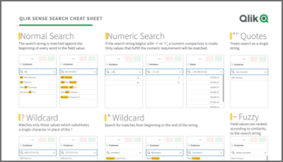
Qlik Sense Cheat Sheet version 2.0
It was back in 2015 when I first published the original Qlik Sense Search Cheat Sheet. Since then, and thanks to lots of individual contributors here in the Community, the Search Cheat Sheet has suffered several transformations to make it more complete and truthful.@afurtado wrote me an email a few weeks ago because he was interested in getting the document localized for the Brazilian folks out there. In addition to thank him for his contribution... Show MoreIt was back in 2015 when I first published the original Qlik Sense Search Cheat Sheet. Since then, and thanks to lots of individual contributors here in the Community, the Search Cheat Sheet has suffered several transformations to make it more complete and truthful.
@afurtado wrote me an email a few weeks ago because he was interested in getting the document localized for the Brazilian folks out there. In addition to thank him for his contribution and sending him the file I decided that it was about the time to get the Search Cheat Sheet an update.
Today I want to introduce a new version of the document. I added the compound search section to it (@jayanttibhe thanks for the tip), and I redesigned and rationalized the position of each element for better comprehension.
As an extra, I made the document multilanguage ready. So, if someone wants to translate the Cheat Sheet to other language (currently available in English, Spanish and Portuguese) please let me know in the comments section and I'll gladly tell you how to help us.
Hope you like it, and please share it.
Arturo
Updates:
Feb 28: French version thanks to @arychener
Feb 25: Italian added thanks to @AntonioCostantino . Russian translation updated
Feb 13, 2020: Cheat sheet includes now the ^ Wildcard to be consistent with Qlik Help. Russian language added thanks to the contribution of @martynova
Jan 29, 2020: German language added thanks to the contribution of @g_mitschke

-
Action required: Snowflake authentication migration guide for Qlik Analytics fol...
Snowflake is rolling out stronger authentication requirements as part of their platform security initiative. Starting May 2026, new connections using only username and password will no longer be accepted, and all existing password-only connections will stop working between August and October 2026. For the full rollout schedule, see Snowflake's authentication enforcement timeline. If your Qlik Sense Cloud Analytics, Qlik Sense Enterprise on Window... Show MoreSnowflake is rolling out stronger authentication requirements as part of their platform security initiative. Starting May 2026, new connections using only username and password will no longer be accepted, and all existing password-only connections will stop working between August and October 2026.
For the full rollout schedule, see Snowflake's authentication enforcement timeline.
If your Qlik Sense Cloud Analytics, Qlik Sense Enterprise on Windows, or QlikView environment connects to Snowflake, you will need to update those connections to use either key-pair authentication or OAuth before this change takes effect.
Who does this apply to?
This applies to any Qlik Cloud Analytics, Qlik Sense Enterprise on Windows, and QlikView connection to Snowflake, where the authentication method is set to Username and Password only. Connections that already use key-pair authentication or OAuth do not need to change.
To check your connections, review the Data connections and look for any Snowflake connections using username and password authentication.
What are my migration options?
There are two supported authentication methods you can migrate to.
Key-Pair Authentication
Key-pair authentication uses an RSA private/public key pair assigned to the Snowflake user account. It is the most straightforward migration path and does not require an identity provider. This option is recommended for most customers.
For setup steps, see Snowflake key-pair authentication documentation and the Qlik Snowflake connector guide.
OAuth
OAuth integrates with your existing identity provider (such as Okta or Azure AD) and is well-suited for organisations that want centralised access control and token-based authentication. It requires an OAuth security integration to be configured in Snowflake.
See the Qlik Snowflake connector guide and Snowflake OAuth documentation.
OAuth support for Snowflake was introduced to Qlik Sense Enterprise on Windows with our May 2026 release.
If you have any questions, we are, as always, happy to assist. Reply to this blog post or take your queries to our Support Chat.
Thank you for choosing Qlik,
Qlik Support -
【オンデマンド配信】データ連携が導く公共サービス改善のヒント
気候変動による災害の激甚化、人口減少による担い手不足、インフラ老朽化、サイバーリスクの高まりなど、行政を取り巻く環境はこれまでにないスピードで変化しています。こうした複合的な社会課題に対し、行政担当者には、限られた人員で迅速かつ的確な対応が求められています。本 Web セミナーでは、サンフランシスコ交通局(SFMTA)、フランスのスマート水道(m2ocity / 現 Veolia)、フランス国家安全保障省の危機管理といった海外の事例を取り上げ、分断されたデータをつなぐことで、どのように業務効率化やサービスの質向上を実現したのかを解説します。日本の行政 DX に役立つヒントをお届けします。 ※ パソコン・タブレット・スマートフォンで、どこからでもご参加・ご視聴いただけます。今すぐ視聴する 今すぐ視聴する -
Financial Analysis
As a follow-up to my previous blog post titled Finance Report with Waterfall Chart, I wanted to share an awesome demo that showcases financial reporting visualizations including a profit & loss statement with a waterfall chart. Qlik's Dennis Jaskowiak and Ekaterina Kovalenko, and partner Dawid Marciniak from HighCoordination, created the Financial Analysis demo based off of Jedox data, incorporating many enhancements to the straight table and piv... Show MoreAs a follow-up to my previous blog post titled Finance Report with Waterfall Chart, I wanted to share an awesome demo that showcases financial reporting visualizations including a profit & loss statement with a waterfall chart. Qlik's Dennis Jaskowiak and Ekaterina Kovalenko, and partner Dawid Marciniak from HighCoordination, created the Financial Analysis demo based off of Jedox data, incorporating many enhancements to the straight table and pivot table. In addition to the waterfall chart, they use inline SVG to create lollipop charts and bar charts in financial statements.
Here is a look at some of the sheets:
The Dashboard provides a high-level overview of profit and loss, cash flow and liquidity. On this sheet, view the use of inline SVG bar charts and lollipop charts.
The P&L sheet provides a more detailed look at profit and loss.
The Cost Center sheet uses the pivot table to show sales costs.
Find a detailed look of cash flow on the Cash Flow sheet.
This is just some of the sheets you will find in the Financial Analysis demo. If you are looking for appealing ways to visual your financial data while keeping it concise and clean, download the Financial Analysis demo (QVF) here.
Thanks,
Jennell
-
Why Summer Is the Best Time to Learn Analytics and AI
For students looking to stand out in today’s competitive job market, summer offers more than just a break from classes — it’s one of the best opportunities to build valuable skills in analytics and AI. As industries across the globe rapidly adopt data-driven decision-making and artificial intelligence, employers are increasingly looking for candidates who can work with data, uncover insights, and understand modern AI-powered technologies. The goo... Show MoreFor students looking to stand out in today’s competitive job market, summer offers more than just a break from classes — it’s one of the best opportunities to build valuable skills in analytics and AI. As industries across the globe rapidly adopt data-driven decision-making and artificial intelligence, employers are increasingly looking for candidates who can work with data, uncover insights, and understand modern AI-powered technologies. The good news? Students don’t need to wait until graduation to start developing these skills.Summer creates the perfect environment to explore analytics and AI in a flexible, low-pressure way that can have a lasting impact on future careers. -
Qlik Talend Cloud Migration Toolkit (QTCMT)
Migrating a Talend Studio project to the cloud is no small undertaking, but we are here to help. Brought to you by Savraj Rakkar, Benoit Barranco, and Sébastien Leduc. The Qlik Talend Cloud Migration Toolkit (QTCMT) is a structured migration solution built for teams running Talend on-premises who are looking to move to Qlik Talend Cloud and upgrade their project code to Talend 8. Whether the destination is the cloud or an on-premises environment,... Show MoreMigrating a Talend Studio project to the cloud is no small undertaking, but we are here to help.
Brought to you by Savraj Rakkar, Benoit Barranco, and Sébastien Leduc.
The Qlik Talend Cloud Migration Toolkit (QTCMT) is a structured migration solution built for teams running Talend on-premises who are looking to move to Qlik Talend Cloud and upgrade their project code to Talend 8. Whether the destination is the cloud or an on-premises environment, the Qlik Talend Cloud Migration Toolkit provides a clear, automated path to get there.
The Qlik Talend Cloud Migration Toolkit also extends beyond Talend Administration Center (TAC), offering an inventory view of Qlik Enterprise Manager (QEM) and Stitch environments so teams can see their full data integration footprint in one place.
The Core Capabilities
Talend Administration Center
- Register a Talend Administration Center server and browse the complete asset inventory
- Generate assessment reports to understand the migration scope before committing to any changes
- Migrate administrative assets (users, groups, projects, authorizations) and runtime assets (tasks, triggers, plans), including artifact uploads to Nexus 3 or JFrog Artifactory, CVE report generation, and Talend 8 code upgrades
- Automate on-premises upgrades to Talend 8 without a cloud migration
- Run project quality checks to surface best-practice violations and a broad range of code issues, with exportable reports
Qlik Enterprise Manager and Stitch
- View Enterprise Manager and Stitch inventories directly within QTCMT to understand the broader environment before migrating a single asset
Why use the Qlik Talend Cloud Migration Toolkit?
- Automated, phased workflows reduce migration effort significantly, cutting weeks or months off a manual migration timeline in many cases
- Full visibility into Talend Administration Center, Qlik Enterprise Manager, and Stitch environments is available before any assets are touched
- Asset configurations, parameters, authorizations, and project code are preserved throughout the migration process
- The phased approach allows assets to be migrated in stages, reducing risk to production environments and giving teams control over the pace
- Teams not yet ready to migrate can still use Qlik Talend Cloud Migration Toolkit to assess their current environment and plan ahead using the assessment and project quality tools
Why Move to Qlik Talend Cloud?
Moving to Qlik Talend Cloud means less time managing servers, upgrades, and infrastructure, and more time focused on actual work. New features ship monthly, so the platform improves continuously without any effort from the team. Data stays current across connected systems in real time, and the platform scales as needs grow. Teams also benefit from unlimited users and execution engines, backed by a generous initial capacity band.
Getting Started
The best first step is installing the Qlik Talend Cloud Migration Toolkit through the Qlik Help Migration Center and connecting it to an existing Talend Administration Center, Qlik Enterprise Manager, or Stitch environment to get an immediate picture of what is there. Full installation steps are available in the Qlik Talend Cloud Migration Toolkit documentation.
If you have any questions, we're happy to assist. Reply to this blog post or take your queries to our Support Chat.
Thank you for choosing Qlik,
Qlik Support -
Developing Word and PowerPoint reports with the expanded Microsoft O365 Add-in f...
Qlik's O365 Add-in offering for report developers has expanded with two new add-ins to enable Word document and PowerPoint presentation analytic reports. Report developers can now: Compose document or portrait style reports with data from a Qlik Sense app with an output format of .docx or .PDF (using the new Microsoft O365 Add-in for Word). Create PowerPoint presentation analytic reports from a Qlik Sense app with an output of .pptx or .PDF (usi... Show MoreQlik's O365 Add-in offering for report developers has expanded with two new add-ins to enable Word document and PowerPoint presentation analytic reports.
Report developers can now:
- Compose document or portrait style reports with data from a Qlik Sense app with an output format of .docx or .PDF (using the new Microsoft O365 Add-in for Word).
- Create PowerPoint presentation analytic reports from a Qlik Sense app with an output of .pptx or .PDF (using the new Microsoft O365 Add-in for PowerPoint).
How do I get started?
Qlik add-ins for Microsoft Office are installed using a manifest file. If you are using an existing manifest, you will need to download and deploy an updated file to access the new add-ins. See the deployment guide Deploying and installing Qlik add-ins for Microsoft Office.
The manifest covers all three productivity tool Add-ins. They cannot be deployed individually.
Notes on the PowerPoint add-in use
Qlik’s integration testing of Microsoft PowerPoint APIs shows that the O365 Add-in for PowerPoint can be unstable or slow at times. Our investigation with Microsoft reveals this to be a known challenge; some APIs on web vs desktop can result in different behaviors.
If your report developers have difficulty with the online PowerPoint Add-in, contact Qlik Support to open a case with us.
While we investigate the integration with Microsoft to determine if a solution is possible, consider developing your reports with the desktop version of PowerPoint.
For Qlik NPrinting Customers
-
Qlik NPrinting May 2026 Initial Release added support for exporting compatible Word and PowerPoint report templates in QDOCX and QPPTX formats for import into Qlik Cloud Reporting.
Please note that only single-connection templates can be exported.
See the Release Notes for details.
- Please note that due to Microsoft API limitations, it is not possible to embed data into an Excel table within the PowerPoint template to then produce native PowerPoint visualizations in the report. Refer to the help documentation for any other Word and PowerPoint report authoring limitations. See Qlik Reporting Service specifications and limitations for details.
If you have any questions, we're happy to assist. Reply to this blog post or take your queries to our Support Chat.
Thank you for choosing Qlik,
Qlik Support -
Action required: Qlik Automate ServiceNow connector migration to OAuth 2.0, June...
Qlik Automate's ServiceNow connector is moving from username and password authentication to OAuth 2.0. This change aligns with security best practices and ServiceNow's own recommendations for third-party integrations, eliminating the need to store credentials in plain text and providing more granular, revocable access control. When will this change be made? The change will go into effect on the 23rd of June, 2026. What action do I need to tak... Show MoreQlik Automate's ServiceNow connector is moving from username and password authentication to OAuth 2.0. This change aligns with security best practices and ServiceNow's own recommendations for third-party integrations, eliminating the need to store credentials in plain text and providing more granular, revocable access control.
When will this change be made?
The change will go into effect on the 23rd of June, 2026.
What action do I need to take?
Existing connections that use username and password authentication will need to be re-authenticated using OAuth 2.0. Complete the re-authentication steps as outlined in this blog post on the 23rd of June to prevent possible service interruptions.
How do I switch my ServiceNow connection to OAuth 2.0?
ServiceNow provides guidance on each stage of the OAuth 2.0 setup. See the following for details:
- OAuth 2.0 Overview
- Set up OAuth
- OAuth Inbound
- OAuth Inbound and Outbound authentication
- Enable OAuth with inbound REST
To migrate your Qlik Automate connector, first prepare ServiceNow by configuring OAuth 2.0, then re-authenticate Qlik Automate on the 23rd of June.
Before you begin, make sure you have Admin access to your ServiceNow instance and Admin or Owner access to your Qlik Cloud tenant and the relevant Qlik Automate automation.
- Open the Application Manager in ServiceNow:
The OAuth 2.0 plugin must be available in your ServiceNow instance.
- Log in to your ServiceNow instance.
- Click the All button in the top-left navigation bar and search for Application Manager.
- Select Application Manager from the results under Admin Center.
- In the Application Manager, use the Search your licensed applications and plugins field to search for OAuth. The ServiceNow products OAuth tile will appear in the results.
- Click the OAuth tile to expand it, then install the OAuth 2.0 plugin (Plugin ID: com.snc.platform.security.oauth). Wait for the installation to complete before proceeding.
- Navigate to Inbound Integrations:
- Click the All button again and search for Inbound Integrations.
- Select it from under System OAuth in the results.
- Create a new OAuth application endpoint:
- Click the New Integration button on the right.
- On the connection type screen, select OAuth – Authorization code grant.
- Configure the application by providing a Name, the Redirect URL, and the required scopes.
When prompted for a Redirect URL, use the callback URL provided by Qlik Automate during the connection setup. This URL must exactly match what is registered in ServiceNow.
- Save the Client ID and Client Secret; they are required for the next step.
- Click Save.
- Re-authenticate the connector in Qlik Automate
This step can only be carried out after the change on the 23rd of June, 2026.
- In Qlik Automate, add a new ServiceNow connection.
- Enter your ServiceNow instance domain (format: https://[domain].service-now.com/).
- Provide the Client ID and Client Secret previously recorded.
- Follow the on-screen authentication flow to complete the OAuth authorisation.
If you encounter issues during the migration, please contact Qlik Support or visit the Qlik Community for assistance. When raising a support case, include your ServiceNow instance domain and the error message you are seeing.
Thank you for choosing Qlik,
Qlik Support -
Qlik Sense May 2026 (Client-Managed) now available!
Smarter Data, More Flexible Analytics, Better User Experiences We’re excited to introduce the May 2026 release of Qlik Sense Enterprise on Windows (client-managed). This release delivers meaningful enhancements across data scripting, visualization flexibility, and user experience helping your teams move faster from data to insight while improving performance, governance, and usability. Below is a breakdown of what’s new, why it matters, and how y... Show MoreSmarter Data, More Flexible Analytics, Better User Experiences
We’re excited to introduce the May 2026 release of Qlik Sense Enterprise on Windows (client-managed). This release delivers meaningful enhancements across data scripting, visualization flexibility, and user experience helping your teams move faster from data to insight while improving performance, governance, and usability.
Below is a breakdown of what’s new, why it matters, and how your teams can benefit.