Unlock a world of possibilities! Login now and discover the exclusive benefits awaiting you.
Analytics & AI
Forums for Qlik Analytic solutions. Ask questions, join discussions, find solutions, and access documentation and resources.
Data Integration & Quality
Forums for Qlik Data Integration solutions. Ask questions, join discussions, find solutions, and access documentation and resources
Explore Qlik Gallery
Qlik Gallery is meant to encourage Qlikkies everywhere to share their progress – from a first Qlik app – to a favorite Qlik app – and everything in-between.
Qlik Community
Get started on Qlik Community, find How-To documents, and join general non-product related discussions.
Qlik Resources
Direct links to other resources within the Qlik ecosystem. We suggest you bookmark this page.
Qlik Academic Program
Qlik gives qualified university students, educators, and researchers free Qlik software and resources to prepare students for the data-driven workplace.
Recent Blog Posts
-
Introducing the Qlik Associative Big Data Index!
Qlik has a unique advantage in the data space – The Associative DifferenceTM. It is our secret sauce that allows all of your data to be brought togeth... Show MoreQlik has a unique advantage in the data space – The Associative DifferenceTM. It is our secret sauce that allows all of your data to be brought together and fully indexed to find all the possible associations in the data, across all your data sources. We’ve now expanded this capability to handle data sources of immense size. Introducing the Qlik Associative Big Data Index - it's a full associative experience for the biggest data sources you have. And rather than bringing your data to Qlik, our new product brings Qlik to the data. This is a governed, high-performance associative engine that can be deployed within sources such as Hadoop based data lakes, eliminating the need to transfer and prepare the data elsewhere before it can be analyzed. It’s a proper incremental index optimized for associative queries from the UI all the way down to the data. And it’s highly scalable as it can be distributed to work across a cluster, both in a cloud or an on-premise environment.
Think of the Qlik Associative Big Data Index as a governed performance layer that can help define your data strategy. We believe we're giving you the maximum flexibility by offering multiple deployment options:
- A Qlik Associative Big Data Index connector in the Data Load Editor allows users to automatically generate a script to access the index with user defined data filters.
- Existing On-Demand App Generation (ODAG) deployments can be enhanced by having the Qlik Associative Big Data Index accelerate the request and delivery of selected data for the detail app.
- The Qlik Associative Big Data Index can directly query the data lake, bypassing the in-memory Associative Engine to create a live window into the governed performance index -all without needing to move data into memory.
To pique your interest, here’s a short video that provides a brief overview of the Qlik Associative Big Data Index:
As previously announced at Qonnections 2018, Qlik will be offering the first release of the Qlik Associative Big Data Index via a Services-led offering that we call the Early Access Program (EAP). The EAP includes:
- The rights to use the software
- Customer Success Early Access Services (which are only delivered by Qlik) to design, implement and support the product within the customers’ environment for six months
- The opportunity for customers to help shape the future direction of the Qlik Associative Big Data Index technology as they will be able to directly work with the Qlik Product team.
Interested in being part of the Qlik Associative Big Data Index EAP? To find out if your environment and immediate needs are a good fit, please contact your local Qlik representative to explore being part of the Qlik Associative Big Data Index Early Access Program!
-
Kick-Start Your Qlik Application Automations with Automation Templates
What are Automation Templates ?Templates are a brand-new enhancement to Qlik Application Automation that provides a library of pre-built workflows to ... Show MoreWhat are Automation Templates ?
Templates are a brand-new enhancement to Qlik Application Automation that provides a library of pre-built workflows to accelerate the development and deployment of automations. These templates expedite your automation journey by providing short-cuts to common automation use-cases such as Reload Task Chaining, Loop and Reduce, Alerts and Notifications, and even the automatic creation of a ServiceNow ticket in the event a reload or business process fails. Templates are completely customizable and provide developers best practices built right into the automation, decreasing any mistakes, and simplifying the development lifecycle. We are excited to announce 18 Qlik-curated and managed templates for our first rollout.
What is Application Automation?
If you missed the announcement, we launched Application Automation, a no-code, drag-and-drop development tool that helps you assemble dynamic workflows to drive automation, optimize processes, and integrate applications across your SaaS ecosystem. Qlik Application Automation provides the ability to automate dynamic workflows that empowers the analytics to trigger action. Qlik Application Automation connects with a variety of enterprise applications like Snowflake, Salesforce, Splunk, and Service now supporting use cases like Analytics Dev-Ops to the more advanced integrations across multiple connectors.
Visit our Knowledge Base to dive deeper with ‘How to Articles’ using Qlik Application Automation or watch the YouTube playlist here.
Getting started with Automation Templates and automations
The template picker automatically pops up from within Qlik Cloud when you start building new automations. You can then configure and modify the template to suit your needs. There are five categories of templates (Analytics Data Pipelines, Alerting, Master Item Management, Change Control, and App to App Integration) covering a variety of use cases such as Task Chaining, Loop and Reduce, and others.
Each Template has a detailed page that provides a summary of the Template, snapshot of the automation workflow, and information such as the type of connectors used within the selected Template.
For the first release, we will deliver 18 Templates around the following categories:
- Analytics Data Pipelines - Easily reload applications, couple task chains together, and create Service Now tickets for failed reloads.
- Alerting - Develop advanced alerts and distribute them through Slack or Microsoft Teams.
- Master Item Management - Send measures from a parent app to other apps in a targeted space.
- Change Control –Automate changes from apps and schedule import/export of Qlik Sense applications back and forth from file services like Amazon S3.
- App to App Integration – Build autonomous integrations across non-Qlik applications to perform tasks like syncing contacts from Salesforce to HubSpot or sending emails with attachments to Dropbox.
Summary
Before Qlik Application Automation, it required users to find the outlier and then alert someone, submit a ticket, or whichever subsequent processes needed execution. Qlik Application Automation solves that and initiates the next evolution from passive BI to Active Intelligence. Using Templates to accelerate the build and deployment of sophisticated autonomous workflows, customers can now think big and solve systemic problems. Through the power of Qlik Cloud, Qlik Application Automation ensures data and analytics are the launch pad for autonomous business processes across your SaaS ecosystem. This is the first release of Templates, so stay tuned as we continue to innovate and enhance Qlik Application Automation.
For all product release details, subscribe to our SaaS Change Log.
-
A new year. A new release of Qlik Data Integration
First and foremost, we have resolved all known log4j critical vulnerabilities across the Qlik Data Integration portfolio and have updated the log4j li... Show MoreFirst and foremost, we have resolved all known log4j critical vulnerabilities across the Qlik Data Integration portfolio and have updated the log4j library to the more secure version 2.16.
Let's start with data lakes.
We've simplified the creation process by allowing users to customize the handling of deleted records in data lake projects. When users delete records in the storage zone of the data lake, they are soft deleted by changing their status to deleted. While this operation provides the ability to understand when deletes have occurred, it is not appropriate for certain types of analyses. The user can now configure the current view of data (i.e., ODS view) to include or exclude deleted records. This flexibility to contain or exclude deleted information makes analytics applications more customizable to the context of the analysis and insights sought.
Second, we've made improvements to data warehouse automation.
- Uniform source consolidations. Using traditional approaches to data warehousing, loading multiple source systems with identical structures (including table or view names, column names, and data types) to the target data warehouse is a maintenance nightmare. But Qlik users can now standardize and reuse mappings across multiple landing areas with identical structures. These mappings can include filters, data quality, and data validation rules. Users can flexibly create a single task across all sources or group sources across multiple tasks by reusing mappings. This standardization allows greater automation of generated code, resulting in increased productivity and reduced maintenance costs.
- Naming templates. Naming schema can vary for different deployment environments leading to error-prone and time-consuming manual changes. Qlik users can now use predefined environment variables to streamline the naming of artifacts such as data warehouse connection information, landing information, data marts, and lookups. These template variables will reduce deployment friction by making code more portable and improving developer efficiency.
Next, let's talk about CDC Streaming
We've added more capabilities to several Source Endpoints, including:
SAP HANA – We have optimized memory usage, and we've added auto-detection of SAP HANA versions to improve the support experience.
Microsoft MySQL Server – We now offer support for nulls as the primary key to help Qlik better align with current structures such as the Data Lakehouse.
IBM DB2 for z/OS – We have added bidirectional replication support for mainframe databases that do not produce an event when updating a record with the same values.
Oracle – We're now capturing more logging details about the Oracle instance configuration to improve support.
Salesforce - In case of transient slowdowns in network traffic, we've added a new parameter that will write Salesforce batches to intermediate files before sending them to the target endpoint.
Regarding Qlik Enterprise Manager, we've increased the granularity rate of purging old log files to allow for an hourly frequency. And we’ve also added a new Qlik Sense application in the Community that significantly expands the capabilities of Qlik Enterprise Manager Analytics.
And finally, we've added new capabilities to Qlik Catalog
- Administrators can now import and export business metadata to maintain or backup business metadata offline.
- We have expanded Qlik Catalog public APIs to include security-related transactions. These new public APIs will allow Qlik Catalog customers to develop integrations with third-party security systems that could automatically add, modify or remove users and groups and manage users within a group.
Together, the February 2022 release of Qlik Data Integration offers many new capabilities to help our customers turn raw data into actionable data. And we'll continue to develop more Qlik Data Integration product enhancements to bolster our Qlik Active Intelligence Platform – an end-to-end real-time data integration and analytics cloud platform.
Want to try out this release? Go to support> Downloads on Qlik.com and filter for the product you want to download
Want to try out this release? Go to support> Downloads on Qlik.com and filter for the product you want to download:
- Qlik Compose (2021.8 SR3, i.e., 2021.8.0.465)
- Qlik Replicate (2021.11.0.193)
- Qlik Enterprise Manager (SR1 / 2021.11.0.198)
- Qlik Catalog (February 2022)
And if you're interested in hearing about how Data Warehouse Automation can deliver a more significant ROI for your analytics data pipelines, register for this webinar.
-
Your 2021 Qlik Innovations Re-cap
Hey Guys, looking back on what we delivered in 2021, I am simply amazed at what we achieved over the past year. Despite the pandemic our momentum rema... Show MoreHey Guys, looking back on what we delivered in 2021, I am simply amazed at what we achieved over the past year. Despite the pandemic our momentum remains strong and continues to grow - delivering features and capabilities that close the gap between data and action – all within the cloud.
Take 4 mins out of your day to revisit all these great innovations released in 2021. Perhaps there are are 1 or 2 you missed and didn't know were there. Did I miss one, or have a favorite Qlik innovation of your own? Let me know in the comments below.
As we embark on 2022, we are accelerating our innovation to support our customers’ journey to the cloud via our SaaS offering, while preserving the flexibility to choose where their data resides.
Want to learn more about our future direction? Visit our Product Innovation and Direction page.
Don't forget - next week Wed January 26th at 10AM ET - we kick off our first Do More with Qlik session of the year where my colleague Product Manager Andrew Kruger and I will be showing of our new Qlik Reporting Service. Register here to save your spot.
Now.....on to the video:
2021 Innovations
- Collaborative Notes
- Hybrid Data Delivery Service
- Qlik Application Automation
- Application Automation Templates
- Qlik Forts
- Reporting Service
- Qlik Sense Mobile App for iOS and Android
- Self-service reporting via subscription
- New Catalog Browsing user experience
- Catalog object’s KPIs
- Data lineage and impact analysis
- Data Lineage Connectors
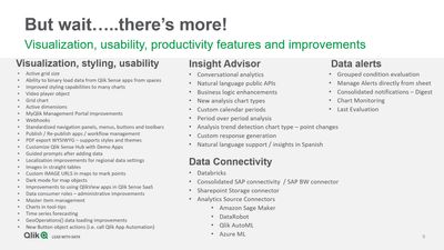
In addition all these great features and capabilities of course we added a ton of visualization, usability and productivity improvements.
Visualizations, usability and productivity improvements
- Active Grid Size
- Ability to Binary Load data from Qlik Sense Apps from Spaces
- Improved styling capabilities to many charts
- Video Player object
- Grid chart
- Active Dimensions
- MyQlik Management Portal Improvements
- Webhooks
- Standardized Navigation panels, buttons and toolbar
- Publish apps Workflow management
- PDF export WYSIWYG – supports styles and themes
- Access Ideation directly from Qlik Sense SaaS environment – connect and learn icon
- Customize Qlik Sense Hub with Demo Apps
- Improvement prompts that guide you after adding data
- Localization improvements for regional data settings – money format, dates etc
- Images in Tables
- Custom IMAGE URLS in Maps to mark locations – points
- Dark Mode for map objects
- Improvements to using QlikView apps in Qlik Sense SaaS
- Data Consumer roles – administrative improvements
- Master Item management
- Charts in tool-tips
- Time Series Forecasting
- GeoOperations data loading improvements
- New Variable Editor UI
Insight Advisor improvements
- Conversational analytics
- Natural Language Public APIs
- Business Logic Enhancements and New Analysis Types
- Custom Calendar Periods
- Analysis trend Detection chart type – point changes
- Custom responses
- Questions and generate NL insights in Spanish
New Data Connectivity
- Databricks
- Consolidated SAP Connectivity
- Sharepoint Connector
- Analytics Source Connectors
- Amazon Sage Maker
- DataRobot
- Qlik AutoML
- Azure ML
- Qlik AutoML
Data Alert improvements
- Grouped condition evaluation
- Create and Manage Alerts directly from sheet
- Consolidated delivery notifications – Digest
- Chart Monitoring
- Last Evaluation comparison rule

-
Announcing the 2022 Class of Qlik Academic Program Educator Ambassadors!
These individuals are some of our most active participants of the Qlik Academic Program who fully utilize the free software, training resources ... Show MoreThese individuals are some of our most active participants of the Qlik Academic Program who fully utilize the free software, training resources and qualifications that we provide to university students and educators. The members of our 2022 class are:
- Jerry Roek, Adjunct Faculty in Statistics and Business Analytics, teaching at Texas A&M - San Antonio, and Southern New Hampshire University SNHU in the United States
- Javier Leon, Adjunct Professor in Business Intelligence and Analytics, teaching at Saint Joseph's University, Eastern University, and Villanova University in the United States
- Angelika Klidas, Lecturer in Data and Analytics teaching at the University of Applied Sciences Amsterdam in the Netherlands
- Blerim Emruli, Senior Lecturer in Informatics, teaching at Lund University in Sweden
- Dr Jean-Yves LE CORRE, Associate Professor of Practice teaching at Xi'an Jiaotong-Liverpool University in China
- César Brochero Castel, MBA Professor in Business Intelligence and Analytics and Founder of QuAlytics Chile, teaching at Universidad de Palermo and Universidad Católica Argentina in Argentina
- Dr Nassir Ibrahim, Lecturer in Technology Innovation teaching at Birmingham City University in the United Kingdom
- Marisa A. Sánchez, Professor teaching at Universidad Nacional del Sur in Argentina
- Mario De Felipe Pérez, Lecturer of Data Visualization teaching at Fundacion Escuela De Organizacion Industrial in Spain
- Angel R Monjarás, Business Intelligence Diploma Professor teaching at Instituto Tecnologico Autonomo De Mexico (ITAM) in Mexico
Meet the Qlik Academic Program Educator Ambassadors for 2022
We are thrilled to be recognizing the efforts of these individuals to help the Qlik Academic Program to achieve its mission - to create a data literate world, one student at a time. Each ambassador has been selected through a self-nominated application process, where they were required to answer various questions covering their motivations for becoming an ambassador, and to evidence their passion for upskilling their students in analytics over the past 12 months. This year, we are excited to select 10 ambassadors, several new ones and 4 returning ambassadors whose efforts continued to impress us. By way of thanks for their efforts our ambassadors will receive exclusive benefits such as webinars and discussion groups with Qlik leaders, opportunities to showcase their experience with the Qlik Academic Program and the chance to grow their network with other educators across various fields and geographies.
Throughout 2022 our ambassadors will continue their advocacy for the Qlik Academic Program and help us to reach even more students and educators with our free resources. Stay tuned over the coming months for more in-depth profiles on each of our ambassadors, and get to know who they are, what they teach and why they are so passionate about bridging the data literacy skills gap! Learn more about the program and how to apply for future classes.
Check out the official blog here

-
Dormitory Constructions in NY
Dormitory Constructions in NY AnyChart — Extensions for QS Explore all active dormitory construction, renovation, and repair projects in NY wher... Show MoreDormitory Constructions in NYAnyChart — Extensions for QS Explore all active dormitory construction, renovation, and repair projects in NY where the Dormitory Authority of the State of New York (DASNY) carries out some level of management oversight — by county, institution, project, architect, start year, or completion year. See how close to conclusion each work is at a glance. Switch to sorting by budget to quickly identify the most expensive projects and find out their location, manager, etc.
Discoveries
Some of the discoveries from using this app include:
* Timeline and details of each active dormitory facility development project across all institutions across the state of New York.
* Most and least expensive dormitory constructions statewide.Impact
Delivers a visual overview of all projects' schedules, communicating how long a project should take, its current schedule status, and budget to support informed, time and cost-aware decisions on prioritization, re-allocation of resources, and other aspects of management.
Audience
Authorities delivering dormitory construction project management supervision and audit. All who need to create or understand project plans and schedules — the app features a good example of a Project Gantt chart in Qlik Sense and is publicly available among AnyChart demo apps for Qlik.
Data and advanced analytics
The dataset is derived from a report on active construction projects managed by Dormitory Authority State of New York (DASNY), which is publicly available online.
-
Business Analyst Qualification tips!
As the final part of my onboarding with Qlik I had to complete the Business Analyst pathway and sit the exam. This involves building an app in Qlik Se... Show MoreAs the final part of my onboarding with Qlik I had to complete the Business Analyst pathway and sit the exam. This involves building an app in Qlik Sense following the app building guidelines provided, and then answering 40 multiple choice questions some of which are based on the app. I only joined Qlik in September, not only was Qlik Sense totally new to me but so was data analytics. I was extremely nervous about taking this exam, however the step-by-step interactive videos and take away documents made the course straightforward, and the exam was the same. As long as you read everything thoroughly and don’t rush, you’d be surprised at how quickly you pick up the basics of Qlik Sense and start to work some of the functionality out for yourself.
A few tips I have if you are sitting the exam:
- Read the app build instructions carefully, everything you need to know for the build is in there but it’s easy to skim read and miss a step that you’ll then need to correct later.
- The first part of the exam is the app build and this is not timed. This part took me a long time and I did it over a few days, make the most of the fact you don't have to hurry.
- Don’t take shortcuts during the app build, if you don’t understand why a step is necessary then it might be a good idea to revisit the training module.
- When studying for the exam, I did it first thing in the morning and I turned off my phone and closed my emails. It is very easy to get distracted, especially when you’re doing something on a screen that allows for endless notifications.
- I was working in the Qlik Sense Cloud for this which meant product updates often meant my screen looked slightly different to the training videos. Don’t let this deter you, when you get used to working in the cloud environment the layout and slight differences become clearer.
- Some parts of the app build process will come naturally to you, others may not. You won’t be able to avoid any part of the build process during the exam, so it’s best to rewatch the videos on the parts you are less confident with.
We hope you found this helpful! And if you want to learn more about the Qlik Academic Program and our qualifications, then visit qlik.com/academicprogram for more information.
-
New and Updated Qlik Compose courses have launched!
Qlik Education is excited to announce New and Updated Qlik Compose Qlik Continuous Classroom courses have launched! These modules can be viewed via th... Show MoreQlik Education is excited to announce New and Updated Qlik Compose Qlik Continuous Classroom courses have launched! These modules can be viewed via the “Browse Courses” on Qlik Learning Portal selecting Data Integration:
Data Integration
Please use the Category filter and select Qlik Compose. This will return the Qlik Compose course library:
Happy Learning!

-
Happy 2022 - Our first enhancements are live!
Happy 2022 Qlik Community! Qlik Community grew so much in 2021! We introduced our new MVP program, launched the Support Case Portal and Product Sup... Show MoreHappy 2022 Qlik Community!
Qlik Community grew so much in 2021! We introduced our new MVP program, launched the Support Case Portal and Product Support Lifecycle page, created three new product forums, acquired the Release Notes, and so much more! We spent the end of the year planning for 2022 and solidified our Qlik Community New Year’s resolution:
Focus on YOU!
YOU will be our driving force this year. Every decision we make regarding features, content, and experiences, will have you front and center, top of mind. We are SO excited for what’s to come this year and cannot WAIT to share everything with you! All of that will come in due time (but go ahead and start getting excited with us).
Right now, we want to kick off the year with our first couple of enhancements that pushed out on January 11th:
You will now see the Search bar available in Support articles.
You no longer need to go to a different tab or a different place in Qlik Community to conduct a new search.
New messaging if you reach an inaccessible area of the Community so you can get the assistance you need quickly.
Trying to access the Case Portal or open a Support case? Reach out to CustomerSupport@qlik.com. Product questions? Try posting on our forums. Need other assistance? Contact the Qlik Community team at qlikcommunityadmins@qlik.com.
Our next release will be on February 15th but be on the lookout for some new things between now and then. 😉
We hope everyone had a happy, safe New Year and wish everyone the best for the upcoming year!
Your Qlik Community Admins,
Melissa, Sue and Jamie
-
Qlik Cloud Data Services Architecture Guide is now available
We want to introduce the Qlik Cloud Data Services Architecture Guide.The guide is for Qlik prospects and customers to help understand the different co... Show MoreWe want to introduce the Qlik Cloud Data Services Architecture Guide.
The guide is for Qlik prospects and customers to help understand the different components that make up our Qlik Cloud Data Services. The focus is more informational than an implementation document for practitioners.
This guide describes how we deliver our capabilities today with a mix of SaaS and client-managed capabilities. These architectures seek to balance the considerations of where customer data sources are present - on-premises or cloud and the expected latency for analytics consumption.
This document focuses on what is currently generally available and will be updated frequently as we aggressively deliver new Qlik Cloud data services throughout the year. The Qlik enterprise architecture group is also creating complementary technical whitepapers starting with hybrid data delivery and app automation that will be more suitable for implementation efforts.
Please reach out to your Qlik account representative regarding any questions on this document.
-
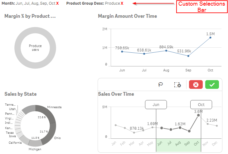
Building your own selections bar
When you're building a Qlik Sense mashup, you have the option of including the selections bar, which is pretty awesome. The selections bar not only ke... Show MoreWhen you're building a Qlik Sense mashup, you have the option of including the selections bar, which is pretty awesome. The selections bar not only keeps track of and displays selections made, it has step back and step forward functionality to undo or redo selection changes, a search tool, and a drop down selections tool.
It's possible, however, that for whatever reason you may not want to use the selections bar, but you still want to give your users some control over selections. The simplest way to do this probably is to include a clear selections button, as we do in quite a few of our mashups. You can see how to do that in a previous post on this blog here - How to create a “clear selections” HTML button for your next mashup project.
But if you want to show a little more information on current selections, and give users a little more granular control over what selections they are clearing, you can build a custom selections bar. I'm going to walk through building a very simple selections bar, and you can follow along and build on the idea, adding your own styling and customizing it even further.
NOTE - I'm going to assume that you have some prerequisite knowledge of building a mashup. If you do not, here are a few links to get you started -
Qlik Sense Workbench. The visualization and Mash-Up Editor
Qlik Sense Mash-Up API Tutorials
Qlik Sense Help - Building Mashups
The first thing you need to do is actually get the selections currently made. You can do that like this -
app.getList("SelectionObject", function(reply){
  // STUFF TO DO IN CALLBACK
});
That will get you the selection object as the reply. The rest of our code will go inside of the callback function, which will execute every time the selections change. Now in the callback, we need to grab the DOM node we're going to use for the selections bar, and make sure it's clear of any previous content so that every time the callback function is called we are not appending duplicate content.
$selections = $("#selections");  //DOM node to append selections to
$selections.html("");  //Clear node of any previous selections
Now comes the bulk of our code. We have to loop through the array of fields that have selections, and for each field that has selections, grab some variables, including the field name, number of selections made in field, the total values in the field, a string of the names of the values selected, and something called the selection threshold. If the number of selections is greater than the selection threshold, the selection object will not return the name of every value selected, so at that point we no longer display the names of the values selected, and instead display the number of selections. You could also choose to always display just the number of selections as well, instead of the names of the values selected. Here, I've chosen to display the names of values selected, when possible.
//Loop through array of fields that have selections
$.each(reply.qSelectionObject.qSelections, function(key, value) {

  var field = value.qField;  //The field name
  var numSelected = value.qSelectedCount;  //Number of selections in field
  var total = value.qTotal;  //Total number of values in field
  var threshold = value.qSelectionThreshold;  //Threshold in which to display a number count instead of each value
  var selectedStr = value.qSelected;  //When numSelected is less than or equal to threshold, a string of the names of each value selected


  //If numSelected is below or equal to threshold, show string of names of each value selected
  if (numSelected <= threshold) {
    var html = "";
    html += "<span class='selected-field-container' id='" + field + "'>";
    html += "<span class='selected-field'>" + field + ": </span>";
    html += selectedStr;
    html += " <span class='clear-field'>X</span>";
    html += "</span>";
    $selections.append(html);
  }

  // If numSelected is greater than threshold, show the numSelected of total values
  else {
    var html = "";
    html += "<span class='selected-field-container' id='" + field + "'>";
    html += "<span class='selected-field'>" + field + ": </span>";
    html += numSelected + " of " + total;
    html += " <span class='clear-field'>X</span>";
    html += "</span>";
    $selections.append(html);
  }

});
Notice that I've include a span with class 'clear-field'. We're going to attach an event listener to that, so that when that span is clicked, the corresponding field has its selections cleared.
//Event listener on .clear-field to clear that field's selections when clicked
$(".clear-field").click(function() {
  var field = $(this).parent().attr("id");  //Field associated with the .clear-field that was clicked
  app.field(field).clear();  //API method to clear the field
});
And that's it. I've attached a folder of the entire project where you can see all of the code, and you can place it into the extensions folder of Qlik Sense Desktop to see this in action and play around with it (you'll also need the Consumer_Sales.qvf if you don't already have it).
-
One Happy Educator!
We love hearing from happy @Anonymous Academic Program members! Check out what Anatoliy Anguelov has to say about being an Academic Program educator ... Show MoreWe love hearing from happy @Anonymous Academic Program members! Check out what Anatoliy Anguelov has to say about being an Academic Program educator by reading his most recent LinkedIn post.
If you are interested in joining as an educator or students you can apply today for free #analytics Qlik Sense software, training, certificate opportunities, and more! Visit qlik.com/academicprogram
-
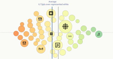
The Canadian Newsroom Diversity Survey data visualized
Happy 2022 to everyone, and this time for real we need a good one 😉In this occasion we teamed up with The Canadian Association of Journalists to expl... Show MoreHappy 2022 to everyone, and this time for real we need a good one 😉
In this occasion we teamed up with The Canadian Association of Journalists to explore the landscape of newsrooms and journalists in Canada. The Canadian Association of Journalists run an annual diversity survey for the first time ever in Canada inquiring more than 200 newsrooms nationwide about the race and gender profile of its newsroom’s employees. It is Canada’s largest survey of the race and gender of those who work in media, including data from almost 4000 journalists.
We architected the site to welcome casual readers into to the topic by starting with a description of the demographics of the Canadian newsrooms. We discovered that, from those who reported gender or race, the majority are white (75%). Across all races/ethnicities slightly more women (53%) work in Canadian newsrooms.
To help readers to understand the data and the composition of the newsrooms in Canada we plotted and interesting first chart. It contains one area block (colored squares) per each journalist in the survey, that is 3873 squares. Then we assigned each journalist, each square, to a group based on their attributes. This way we can explore the landscape of journalism in Canada.
Readers can toggle between different mix options and explore the data freely learning along the way.
Once the reader is familiarized with the “raw” data using the chart described above, any of us can see how 75% of the reported journalists are “white” in Canada, but what that really means? is that a lot?
Adding context
Each newsroom serves an audience, some work for the entire country and some only for a small community. We mixed the survey data with Canadian Census data about audience specific race and gender. Now we can compare each newsroom to its audience and determine if it’s a good representation of the people it serves.
In the chart below readers can see each newsroom in the survey and identify those that are in parity with their audience. We discovered that, on average, white journalists are over-represented in the newsrooms. Similar analysis is available for gender
The follow up question leads up to the next charts, now that we know how each newsroom are compared with the audiences they serve, we want to know who really makes the decisions in the newsrooms, are more women in charge?
Visualizing leadership
We compared the percentage of women supervisors to the percentage of women staff to add context to our chart as well. We can read this chart in different ways, if we pay attention to the y-axis, we can explore all the newsrooms that have 50% or more women that men in a supervisor role. Alternatively, we could look at the other axis (x-axis) to discover the newsrooms that employees more women.
By looking at our reference line we can easily spot those newsrooms where the number of women supervisors is proportional to the number of women in the newsroom.
These two spots I highlighted in the capture above show the extremes. On one hand the blue squared area contains the newsrooms that have a disproportionally large percentage of women in a supervisor role compared with a low number of staff women percentage. The area enclosed in the red square would show the newsrooms where a very low percentage of women supervisors would work in a women intensive newsroom.
Who is getting better jobs
Now that we know the gender and race/ethnicity shape of the Canadian Newsrooms a question arise, who is getting better jobs? Are more better jobs reserved for a particular race/ethnicity or a gender?
We used simple charts to represent this data, all the chart share the same y-axis so we can quickly compare the results as you move left to right, from better paid jobs to the entry level ones.
I’d say that it is safe to affirm that journalists, as all of us are, are biased beings. Many journalists tend to focus more on topics that are related to the social class they interact with, or about issues of their own gender or race/ethnicity. Thus, knowing the composition of newsrooms in Canada, or elsewhere, becomes a very important matter for all of us when it comes to better understand the food we are being served by the media.
I hope you enjoy this project as much as I did working on it.

-
A method to calculate time span between two Year-Month values
Calculate method Let: Start Year=Fy, Start Month=Fm, Start Year-Month=Fym Let: End Year=Ly, End Month=Lm, End Year-Month=Lym Year-Month = Year * ... Show More- Calculate method
Let: Start Year=Fy, Start Month=Fm, Start Year-Month=Fym
Let: End Year=Ly, End Month=Lm, End Year-Month=Lym
Year-Month = Year * 100 + Month
Default: Ly >= Fy; Fm & Lm ∈ [1,12]
Formula: Time Span = {[(13-Fm) + Lm] + (Ly – Fy -1)*12}
Or: {[(Fy*100 + 13) – Fym] + (Lym – Ly*100) + (Ly-Fy-1)*12}
(13-Fm): Month number of Start Year. There are (13-Fm) months from Start Month to December, including the Start Month itself. For example, it counts a total of 4 months from September to December (13-9=4); it counts a total of 1 month from December to December (13-12=1).
Lm: Month number of End Year. There are Lm months from January to end month, including the End Month itself. For example, it counts a total of 5 months from January to May; it counts a total of 8 months from January to August.
(Ly-Fy-1)*12: Month number of Start Year to End Year.
Considering the year difference, there exist three situations.
1. If the Start Year and the End Year are the same year (Ly=Fy), then Time Span = (13-Fm)+Lm+(-1)*12, that is, (Lm–Fm+1), the End Month minus the Start Month and plus one. This equals to the number of months from Start Month to End Month.
2. If the End Year is the next year of the Start Year (Ly=Fy+1), then Time Span = (13-Fm)+Lm, that is the number of months in the Start Year (13-Fm) plus the number of months in the End Year (Lm).
3. If the End Year is two or more years later than the Start Year, then Time Span = the number of months in the Start Year + the number of months in the End Year + (the number of all months in the year between the Start Year and the End Year)
- Scenario Application
Calculate the number of months between customer’s registration year-month and each order year-month, and compare it with the customer’s [total number of order months] corresponding to each order year-month, so as to calculate the customer’s loyalty to the platform
- Qlik Sense Load Script Steps
Due to data privacy, this article uses dummy data for demonstration.
Basic data: customer registration information, order list.
Customer registration information fields:customer_code; customer_name; register_date
Order list fields:order_date; order_number; customer_code; commodity; order_amount
(1) Load order list data.
[orderlist]:
Load * Inline [
order_date, order_number, customer_code, commodity, order_amount
2021/1/5, O2021001, T001, Milk, 10.5
2021/1/20, O2021002, T001, Cheese, 5
2021/3/2, O2021003, T001, Ham, 20
2021/3/7, O2021004, T002, Apple, 8
2021/4/10, O2021005, T001, Banana, 9
2021/5/18, O2021006, T001, Pie, 30
2021/6/1, O2021007, T001, Coke, 7
2021/6/1, O2021008, T002, Butter, 6
2021/6/1, O2021009, T003, Bone, 18
2021/7/1, O2021010, T003, Steak, 100
2021/8/8, O2021011, T003, Bacon, 60
2021/8/12, O2021012, T001, Egg, 40
2021/8/20, O2021013, T002, Candy, 15
2021/9/6, O2021014, T003, Potato, 22
2021/10/1, O2021015, T003, Bean, 20
2021/10/15, O2021016, T001, Chocolate, 12
2021/11/11, O2021017, T003, Pork, 70
2021/11/17, O2021018, T002, Chicken, 30
2021/12/10, O2021019, T002, Bread, 14
2021/12/12, O2021020, T001, Fish, 56
2021/12/15, O2021021, T003, Ketchup, 24
2022/1/1, O2021022, T003, Jam, 35
];
(2) Load customer registration information, and left join it to order list.
Left Join [orderlist]:
Load * Inline [
customer_code, customer_name, register_date
T001, Tom, 2021/1/1,
T002, Jerry, 2021/3/1,
T003, Spike, 2021/6/1
];
The combined table is shown as below.
(3) According to the merged [orderlist], get each customer’s: registration year (registeryear); register year-month (registerym), which is expressed in digital form, registeryear*100+registermonth; in the same way, get the order year (orderyear) and order year-month (orderym).
[orderwidetable]:
Load *,
Year(register_date) as [registeryear],
Year(register_date)*100 + Month(register_date) as [registerym],
Year(order_date) as [orderyear],
Year(order_date)*100 + Month(order_date) as [orderym]
Resident [orderlist];
Drop Table [orderlist];
Table generated is shown as below.
(4) Based on the wide table [orderwidetable] generated in the step 3, generating a new table by customer to get each customer’s: first order year (firstyear), first order year-month (firstym), total number of order months (totalordermonth).
[ordermonth]:
Load
[customer_code] as [ccode],
[registerym] as [rym],
[registeryear] as [ryear],
min(orderym) as [firstym],
min(orderyear) as [firstyear],
count(distinct [orderym]) as [totalordermonth]
Resident [orderwidetable]
Group By [customer_code],[registerym],[registeryear];
Table generated is shown as below.
(5) Based on the same table [orderwidetable], generating a new table by customer and order year-month to get each customer’s different order year-month.
[count]:
Load
[customer_code] as [ccode],
[orderym] as [oym],
[orderyear] as [oyear],
count(distinct orderym) as [countym]
Resident [orderwidetable]
Group By [customer_code],[orderym],[orderyear]
Order By [customer_code],[orderym];
Table generated is shown as below.
(6) Left join table generated in step 4 to the table generated in step 5. Therefore, each table row will be able to show customer’s first order year, first order year-month and total order months.
Left Join [count]:
Load
*
Resident [ordermonth];
Drop Table [ordermonth];
Table generated is shown as below.
(7) Based on the table generated in step 6, apply the time span calculation method to get each customer’s number of months between each order year-month and first order year-month ([lifemonth]). Using Peek Function to get the cumulative order months in each customer’s order year-month ([ordermonth]).
Calculating cumulative order year-month mainly refers to an article below.
Link: https://community.qlik.com/t5/QlikView-App-Dev/Script-cumulative-sum-group-by/td-p/1810410
[count_temp]:
Load
*,
(([ryear]*100+13-[rym])+([oym]-[oyear]*100)+(([oyear]-[ryear]-1)*12)) as [lifemonth],
if(RowNo()=1,[countym],if(ccode<>Peek(ccode),[countym],if(ccode = Peek(ccode) and Peek([ordermonth]) = 1, 2, [countym]+Peek([ordermonth])))) as [ordermonth]
Resident [count]
Order By [ccode],[oym];
Drop Table [count];
Table generated is shown as below.
(8) Based on the [ordermonth] and [lifemonth] generated in step 7, calculating customer loyalty ([loyal%]) in each order year-month.
[count_final]:
Load
*,
Num([ordermonth]/[lifemonth],'#,##0%') as [loyal%]
Resident [count_temp];
Drop Table [count_temp];
Rename Table [count_final] to [count];
Table generated is shown as below.
In this way, the loyalty of each customer in each order year and month is calculated.
-
Data analytics among the most in demand skills for 2022 and beyond
According to an article published in cxotoday.com, data analytics will continue to rise to become a crucial component for organizations and government... Show MoreAccording to an article published in cxotoday.com, data analytics will continue to rise to become a crucial component for organizations and governments because it helps leaders make decisions based on facts and trends. By 2025, IDC estimates the world will create and replicate 163 zettabytes (ZB) of data, 10 times the number that was created in 2016. Data analysts and data scientists are hot commodities because organizations need professionals who can store, process and analyze data to answer critical questions and make predictions to solve problems and make informed decisions. Organizations however are facing the shortage of qualified individuals with this specific skill set. Data analysts and scientists are already playing a big role in the health care industry in the fight against COVID-19. Almost all the experts believe that data science and analytics will be an important skill as they navigate the current roadblocks to growth.
Read more at: https://www.cxotoday.com/ai/most-in-demand-tech-skills-for-2022-and-beyond/The Qlik Academic Program has a complete set of resources aimed to train the future generation in analytics. More than 2600 institutions and universities have accepted this program to train in analytics. To know more about this program, visit: qlik.com/academicprogram
-
New Year, New Badges!
If your New Year’s Resolution is to get more data literate or if you just want to get the most from your free #Qlik #AcademicProgram subscription, the... Show MoreIf your New Year’s Resolution is to get more data literate or if you just want to get the most from your free #Qlik #AcademicProgram subscription, then look no further! We have just launched three new Academic Program badges:
Academic Program - Data Visualizations Badge
Academic Program - Introduction to Data Analytics Badge
Academic Program - Advanced Topics in Data Analytics Badge
All you need to do is go to the Achievements Page which you can find under the Continuous Classroom dropdown menu on our Learning Site. Here you can find the complete list of courses users will need to complete to earn a badge.
Once you have completed the course and achieved the badge, it can be downloaded and shared on Social Media platforms to communicate your hard work and knowledge to future employers in your network!
Not yet signed up to the Academic Program but want to start earning your badges? For more information or to apply visit qlik.com/academicprogram
-
Qlik Learning Portal Achievements is now Live!
Qlik Education is excited to launch a series of badges you can earn by completing specific subsets of courses within the Qlik Learning Portal. Access ... Show MoreQlik Education is excited to launch a series of badges you can earn by completing specific subsets of courses within the Qlik Learning Portal. Access Qlik Learning Portal Achievements Page to learn more on specific courses you will need to complete in order to earn a badge.
These achievements will be awarded in several areas of mastery:
- New User Learning Plan
- Program
- Role and Product - Coming soon
We are looking forward to adding additional badges for Role Mastery and Product Mastery in the coming months.
You can access badges earned on My Badges page of the Qlik Learning Portal. To access My Badges Page, click on My Account in the top right corner, then click on the “My Badges” icon from the user-menu.
By completing the required courses, you will be awarded a badge which can be shared on social sites.
Happy Learning!
-
San Francisco Mobile Food Permits
SF Food Truck Permits AnyChart — Extensions for QS Run through the mobile food facility permits in San Francisco in an intuitive visualization o... Show MoreSF Food Truck PermitsAnyChart — Extensions for QSRun through the mobile food facility permits in San Francisco in an intuitive visualization of the official data provided by the city's Public Works department. For each vendor and location, quickly see the current status of the permit (approved, expired, inactive, issued, requested, or suspended), as well as the dates when the application was received and approved, and when the permit is set to expire.Discoveries
Some of the discoveries from using this app include:
* Key milestones in the food permit application process for all mobile vendors, including when it was requested, approved, and expires.
* Current application status and timeline for each vendor.Impact
Makes it easy to understand which mobile vendors actually possess an official food permit from San Francisco city authorities, identifying violators endangering public health, as well as to plan timely inspections, renewals, and other procedures established by law.
Audience
Authorities overseeing mobile food safety and operations. People willing to know if a certain vendor has the required permit. All who want to analyze resource allocation in Qlik Sense — the app features a good example of a Resource Gantt chart and is publicly available among AnyChart demo apps for QS.
Data and advanced analytics
The dataset is derived from a report on mobile food facility permits, which is provided by the San Francisco Department of Public Works and publicly available online.
-
Reflecting on the year 2021: Qlik Developer community
The year 2021 has been a challenging year for all of us without a question. And with this challenge of not being able to be in person for work, busin... Show MoreThe year 2021 has been a challenging year for all of us without a question. And with this challenge of not being able to be in person for work, business or education, emerged a new opportunity — relying on our community. As a team dedicated to supporting development and innovation, we feel thrilled to create possibilities that drive value for our worldwide Qlik developer community & organizations enabling them to take data & visual-analytics-led decisions. We are wrapping up the year with some key milestones that we achieved as part of the DevRel team in Qlik R&D.
Rebranding
First, we focused on rebranding our various developer platforms. We realized that it was imperative to be able to communicate & reach out to our developer community through certain specific platforms so the discussions are focused. As a starting step, we relaunched our Twitter. This platform is effectively used to share updates about any new blog posts, videos, experiments, etc., and serves as a primary scene of our presence.
Twitter Page
We also have an active community presence in our developer-focused Slack channel “Qlik Dev”, and we decided to keep that going so the community can benefit from it by getting direct help from fellow members, Qlik-insiders, and the DevRel team. One of the primary goals of the DevRel team is to set a two-way communication process between our developers and the R&D team. The Slack channel helps us in this process by getting direct feedback back to Qlik R&D about our suite of products and APIs. This feedbacks are a great way to understand what our users think, any pain points & suggestions. The openness is something we really value at Qlik.
Slack channel — Developer community
Content
The Qlik community consists of a wide array of developers with varying roles & levels of expertise (Data Analysts, BI Engineers, Embedded Analytics developers, etc.). While we started with a focus on developers leveraging Qlik APIs for embedding analytics, we also wanted to expand our horizon and support different developer needs. Therefore, it was crucial to identify role-specific developer contents that could cater to each category of the developer. With this in mind & the interest of our community, we focused on certain specific areas:
- Embedded Analytics — Qlik Sense APIs, open-source libraries(Nebula, Picasso, Enigma, etc.), Automations
- Descriptive Analytics — Data analysis, dashboards, visualization
- Predictive Analytics — Machine Learning within QS (supervised/unsupervised), Qlik AutoML
Mediums
We also realized that there was a lot of content out there in the community but they needed to be streamlined so the developers could just rely on these primary sources to start their Qlik development journey. With this in mind, we set qlik.dev as our base for all things related to Embedded Analytics. qlik.dev is comprehensive & lists out tutorials, API specifications & various ways to use our libraries.
qlik.dev
To target the other two categories(Descriptive & Predictive Analytics), we leveraged the Qlik Design blog which is again an excellent platform for any Qlik developer to be and understand the best practices, innovative solutions, etc.
Qlik Design Blog- Community
Our motive has always been to simplify the journey for the developer community and we understand that everyone has their own preferences in terms of tutorial mediums. Some may just like to open up a tutorial, look at a code snippet and take things from there and some may like to follow an end-to-end coding video. This led to launching our own Developer playlist on the official Qlik YouTube channel.
Developer Playlist
We also kept in mind the various categories of developers mentioned before and so irrespective of whether you are just getting started or you are looking at implementing an advanced-level use case, this playlist is going to have it all. Since its release last month, we have productionized 4 videos in the form of 3 series.
Videos released
Here’s a high-level overview of the various series we have launched.
Various YouTube series in Developer playlist
We are going to focus a lot in the next year on the already launched series & plan to additionally introduce a few to address the various aspects within the Qlik developer journey. So stay tuned!
Takeaways
Although it’s been less than a year since we started revamping our platforms and setting the goals(as a team), we wanted to understand how the community responded to the released content.
Here is the count of articles for each category released in the Qlik Design blog.
Count of articles per category
And here is a breakdown of the number of views for the two categories.
The articles in the Predictive Analytics category have a very consistent & high number of viewers. And things around building visualization extension using Nebula, migrating from Capability APIs to Nebula, chatbot had great interests in the Embedded Analytics part. This allows us to pay heed to what the developers are interested in.
We also created a Control chart to understand how the views change over time and look like there are no special cause variations and things look consistent.
Finally, we aim to assist & guide developers in bringing the best of the Qlik ecosystem so they can adapt to new & existing technologies to solve critical business problems. Our communities play a pivotal role in this process and we can’t wait to unfold what lies the next year. Together we can bring the best of Qlik. Happy Holidays!~Dipankar, Qlik R&D