Unlock a world of possibilities! Login now and discover the exclusive benefits awaiting you.
Analytics & AI
Forums for Qlik Analytic solutions. Ask questions, join discussions, find solutions, and access documentation and resources.
Data Integration & Quality
Forums for Qlik Data Integration solutions. Ask questions, join discussions, find solutions, and access documentation and resources
Explore Qlik Gallery
Qlik Gallery is meant to encourage Qlikkies everywhere to share their progress – from a first Qlik app – to a favorite Qlik app – and everything in-between.
Qlik Community
Get started on Qlik Community, find How-To documents, and join general non-product related discussions.
Qlik Resources
Direct links to other resources within the Qlik ecosystem. We suggest you bookmark this page.
Qlik Academic Program
Qlik gives qualified university students, educators, and researchers free Qlik software and resources to prepare students for the data-driven workplace.
Recent Blog Posts
-
Introducing the Qlik Cloud Welcome Tour, a new guided experience for all new Saa...
The first step of the tour will appear upon a user’s first login, with the option to take the tour, be reminded later, or dismiss. The tour will alwa... Show MoreThe first step of the tour will appear upon a user’s first login, with the option to take the tour, be reminded later, or dismiss. The tour will always be available to access again from the onboarding section of the Connect & Learn menu when you are in your hub homepage. We will continue to improve the onboarding experience based on your feedback from these tours, this section will be a hub for tailored learning content. Explore this area to provide feedback on the tour and details about your interests so we can offer guidance that is more relevant to you.
This tour is aimed to enhance your SaaS onboarding journey and improve everyone’s first-time experience with Qlik to accelerate your time to value.
We will continue to build in additional customization will provide greater in-product guidance as this Welcome Tour evolves. Industry-specific demo apps, integrated feedback and support, and onboarding content tailored to each user’s use case are just a few of the next steps towards creating a fully integrated, customized, and successful user experience.
-
Final Qlik Academic Program Thoughts for 2021!
The time has come for most universities to wrap up the year and what better way to summarize our year than by sharing some Educator and Student feedba... Show MoreThe time has come for most universities to wrap up the year and what better way to summarize our year than by sharing some Educator and Student feedback! It was an honor to support returning and new members of the Qlik Academic Program and we love knowing what an impact we are making in classrooms around the world!
Listen to what our members have to say...
Educator Gabriel Olivares from Universidad Andrés Bello says "Muy útil para el desarrollo de clases de sistemas de control de gestión, así los estudiantes pueden aprender creando tableros de control y descubriendo las relaciones causa-efecto que se dan entre los datos."
Student anonymous from B.V Raju Institute of Technology "My experience with the Qlik Academic Program was very good and informative. I got to learn more about Analytics through Qlik Tools for free as part of the Academic Program. And I hope to have a career as a Business Analyst."
Educator Uladzimir Akulich from Belarusian State Economic University says "I am happy that there is an opportunity for me and students to master modern information technologies."
Student anonymous from University of Tasmania says "It was interesting to learn something new and do it at a time convenient to my work schedule."
Educator Anatoliy Anguelov from The University of Delaware says "Impressed by the quality of the tutorials, Qlik Sense cloud version, as well as the response time from Qlik Academic Program team."
If you wish to renew your membership or apply as a new member, visit us today qlik.com/academicprogram
-
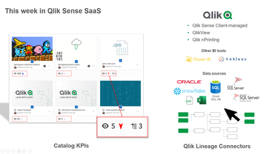
More lineage + More catalog capabilities = More data confidence
Catalog KPIs How many apps are using this data? What datasets are being looked at the most? Now everyone will be able to quickly answer questions l... Show MoreCatalog KPIs
How many apps are using this data? What datasets are being looked at the most? Now everyone will be able to quickly answer questions like these. Visual KPIs have been added to every data and app tile in your Qlik Sense SaaS collection. One icon will indicate usage - how many apps are using a dataset. A second icon is focused on views - how many times (over the last 28 days) has a dataset or app been viewed. To identify viewing trends, an up or down arrow next to the usage KPI will signify whether the number of views is trending up or down.
These KPIs will increase data trust by providing an easy way for users to distinguish which data and apps will best meet their needs. This is just the initial release of Catalog KPIs. Additional indicators are planned for a future release.
Lineage Connectors
In September we released Impact Analysis – a new Qlik Sense SaaS capability that enables users to easily understand the complete history of a dataset, thus increasing users’ confidence in the data. But a full lineage picture can be difficult to understand for data that's being used by on-premise applications. The only way to determine such complex data traceability was to manually access multiple systems and then bring all the different pieces together.
Not anymore! Qlik can now automatically pull together data traceability information from multiple sources with the introduction of Qlik Lineage Connectors. This new addition to Qlik Sense Enterprise SaaS empowers users to uncover more lineage-related insights by accessing multiple BI tools and data sources to find and document all data traceability information. The result is that Insight Analysis can not only show the data lineage of your Qlik Sense SaaS apps, but also the data lineage of Qlik Sense Enterprise Client-managed apps, QlikView apps, and even Tableau & PowerBI apps. It can also show the upstream lineage of data stored in repositories like Snowflake or SQL Server.
With a better understanding of the origin, evolution, and meaning of each dataset, people gain confidence that their data is vetted and trusted. And that drives up data and analytics used for decision making.
All Qlik Sense Enterprise SaaS customers can now install and utilize Qlik Lineage Connectors to access lineage information within Qlik Sense Enterprise Client-managed, QlikView, Qlik NPrinting, and on-premise Excel & QVD files.
To access lineage information within non-Qlik data source or applications, Qlik Sense Enterprise SaaS customers will need to purchase a separate license. This one license currently provides access to Tableau, PowerBI, Oracle, Snowflake, SQL Server, Azure SQL and SSIS (SQL Server Integration Service).
We plan on expanding Qlik Lineage Connectors to include more Qlik and non-Qlik data sources in the future.
You may be interested to know that the Qlik Lineage Connectors are based on NodeGraph technology. It’s a great example of how quickly Qlik has been incorporating this acquisition of a few months ago into the Qlik product family.
For more details on both Catalog KPIs and the Qlik Lineage Connectors visit our SaaS change log
-
Active Clinical Trials at RPCI
Active Clinical Trials at RPCI AnyChart — Extensions for QS Grab a clear picture of the active clinical research studies conducted at Roswell Pa... Show MoreActive Clinical Trials at RPCIAnyChart — Extensions for QS Grab a clear picture of the active clinical research studies conducted at Roswell Park Cancer Institute (RPCI) and how they progress. For each of the five most common types of cancer by primary anatomic site of origin, learn what trials are ongoing and intuitively understand which ones are closer to completion than others. Explore by cancer type, current phase, protocol, principal investigator, or start year.
Discoveries
Some of the discoveries from using this app include:
* Ongoing clinical trials by phase (Early I, I/ I/II, II, II/III, and III) and location (breast, colon, lung, prostate, and stomach).
* Details of each study: protocol, start year, and principal investigator.Impact
Provides a comprehensive big picture of the ongoing clinical research studies across all phases, showing at a glance which trials are about to be completed or lag behind and therefore facilitating the process of setting priorities and making critical decisions.
Audience
Pharmaceutical company managers and clinical research directors tracking progress across multiple trials. All who want to monitor progress towards goals in Qlik Sense — the app features a good example of a Bullseye chart and is publicly available among AnyChart demo apps for Qlik Sense.
Data and advanced analytics
The dataset is derived from the list of active clinical studies submitted by the Roswell Park Cancer Institute (RPCI) to the U.S. National Cancer Institute (NCI), which is publicly available online.
-
2021: A big step towards data literacy
As this year draws to a close, amid some of the challenges we faced, as we look back, there have been so many brighter events in 2021. The Qlik Academ... Show MoreAs this year draws to a close, amid some of the challenges we faced, as we look back, there have been so many brighter events in 2021.
The Qlik Academic Program had a glorious 2021 and being an important pillar of Qlik's vision of a data literate world, makes it sweeter even more!
This year, the academic program crossed many milestones. In India for example, more than 10,000 students signed up for the program and are now leveraging its amazing benefits. This was a significant uptake compared to all previous years. In the wider Asia Pacific region, there was a great response to the program in countries such as Singapore, Australia, New Zealand, Vietnam, Malaysia and China. Some of the countries had a remarkable engagement with the academic program such as workshops in Australia at Deakin University University of Queensland, Massey University in New Zealand. Another interesting development was around a Qlik Partner promoting the program in Universities in Vietnam. The National University of Singapore organised a session inviting a presentation of the program during a boot camp for its Masters students in Analytics. Another boot camp where students developed dashboards and applications using Qlik Sense and presented to analytics professionals was at the Xi'an Jiaotong-Liverpool University (XJTLU) in China.
The support to the program has been outstanding from regional champions from within Qlik who demonstrated a strong support to Qlik's vision by promoting the program, volunteering to speak, conducting workshops and in numerous other ways.
Overall, a great year for the academic program and for Qlik's vision of data literacy!
For more information about the Qlik Academic Program and its features, visit: qlik.com/academicprogram
-
Templates, Tabs, and More
I started out writing this blog post with the intent of explaining a relatively simple technique for making sure charts display when building a mashup... Show MoreI started out writing this blog post with the intent of explaining a relatively simple technique for making sure charts display when building a mashup with tab navigation. However, it turned into a bit more. We'll go through that initial thought, in addition to installing and using a mashup template, and building a mashup using our newly installed template that's like this https://s3.amazonaws.com/demo-root/tabdemo/index.html.
Let’s start with the original intent and kind of work our way through a few topics. When building a mashup with tab navigation, any charts that render or re-render while their tab is not active end up not displaying when their tab is active. This is true of any situation in which a chart renders while its container element’s display property is none. The way to handle this is to use the qlik.resize() method when the tab is active and the chart’s container element is displayed.
I thought it would be a good idea to build a simple mashup template that implements tab navigation so you could see what I was talking about as I explained the problem above. And I did. Then I realized that it would probably be a good idea to cover how to install and use a mashup template. So let’s do that quickly.
You’ll find a .zip file attached to this post. Download it. If you're using Sense Desktop, then unzip it. Find the unzipped folder, which should be titled “bootstrap-template”. Navigate to C:\Users\{{username}}\Documents\Qlik\Sense\Extensions\Templates, and put the unzipped “bootstrap-template” folder into the templates folder. For Sense Enterprise, navigate to the QMC and click on “Extensions” in the left-bar navigation, then click “Import” and import the zipped “bootstrap-template” folder.
Once installed, navigate to the workbench. On Sense Desktop, by default this is localhost:4848/workbench, and on Sense Enterprise it’s at the \workbench subdirectory. Now that you’re at the workbench, click on “Create New,” name your mashup whatever you’d like, and from the template dropdown menu you should now see and be able to select “Basic Bootstrap Template.” Then click on the puzzle icon with the title you just gave your new mashup, and then click “Edit.”
Now you can choose an app in the upper left corner, and start dragging charts into your mashup. If you’re unfamiliar with this step, refer to https://community.qlik.com/blogs/qlikviewdesignblog/2015/05/22/creating-a-webpage-based-on-the-qlik-sense-desktop-mashup-api.
Assuming that everything went well with the installation, let’s discuss this template a bit. While I was building this template I realized that I couldn’t actually navigate tabs while in the workbench, so by default, all three (Sheet 1, Sheet 2, and Sheet 3) are displayed. This is so you can drag and drop charts into all three. Once you are done dragging charts into them, click on the .js file in the top bar, look for
var tabs = false;and change it tovar tabs = true;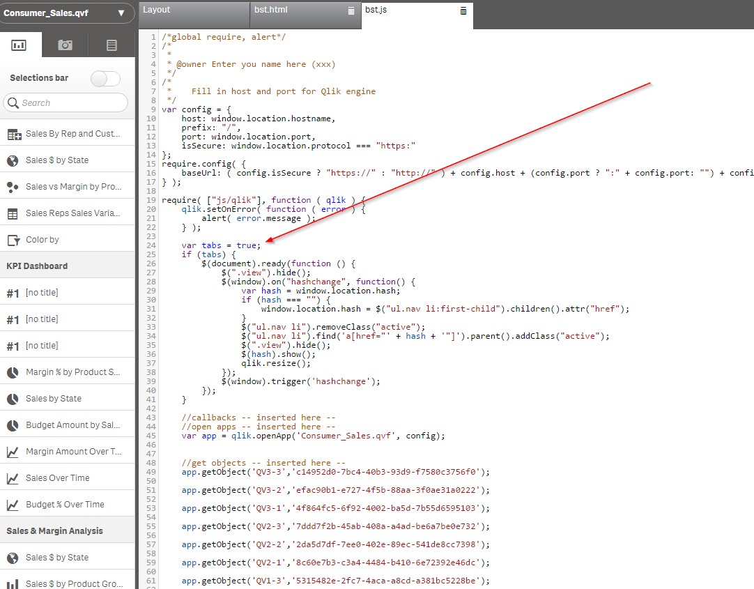
Now the tab functionality is active and you can click “View” to view your creation. If you’d like to change your charts using the Layout editor, you will have to revert that last change you made. Now you should have a mashup with tab navigation and 3 views.
Back to how this blog post started. When you switch from “Sheet 1” to “Sheet 2” or “Sheet 3”, some charts are hidden and others are displayed. Without the qlik.resize() method, the charts that were hidden when they were rendered wouldn’t display. You can test this out if you’d like by going back to the .js file and commenting out the qlik.resize() method that is being called every time you switch tabs.
If you’re not that familiar with web technologies, some of this stuff can be a little confusing, so please ask any questions you have!
-
Build a customized Qlik ChatBot using the Natural Language(NL) API
Qlik Sense’s self-service visual analytics platform has been compelling in processing and analyzing complex datasets to derive hidden patterns from th... Show MoreQlik Sense’s self-service visual analytics platform has been compelling in processing and analyzing complex datasets to derive hidden patterns from the data and helping end-users make faster decisions by presenting interactive visualizations. To add to its charisma, Qlik incorporated Conversational Analytics, the “Insight Advisor” — an AI-powered chatbot platform that provides a faster mechanism for users to ask questions and help them discover insights using Natural language Processing(NLP).
By blending the robustness of Qlik’s Associative and Cognitive Engine, the Insight Advisor assistant instantly generates relevant answers in the form of narrative texts, visualization charts and recommendations to help users with any level of expertise to maximize their potential when deriving insights. The flexibility to switch between visual and conversational analytics in Qlik Sense seamlessly & without losing context bridges the gap that is often seen with traditional Business Intelligence tools.
Ref: https://www.qlik.com/us/products/qlik-sense/ai
So, what are we doing new now?
We are bringing the potential of our Cognitive Engine that powers the ‘Insight Advisor’ to the hands of the Developer community with the launch of our new — Natural Language API.
Potential Benefits?
- Orgs starting out with new automation tools: Develop Qlik Chatbots specific to your company(customized UI) & interact with our cognitive and associative engines.
- Orgs already using Chatbots: Integrate the NL API to the existing company chatbots/communication platforms(Slack, Teams) and drive the analytical questions through Qlik Sense.
Before we delve into the steps and technology stack to build up our first Qlik Chatbot, let me give you a brief idea about a couple of things running behind the scenes of this API.
Generally speaking, Natural Language Processing(NLP) comprises of two essential sub-components — Natural Language Understanding(NLU) and Natural Language Generation(NLG) that help in interpreting and generating human language.
As the name suggests, NLU is responsible for comprehending and transforming any unstructured data into a structured form that the machine can understand. This is particularly important when it comes to ambiguous texts, for example, texts that are similar but have different meanings and changes with respect to the context. NLG, on the other hand, generates natural language in a human-understandable format based on the machine’s response.
So how do these components work together in a ChatBot?
Well, like I discussed, the intent of a sentence is first deciphered by the NLU and then the NLG analyzes the data and a response in plain-text is provided back. NLP basically takes the role of an engine for the chatbot that helps in this process of understanding and fetching a response for the user.
Alright, let’s visually understand these things from Qlik’s NL API perspective now.
As we see, the NLU first reads the sentence — “give me the sales” and then tries to understand the intent and what entity it is. In this case, the entity type is a ‘master_measure’ which aligns with what I have in my Qlik Sense app. The NLG then generates the response in the form of a conversationalResponse property that comprises of the responses type, which in this case is a narrative and the corresponding text “Sales is 23.89M”. This text is returned to the user.
Now that we have an understanding of the things running under the hood, let’s explore the API endpoint and understand a hypothetical user scenario.
API Endpoint: '/api/v1/questions/actions/ask'
The Natural Language API is a REST-API that allows for asking questions and context aware partial questions against applications enabled for conversational analytics or a specific app to receive Insight Advisor generated responses and suggestions.
The motivation behind this blog is to introduce the API to the Developer community and give the much-needed background for developing chatbots. The technical aspects of the API will be discussed elaborately in our official developer site - https://qlik.dev
User scenario: A customer wants to build a new Embedded analytics solution that brings in the capabilities of a Qlik Sense Mashup(visualizations from various apps) and would also like to develop and embed a Qlik ChatBot on that same portal. Ultimately what the company wants to achieve is a balance between visual analytics & conversational analytics to allow any level of user(in terms of data literacy) to take full advantage of Qlik’s analytical platform.
API Endpoint: '/api/v1/questions/actions/ask'
Want to build a Qlik ChatBot?
Now that you have an understanding of the technicalities, prerequisites and a hypothetical user scenario where you can possibly apply this new API to, you should be all set to start building your own customized Qlik Bot.
Prerequisites:
- Register for a subscription on Qlik Sense SaaS.
- Create a new web integration from the Management console.
- Create an API key.
- Enable apps for Insight Advisor chat.
To make implementation easier for the Developer community, we have created a tutorial required to build your first Qlik Bot using NodeJS in our Official Developer site - https://qlik.dev .
Hopefully, the tutorial will serve as a boilerplate for the future development of chatbots using the Natural Language API.
Tried out the Natural Language API and developed your own cool Qlik Bots?? Share with us in the comments your GitHub link or tag me on LinkedIn(https://www.linkedin.com/in/dipankar-mazumdar/)
-
A University of Delaware Success Story
I have had the pleasure of working with educator Anatoliy Anguelov from the University of Delaware for several years now, so I was very excited when w... Show MoreI have had the pleasure of working with educator Anatoliy Anguelov from the University of Delaware for several years now, so I was very excited when we got the chance to interview him about his experience and thoughts on the Qlik Academic Program. Anatoliy is an adjunct educator so he understands very well the need for analytics skill sets both inside and outside of the classroom. Using Qlik allows him to prepare his graduate students for any analytics scenario.
Don't take my word, visit the University of Delaware story and watch his interviews today!
If you are an educator looking to update your analytics software or introduce data literacy to your students, visit the https://www.qlik.com/us/company/academic-program and apply today for a year of free software, training, certificates opportunities, and more! Students are also welcomed to apply!
-
Qlik’s Application Automation Continues to Impress with Seven New Connectors
But we have not rested on our laurels. Last week, we added a new template feature, and we are happy to announce that we’ve now rolled out seven new c... Show MoreBut we have not rested on our laurels. Last week, we added a new template feature, and we are happy to announce that we’ve now rolled out seven new connectors.
So, let’s take a deep dive and get a closer look at the new connectivity and automation blocks.
- Data Warehouses: The system can trigger webhooks, bring the data into Qlik Application Automation for analytics, based on the data warehouse telling the system it’s ready to go through an API call.
- Snowflake- Get (or push) data from (or to) Snowflake data cloud for use in analytics or data integration processes.
- Amazon Redshift- Get (or push) data from (or to) Redshift warehouse for use in analytics or data integration processes.
- Google Big Query- Get (or push) data from (or to) Google Big Query warehouse for use in analytics or data integration processes.
- Platform Enhancements:
- Qlik Auto ML- ‘First’ Big Squid integration. Modest support (Automated Prediction Download, Get Express Prediction, Get Express predictions). Read about Qlik’s acquisition of Big Squid.
- Remote Application:
- Dbt (data build tool) is a solution that enables data analysts and engineers to transform, test, and document data in their cloud data warehouses. Use the connector and blocks to control dbtCloud jobs as an action within Qlik Cloud.
- UI Path- Control UiPath automations from within Qlik Cloud. UiPath is Robotic Process Automation (RPA). RPA alternative automation for systems that do not support API-based integrations (screen-scrape instead). Read more about Qlik’s key partnership with UI Path.
- Splunk- Splunk is “enterprise log/event management.” Search Splunk instances or add events to Splunk (e.g., app reload completed).
Qlik Application Automation is part of our Active Intelligence vision which delivers in-the-moment awareness of every aspect of your business and helps to drive immediate actions. Read more about the value of Qlik Application Automation.
Review a YouTube video that will walk you through Qlik’s Application Automation, using SalesForce.
-
Become a Data Expert in 15 weeks!
New data is being created everyday as we carry on our daily activities and interact with the world. There is possibly no industry that doesn’t deal wi... Show MoreNew data is being created everyday as we carry on our daily activities and interact with the world. There is possibly no industry that doesn’t deal with data. Exponential growth of data opens the door of opportunities and the competitive advantage to those who know who to use it. A data-informed mindset is essential to deliver the insights and transform organizations.
When you base decisions on data, are you sure you are using the right data?
Are you sure you are asking the right questions of the data?
Are you confident in turning business questions into analytical questions?
Are you challenging assumptions you have with the data? Are you sure you have enough context from the data to ensure it is not telling you only part of the story?
Are you confident in using techniques to help mitigate any unconscious bias you may have when interpreting the data and insights?
With Qlik’s Analytics Expert Program “Applied Data Analytics using Qlik Sense”, you will not only learn data analytics best practices but also learn how to achieve a data-informed mindset that shifts you from just looking for data and information to looking for insights and knowledge.
You will learn best practices in data analytics, data literacy and data-informed decision making that help you make the most effective use of Qlik Sense. In just 15 weeks, you will be on your way to become a leader in developing a data-driven culture in your organization.
Learn More and Register to get started and save your spot today!

-
Learning from our Customer Stories
Last Friday the #AcademicProgram had our final Educator Ambassador meeting of the year. The aim of this session was to give something to our Educators... Show MoreLast Friday the #AcademicProgram had our final Educator Ambassador meeting of the year. The aim of this session was to give something to our Educators that they could take with them to their classes and use to get their students excited about Qlik Sense Business in the real world. With this in mind we had three presenters, firstly one of our Qlik customers, Enolytics, spoke to us about how the wine and spirits industry is learning to harness data for growth, and how Qlik Sense is helping producers better understand their customers.
We then had some of our own Qlikkies present on how their customers are using Qlik. Firstly, Patrick Stevens took us through a couple of success stories regarding financial service, HSBC and Lloyd’s of London. The success story regarding Lloyd’s of London was particularly interesting since the insurance industry is traditionally very old fashioned when it comes to recording and utilizing data. Something that it has in common with the wine and spirits industry.
Nick Ward then discussed the work he does with two NHS trusts; Wrightington, Wigan and Leigh NHS Foundation Trust and University Hospitals of Morecambe Bay. This part of our meeting was especially poignant given the ongoing pandemic. It was interesting to understand how data can be utilized in the healthcare industry to save the valuable time of healthcare staff and improve on patient waiting times.
The key takeaway from these presentations seemed to be that no matter which industry you’re working in, utilizing your data is necessary for growth and progress. This is a powerful message to communicate to students as regardless of the industry they gain employment in, honing their data skills now will be a great asset to them in the future.
We have recently closed applications for our next cohort of Educator Ambassadors, so watch this space for updates!
Want to learn more about the Qlik Academic Program? For more information or to apply visit qlik.com/academicprogram
-
Qlik Compose November SR provides new data quality and profiling capabilities fo...
Data profiling analyzes the candidate data sources for a data warehouse to clarify the data's structure, content, relationships, and derivation rules.... Show MoreData profiling analyzes the candidate data sources for a data warehouse to clarify the data's structure, content, relationships, and derivation rules. In short, data profiling helps users understand their data and model it correctly.
Qlik Compose lets you profile the data in the landing zone tables when designing their data warehouse, allowing users to identify uniqueness, cardinality, format discrepancies, value ranges, and other profile information, which helps better design the model.
For data quality, Qlik Compose allows you to detect issues in the data, then either reject insufficient quality data into an error mart or make some simple repairs before loading. All this in a rule-driven approach.
With this release of Qlik Compose, we have expanded this data profiling and data quality rule functionality to be available on Google Cloud's Big Query data warehouse and Snowflake, AWS Redshift, Azure Synapse well Oracle and SQL Server.
For more information on how Qlik Compose can improve data quality in your Google BigQuery and other data warehouses, check us out here. Qlik Compose users can find and download the latest release of Qlik Compose here (filter for Qlik Data Integration – Qlik Compose – 2021.8.0 – SR1). -
Qlik Compose November SR provides new performance optimizations to evolve your D...
In our November SR of Qlik Compose, we included new performance optimizations to lower customers operating costs for all data warehouse targets, empha... Show MoreIn our November SR of Qlik Compose, we included new performance optimizations to lower customers operating costs for all data warehouse targets, emphasizing cloud data warehouses, including Snowflake, Azure Synapse, and Google BigQuery. For Snowflake, we partnered with Snowflake engineering to review the changes and ensure that they are optimal for the platform.
The optimization is part of the benefit of using an automation tool. The design stays the same, but the generated code evolves, keeping up with advancements in the data warehouse capabilities and features without any effort required by the customer.
The November SR focused on optimizing the load of type-2 dimensions. Performance advancements for the optimized portion resulted in improvements ranging from 33% to over 90%, depending on the target cloud platform.Users can view improvements in their use cases in either Qlik Compose UI or, in the case of Snowflake, in our new Snowflake Usage Dashboard, built with Qlik Sense. Here, administrators can audit the queries and the users running those queries. They can also analyze the usage and associated cost. We made this dashboard available free for customers to use and is available here.
Check us out here for more information on how Qlik Compose can cost-effectively automate your data warehouse. You can find and download the latest release of Qlik Compose here (filter for Qlik Data Integration – Qlik Compose – 2021.8.0 – SR1). -
Using Qlik Sense Analytics to Get in Shape
Hello Qlik Community! In this post, I’d like to introduce you to today’s guest blogger and Qlik enthusiast, Jason Yeung. Jason is our North East Solut... Show More Hello Qlik Community! In this post, I’d like to introduce you to today’s guest blogger and Qlik enthusiast, Jason Yeung. Jason is our North East Solution Architect Manager who has over 15 years in the BI industry…flexing his muscles in Pre-sales, product management, consulting, and support. Jason wanted to get healthy, but traditional means of health data tracking weren’t enough. Continue reading to learn more about why Jason applied Qlik Sense to his fitness plan and how it was a better alternative to traditional fitness tracking methods.
This past year, I decided to get in shape. Over the years, I went from being an avid runner to a car service, driving my children to hockey rinks on the weekends. This year, things were going to change. I had a strong plan, motivation, and allocated the right amount of time to be successful. However, I needed an analytical tool to track my progress and keep me honest.
The Analytics Problem with Fitness Apps
Today, we have access to data around our personal well-being and there are data collection tools everywhere. We wear them on our wrists, have them in our pockets, and have them built into our treadmills. While these tools serve as great motivators, they all seem to fall short in 3 key analytical areas:
- Data in, not data out. These tools do an excellent job collecting large amounts of data, but tend to fall short when it comes to analytics. They often provide summary level dashboards that just show fitness activity over time, but with limited abilities to explore the data further.
- Lack of self-service. My fitness “dashboards” are never quite the way I want them. Everybody uses slightly different metrics and different ways to visualize their fitness activity and it seems we are limited to static dashboards that can’t be modified easily.
- I want “other” data. No one fitness tracker really tells the whole story because they’re all used for specific purposes. Additionally, these “apps” are all isolated from one another with no unified way to bring the data together, especially data from other sources. This is important because when it comes to physical fitness, we tend to only see the data relationships and associations that we want to see.
Enter Qlik Sense
At Qlik, I’m constantly working with customers and prospects to build and develop innovative analytical solutions to solve their real-life complex information needs. Qlik Sense provides these organizations with an analytical tool that enables them to build dynamic and interactive dashboards from many different sources of data. As you can see, this is the same problem that I’m trying to solve, so I put Qlik Sense to the test.
What I did
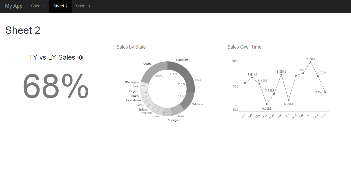
Here’s a two view dashboard that I built to track my fitness activity.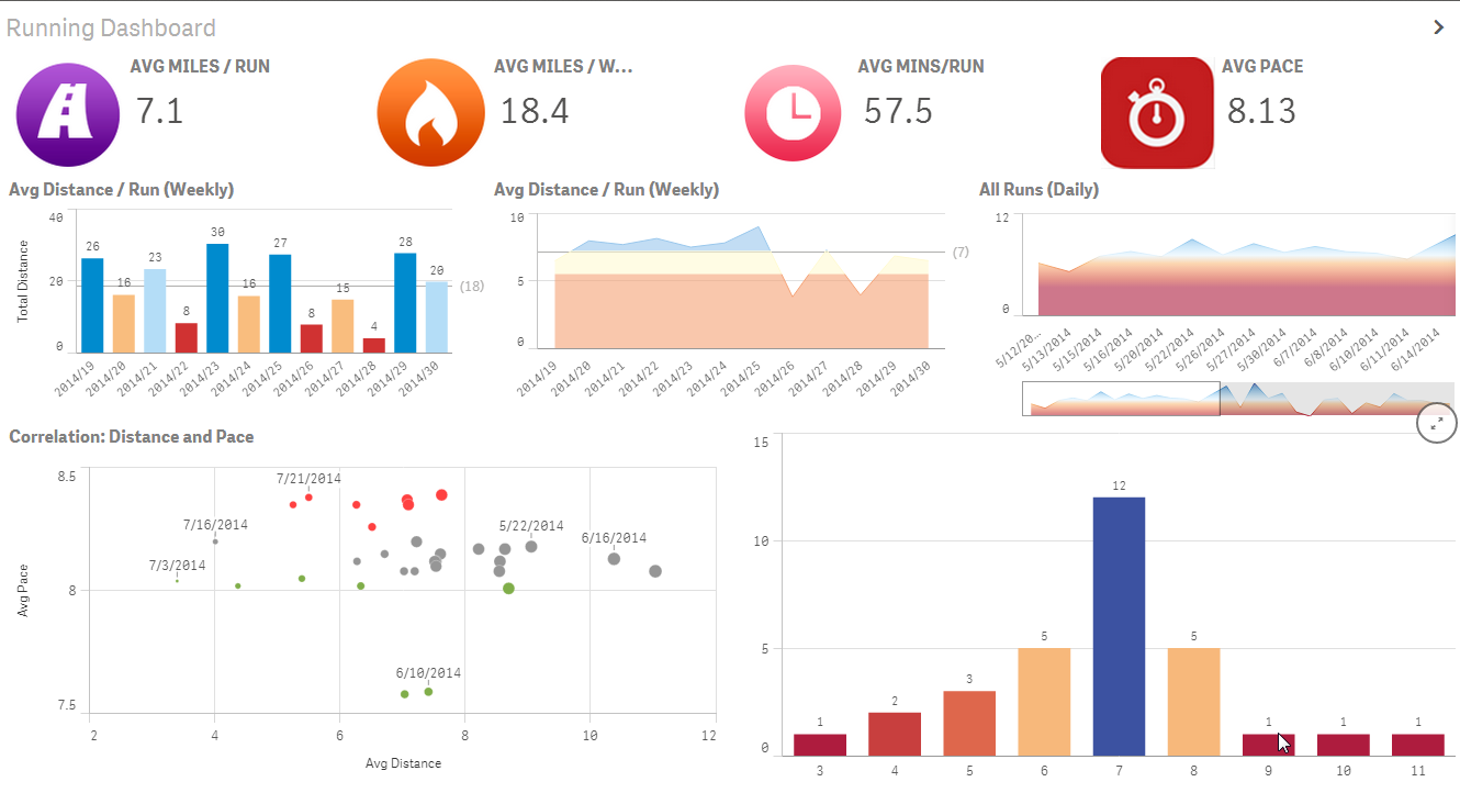
At first glance this may not seem to be any different than other fitness dashboards, but the fundamental differences are as follows:- Data from four different data sources. RunKeeper, Fitbit, Weatherbug, and my personal data entry spreadsheet. Therefore, no more isolated views of data.
- No modifications or “massaging” of data needed. I was able to use the applications’ “out-of-the-box” functionality to export the data as-is and combine them together.
- Personalization. I was then able to build my own custom visualizations tailored to how I wanted to see them.
- Speedy. Based on my knowledge of Qlik Sense, I was able to easily load the data and build the visuals very quickly, while gaining additional insight from the data of the various tracking devices.
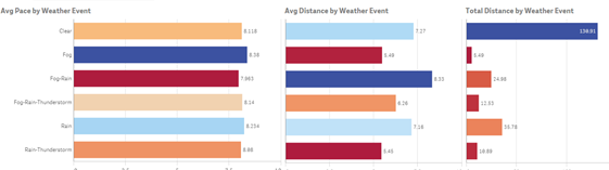
The Biggest Insights Can be Simple to Discover
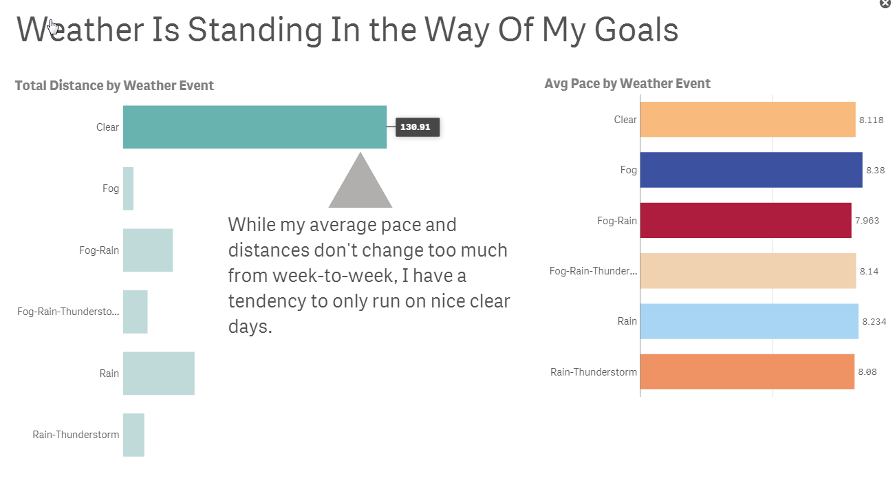
The previous dashboard view was extremely effective in tracking my fitness activity. But the dashboard itself really didn’t shed any new insights. However, the additional data from Weatherbug did! For runners, weather can be the single biggest motivational driver. In the visuals below, there are two main discoveries.
The weather varies from week-to-week, but my weekly running activity remained relatively constant:
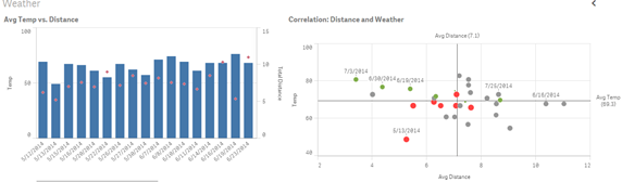
But the “type” of day played the biggest role. I noticed that while my pace and distance doesn’t significantly change based on temperature, the outliers on the right suggests that I typically only run on “Clear” days.
Telling the Story
After analyzing all this data, I needed to build a story to communicate the meaning behind the numbers. Using Data Storytelling, Qlik Sense allowed me to build a dynamic presentation with a narrative to highlight my overall activity. I wanted to share this information with my support structure, my family.
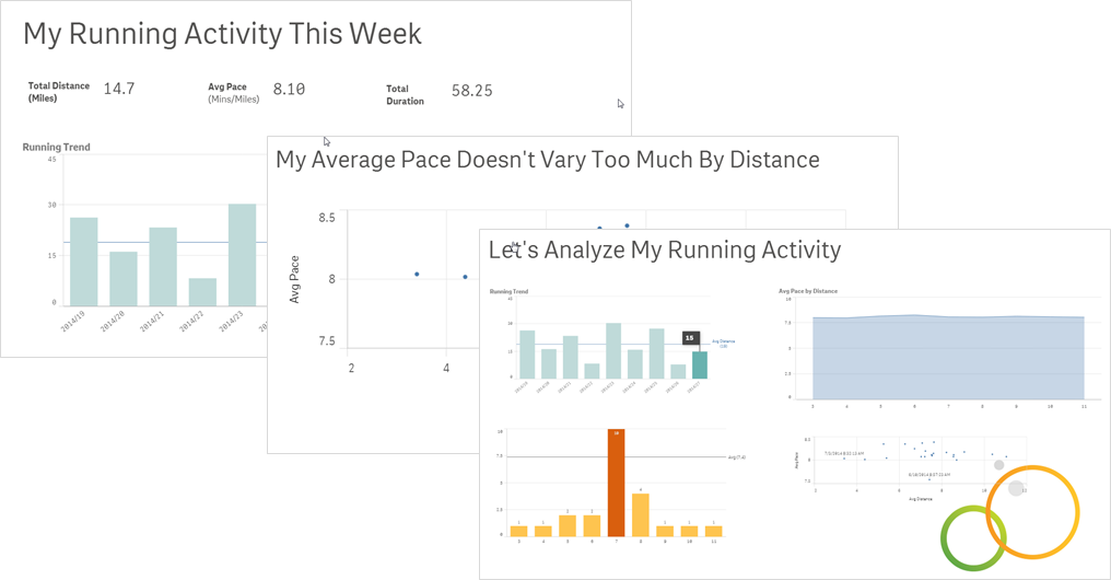
And the main point to communicate was:
The Result
What was the outcome of all this? My wife bought me a windbreaker!

In summary, as you can see, analytics is all around us. In addition to being a top priority across all organizations, it should be a top priority for individuals to better manage their health. Using data to gather and build new insights allows us to be more productive, make better and more informed decisions, and hopefully live healthier lives. Being able to communicate your findings effectively increases your chances of getting the message heard and understood. I used Qlik Sense to unleash my intuition and so should you. Download Qlik Sense today for free.
Jason Yeung
Qlik

-
Building fast & efficient Qlik Sense visualization extensions using Nebula.js &...
Building a visualization from scratch is always a time & resource-intensive task. Specifically, when you would like to design something which is out-o... Show MoreBuilding a visualization from scratch is always a time & resource-intensive task. Specifically, when you would like to design something which is out-of-the-box or custom, there is a learning curve to getting hold of component-based frameworks such as D3.js but your ultimate goal of using the visualization may be different.
For instance, in the Qlik Sense world, a BI Developer might just be focused on using the visualization on their dashboards and presenting key metrics. Similarly, a Data Scientist might just use it for exploratory data analysis or validating their hypothesis. Irrespective of the use-cases, building a Qlik Sense visualization extension should not be cumbersome.
An easy way to get started building a visualization extension in Qlik Sense is by using our framework-agnostic library, Nebula.js. If you haven’t tried Nebula, here is a simple tutorial to get right into it. Basically, Nebula comes with a bundle of visualization objects and APIs to interact with the engine & even allows for seamless integration of custom charts (e.g. D3) so they can be used within the Qlik Sense environment.
One of the many incentives of working with Nebula is that it is framework-agnostic and allows using any available charting frameworks to create new visualizations for use within Qlik’s platform. In this blog, we will understand how to quickly build a visualization extension by integrating Nebula.js with a widely used charting library called Plotly. Personally, Plotly has been a top choice for many of my use-cases due to the ease of its use and native interaction capability.
Plotly is an open-source, interactive library that is built on top of d3.js and stack.gl. Plotly.js ships with over 40 chart types, including 3D charts, statistical graphs, and SVG maps.
Source: Plotly.js
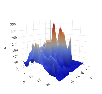
Before we walk through the steps to build our Qlik Sense extension, let me give you a brief background about the problem I was trying to solve and how Plotly has made that journey easy. As part of my research work, I had to design a prototype that could visualize mountain elevation data in 3D. A common way to achieve this is by using Surface plots.
Surface plots are diagrams of three-dimensional data. Rather than showing the individual data points, surface plots show a functional relationship between a designated dependent variable (Y), and two independent variables (X and Z).
A Surface plot
Now, since my experience with 3D visualization has been limited, I was looking for an easy-to-adopt solution and after reviewing a few available JavaScript libraries, Plotly seemed to be a great choice. Also, in my case, I was looking for an effortless way to interact with the data since I needed to invoke the data from Qlik Sense first and Plotly served that purpose.
Alright now, let’s try building a 3D Surface plot using a sample data set. This dataset is made publicly available by Plotly and looks like its elevation details of Mt. Bruno.
Pre-requisites:
- Node.js (version 10 or newer)
- An existing web integration
- Install plotly.js library via NPM
Step 1: Create a Nebula project
The quickest way to get started is to use the nebula.js CLI:
npx @nebula.js/cli create hello --picasso none
The command scaffolds a project into the /hello folder with all the required files under /src .
To read more around building extensions with Nebula, here is a basic tutorial.
Step 2: Install Plotly.js using NPM
To get all the dependencies related to Plotly, we will do an NPM install. Please route to the /hello folder and run the following command.
npm install plotly.js-dist
Now if I check my package.json file, I can see that the dependency has been installed.
Step 3: Import Plotly library
Next, to use all the Plotly related stuff, we will import the library in our main JavaScript file index.js, and from here on we will start building our visualization. This is how my code looks like now.
import { useElement } from '@nebula.js/stardust';
import properties from './object-properties';
import data from './data';

import Plotly from 'plotly.js-dist'

export default function supernova() {
  return {
    qae: {
      properties,
      data,
    },
    component() {
      const element = useElement();
      element.innerHTML = '<div>Hello!</div>';
    },
  };
}
Step 4: Accessing QIX engine and retrieving data
Now that we have all the required dependencies, let’s start invoking the data that is there in our Qlik Sense app (with which we plan to use this extension). Nebula offers custom hooks that enable us to access the hypercube to interact with the dimensions & measures.
To retrieve our data, we first need to access the layout through the useLayout() hook and then use it in combination with the useEffect() hook. The hypercube’s qDataPages[0].qMatrix contains all the dimensions and measures, and we will pass this data to the Plotly visualization object using a function viz() that we will define later. The below code snippet shows how to achieve this.
component() {
      const element = useElement();
      const layout = useLayout();

      //getting data array from QS object layout
      useEffect(() => {
        var qMatrix = layout.qHyperCube.qDataPages[0].qMatrix;

        //an array that invokes each row of qMatrix from layout:
        var data = qMatrix.map(function (d) {
          return {
            0: d[0].qText,
            1: d[1].qText,
            2: d[2].qText,
            3: d[3].qText,
            4: d[4].qText,
            5: d[5].qText,
            6: d[6].qText,
            7: d[7].qText,
            8: d[8].qText,
            9: d[9].qText,
            10: d[10].qText,
            11: d[11].qText,
            12: d[12].qText,
            13: d[13].qText,
            14: d[14].qText,
            15: d[15].qText,
            16: d[16].qText,
            17: d[17].qText,
            18: d[18].qText,
            19: d[19].qText,
            20: d[20].qText,
            21: d[21].qText,
            22: d[22].qText,
            23: d[23].qText
          };
        });

        var width = 1000;
        var height = 400;

        var id = "container_" + layout.qInfo.qId;

        // if not created, use id and size to create
        const elem_new = `<div id=${id}></div>`;
        element.innerHTML = elem_new;

       //function to draw Plotly surface plot
        viz(data, width, height, id);
      }, [element, layout]);
 }
Step 5: Creating the Surface plot
Our next step is to build the topological 3D surface plot using the data we retrieved from Qlik Sense and Plotly.
We define a basic layout for our Plotly visualization like this.
var layout = {
  title: 'Mt Bruno Elevation',
  autosize: false,
  width: 800,
  height: 500,
  margin: {
    l: 65,
    r: 50,
    b: 65,
    t: 90,
  }
};
Next, we want to store our values as an array so we can pass it to Plotly as it would expect. The following function does the same.
function unpack(data, key) {
  return data.map(function(data) {
    return data[key];
  });
}
var z_data=[ ]
for(var i=0;i<24;i++)
{
  z_data.push(unpack(data,i));
}
To render the Plotly 3D surface chart, we will need to define a data parameter by specifying the array and type of the plot.
var data = [{
  z:z_data,
  type: 'surface'
}];
Finally, we render the chart by passing the object id, data and layout to the newPlot() method.
Plotly.newPlot(id, data, layout);Step 6: Create a Qlik Sense extension
The last step is to create a visualization extension that can be used within Qlik Sense environment. To do that, we will use the following Nebula CLI command.
nebula sense
This creates a ZIP file with all the required files so we can import it to Qlik Sense.
Here’s our 3D Surface plot in Qlik Sense.
Plotly 3D Surface Plot in Qlik Sense
This tutorial showcases an easy approach to developing custom visualizations to be used within Qlik Sense using Nebula.js and a 3rd-party charting library called Plotly. The goal was to give an idea of how effortlessly you can build out-of-the-box solutions without really investing much time by designing them from scratch.
The entire code can be found here: https://github.com/qlik-oss/QlikSense_Plotly
~Dipankar, R&D Advocate
-
Pre-Registration Now Available for Our Newest Certification exams: Qlik Compose ...
Pre-registration for these new exams is available - testing begins December 6, 2021. Pre-register now for the best choice of appointment times! Each ... Show MorePre-registration for these new exams is available - testing begins December 6, 2021. Pre-register now for the best choice of appointment times!
Each 2-hour exam costs $250 and can be taken in a local test center or via online proctoring. Learn more about these new certifications on our Certifications & Qualifications page.
For the most commonly asked questions you can visit our Frequently Asked Questions page. If you have further questions, please send an email to certification@qlik.com.
-
Qlik Educator Ambassador
The @Qlik #AcademicProgram is currently accepting applications for Educator Ambassadors! Students and educators can join the Qlik Academic Program by... Show MoreThe @Qlik #AcademicProgram is currently accepting applications for Educator Ambassadors! Students and educators can join the Qlik Academic Program by visiting apply today but for exclusive educator benefits, learn more about becoming an Educator Ambassador!
Hear from Educator Javier Leon!
-
Nebula.js Plugins — customize your visualizations.
Nebula.js is a collection of product & framework-agnostic JS library that helps developers achieve the following goals:allows for developing visualiza... Show MoreNebula.js is a collection of product & framework-agnostic JS library that helps developers achieve the following goals:
- allows for developing visualization extensions (e.g. non-native charts in Qlik Sense client)
- develop mashups (e.g. creating/embedding Qlik Sense visualizations to web applications)
For this tutorial, we will focus on the 2nd use case.
BTW if you are just getting started with Nebula, here is an introductory video.
Now, if you have used Nebula.js to build a mashup by either creating Nebula charts on the fly or embedding visualizations from your Qlik Sense client, you might have realized that the charts do not really present many customization abilities and they are rendered as it is in the client. Enter “plugins”!Background:
Before we delve into what plugins specifically allow you to do, please note that they involve dealing with Picasso.jscomponents that run under the hood. Components are the visual building blocks that make up the chart & by combining them in various forms virtually any chart can be created. Typically components can be — axes, grid lines, data points, etc. So, using Nebula plugins we would essentially be interacting with these components to customize our chart. I have tried summing this up in the image below.
What do plugin allows us to do?
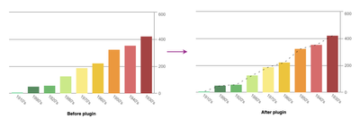
- Modify an existing chart component. For instance, changing the interpolation of a line chart from linear to monotone in the below chart.
- Add a new chart component. Note that the new component can either be a standard Picasso component(native Picasso) or a custom one(your own). For instance, below we add a reference line at the median of frequency in a bar chart. This is an example of adding a standard component.
Now that we know the usability & background behind Nebula plugins, let’s try to develop some.
1. Modifying an existing component:
For our first implementation, we will try to modify an existing Picasso component in a Nebula line chart. Currently, this is how our chart looks like -
Our aim is to simply change the interpolation of the line from linear to monotone.
Step 1: Define the plugin
To be able to use a plugin, we need to first define it. Let’s do that as shown below.
const linePluginNew = {
  info: {
    name: "line-plugin",
    type: "component-definition"
  },
  fn: ({ layout, keys }) => {
    const componentDefinition = {
      type: "line",
      key: keys.COMPONENT.LINE,
      settings: {
        layers: { curve: "monotone", line: { strokeWidth: 3 } }
      }
    };
    return componentDefinition;
  }
};
Important things to note:
- A plugin definition is an object, with two properties info and fn. The fn property returns a picasso.js component.
- The info property has an attribute called type which should specify whether you are developing a custom plugin or a standard one. For standard components, the value will be 'component-definition' & for custom ones the value will be 'custom-component'.
- To override an existing component, fn should return a picasso.js component that has the same key as the existing component (keys.COMPONENT.LINE in this example)
- Finally, we change the curve to monotone inside our settings and set stroke-width as per our requirement.
Step 2: Using the plugin
In the next step, we just have to use the defined plugin by passing the name inside the plugins attribute like below.
    nuked.render({
      type: "line-chart",
      element: document.querySelector(".object"),
      plugins: [linePluginNew],
      fields: ["Decade", "=Max(Length)", "=Avg(Length)"],

      properties: {
        title: "Line Chart",
        dataPoint: {
          show: false,
          showLabels: true
        },
        gridLine: {
          auto: false
        },
        dimensionAxis: {
          show: "all",
          dock: "near"
        },
        measureAxis: {
          show: "all",
          logarithmic: true
        }
      }
    }),
Here’s our customized visualization.
2. Add a new component:
As mentioned before, adding a new component can have 2 scenarios — adding a standard component or adding a custom one. We will cover both of them through two implementations below.
Adding a standard component
In this example, our goal is to add a native ‘line’ component to a bar chart that goes through the end of the bars. Currently, this is how our chart looks like.
Let us start building our plugin.
- First, since our goal is to add a native line component, our Picasso fn should know about it. We will use the type attribute to pass that info.
fn: ({ keys, layout }) => { const componentDefinition = { key: "sum-line", type: "line", } return componentDefinition;- Next, we need to know the value of each bar, so we can draw our line based on that. Therefore, we have to define the data we want to work with.
const componentDefinition = { key: "sum-line", type: "line", layout: { displayOrder: 10 }, data: { collection: keys.COLLECTION.MAIN }, }- Finally, each component uses a settings object that is specific to the component. In this case, we will pass the end value of each of our bars to SCALE.MAIN.MINOR. We also control the aesthetics of the line we are drawing using layers attribute like below.
settings: {
        coordinates: {
          minor: {
            scale: keys.SCALE.MAIN.MINOR,
            fn: d => d.scale(d.datum.end.value)
          },
          major: { scale: keys.SCALE.MAIN.MAJOR,
                 }
        },
        layers: {
          line: {
            stroke: "black",
            strokeWidth: 2,
            opacity: 0.5,
            strokeDasharray: "5 10"
          }
        }
      }
Finally, after applying our plugin to the bar chart, here’s what it looks like.
Adding a custom component
Our final use case is to develop a custom plugin and add it as a component in our native chart. The goal here is to incorporate some custom labels to the min & max positions of one of the lines in our line chart. Remember we changed the native line chart to have monotone interpolation in the 1st use case.
We will try to add the labels in this chart now. Let’s start!
Step 1: Implement the custom plugin.
As discussed before, since we are developing a custom plugin, we will need to specify that in the info property by passing the custom-component to the type attribute.
const minMaxLabelsPluginImplementation = {
  info: {
    componentName: "custom-labels-plugin",
    name: "custom-labels-plugin",
    type: "custom-component"
  }
}
Next, we use the require property to pull in our dependencies. In this case, we will pull the ‘chart’ instance for getting our component-related data and scales as seen below.
const implementation = {
      require: ["chart"],
      render() {
        const items = this.chart
          .component(keys.COMPONENT.LINE)
          .data.items.filter(
            item => item.line.value === 1 && item.label >= "1950's"
          );
        const scale = this.chart.scales();
 }
}
Each component has a type property that identifies the type of component to create. In this case, since we want to just create a label, we will pass a ‘text’ type. The other relevant properties are then added to our code as below.
if (item.end.value === min) {
            labels.push({
              type: "text",
              text: `min: ${item.end.label}`,
              x: timeScale(item.major.value) * width,
              y: lineScale(item.end.value) * height + 15,
              anchor: "middle",
              fontFamily: "Helvetica, san-serif",
              fontSize: "15px",
              fill: "darkred"
            });
}
Step 2: Define the plugin
Now that we have implemented the functionality for our custom plugin, we will use it to define a plugin so it can be used with Nebula charts.
const minMaxLabelsPlugin = {
  info: {
    name: "labels",
    type: "component-definition"
  },
  fn: ({ keys }) => {
    const componentDefinition = {
      type: "custom-labels-plugin",
      key: "my-labels"
    };
    return componentDefinition;
  }
};
Note how the type property inside the fn:( ) changes from standard ones like ‘line’, ‘point’, etc. to ‘custom-labels-plugin’. The type value has to exactly match with the componentName of the plugin defined above.
Step 3: Use the plugin
The final step is to apply the custom plugin to our line chart.
nuked.render({
      type: "line-chart",
      element: document.querySelector(".object"),
      plugins: [linePluginNew, minMaxLabelsPluginImplementation, minMaxLabelsPlugin],
      fields: ["Decade", "=Max(Length)", "=Avg(Length)"],
// Overrides default properties
      properties: {
        title: "Line Chart",
        dataPoint: {
          show: false,
          showLabels: true
        },
        gridLine: {
          auto: false
        },
        dimensionAxis: {
          show: "all",
          dock: "near"
        },
        measureAxis: {
          show: "all",
          logarithmic: true
        }
      }
    }),
And here’s our visualization with the custom labels.
All the code related to this tutorial can be found in this Glitch or my Github.
Hope this tutorial will allow developers to take their first step towards building plugins in Nebula.
~Dipankar, Qlik R&D
-
Qlik Academic Program inks MOU with Gurukul Kangri University
The Gurukul Kangri University and the Qlik Academic Program entered into an MOU on 16 November 2021 to skill students and professors of the University... Show MoreThe Gurukul Kangri University and the Qlik Academic Program entered into an MOU on 16 November 2021 to skill students and professors of the University in data analytics.
Gurukula Kangri University was founded on 4 March 1902 by the Arya Samaj sannyasi Swami Shraddhanand, with the sole aim to revive the ancient Indian gurukula system of education. The University functions through its five campuses spread across the state of Uttarakhand. Gurukula Kangri has 24 academic departments covering Engineering, Applied Sciences, Vedic Sciences, Humanities and Social Sciences and Management programs. The University has more than 4000 students enrolled in its various courses.
The Qlik Academic Program offers the most complete and updated resources in data analytics for professors and students, completely free. The se resources include Qlik Sense Business software, online training (worth $3000), qualifications, certifications, and a host of offerings to enable the academic community in analytics. More than 36,000 students from 2600 plus universities and institutions are benefitting from this program. For more information about the Qlik Academic Program, visit: qlik.com/academicprogram
The virtual MOU signing ceremony was attended by the Vice Chancellor of the University, Professor Roop Kishore Shastri, Hon. Registrar Prof. Sunil Kumar, Prof. Pankaj Madan, Dean FET and various department Heads and Professors. Professor Namit Khanduja will the SPOC of this engagement on behalf of the University.
Dr. Mayank Agarwal who led this initiative says, “Gurukul Kangri University is committed to providing state of the art technologies to its students . The MoU with Qlik in the field of data analytics is a step forward in our mission to contribute to build a new and developed India. Qlik is a pioneer in data analytics and the Qlik Academic Program resources shall definitely make our students excel in the field of analytics and data science”
In view of the increased need for students to be skilled in data analytics, this is an important milestone for the University and the Qlik Academic Program is happy to support this initiative of the Gurukul Kangri University.