Unlock a world of possibilities! Login now and discover the exclusive benefits awaiting you.

Analytics & AI
Forums for Qlik Analytic solutions. Ask questions, join discussions, find solutions, and access documentation and resources.
Data Integration & Quality
Forums for Qlik Data Integration solutions. Ask questions, join discussions, find solutions, and access documentation and resources
Explore Qlik Gallery
Qlik Gallery is meant to encourage Qlikkies everywhere to share their progress – from a first Qlik app – to a favorite Qlik app – and everything in-between.
Qlik Community
Get started on Qlik Community, find How-To documents, and join general non-product related discussions.
Qlik Resources
Direct links to other resources within the Qlik ecosystem. We suggest you bookmark this page.
Qlik Academic Program
Qlik gives qualified university students, educators, and researchers free Qlik software and resources to prepare students for the data-driven workplace.
Recent Blog Posts
-
Floor It!
Have you ever tried to compare two dates that looked the same to find out that in fact they were different? I was recently approached by a colleague ... Show MoreHave you ever tried to compare two dates that looked the same to find out that in fact they were different? I was recently approached by a colleague who had this problem. In their script, they were adding a flag when the date in a field was also the last day of the month. Both dates were formatted to show the month, day and year (M/D/YYYY) but the flag was never true even when the dates appeared to be the same. When working with dates, you may find that although two dates are formatted the same, the underlying values may be different. To troubleshoot this, we used the Num function to get the numeric value of the two dates we were comparing in the script to see if the two dates were the same numerically. Take a look at the table below for an example of how we resolved the issue.
Steps Date 1 Date 2 Notes
Start with these dates 2018-10-05 05:16:50 10/5/2018 Format Date 1 to display the date like Date 2 is formatted Date('2018-10-05 05:16:50', 'M/D/YYYY')
>>
10/5/2018
10/5/2018 Is Date 1 = Date 2? 10/5/2018 10/5/2018 No, not equal Use Num() to see numeric value of dates Num(‘2018-10-05 05:16:50’)
>>
43378.220023148
Num(10/5/2018)
>>
43378
The numerical values of Date 1 and Date 2 are not the same Use Floor to round Date 1 down to just the date Num(Floor(‘2018-10-05 05:16:50’))
>>
43378
Num(10/5/2018)
>>
43378
Using Floor, is Date 1 = Date 2? Num(Floor(‘2018-10-05 05:16:50’))
>>
43378
Num(10/5/2018)
>>
43378
Yes, they are equal So let’s explain what is going on here. We started with 2 dates – one that had a timestamp and one that did not. After formatting the dates the same, it was determined that the dates were not equal. This is because the underlying numeric value of Date 1 still included the time even though the time was not visible after it was formatted as M/D/YYYY. The numeric value of 2018-10-05 05:16:50 is 43378.220023148 while the numeric value of 10/5/2018 is 43378. When looking at the numeric values, the value before the decimal point represents the date and the value after the decimal point represents the time. To handle this, the Floor function was used. According to Qlik Sense Help,
Floor() rounds down a number to the nearest multiple of the step shifted by the offset number.
Compare with the ceil function, which rounds input numbers up.
Syntax:
Floor(x[, step[, offset]])
Once the floor function was used, Date 1 was rounded down to just the date, giving it a numeric value of 43378 - the same as Date 2.
It is helpful to remember that dates have numeric values. We often see dates formatted to meet our needs which is great but when we need to compare dates, we need to look beyond the displayed date and look at the numeric date. The Date function controls how the date is displayed but it does not change the underlying value of the date. In this example, the Floor function rounded the timestamp down to just the date. The Ceil function works similarly except it rounds up. You can also check out Henric Cronstrom’s blog titled Why don’t my dates work? for other date related issues you may stumble upon. I hope you find this blog helpful and that it helps you quickly troubleshoot date comparison issues should they arise.
Thanks,
Jennell
-
Qlik Reporting Service, a new approach to report distribution in the cloud
What Is Qlik Reporting Service?Qlik Reporting Services is a public API that provides the ability to compose multi-page outputs from your apps, leverag... Show MoreWhat Is Qlik Reporting Service?
Qlik Reporting Services is a public API that provides the ability to compose multi-page outputs from your apps, leveraging your curated analytics in a report format. It can be easily used from within Qlik Application Automation or can be integrated into customers’ systems directly. Qlik Reporting Service is available to our Qlik Sense Enterprise SaaS customers. This is our first major release on our cloud reporting journey and together with Qlik Application Automation it reimagines report task management using a low code/no code report process definition. Centralized reporting teams can now in a matter of a few inputs define burst reports to support management or operational reporting requirements and leverage their cloud eco-system to source recipients, and configure distribution channels.
- Part 2: https://youtu.be/7fNnSXtDKQY
- Part 1 and Part2 Combined: https://youtu.be/tXyuT_1S23o
We see three areas where our customers will reap immediate benefits with Qlik Reporting Service:
- Automate report distributions: Time to value is an overarching benefit provided by Qlik Reporting Service. By utilizing automation, IT centralized reporting functions, as well as many savvy team members within line of business, can quickly learn to assemble, automate and accelerate the distribution of different reports needed by a wide variety of stakeholders across the organization.
- Connect and Deliver: Whether through emailing to anyone (both Qlik users and non-Qlik stakeholders) or delivering through cloud storage connectors such as Dropbox, Amazon S3 or Google Cloud Storage, there are several options to support burst reports in Qlik Cloud.
- Extend the reach of analytics: We can now provide scheduled or triggered cadence of Qlik Sense report insights to a customer’s wider business ecosystem, including to partners, suppliers, customers, agents, etc. extending Qlik’s analytics reach and increasing the investment value of our Qlik Sense SaaS analytics platform.
Qlik Reporting Service is now available to all Qlik Sense Enterprise SaaS customers and includes 100 reports per tenant per month defined as a document output of a reporting services call.
We are excited about our latest data analytics innovation for the cloud. We invite you to revisit, rethink and reexamine your potential for reporting in the cloud with Qlik Reporting Service.
To learn more visit: Qlik Reporting Service video playlist and for all the latest SaaS enhancements visit our SaaS Change Log
-
Highlights of Recent Qlik Sense SaaS Data Visualization Capabilities
Add Help to your Qlik Sense ApplicationWhen you need to provide more details to a chart, such as a definition, tip, or note, you can add a container t... Show MoreAdd Help to your Qlik Sense Application
When you need to provide more details to a chart, such as a definition, tip, or note, you can add a container tab with text and image object. This not only gives users context, but also reduces clutter when you need to add more information that is not specified within the chart.
Add Reference Lines in Charts
It’s often necessary to add context to metrics presented in charts and dashboards. This helps data consumers and decision makers easily see key points within your chart. By adding reference lines for 50% and top 5 as dynamic indicators, additional perspective is displayed.
Grid Chart with Pie Charts
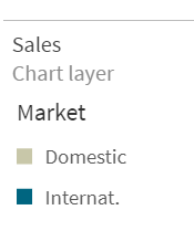
Using a grid chart with pies can help users visualize KPIs over time or with different variables like regions. To do this, you can re-use the map chart with the chart layer.
Table Indicators
By adding table indicators, you can enrich your tables with context, allowing users to immediately identify outliers and understand key metrics. Table indicators can include rank, trend, and status markers to simplify the interpretation of values. Below you will see how to add table indicators in Qlik Sense.
Icicle Chart
Helpful in showing hierarchies, you can create an icicle chart by modifying the pivot chart. To determine the space you need, sort by the first measure and count the leafs. Make sure “totals” are turned “on,” so you can sort by the first measure. To color by number of leafs, use the colormix function. You can reduce clutter utilizing pivot buttons and condensing the header with CSS multi-KPI.
Icicle Chart with Deviation
Finally, the deviation icicle chart provides users with a simple way to see the differences between metrics over time. For example, you can quickly show a number increase or decrease in units sold or bookings month over month using the deviation icicle. This type of chart is created using the combo with stacked bars for the deviation and white bar as the offset. First, add lines with actual and forecast, turn on labels, and set forecast to transparent =argb(0,0,0,0). Next, add bars for offset=min(Actual,Forecast) and deviation. Then, color the offset bar transparent =argb(0,0,0,0) and deviation red for – and green for +. Finally, add a marker layer for lollipops.
As you use Qlik Sense SaaS more and more, you will clearly see how Qlik’s world-class visualization capabilities stand ahead of other analytics companies when it comes to supporting your innovation today and in the future. For more information on these and other data visualization capabilities, check out Qlik’s Visualization Showcase. See this eBook for tips on avoiding common data visualization pitfalls.
-
University of Tasmania students learn data analytics using Qlik Academic Program
The Qlik Academic Program is being leveraged by many Universities in Australia and New Zealand. More than 45 Universities from ANZ are using the acad... Show MoreThe Qlik Academic Program is being leveraged by many Universities in Australia and New Zealand. More than 45 Universities from ANZ are using the academic program resources to enable the student and educator community in analytics.
A local study by Arktic Fox and Michael Page Australia has identified data and analytics as the number one skill gap in marketing teams. Most marketing leaders say data literacy was not strong in their departments. To fulfill this gap and also a growing demand for data analytics resources, the Qlik Academic Program provides top class analytics software, training, qualifications, certifications to University students and professors, completely free.
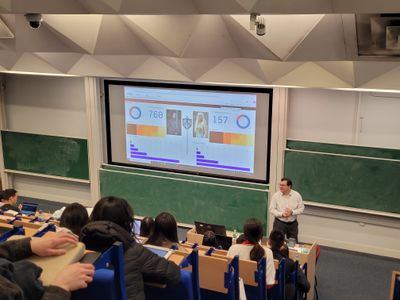
The University of Tasmania (UTAS) has been partnering with the Qlik Academic Program for a number of years now. Each year, Charlie Farah, Senior Director, Solutions and Value Engineering at Qlik presents to the students on all things data and analytics.
Dr. Joel Scanlan from UTAS who collaborates with Charlie on this initiatives says, “ We are very grateful to Charlie for his time and continued support”
The primary course is the Master of Health Information Management which aims to equip students with a strong awareness of the role that data and information have on modern healthcare, with particular interest in Data Analytics, Privacy and Security, ethics, and governance. A number of these components are also covered in the Graduate Certificate in eHealth also.
Charlie is invited to present to students enrolled in subject BAA735 Health Data Management, Information Analysis and Improvement which delves into key theories and approaches in health data management and information. Frameworks and models for information analysis and reporting are also investigated, including strategies for measuring and monitoring organisational and clinical outcomes and experiences. Something world leading data & analytics software is critical for.
Students get practical hands on with a range of data, including a deep dive into a dataset of their own choosing using Qlik Cloud. This equips them to be able to analyse and understand data, to see its impact not only on clinical outcomes, but also the efficiency of care delivery and better equip them for their roles ahead.
Joel Scanlan further says that they look forward to continuing this partnership for many years ahead. The Qlik Academic Program is happy to work with UTAS and forge a strong partnership to enable its students and professors in data analytics.
For more information about the academic program, visit: qlik.com/academicprogram
-
Honey Production (U.S.)
Honey Production (U.S.) AnyChart — Extensions for QS Gain rich insight into the volume and value of honey production across the United States of... Show MoreHoney Production (U.S.)AnyChart — Extensions for QS Gain rich insight into the volume and value of honey production across the United States of America as officially reported by the USDA’s National Agricultural Statistics Service (NASS). Know which states output the most honey. Instantly figure out and look into increases and declines in their contributions year by year. Focus on certain states or periods at a click by making use of the appropriate filters.
Discoveries
Some of the discoveries from using this app include:
* Top 5 states by honey production (lb) and its value ($) — calculated automatically.
* Detailed breakdown by state.
* For each state — production, value, number of colonies, yield per colony, and price. Plus the change from the previous year.Impact
Makes it clear at a glance which five states produced the most honey, by weight and by value, and how their contributions to the top five totals were shifting on a yearly basis, revealing the biggest effects on each change and delivering more analytics on demand for informed decision making.
Audience
Business and market analysts watching the development of the honey production sector. All who want to analyze the cumulative effect of sequentially introduced values in Qlik Sense — the app features a good example of an advanced Waterfall chart and is publicly available among AnyChart demo apps for QS.
Data and advanced analytics
The dataset is derived from publicly available reports on honey production in the United States, provided by the National Agricultural Statistics Service (NASS), the statistical branch of the U.S. Department of Agriculture (USDA).
-
Insight Advisor Analysis Types - Sophisticated AI-generated analyses in a few cl...
Users can choose from a variety of advanced analysis types, and analyses will be auto-generated, including data visualizations, narrative interpretati... Show MoreUsers can choose from a variety of advanced analysis types, and analyses will be auto-generated, including data visualizations, narrative interpretations, and even entire dashboards.
Demonstration / Walkthrough Video
Can't see the video? YouTube blocked by your region or organization? Check out this link to view the video on Qlik's video platform: https://videos.qlik.com/watch/vK3S8eoBAoXNjzJzwfJErV.
This capability exposes the full range of AI-generated analyses available through Insight Advisor, and instead of relying on the system to determine the best analysis type (as is the case with Natural Language), users can now direct the system to generate a specific type of analysis. You’ll get guidance on what data is required and suggestions for the best fields to use, and in just a few clicks, you can generate sophisticated analyses that would require complex authoring of visualizations and expression logic if created manually.
Insight Advisor now supports multiple pathways to insight, whether you are a less sophisticated user looking for fast answers through chat and search, a business analyst trying to solve a specific type of business problem, or a content author using AI for assistance. In all cases, our users can unlock their full data literacy skills and potential.
And remember, this is very different than just auto-generating a visualization. Insight Advisor delivers the right analytics to solve the business problem at hand. So with this, you don’t request a bar chart, scatter plot, or combo chart – instead, you choose a ranking, comparison, or breakdown analysis and leave the heavy lifting to Insight Advisor. Ask for relative importance, get back a combo chart with values and accumulation of contribution; a clustering, get back a scatter plot with K-means applied and narrative interpretations; and a period-over-period analysis, you’ll get an entire smart sheet. You’ll get the right charts, readouts, and even entire dashboards for further exploration.
A full range of analysis types are available – check out the complete list here. And for a complete demonstration, join Mike Tarallo’s upcoming DO MORE WITH QLIK session on this capability - register here
Resources
- Insight Advisor Analysis Types - Qlik help
- Business Logic Do More with Qlik Webinar
(after registration look for: Session #11: November 5 - Business Logic)
-
The Qlik Academic Program returns to the University of Southampton
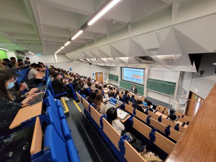
Last Friday the Qlik Academic Program ran a hybrid lecture session for Masters students at the University of Southampton for educator Fatema Zaghloul.... Show MoreLast Friday the Qlik Academic Program ran a hybrid lecture session for Masters students at the University of Southampton for educator Fatema Zaghloul. With lots of universities still pursuing a blended model of education, I ran my section of the lecture virtually, while our Solution Architect Marius Popa attended in person to introduce the students to Qlik Sense.
This session was run for a group Fatema’s students studying a Data Analytics and Organisational Decision Making module. The module is designed to provide students with a knowledge of how information systems and analytical tools can be used to tap into big data and enhance decision making within different organizational contexts. We had over 100 students attend in person and a further 15 online.
Marius spent just under an hour introducing the students to a couple of industry specific uses cases. Here is what lecturer Fatema Zaghloul had to say about the session:
“Inviting guest speakers offers students the opportunity to meet passionate industry experts and learn from them in various ways. During this guest lecture, students learned about a wide range of current business scenarios and Qlik use applications, such as within UK emergency services (NHS, police forces), retail sector, and the electronics industry. The session presented a broader view of the real-life data-related problems that such organisations face, and how Qlik presents a possible solution.
Marius introduced students to Qlik Sense and demonstrated how the use of Qlik supported a UK hospital in improving their operations by making staff meetings more focused, especially during times of crisis, and more evidence-based, while freeing up employee time to focus on enhancing the patient experience.
The session provided an excellent opportunity for students to learn how to apply the theoretical concepts they have learned in classes to practice and real-life scenarios. They were familiar with tools such as Microsoft Power BI and Tableau, and the ability to learn another software was very valuable.”
In addition to this Marius received comments from students expressing their enthusiasm for the session, one came from Vishnu who said “It was great attending your guest lecture session conducted last week. What you do at Qlik sounded fascinating and it totally inspired me!”. Marius finished the session by showing the students you can use Qlik Sense to explore data sets related to hobbies and interests too, before showing them an app he'd build based on the Game of Thrones book series.
We really enjoy running these sessions for our Academic Program members. Receiving feedback such as the above, and about how the program has supported students in their study of data analytics, is part of why we run the program. If you’re interested in learning more about our free Qlik Academic Program, you can follow this link: https://www.qlik.com/us/academicprogram.
-
Internet of Things - A Retro-gaming Perspective (video)
Hey guys - I recently was inspired at Qonnections 2018 by our Big Data Qlik IoT Race game, so much so that I had to understand how it all worked and w... Show More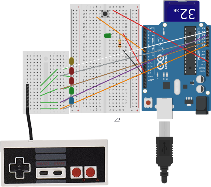 Hey guys - I recently was inspired at Qonnections 2018 by our Big Data Qlik IoT Race game, so much so that I had to understand how it all worked and wanted to play with the underlying technology. Aside from gathering the statistics and providing an analysis on the results, I was really interested in learning about those little devices or "things" that were connected to the track. However, how would I use something like that? Not really knowing anything about Arduino, WEMOS and IoT in general, I set out on a mission to learn about this fascinating technology while incorporating somethings I enjoy such as Qlik and retro-gaming. Take a look how I made IoT interesting and fun to learn, by incorporating a Retrogaming spin and of course added some Qlik Sense data analysis.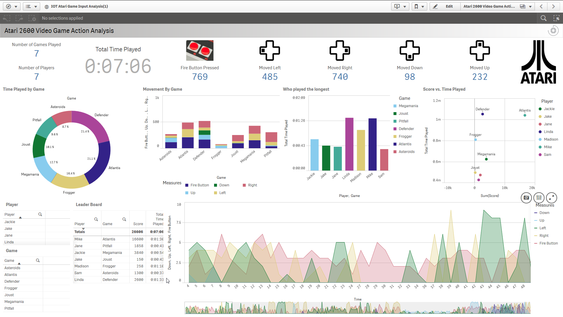
Atari Action Analysis Dashboard
Thanks guys, hope you enjoyed it. Let me know what you think by leaving your questions and comments. I'll do my best to respond.
Can't see the video? YouTube blocked by your region or organization?
A copy of the video can be downloaded or streamed from here:
Regards,

-
QlikWorld 2022 Online is fast approaching!
Hello Qlik Community! Okay, it's almost May, which means QlikWorld is around the corner. So, if you haven't already registered, watch this short vide... Show MoreHello Qlik Community!
Okay, it's almost May, which means QlikWorld is around the corner. So, if you haven't already registered, watch this short video from Qlik's very own CEO, Mike Capone, get inspired, and Click HERE to register today!!
PS: Your Community team will be there waiting to meet you!
Click here for transcript.
-
Best Practices for Developing User Experience in Qlik Sense
Hello Qlik Community, today I have the pleasure of introducing our latest and newest guest blogger, Bruno Calver. Bruno is a Principal Solution Archit... Show MoreHello Qlik Community, today I have the pleasure of introducing our latest and newest guest blogger, Bruno Calver. Bruno is a Principal Solution Architect working in the UK with some of Qlik’s
 largest enterprise customers. His passion is working with business people to turn disparate and otherwise mundane data sets into insights and stories that can engage their audience, drive change and inspire new ways of thinking. He comes to us today with an introductory article that presents a paper that will cover best practices when developing the "user experience" (UX) within Qlik Sense.
Reaching more people
Qlik Sense is all about extending the reach of Visual Analytics to more people in the business. In many organizations, people make decisions. The more people that use Visual Analytics the more value an organization will get from their data investment.
But, how do we engage users and drive adoption of Visual Analytics solutions such as Qlik Sense? There are a number of ways this can be achieved, both in and outside the box. But in terms of what we can do within Qlik Sense in general, the "user experience" is one of the most important factors which can help drive adoption.
The User Experience
The user experience (UX) refers to an individual's expressed emotion and attitude when using a particular product, system or service. User experience includes the practical, experiential, effective, meaningful and valuable aspects of human–computer interaction and product ownership. Additionally, it includes a person’s perceptions of system aspects such as utility, ease of use and efficiency.
Qlik Sense is the business’ window into the world of data and insight that can help drive even better business decisions. This window needs to be beautiful, like a top department store showcases to entice shoppers and draws them in to find the products (insights) they want or need.
There are some basic guidelines that can be followed to help ensure your "window" is looking tip top. You also want to make sure that as your users enter your shop (application), there are immediately impressed with the aesthetics of the environment, that the most important products are prominently displayed and that as they navigate their way through they get to see other relevant products. In the following article I will cover these basic guidelines:
- Less is more
- Space and symmetry
- Don’t be afraid of logos, icons and images
- Think of your audience
- Carefully consider the use of extension objects and more exotic visualizations
Read more in the attached article.
Now, let's go window shopping.
-
Qlik Announces the finalists of the Qlik Academic Program Datathon!
Recently the Qlik Academic Program hosted a Datathon for students around the globe to help develop solutions towards achieving three of the United Nat... Show MoreRecently the Qlik Academic Program hosted a Datathon for students around the globe to help develop solutions towards achieving three of the United Nations 17 Sustainable Development Goals: Goal 13 Climate Action, Goal 14 Life Below Water, and Goal 15 Life on Land which all focus on protecting our planet. We invited our Qlik Academic Program students to develop data and analytic solutions for the global climate challenges we face because there is no Planet B!
We received submissions from universities around the world and we were both overwhelmed and grateful for all students who participated.
Our challenge finalists include:
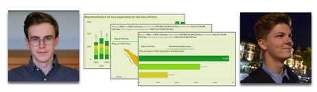
- Thomas De Dobbeleer & Rutger Mols: Team AtTwice from Thomas More, Belgium
- Shubham Thakur & Snehal Joshi: Team Qlikit_IN from Hochschule für Technik und Wirtschaft, Berlin
Join us at QlikWorld Online where you can listen to each finalist present about their solution and then vote for your favorite and help us crown an overall winner!
If you are a student or educator and wish to take part in the Qlik Academic Program to receive free software, training, and additional resources, apply today by visiting qlik.com/academicprogram.

-
【オンデマンド配信】QlikWorld 2022 - バーチャルイベント
イノベーションとインスピレーション満載の 3 日間にわたるバーチャルイベント、QlikWorld 2022 は、インターネット環境で、どこからでもご参加いただけます。基調講演や 85 以上のブレイクアウトセッションのほか、日本語の資料を多数揃えて、皆さまのご参加をお待ちしております。また、他の参加者... Show Moreイノベーションとインスピレーション満載の 3 日間にわたるバーチャルイベント、QlikWorld 2022 は、インターネット環境で、どこからでもご参加いただけます。基調講演や 85 以上のブレイクアウトセッションのほか、日本語の資料を多数揃えて、皆さまのご参加をお待ちしております。また、他の参加者と交流することもできます。
※ 参加費無料。パソコン・タブレット・スマートフォンで、どこからでもご視聴いただけます。日本語字幕付きでお届けします。
日程 講演内容 講演者 5月 17日(火)
変化し続ける世界で確実性を生み出す
経済や市場の状況が変化し続けている中、すべてのビジネスにおいて、適切なタイミングで適切なデータにアクセスして活用することは必要不可欠です。完全かつ最新のデータを入手することで、信頼と自信を生み出し、常に正しいアクションを起こすことができるのです。これらの課題に対処するべくアクティブインテリジェンスの必要性が加速している市場勢力についての見解、Qlik で確実に正しい意思決定を行う方法について、実際のお客様やパートナー様からの見識をご紹介します。Mike Capone
Qlik 最高経営責任者5月 17日(火)
未来は今:Qlik アクティブインテリジェンスプラットフォーム
新たなユースケース、より高いビジネス価値の必要性から、データおよび分析戦略の融合が進んでいます。エンドツーエンドの分析データパイプラインは、「あった方がいい」ではなく、「必要不可欠」なのです。データおよび分析戦略に効果的なトレンドを検証し、リアルタイムのデータ提供、ワークフローと自動化、ハイブリッドクラウドなどの分野における Qlik 独自のイノベーションのほか、Qlik Active Intelligence Platform でデータの可能性を最大化する方法をご紹介します。James Fisher
Qlik 最高製品責任者5月 18日(水)
未開拓領域を明らかに
小児ガンを克服し、2021年にスペース X の初の民間宇宙飛行に参加。新たな境界線を破り、一歩一歩困難を克服していく感動的なストーリーをご紹介します。宇宙へ行った最年少のアメリカ人女性・義足を装着した初の宇宙飛行士・そして世界初の民間宇宙飛行に選ばれた 4 人のうちの 1 人として、次のフロンティアを定義することに人生を費やしてきました。リスクを負うこと、忍耐力、革新性、そして恩返しについて、見解を語ります。Hayley Arceneaux 氏
ガンを克服した宇宙飛行士5月 18日(水) 特別講演:国連特集 - Data4Good
現在、多くの課題は世界的なものですが、ソーシャルメディアのフィードは、頻繁に疑わしい情報で溢れています。事実と意見を区別して、適切な行動を起こすにはどうすればよいのか?Qlik.org のディレクター、Julie Kae が国連のデータ主導型への取り組みについてご説明します。また、「市民」データサイエンティストになって、理解・行動し、変化を生み出す方法を明らかにします。Lambert Hogenhout 氏
国連情報通信技術局
データ / 分析責任者Julie Kae
Qlik.org ディレクター5月 19日(木) パネルディスカッション:今後のテクノロジーと人間の関わり
テクノロジー、人間、社会の未来とは?専門家によるパネルディスカッションで、変化し続ける複雑な関係性、そして次に目指すべき方向性について議論します。Poppy Crum 博士
Dolby ラボ 主任サイエンティスト / 先見未来学者Kate Darling 博士
MIT Media ラボ リサーチスペシャリスト / ロボット倫理学エキスパートNicholas Thompson 氏
Atlantic 社 最高経営責任者 / WIRED 誌 前編集長 -
Welcome Angel Monjarás to the Qlik Educator Ambassador Program!
This week I have the pleasure of introducing our newest Educator Ambassador for the 2022 class, Angel Monjarás! Angel lives in Mexico where he teache... Show MoreThis week I have the pleasure of introducing our newest Educator Ambassador for the 2022 class, Angel Monjarás! Angel lives in Mexico where he teaches at Instituto Tecnologico Autonomo de Mexico. There he has been teaching graduate students who are pursuing degrees in Business Intelligence for several years.
However, that is not where Angel got his start with Qlik. He began teaching Qlik way back in 2010 when he oversaw Training at a Qlik Master Reseller, so it only made sense for him to choose Qlik when he started teaching the Business Intelligence Diploma 5 years ago. Since then, he has migrated to Qlik Sense for class exercises and uses it for the students' course-long project, where every student must design a dashboard that provides answers to specific business questions about a real-life use case. He also uses Qlik Sense to illustrate visualization best practices and show students how to identify and solve data quality issues.
In his Best Practices in Visualization course, he uses the Qlik Academic Program Data Visualization course in addition to the Qlik Continuous Classroom training he received as part of his membership. Right now, he is currently designing a Practical Data Visualization course which will also incorporate the Data Visualization course materials from the program. In each of these courses, students are required to join the Academic Program for their own membership to software and training!
Since these are post-graduate courses, most of the students are already employed and some of them (one or two per class) have been instrumental in bringing Qlik to their companies and becoming Qlik customers! In addition, he is also working on adding topics inspired by The Data Literacy Project and encouraging his students to take the Data Literacy Certification exams to become certified.
Not only does Angel participate in the Qlik Academic Program for teaching but he has also participated in other Qlik initiatives in the past such as Qlik Visualize Your World and several Qlik Meetup meetings. Thus, confirming that Angel is the perfect Educator Ambassador as he is a real Qlik enthusiast!
When asked what a shinning moment in teaching was, he explained that one of his former students who learned Qlik Sense in his course later graduated and worked for Universidad Cristobal Colón where he was influential in their decision to adopt Qlik Sense for university use.
If you can believe it, outside of teaching, Angel has a full-time job leading a Business Analytics practice at Sellcom Solutions. He also runs a side business at Uva y Malta, a wine and beer distribution startup, and he co-host Tecnocasters, which is a show that explains technology trends for everyone's daily life at NowMedia Television! He also enjoys collecting comic books and has a large collection. Some dating back from the 60’s and that are signed!
When asked about working with Qlik he explains Qlik is “No-nonsense Business Intelligence; it just works!" and every year Qlik's vision and execution makes it more true”.
To learn more about Educator Ambassadors visit: https://www.qlik.com/us/company/academic-program/ambassadors
If you are a university student or educator, visit qlik.com/academicprogram to learn more and apply!
-
Dynamic height for embedding stuff
If you're familiar with iframes, you're probably familiar with the fact that they don't handle dynamic height very well. In other words, when you use ... Show MoreIf you're familiar with iframes, you're probably familiar with the fact that they don't handle dynamic height very well. In other words, when you use an iframe you have to define it's height, and it does not change based on the height of it's content.
This can be problematic. For instance, if I use the single configurator to embed a large pie chart, and define the iframe's height so that the entire pie chart is displayed without scrolling, if the pie chart shrinks in height on a smaller device it will leave extra empty space in the iframe. Another common time I run into this problem is when embedding mashups that are responsive with content that wraps on mobile, or with multiple views that have different heights.
You may run into this problem, too, when using the single configurator or embedding mashups, as I often do. What can you do about it?
Using Pym.js
Pym.js is a super useful library when dealing with iframes. With pym.js, your iframes will respond to the height of their content, making their integration into your page much more seamless by avoiding either extra empty space or inner-page scrollbars, and it's pretty easy to use, too!
So how do you actually use it?
Well, first thing to know is that pym.js must be placed on both the child site and the parent site, so if you'd like to use this with an object from the single configurator, for instance, you'll have to put together a quick mashup. Super simple. Let's do that as an example, and then you should be able to apply the same idea to any situation you'd like to use pym.js.
Step 1 - Add necessary code to your mashup
Require pym.js, and include var pymChild = new pym.Child()
require( ["js/qlik", "https://pym.nprapps.org/pym.v1.min.js"], function ( qlik, pym ) {
var pymChild = new pym.Child();
//rest of your code...
Step 2 - Override html and body height 100%
Qlik Sense mashups set html and body height to 100%, this will not work with pym.js. Just add the following css
html, body {
height: auto !important;
}
That's all that needs to be done in the mashup.
Step 3 - Embed mashup in website with pym.js
Include the following in your website to embed the mashup with pym.js
<!-- This adds pym.js to your page -->
<script src="https://pym.nprapps.org/pym.v1.min.js"></script>
<!-- This is the container for the frame -->
<div id="example"></div>
<!-- This is the pym.js method that adds the frame to the page. -->
<!-- Make sure the first param matches the container id, and the second param is the url to the mashup -->
<script>
var pymParent = new pym.Parent('example', 'example.html', {});
</script>
And that's it.
I've put up an example to show you the difference between using pym.js and not. This page https://demos.qlik.com/extensions/pym-example/iframe.html includes a large pie chart that is set to have it's width equal its height, and its width equal to 30% of the page, and is simply iframed in to fit nicely at full screen, but make the screen smaller and notice all the empty space between the pie chart and the "Some other content" string that sits outside of the iframe.
This page https://demos.qlik.com/extensions/pym-example/pym.html uses pym.js, and when you resize, the iframe height also adjusts, so that it's not taking up a bunch of unnecessary space.
-
Charts in Tooltips
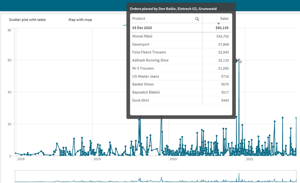
Custom tooltips in visualizations keep getting better and better. Now, you can add a chart to a tooltip – it is like a chart within a chart. The abili... Show MoreCustom tooltips in visualizations keep getting better and better. Now, you can add a chart to a tooltip – it is like a chart within a chart. The ability to add master visualizations to tooltips enables users to drill down in the data in a different way. Charts can be added to custom tooltips for the following charts: Bar, Bullet, Combo, Line, Map, Scatter Plot and Treemap.
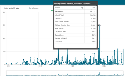
When a chart is added to a tooltip, the chart picks up on the dimension that is being hovered over and displays the embedded visualization based on that dimension. It provides a nice way to see details, trends or supporting information about a data point in a visualization. The line chart below shows sales over time. The table that is added to the tooltip shows the products that were ordered on the respective order date as well as customers that placed the order. It is clean and simple and offers details in the moment.
Adding a chart to a tooltip is easy to do. The first step is to create the chart that you would like to add to the tooltip. Make sure the chart is not too big and will fit in the tooltip. Add the chart to the master items. Then in the properties panel of the visualization under Appearance > Tooltip, toggle Basic to Custom. In the Chart section, click the Add chart button. Select the chart from the list of master items. Lastly, change the chart size, if necessary. Now, test it out. Exit edit mode and hover in the chart to see the tooltip. Make sure it looks as you expect and is fully visible. It’s that easy. Want to see more? Check out this video on adding a chart to a custom tooltip.
Things to be aware of when considering using a chart in a tooltip:
- The chart that is added to the tooltip must be a master visualization.
- You cannot interact with the tooltip chart so make sure the whole chart is visible because there is not the option to scroll.
- You can select the size for the chart (small, medium, or large) so keep that in mind if you have a larger chart that may not be fully visible when set to small or medium.
- When using a touch device, charts will not appear in custom tooltips.
- If using a Treemap chart in a custom tooltip, you can only have one dimension in the Treemap.
- Container and Trellis container charts are not supported in custom tooltips.
- Charts in tooltips are not supported in Storytelling.
Charts in tooltips is a helpful new feature that can enhance your visualizations and provide further insights. To view some examples, check out the Charts in Tooltips sheet in the What’s New App on the Demo Site that was released earlier this month.
Thanks,
Jennell
-
ループによる繰り返し処理-For Loop
■はじめにここでは、Qlik SenseのロードスクリプトでFor Loopを使ったループによる繰り返し処理を行う手順についてご説明します。ループ処理の適用例として、分析対象の売上明細データを格納した複数のファイルが以下の様に同一スペースにアップロードされているケースをここでは取り上げます。 売上デ... Show More■はじめに
ここでは、Qlik SenseのロードスクリプトでFor Loopを使ったループによる繰り返し処理を行う手順についてご説明します。
ループ処理の適用例として、分析対象の売上明細データを格納した複数のファイルが以下の様に同一スペースにアップロードされているケースをここでは取り上げます。
売上データには売上が発生した年月の情報が含まれておらず、これらのファイルのデータをロードスクリプトで取り込みつつ、それぞれのファイル名称を取得して名称に含まれる「年月」の情報を取り込んだデータに付加する処理を行う必要があるものと想定します。こういった形の繰り返し処理に今回ご紹介するFor Loop処理は有効です。
■For Loop処理
Qlik Senseアプリを起動してロードスクリプトの画面を開きます。ロードスクリプト画面の使用方法については「Qlik Senseロードスクリプトによる変換処理の基礎」をご参照ください。
そして、以下のロードスクリプトを追加してデータのロードを実行します。Filelist ('lib://DataFiles/売上明細_*.csv')により、スペースに保存される「売上明細_」で始まる名前で、「.csv」拡張子のファイルを全て取込み対象とし、ファイル一覧のリストを取得してそれぞれのファイルに対してFor eachループの中でロード処理を行っています。
For each vFileName in Filelist ('lib://DataFiles/売上明細_*.csv')
 Load *,
    '$(vFileName)' as ファイル名
 From [$(vFileName)];
Next vFileName
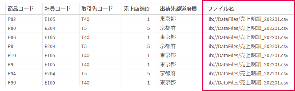
この時、各ループ処理の中で$(vFileName)の変数にファイル名が格納されますので、そのファイル名をLoad処理時に「ファイル名」の項目に含めています。この処理を実行すると以下の形でデータを取り込むことができます。
ただ、上記の状態では「ファイル名」にファイルのフルパスが含まれてままとなっていますので、Load処理の「ファイル名」の項目の部分の処理を以下の様に書き換えます。
For each vFileName in Filelist ('lib://DataFiles/売上明細_*.csv')
 Load *,
   Replace(SubField('$(vFileName)','_',2),'.csv','') as 年月
 From [$(vFileName)];
Next vFileName
ここでは、例えばファイル名が「売上明細_202201.csv」の場合、SubField関数で「_」の文字で分割した時の前から2番目の文字列である「202201.csv」を取得し、Replaceで「.csv」を削除することで年月の部分だけを残しています。
尚、ここではCSVファイルを取り込んでいますが、例えば.xlsx形式のファイルを取り込む場合には以下の様な形でファイル名の後にフォーマットの指定が必要となりますのでご注意ください。
- From [$(vFileName)] (ooxml, embedded labels, table is シート名);
■その他のループ処理関数
上記ではFor Loop文をご紹介しましたが、その他に以下の様なループ処理関数が用意されています。
- Do While文
Do While i < 10
	//[処理内容]
Loop
- For Next文
For i = 1 To 10
	//[処理内容]
Next
■まとめ
ここでは複数ファイルへの繰り返し処理を例にとってFor Loopによる繰り返し処理の利用方法をご説明しました。

-
インサイトアドバイザーが分析タイプの指定で使いやすくなりました!
この記事はQlik Product Innovation BlogのInsight Advisor Analysis Types - Sophisticated AI-generated analyses in a few clicks を参考にしています。インサイトアドバイザーが新しくなりました。... Show Moreこの記事はQlik Product Innovation BlogのInsight Advisor Analysis Types - Sophisticated AI-generated analyses in a few clicks を参考にしています。
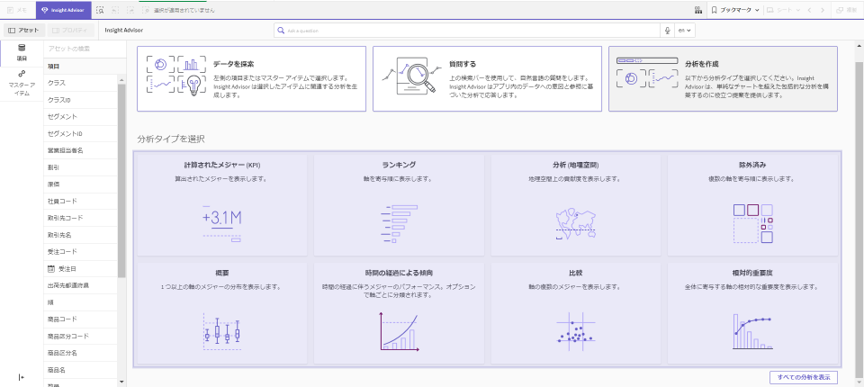
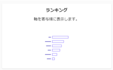
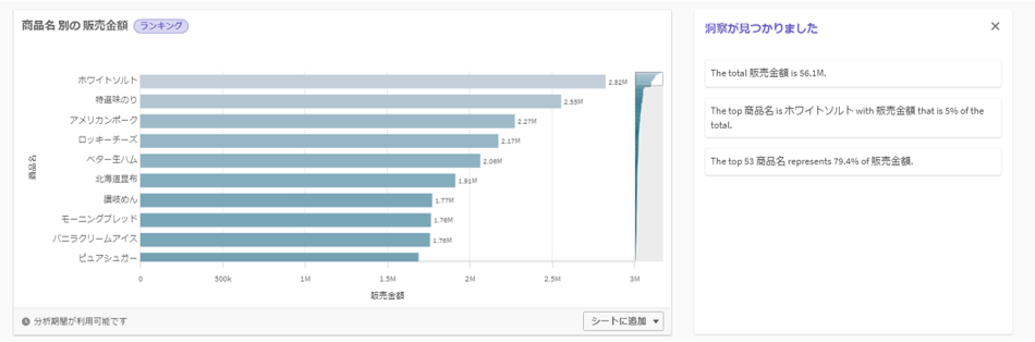
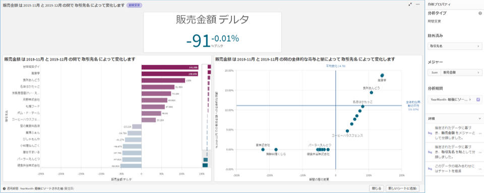
インサイトアドバイザーが新しくなりました。これまでの、データから項目を選択と自然言語で質問の機能に加え、ランキングや比較、時間の経過による傾向など、分析タイプを指定してチャートや解説を作成することができるようになりました。
最適な分析タイプの決定をシステムに依存するのではなく、ユーザーが特定のタイプの分析を生成するようにシステムに指示できます。 選んだ分析タイプに応じて、どのようなデータが必要なのかのガイダンスも表示され、高度な分析をわずか数クリックで生成することができます。
①分析タイプを選択
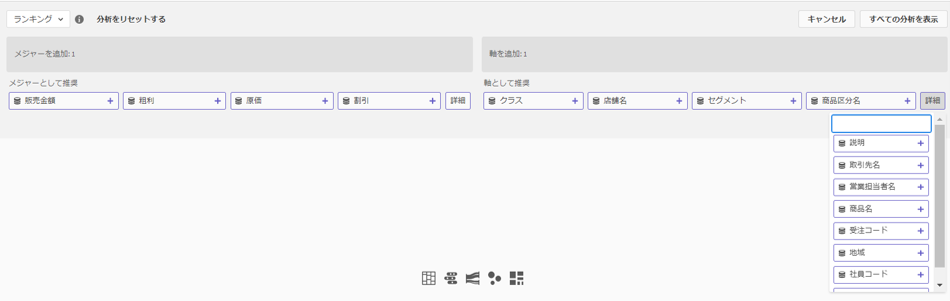
②メジャーと軸を選択
③チャートや解釈が表示されます。
分析に不慣れでチャットや検索ですぐに回答が欲しいユーザーも、特定の課題を解決したいビジネスアナリストも、AIを利用して開発したいコンテンツ作成者も、複数の方法でインサイトを得ることができます。
そしてこの機能は単なるチャート作成とは異なります。棒チャートや散布図の作成を求めるのではなく、ランキング、比較、傾向などの分析タイプを指示して、可視化はインサイトアドバイザーに任せるのです。また期間変更などのスマートシートを選択すると、ダッシュボード全体が作成されそのままシートに追加することができます。
詳細はヘルプの Insight Advisor 分析タイプ をご覧ください。
下記からデモ動画もご覧いただけます。
Insight Advisor Analysis Types - Walkthrough
-
Meet Dr. Marisa A. Sanchez-Qlik Ambassador Class of 2022
This week, we introduce Dr. Marisa A. Sanchez, one of our new Educators in the 2022 class of Qlik Academic Program Ambassadors. Dr. Marisa is a Profe... Show MoreThis week, we introduce Dr. Marisa A. Sanchez, one of our new Educators in the 2022 class of Qlik Academic Program Ambassadors. Dr. Marisa is a Professor at the Department of Administration Sciences at the Universidad Nacional Del Sur, Argentina.
Marisa and her family lives in Bahia Blanca, a city is of about 300, 000 inhabitants at the doors of Patagonia in Argentina. Her family includes her husband and a 16-year-old daughter and a 21 year son. She enjoys gardening and that is her most favorite leisure activity!
Marisa’s journey with Qlik began when she was in search for the best-of-the-breed analytics technologies and during this search, she learnt about Qlik. Upon using the product, she became a loyal user due to the features of the Qlik Sense software and the Qlik Academic Program resources. She further adds that Qlik is a world-class technology company, and she is particularly impressed about the quick response from the academic program team, if there are any issues or questions.
Marisa says “We are using Qlik in an undergraduate Management course since 2018. It is a Business Intelligence course under which we cover techniques to support decision making to build models from data such as data visualization and data mining, based on mathematical models like simulation. We also give due importance to data analytics topics as we understand, this will better prepare students in their professional career”
The way the Qlik Academic Program is incorporated into her class is through example files and exercises. In addition, she encourages students to pursue the program’s qualifications and certifications which would add value to their resume’.
There is a great demand of data analytics competencies according to Marisa but in her view, there is a need for a follow-up program after graduation.
Regarding her goals for 2022, Marisa says that this year they would be offering more contents based on the data analytics curriculum from the academic program resources. In addition, in May, they would be starting a data visualization post-graduate course to introduce this subject to both professional and research students. They shall also be attempting to translate the course material in Spanish.
We asked Marisa about her thoughts on trends in analytics and in the context of education. She had some interesting insights to share. She said that some years ago, companies irrespective of their size, used information systems to gather historical data and produced reports, rather shyly. But today, due to the digital transformation and addition of numerous platforms, there has been a transition from product-based to service or platform-based business models. These are instrumental in generating huge amounts of data. In addition, due to the Internet of Things ( IoT) and various social networks, these have become sources of large amount of data. Therefore, it is imperative that higher education should strongly support data analytics and data science education to prepare students in both professional and research careers.
Marisa says that being an Educator Ambassador is a responsibility to make good use of all available resources and share this with colleagues and students. Due to the free resources of the program, it’s a great offering for public universities with reduced budgets.Please join us in welcoming Dr. Marisa Sanchez to the Ambassador Program and congratulating her on her many accomplishments as an Educator and Qlik enthusiast!
To learn more about Educator Ambassadors visit: https://www.qlik.com/us/company/academic-program/ambassadors
If you are interested to learn more about the Qlik Academic Program and its amazing resources, visit qlik.com/academicprogram
-
A few enhancements as we gear up for QlikWorld 2022
Hello Qlik Community! QlikWorld 2022 is only a month away, and we have been gearing up behind the scenes. With all the hustling, we still couldn’t be ... Show MoreHello Qlik Community!
QlikWorld 2022 is only a month away, and we have been gearing up behind the scenes. With all the hustling, we still couldn’t be stopped from putting out a few enhancements for you!
Here is a quick overview of what’s new for the month of April:
Expanded Chat Bot
You will now see Chat Bot on all of the Product News pages and the Search page. This means whether you’re downloading Qlik software, reading the Release Notes or in the middle of a search, help is only a click (Qlik? 😉) away!
Products search fixed on Release Notes page
An issue with the search in the Products filter was identified and is fixed.
‘Last Updated’ field added to Release Notes post
A user requested to know when Release Notes posts are updated. The ‘Last Updated’ timestamp is now visible on Release Notes posts.
Check back next month for more improvements coming your way!
Many of you have extended weekends, so enjoy and be safe!
Your Qlik Community Admins,
Melissa, Sue, Jamie, and Nicole
-
Insight Advisor Analysis Types
This week, Insight Advisor got even better with the new analysis type experience. Now when you click on the Insight Advisor button from within an app... Show MoreThis week, Insight Advisor got even better with the new analysis type experience. Now when you click on the Insight Advisor button
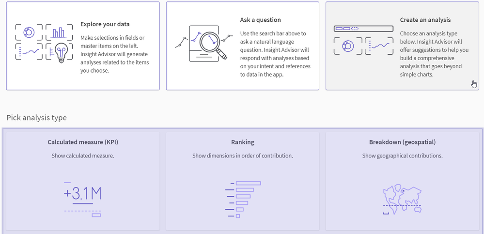
from within an app, you have 3 options for insights.
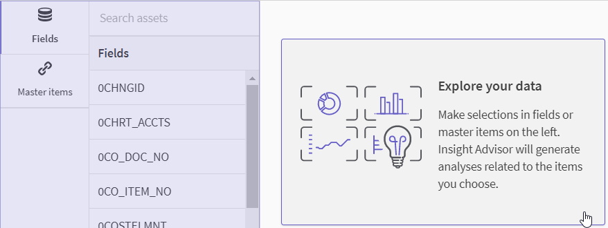
You are probably familiar with the first two options. Explore your data allows you to select fields and/or measures from a list that Insight Advisor will use to generate analyses.
The second option, Ask a question, allows you to use natural language to ask a question.
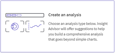
The third option, Create an analysis, allows you to select from a long list of analysis types such as ranking, trend over time, and correlation to gain insight. The image below shows just some of the analysis types available. You can find all available analysis types here in Qlik Help.
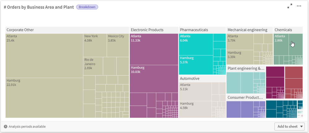
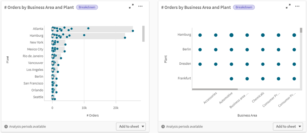
The analysis types are helpful to users who know what type of analysis they are looking for but may not have the skill set to create it. Users can select the analysis type they are looking for and get the best data and option. Let’s look at a few examples. If I select the breakdown analysis type, I am prompted with suggested measures and dimensions I can use, as well as the number of measures and dimensions I need to select to perform a breakdown analysis.
I can select the measures and dimensions as seen above and then analyses are auto generated as seen in the images below. These visualizations can be edited in the analysis properties pane or added to a sheet in the app. Selections can also be made from the analysis.
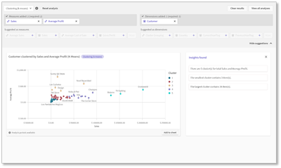
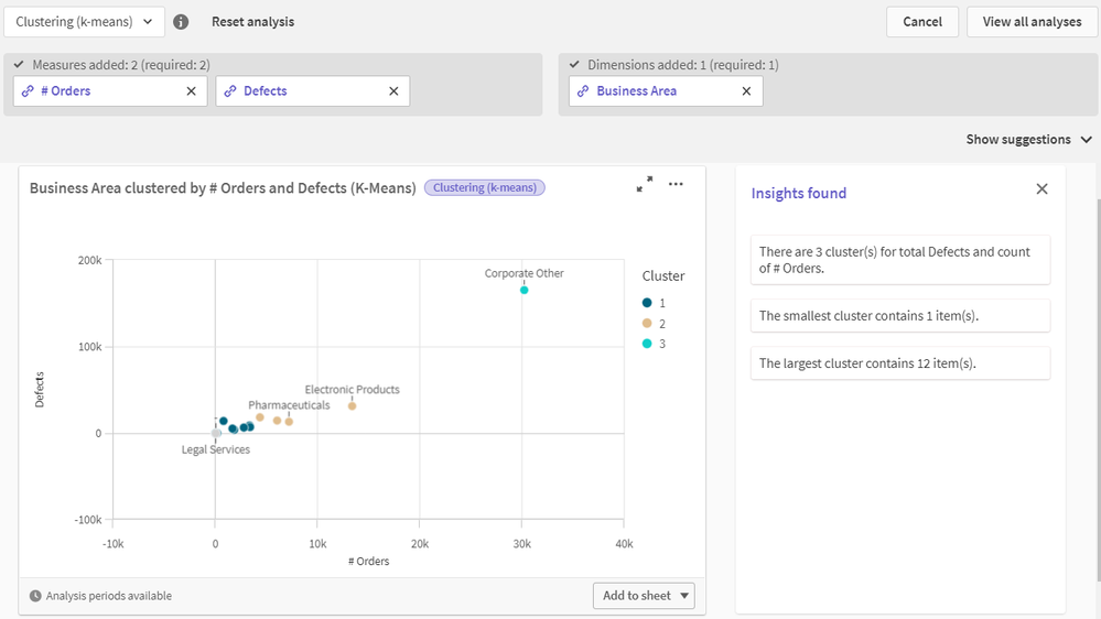
Here is another example using the clustering analysis type. In this example, we get a scatterplot as well as some information about the insights found.
There are many analysis types to choose from and they are all easy to produce and get insights from without having to take the time to create them manually, which in some cases can be complex. The analysis types are best practice within organizations and methodologies that are used by many. Try it out yourself to see how easy it is to perform complex analyses in your apps. To learn more, read the Qlik Product Innovation Blog and check out Michael Tarallo’s SaaS in 60 video and demonstration walk-through.
Can't see the videos? YouTube blocked by your region or organization? Check out this link on our video site:Thanks,
Jennell