Unlock a world of possibilities! Login now and discover the exclusive benefits awaiting you.
- Qlik Community
- :
- Discover
- :
- Blogs
- :
- Non-Technical
- :
- Community Manager Blog
- :
- Community Redesign - Phase 1
- Subscribe to RSS Feed
- Mark as New
- Mark as Read
- Bookmark
- Subscribe
- Printer Friendly Page
- Report Inappropriate Content
Hello Members!
Two years after the re-platforming and relaunch of our Community, which now serves more than 114,000+ members, we are rolling out some design improvements. The changes will offer an updated look and feel and ultimately, once fully completed, an improved user experience. Today, we rolled out a first set of updates to the 'inside' of the community.
What changed:
1. New Banner Images (site-wide)
2. New cards and action buttons - to category level pages ( aka 'landing pages')
Backdrop:
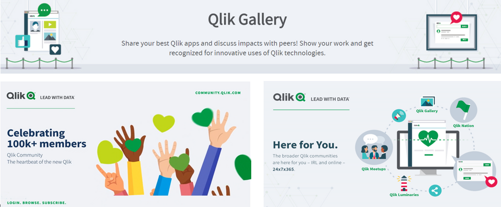
The design concept was initially born with the launch of our Qlik Gallery and was later incorporated into many of our social campaigns, such as these:
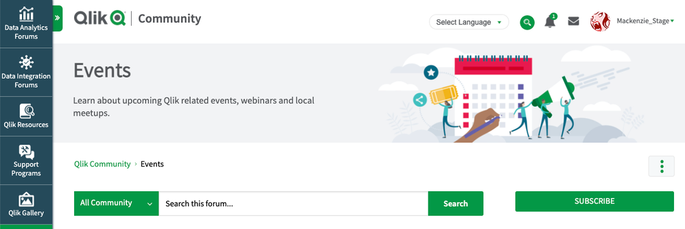
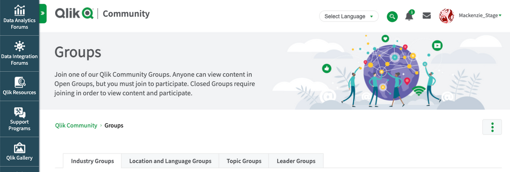
If you browse across the community you will see banner images have been updated site-wide.
Some Examples:
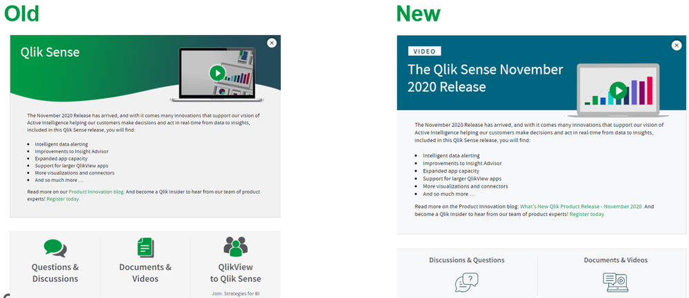
We also updated the cards and action buttons that sit on category level pages:
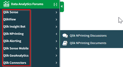
What is a category page:
Categories are the highest-level nodes in our community and are a useful tool for organizing content. From a navigation perspective you can find them as this screenshot below demonstrates. You can subscribe to a category page and we encourage you to do so!
What's next:
The next round of design updates are SO EXCITING - at least for this geek 🙂
Coming to Qlik Community in January 2021:
- Redesigned Home Page
- Improved Navigation
- More modern use of icons site-wide
- Changes to colors, font - all Qlik brand-approved
Then there is one more really big surprise that I just know you will all LOVE !!! 😍
I have to leave just one surprise... !
If all goes as planned we have a lot in store for you in 2021.
See you online -
Melissa
Director, Qlik Community
You must be a registered user to add a comment. If you've already registered, sign in. Otherwise, register and sign in.
