The straight table, included in the Visualization bundle, has all the table properties that we are used to as well as many new features. These new features make it easier for developers to create a straight table and it gives users the ability to customize straight tables in the apps they view. The straight table is ideal when you want to provide detailed data – the raw data. While you do not want to have too many columns (ten or less columns are ideal for the best performance), a straight table can have many columns (dimensions and measures).
As previously mentioned, the straight table can be added to a sheet from the Qlik Visualization bundle. This means developers will need to open the advanced options to add the straight table to their sheet(s) and make edits. Once the straight table is added to a sheet, developers can add columns – either fields and master items or custom expressions. One of the new features that developers can take advantage of to build tables quickly is the ability to add more than one dimension and/or measure at once. Simply select the dimensions and measures you would like to add to the table and then click the Add button.
Once columns are added to the table, they can be dragged as needed to the desired position/order. Developers also can add alternate columns to the straight table. These columns can be dimensions and/or measures. These alternates columns will be available to users to customize the straight table if chart exploration is enabled. This is a great new feature because the user does not need edit permissions to modify the straight table. Users can add and/or remove columns based on their analysis. Being able to add columns as needed also improves performance since the straight table does not need to display all the columns, all the time. Loading the straight table with the minimum columns needed will decrease the load time.
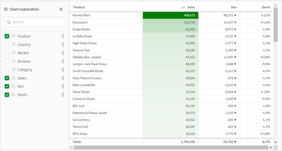
Chart exploration allows users, who are in analysis mode, to add and remove columns from the straight table they are viewing by checking or unchecking them in the Chart exploration panel (see image below). Any users viewing the sheet can customize the straight table. Users cannot see layout changes made by other users using the app, unless they opt to share the visualization or create a public bookmark with the layout saved.
Another new feature for developers is the ability to set the column width. By default, the column width is set to Auto, but developers can set it to Fix to content, Pixels or Percentage. Pagination is another new feature that can be enabled in a Straight table. With pagination, a specified number of rows are displayed at once and the user can navigate through the pages using arrows or selecting the page.
Many of the properties for the straight table are familiar but the new ones are moving the straight table to a new level. Learn everything you need to know about the straight table in Qlik Help and add one to your next app. Also check out the SaaS in 60 video for a quick video overview:
Thanks,
Jennell
...View More
In my previous blog posts (part 1, part 2), I explained how we can use enigma.js to communicate with the Qlik Associative Engine and get access to data. We also went through the concept of Generic Objects and saw how they can be used to do many things including getting raw data and using it to build visualizations.
In this post, we are going to expand on that and take a look at a real world example where enigma.js can be used to get Master Measures data that is rendered as KPIs in a web app, and monitor them for any changes to reflect the latest values.
This post is based on the following tutorial on qlik.dev where you can find the boilerplate code and more resources to help you get started: https://qlik.dev/embed/control-the-experience/dimensions-and-measures/get-master-measures/
You will find the full example code attached at the end of the post, I recommend you download it and open it in your favorite text editor as I will only feature some parts of it to keep this post short.
1- First, let’s take a look at the index.html:
We include the enigma.js library.
We define the configuration options to connect to our Qlik Cloud tenant and other needed variables including:
the tenant URL
the Web Integration ID (you can learn more about how to create this here)
The App ID
and a list containing the names of the Master Measures we wish to access.
const TENANT = '<INSERT YOUR TENANT HERE (example: xxxx.us.qlikcloud.com)>';
const WEB_INTEGRATION_ID = '<INSERT WEB INTEGRATION ID HERE>';
const APP_ID = '<INSERT APP ID HERE>';
const MASTER_MEASURE_NAMES = ['# of Invoices', 'Average Sales per Invoice', 'Sales (LYTD)', 'Sales LY'];
const IDENTITY = '1234';
In the main function, we initiate the login process, get the csrf token, and open the Enigma session. Then we get all the Master Measures via the getMeasureList function, and render only the Master Measure data from the "MASTER_MEASURE_NAMES" list we previously defined.
All the functions are defined in scripts.js
(async function main() {
const isLoggedIn = await qlikLogin();
const qcsHeaders = await getQCSHeaders();
const [session, enigmaApp] = await getEnigmaSessionAndApp(qcsHeaders, APP_ID, IDENTITY);
handleDisconnect(session);
const allMasterMeasuresList = await getMeasureList(enigmaApp);
const masterMeasureValuesDct = await masterMeasureHypercubeValues(enigmaApp, allMasterMeasuresList, MASTER_MEASURE_NAMES);
})();
2- Now, let’s take a look at the different functions that make this happen:
Login and session handling:
the qlikLogin function checks to see if you are login by fetching the /api/v1/users/me api endpoint, if not it redirects to the Interactive idp login page.
getQCSHeaders fetches the CSRF token needed to make the websocket connection to the Qlik Engine.
// LOGIN
async function qlikLogin() {
const loggedIn = await fetch(`https://${TENANT}/api/v1/users/me`, {
mode: 'cors',
credentials: 'include',
headers: {
'qlik-web-integration-id': WEB_INTEGRATION_ID,
},
})
if (loggedIn.status !== 200) {
if (sessionStorage.getItem('tryQlikAuth') === null) {
sessionStorage.setItem('tryQlikAuth', 1);
window.location = `https://${TENANT}/login?qlik-web-integration-id=${WEB_INTEGRATION_ID}&returnto=${location.href}`;
return await new Promise(resolve => setTimeout(resolve, 10000)); // prevents further code execution
} else {
sessionStorage.removeItem('tryQlikAuth');
const message = 'Third-party cookies are not enabled in your browser settings and/or browser mode.';
alert(message);
throw new Error(message);
}
}
sessionStorage.removeItem('tryQlikAuth');
console.log('Logged in!');
return true;
}
// QCS HEADERS
async function getQCSHeaders() {
const response = await fetch(`https://${TENANT}/api/v1/csrf-token`, {
mode: 'cors',
credentials: 'include',
headers: {
'qlik-web-integration-id': WEB_INTEGRATION_ID
},
})
const csrfToken = new Map(response.headers).get('qlik-csrf-token');
return {
'qlik-web-integration-id': WEB_INTEGRATION_ID,
'qlik-csrf-token': csrfToken,
};
}
Enigma session connection:
we use enigma.create() function to establish the websocket connection and create a new QIX session.
we use openDoc() method of the global object to open our app, and then return it for later use.
// ENIGMA ENGINE CONNECTION
async function getEnigmaSessionAndApp(qcsHeaders, appId, identity) {
const params = Object.keys(qcsHeaders)
.map((key) => `${key}=${qcsHeaders[key]}`)
.join('&');
return (async () => {
const schema = await (await fetch('https://unpkg.com/enigma.js@2.7.0/schemas/12.612.0.json')).json();
try {
return await createEnigmaAppSession(schema, appId, identity, params);
}
catch {
const waitSecond = await new Promise(resolve => setTimeout(resolve, 1500));
try {
return await createEnigmaAppSession(schema, appId, identity, params);
}
catch (e) {
throw new Error(e);
}
}
})();
}
async function createEnigmaAppSession(schema, appId, identity, params) {
const session = enigma.create({
schema,
url: `wss://${TENANT}/app/${appId}/identity/${identity}?${params}`
});
const enigmaGlobal = await session.open();
const enigmaApp = await enigmaGlobal.openDoc(appId);
return [session, enigmaApp];
}
Get a list of all master measures in our app:Now that we have the enigma app object, we can use the createSessionObject method to create a session object by passing the qMeasureListDef definition with qType “measure”
// GET LIST OF ALL MASTER MEASURES
async function getMeasureList(enigmaApp) {
const measureListProp = {
"qInfo": {
"qType": "MeasureList",
"qId": ""
},
"qMeasureListDef": {
"qType": "measure",
"qData": {
"title": "/qMetaDef/title",
"tags": "/qMetaDef/tags"
}
}
}
const measureListObj = await enigmaApp.createSessionObject(measureListProp);
const measureList = await measureListObj.getLayout();
return measureList.qMeasureList.qItems;
}
Get data from our list of Master Measures:
Now, we loop through the list of all master measures returned from the function above and only grab the ones matching our list of matching measures from the MASTER_MEASURE_NAMES variable defined in index.html.
We then create a generic object based on the Hypercube definition that includes the matchingMeasures representing the measureObjects’ qIds.
Finally, we listen to any changes using the .on(”changed” …) event listener and grab the latest layout.
// CREATE HYPERCUBE WITH MULTIPLE MASTER MEASURES (INCLUDE MATCHING NAMES ONLY)
async function masterMeasureHypercubeValues(enigmaApp, allMasterMeasuresList, desiredMasterMeasureNamesList) {
let matchingMeasures = [];
allMasterMeasuresList.forEach(measureObject => {
if (desiredMasterMeasureNamesList.includes(measureObject.qMeta.title)) {
matchingMeasures.push({
"qLibraryId": measureObject.qInfo.qId
})
}
});
if (!matchingMeasures.length > 0) {
console.log('No matching master measures found! Exiting...');
return
}
const measureDef = {
"qInfo": {
"qType": 'hypercube',
},
"qHyperCubeDef": {
"qDimensions": [],
"qMeasures": matchingMeasures,
"qInitialDataFetch": [
{
"qHeight": 1,
"qWidth": matchingMeasures.length,
},
],
},
};
const measureObj = await enigmaApp.createSessionObject(measureDef);
const measureObjHypercube = (await measureObj.getLayout()).qHyperCube;
// LISTEN FOR CHANGES AND GET UPDATED LAYOUT
measureObj.on('changed', async () => {
const measureObjHypercube = (await measureObj.getLayout()).qHyperCube;
processAndPlotMeasureHypercube(measureObjHypercube);
})
processAndPlotMeasureHypercube(measureObjHypercube);
}
Render the data to the HTML as KPIs:Lastly, we retrieve the data in “hypercube.qDataPages[0].qMatrix” and loop through it to construct an easy manipulate array of key/value objects which are then injected into the HTML.
// HELPER FUNCTION TO PROCESS HYPERCUBE INTO USER FRIENDLY DICTIONARY
function processAndPlotMeasureHypercube(hypercube) {
const masterMeasureValuesDict = Object.create(null);
hypercube.qMeasureInfo.forEach((measure, i) => {
masterMeasureValuesDict[measure.qFallbackTitle] = hypercube.qDataPages[0].qMatrix[0][i].qText;
});
const masterMeasureKeys = Object.keys(masterMeasureValuesDict);
masterMeasureKeys.sort();
const sortedMasterMeasureValuesDict = Object.create(null);
masterMeasureKeys.forEach(name => {
sortedMasterMeasureValuesDict[name] = masterMeasureValuesDict[name];
})
renderKpis(sortedMasterMeasureValuesDict);
}
// RENDER KPIs
function renderKpis(masterMeasureValuesDict) {
let kpiData = [];
Object.entries(masterMeasureValuesDict).forEach(([key, value]) => {
kpiData.push({
label: key,
value: Number(value).toLocaleString()
});
});
const kpisContainer = document.querySelector('#kpis');
kpisContainer.innerHTML = '';
kpiData.forEach((kpi) => {
const kpiCard = document.createElement('div');
kpiCard.classList.add('kpi-card');
const labelElement = document.createElement('div');
labelElement.classList.add('kpi-label');
labelElement.innerText = kpi.label;
const valueElement = document.createElement('div');
valueElement.classList.add('kpi-value');
valueElement.innerText = kpi.value;
kpiCard.appendChild(labelElement);
kpiCard.appendChild(valueElement);
kpisContainer.appendChild(kpiCard);
});
}
This is how the KPIs are rendered to the page:
To show how the on-change event listener works, let's simulate a change by editing the # of Invoices Master Measure in Qlik:
Looking back the web page, the change is instantly reflected on the KPI:
That’s all, I hope you found this post helpful, do not forget to check out more tutorials on qlik.dev that cover other important use cases!
P.S: to make it easier to run the web app, I have included a server.py file to easily serve the files viahttps://localhost:8000. You can run it with the command: python server.py.
Also, don’t forget to whitelist this localhost domain when generating a new Web Integration ID:
Thanks for reading!
...View More
Let's see how it is possible to control sheet and object-level access in Qlik Cloud, specifically when organizations want to show/hide specific assets in an application based on the group membership of the current user that is accessing the application.
Customer asked how to create a drill-able map, BUT wanted to display different layers when drilling down. It's very easy by simply using a Drilldown dimension and controlling the layer visibility in the map layer options - check it out!
There are now many new ways a filter pane can be customized to change its appearance and/or functionality. In this blog, I will cover the new customizations available. Let's start with the new look of the filter pane properties panel (shown below). Now when the field or master item is selected in the properties panel, an additional properties panel is provided with further appearance and functionality options.
There is now a “Show title” checkbox that can be used by app developers to show or hide the title of the filter pane. App developers can indicate if they want search capabilities on or off in a filter pane by toggling the Search option. By default, the search mode for a filter pane is normal, but now it can be set to Wildcard mode which adds asterisks before and after the search text like this:
This example wildcard search will search for any text with “wear” in it.
In the presentation section of the properties panel, is where app developers can customize how the filter pane will look. By default, the text alignment is set to Auto, but it can also be set to left, center or right. There are checkboxes for the following options: Compact view, Checkbox mode and Histogram.
The Compact view option reduces the space between dimension values, fitting more items in less space. In the image below, the second filter pane has the Compact view option checked. Notice that there is less space between the list items, making the filter pane smaller than the default filter pane on the far left. This can be helpful if space is an issue on your sheet. The Checkbox mode (see third filter pane) will add a checkbox to the left of the list items and the checkbox is what is used to make selections. The Histogram option (fourth filter pane) displays bars under each list items to indicate the frequency of the item in the data – it is like a visual representation of the frequency. Each of these options can be used independently or in combination with one another. Below is an example of each and all three together.
The last of the new customization options that can be found in the properties pane is how to show the data – either single column or grid.
Here is a simple example using the Year dimension. The filter pane on the left is showing the filter as a grid while the filter pane on the right is showing a single column.
Here is another example of the grid option when there are more values.
When displaying the values in a grid, the app developer is presented with the option to set the order and the maximum number of columns. In the example above the values are ordered by row, so you read them from left to right versus top to bottom. The Max visible columns can be manually set (custom) or can be set to auto.
These new filter pane customization options provide the app developer with more flexibility in how they would like to present filter panes on a sheet. Check out Qlik Help for a video on creating a filter pane as well as additional helpful information. Also take a look at Michael Tarallo’s SaaS in 60 video herefor this and other new features in Qlik Sense SaaS.
Thanks,
Jennell
...View More
When analyzing data with Qlik Sense, you might have come across the need to compare two sets of selections side by side. This is where the Alternate States feature come into play, allowing you to create different sets of selections and compare them in the same dashboard. In this blog post, we'll walk through the process of performing comparative analysis using alternate states in Qlik Sense including how to create it, apply it, and we’ll dive into how we can synchronize selections between the default state and alternate states.
What are Alternate States?
Alternate states in Qlik Sense can be thought of as multiple windows looking into the same app data model, allowing users to perform comparative analysis without losing or overriding other selections. Each state represents a unique perspective (For example, a Sales perspective, Operations, or Finance view) on the data, and these different windows or "states" can coexist within the same app without interfering with one another.
The normal operation of Qlik Sense involves a default state that affects the entire app when selections are made since every object in each sheet inherits from this state. However, this inheritance can be broken by creating new states for either sheets or individual objects, allowing them to exist independently and enabling side-by-side comparisons of charts. In this way, selections on different objects on the same sheet can co-exist without interfering with one another. This allows for having side-by-side comparison of charts.
Setting up the Alternate States
Let’s create two states for our example:
Click on “Master Items” then ‘Alternate States”
Select“Create new”
Enter “State A” as the name.
Keep in mind that there are some naming limitations:
- Do not use $, 0, or 1 as a state name.
- Do not use a state name starting with $ or $_ followed by a number (for example $3).
- Do not use a state name already used as a bookmark name.
Repeat the same for the second state and name it “State B”
Add 2 filter panes with the “Country” field and 3 bar charts
For each filter pane, go to Appearance > Alternate Sates and select State A and State B respectively.
In the 2 bar charts, add “Country” as a dimension and “count of distinct Orders” as a measure.
Notice that now, if you try and make a Selection in either filter pane, nothing will happen to the Bar charts, that is because the selections are made to the newly created Alternate States whereas the bar charts are still in the default state.
Applying Alternate States
In order to make the selections on the Alternate states affect the visualization objects, we need to link them to these alternate states. We can do that in a variety of ways:
1- You can drag the newly created state from the left sidebar onto the visualization
2- You can go to the properties of the visualization, and under Appearance > Alternate states, choose the appropriate state from the dropdown (similar to what we did on the filter panes).
3- You can use Set Analysis to add the alternate state to the measure. Let’s use the following expression in our bar charts:
Count({[State A]} distinct orderID)
Count({[State B]} distinct orderID)
Bonus: Dynamic title for the Bar Charts.
If you want the title of the bar chart to reflect the selections of the respective alternate state, you can use the following expression:
='# of Orders '&GetCurrentSelections(chr(13)&chr(10), ': ', ',', 9, 'State A')
This will get the current selections in State A and comma separate them. Repeat this for State B.
Using Set Operators with Alternate States
It’s possible to use Set Operators (+, *, -, /) with states, meaning that we can do intersections, unions, exceptions etc... For example:
Count({$ + [State A]} distinct orderID) -> will count the distinct orders in the union of the “Default” state and the alternate state “State A”.
Count({1 - [State A]} distinct orderID) -> will count the distinct orders NOT in “State A”
Count({[State A] * [State B]} distinct orderID) -> will count the distinct orders that are both in the intersection of ”State A“ and “State B”
Keep in mind that you should be cautions when using set operators in this manner. In some situations the result will not be what is expected. This is because the selections in a given state generate a set of data that may not be fully compatible with the set(s) it is being combined with. This is especially true as the complexity of the data model increases.
Synchronizing Selections between the Default state and Alternate States
When doing comparative analysis, you might run into a case where for instance you have 2 alternate states A and B, as well as the Default state.
Let’s say that we have 3 filter panes based on the field “Country” that have states A, B, and Default. In addition to that, we have 2 more filter panes with fields “Year” and “Month” that only have state Default.
If we’re only comparing Countries, we would be fine to make selections in all 3 “Country” filter panes to compare.
However, if we make a selection in either “Year” or “Month” filter panes which are only in the Default state, we can no longer see a clear comparison. So how can we solve that?
It’s simple, we can tweak the expressions in our 2 “alternate state”-bound measures to the following:
Count({[State A]<[orderDate.autoCalendar.Year] = $::[orderDate.autoCalendar.Year], [orderDate.autoCalendar.Month] = $::[orderDate.autoCalendar.Month]>} distinct orderID)
Count({[State B]<[orderDate.autoCalendar.Year] = $::[orderDate.autoCalendar.Year], [orderDate.autoCalendar.Month] = $::[orderDate.autoCalendar.Month]>} distinct orderID)
Notice that we have added the following set analysis syntax for both "Year" and "Month":
[orderDate.autoCalendar.Year] = $::[orderDate.autoCalendar.Year]
This means that we can keep selections for "Year" and "Month" consistent between states because when we select “Year” and “Month” in the Default states, these selections will be automatically applied to our Alternate States!
Conclusion
Comparative analysis is an essential tool for data analysis. Using alternate states in Qlik Sense makes it possible to compare two different sets of selections side by side. You can also go beyond the basics and leverage the power of Set Analysis to include Set operators or to automatically sync fields across states.
Attached is a QVF that has the example we went through!
Thanks for reading.
...View More