Unlock a world of possibilities! Login now and discover the exclusive benefits awaiting you.
- Qlik Community
- :
- Discover
- :
- Programs
- :
- Education
- :
- Qlik Education Discussions
- :
- How to show Contribution in Pie Chart in Qlik View...
- Subscribe to RSS Feed
- Mark Topic as New
- Mark Topic as Read
- Float this Topic for Current User
- Bookmark
- Subscribe
- Mute
- Printer Friendly Page
- Mark as New
- Bookmark
- Subscribe
- Mute
- Subscribe to RSS Feed
- Permalink
- Report Inappropriate Content
How to show Contribution in Pie Chart in Qlik View?
Hello all,
I am working with Qlik View 11 Personal Edition I have the data like this
| Age Group | Number of Students |
|---|---|
| 20-22 | 30 |
| 23-25 | 20 |
| 25 and above | 50 |
Now I want to show a pie chart to represent contribution.
i.e., if I select "20-22" from the list box, pie chart should show two parts 20-22 (30%) and Others (70%).
I tried "Dimension Limits" by selecting "First" "1" values and "Show Others". But now luck.
Any clues?
Accepted Solutions
- Mark as New
- Bookmark
- Subscribe
- Mute
- Subscribe to RSS Feed
- Permalink
- Report Inappropriate Content
You should be able to do this with a Calculated Dim of:
=aggr(if(only({1}[Age Group])=[Age Group],[Age Group],'Others'),[Age Group])
and an Expression of
sum({1}[Number of Students])
with Relative checked.
See attached example.
-Rob
- Mark as New
- Bookmark
- Subscribe
- Mute
- Subscribe to RSS Feed
- Permalink
- Report Inappropriate Content
Use alternate states
- Mark as New
- Bookmark
- Subscribe
- Mute
- Subscribe to RSS Feed
- Permalink
- Report Inappropriate Content
In pie chart your requeriment aren't possible, but yes in pivot table as this:

- Mark as New
- Bookmark
- Subscribe
- Mute
- Subscribe to RSS Feed
- Permalink
- Report Inappropriate Content
you can store grand total in variable vgtot and use this variable as fourmula no of students/ vgtot in number format choose show in %
Hope this helps you
Vikas
If the issue is solved please mark the answer with Accept as Solution & like it.
If you want to go quickly, go alone. If you want to go far, go together.
- Mark as New
- Bookmark
- Subscribe
- Mute
- Subscribe to RSS Feed
- Permalink
- Report Inappropriate Content
Hi,
Thank you for the solution. Is it possible to show the totals as percentage?
- Mark as New
- Bookmark
- Subscribe
- Mute
- Subscribe to RSS Feed
- Permalink
- Report Inappropriate Content
Hi Vikas,
Thank you for the solution. I tried it but no luck.
- Mark as New
- Bookmark
- Subscribe
- Mute
- Subscribe to RSS Feed
- Permalink
- Report Inappropriate Content
You should be able to do this with a Calculated Dim of:
=aggr(if(only({1}[Age Group])=[Age Group],[Age Group],'Others'),[Age Group])
and an Expression of
sum({1}[Number of Students])
with Relative checked.
See attached example.
-Rob
- Mark as New
- Bookmark
- Subscribe
- Mute
- Subscribe to RSS Feed
- Permalink
- Report Inappropriate Content
Yes .. 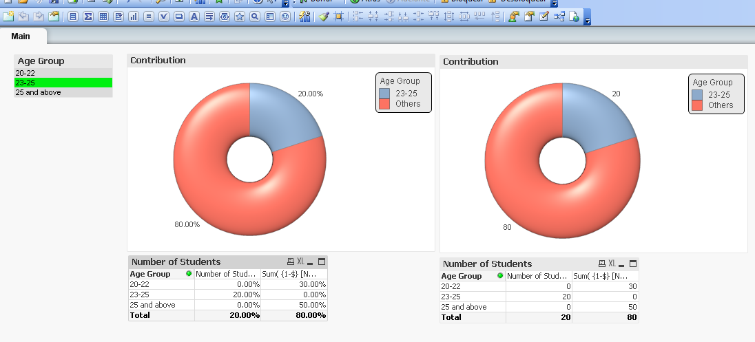
- Mark as New
- Bookmark
- Subscribe
- Mute
- Subscribe to RSS Feed
- Permalink
- Report Inappropriate Content
Hi Ravindra
I think the following is exactly what you are looking for.
Please let me know if you need anything else.
Thanks
Agis
- Mark as New
- Bookmark
- Subscribe
- Mute
- Subscribe to RSS Feed
- Permalink
- Report Inappropriate Content
Thank you so much.