Unlock a world of possibilities! Login now and discover the exclusive benefits awaiting you.
Recent Posts
-
Apple HealthKit - A Delicious Qlik Recipe
I wrote a blog post for Qlik Branch (the Qlik Developer Community) on how to build your own wellness/activity tracker app using your personal health d... Show MoreI wrote a blog post for Qlik Branch (the Qlik Developer Community) on how to build your own wellness/activity tracker app using your personal health data from your Apple iPhone, Apple Watch, and various home monitoring devices. Enjoy!
FULL BLOG LINK with helpful images: https://branch-blog.qlik.com/apple-healthkit-a-delicious-qlik-recipe-d61167e7ab89
------------------------------------------
Apple continues to make health and fitness capability improvements to their software and devices. Every year at WWDC — their Worldwide Developers Conference — healthcare gets the spotlight for a moment. Building upon previous health announcements of the release of HealthKit (I wrote about this a few years ago: the Electronic Sickness Record), CareKit, ResearchKit, and Apple Health Records (recently I covered that: An Apple a Day Keeps the Doctor at Bay), they continue to make it easier for people to track their well-being, effortlessly.
Like the saying “the best camera you have is the one that’s with you”, IoT sensors passively collecting your health data will prove invaluable. In the past, this data had to be tracked manually, or through a visit to your doctor to assess occasionally. But it’s not that the data is being always collected and just there for you to review. It’s that it’s being collected seamlessly and combined with context to provide you and your care team with more complete and timely information that can be used to find things before it becomes a problem and you end up at the Emergency Department. This is the promise behind this technology in driving the way to true digital transformation in healthcare.
A little background and why I wanted to build an Apple HealthKit app
Your doctor and the systems they use (the EHRs — Electronic Health Records systems) only know so much about you. Think about it — your doctor usually only sees you once a year for your annual checkup, or when you are sick. The data your health system has therefore isn’t really a reflection of your health, but of your sickness at a few points in time.
Most likely there is a device in pocket that has much more detail about your health. Smart phones and fitness devices can provide you with a much better picture of your health overall, yet few doctors are utilizing this rich data.
My iPhone and Apple Watch are tracking key health measures in the background every minute. It’s recording my steps, blood pressure, weight, exercise, and nutrition. It knows my location, the temperature outside, and the air quality; these are all key factors or metrics important to my health. Unfortunately, the built-in health app is locked down and only shows snapshots of my health trends rather than more robust analysis of my personal health. Apple is making some changes here with iOS 13 and WatchOS 6, but you will be stuck with what they choose to display.
Using Qlik, I can analyze all of this collected data, in any way that I want. Using years of fitness data that is accurate down to the minute will tell stories of my health and activity. I can see how my diet is affecting my weight (did I really need that Grande size cappuccino and a chocolate croissant?), how I need to get better at walking 10,000 steps a day, how travel and weather impacts my exercise regimen (hint: travel means little to no exercise for me, and warmer weather at home means I get more steps in).
Does my doctor see any of this? Nope — not yet. Well, not unless I show her my phone — and then what will she do with data? Maybe we’d have a conversation about it while I’m sitting on the cold table in a funny gown, but she’s certainly not going to track how I’m doing next week or months later when I change my diet or visit the UW Memorial Union terrace for beers with friends more often during the summer.
While EHRs have the ability to bring in personal health data (often called PRO or Patient-Reported Outcomes), many organizations have not turned on this capability or they fail to use it effectively. This is a missed opportunity to see the whole story. Should we go ahead and just call the systems our doctors use Electronic Sickness Records?
How to download your personal health data for analysis
1. Export data from Apple Health app on iPhone. Click your Profile icon in the top-right corner, choose ‘Export Health Data’.
2. Save the ZIP file, load it onto your desktop, and extract the contents.
3. Pass the export.xml file through the Apple Health XML to CSV Converter: http://ericwolter.com/projects/health-export.html. This browser-based tool uses the FileReader API and FileSaver.js library to convert the file into CSVs, which are easier for us to use. Not comfortable with this step? Review the Github repository: https://github.com/eligrey/FileSaver.js
How to bake a nice Apple app with Qlik Sense
Once you’ve converted your Apple Health data into upwards of 40 different CSVs, you now have a fun problem on your hands. How do you bring all of this data together and get insights? I picked the most useful files based on file size and name, but you can grab anything and bring it into Qlik Sense and let the magic of the associative engine wire it all together. You will need to create a File Folder connection as likely some of the files are over the size limit for dragging-and-dropping into the interface.
The Associative Engine chooses the StartDate as the key field to bring everything together, and I renamed this to Date:
Another tool that I used to explore the data model was Catwalk — a great little utility from the Qlik Core team: https://catwalk.core.qlik.com
Catwalk provides a quick way to browse relationships and the data frequencies. I wouldn’t have quickly noticed which apps/devices were storing Apple Health data without it. For instance, I totally forgot that Pokémon Go was collecting and storing some health data for that brief time I wandered my neighborhood in search of creatures. I just use the javascript bookmarklet to quickly explore the data model for any open app as I’m developing. Give it a try!
Once you have the data loaded, you can start the visualization process and create stories about your own health. I used a healthy mix of native Qlik Sense objects and also some extensions from Vizlib and Narrative Science to paint these pictures.
I wanted to keep a familiar look and feel of the Apple Health and Apple Watch activity rings. A darkmode theme for Qlik Sense (build your own with Bitmetric’s SenseTheme Builder) and the Vizlib Activity Gauge object made it come together quickly and beautifully:
What better way to tell a story with your data, then by having your data tell the story directly?! Enter Narrative Science. I asked the extension to analyze my step count and give me some insights:
I didn’t want to stop there. Everybody has up and down days for activity. Did the data tell me anything about how my health is trending for the better (or the worse). I could infer some trends from the line charts, but a great way to measure warranted and unwarranted variation is with statistical control charts, such as this I-Chart from Acumen BI:
This highly configurable but easy-to-use extension helps you to quickly build a control chart. It’s not only showing the average steps, it is also automatically recalculating the average, upper control limit, lower control limit, and outliers based on runs and trend triggers. Looking at the chart above, I must have been on the road in late January as my steps dropped, causing my average to be recalculated lower. Net-net: I was walking less because I was tied up in meetings (and the weather probably wasn’t great either).
Last, and certainly not least, I wanted to figure out how to indicate one of the greatest moments of my life, the birth of my first child. You can clearly see a dip in activity (rightfully so) on the day Jack was born. How did I achieve this? With annotations on the Vizlib Line Chart object. It really helps tell the story of events and how they impacted the data. You’ll be happy to know that the baby and I go on numerous walks each week.
Telling the story of your health with data can be a truly personal and insightful experience. If you’ve been passively tracking your health with your devices, try throwing the data into Qlik to see what you can discover about yourself. Maybe it’ll even push you to get to those 10,000+ steps a day.
Now, get out there and close those rings!

-
Webinar - QlikView and Informatica - Using Relationship Analytics to Improve Pat...
Date: May 2, 2012Time: 2:00PM - 3:00PM EST / 11:00AM - 12:00PM PSTDuration: 1 hourHealthcare organizations are facing a tidal wave of data and have a ... Show More
Date: May 2, 2012
Time: 2:00PM - 3:00PM EST / 11:00AM - 12:00PM PST
Duration: 1 hour
Healthcare organizations are facing a tidal wave of data and have a real urgency to find cost effective, high-value ways to derive value from this data to improve care and reduce costs.
Informatica and Qlikview offer just the solution – enabling powerful, easy-to-use analytics against trustworthy data to answer key business and clinical questions such as…Who are my primary patients or members? What is the relationship between my patients and their providers? To whom are my providers referring my patients? What are the household relationships between my members or patients so that I can increase revenue?
Join Informatica’s Chief Healthcare Strategist, Richard Cramer, and QlikView’s Healthcare Director, Tracy Behar, to discuss how to overcome data challenges to better understand your customers, service providers, and the relationships between them to improve service quality, increase revenue and create business agility.
In this interactive webinar you will learn:- Why relationships are so important to understanding your business
- How to fix unreliable, conflicting or poorly managed data to makes relationships easier to manage
- How analysis and reporting can be achieved at the physician, organization and service line level
Register here: http://tinyurl.com/7zfzj94
-
New here 👋🏼
I'm new here and just checking out this space - love what you all are doing! -
Hi There
Im new
-
Healthcare (Oncology) Dashboard: Meet New App in Qlik Gallery
Check out our new Qlik Sense app featured in the Qlik Gallery: 🏥 Unlock transformative insights in healthcare using Qlik Sense with AnyChart's exten... Show MoreCheck out our new Qlik Sense app featured in the Qlik Gallery:
🏥 Unlock transformative insights in healthcare using Qlik Sense with AnyChart's extensions: Decomposition Tree, Gantt Chart, Combo Chart, Sunburst Chart, and Timeline Chart. Dive deep into metrics like admissions, patient counts, and treatment costs. Perform root cause analysis or ad-hoc explorations with ease. Maintain clear, actionable visibility of doctor-patient timelines and track each patient's journey with insightful precision.
Check out the app in the Qlik Gallery:
👉 https://community.qlik.com/t5/Explore-Qlik-Gallery/Healthcare-Dashboard-Oncology/ba-p/2458556 -
Digitized Human Body Map for Qlik Sense
Using Qlik GeoAnalytics and a few open-source tools, you can create engaging visualizations tied to your data such as this. Ever wondered how else the... Show MoreUsing Qlik GeoAnalytics and a few open-source tools, you can create engaging visualizations tied to your data such as this. Ever wondered how else the number X-rays and MRI scans received at hospitals can be visualised? Just a simple click and you can find out what individual body parts had the most scans!
The GeoAnalytics team wrote up a tutorial on how to do things like this: https://community.qlik.com/t5/Qlik-GeoAnalytics-Documents/Digitizing-floor-plans-for-use-in-Qlik-GeoAnalytics-QGA/ta-p/1489032

-
Data Visualization Highlights for Healthcare - Video
Data visualization helps to tell patient stories. Check out this video ( https://youtu.be/CBnaPbGGWfc ) of various Qlik implementations for Healthcare... Show MoreData visualization helps to tell patient stories.
Check out this video ( https://youtu.be/CBnaPbGGWfc ) of various Qlik implementations for Healthcare including statistical process control charts (SPC), Vizlib dashboards, Apple HealthKit, and NHS Command Centers.
#Qlik #QlikSense #HealthTech #analytics #dataviz
-
using html in Sense
Having successfully used html within a text box, am now trying to use html within chart expression for a table.any ideas?... so that I can show a summ... Show MoreHaving successfully used html within a text box, am now trying to use html within chart expression for a table.
any ideas?
... so that I can show a summary list of a person's health transactions
-
Visualizing Paths and Flow with Sankey Diagrams
Sankey diagrams are a specific type of flow diagram, in which the width of the paths represent some quantity. These multidimensional visualizations he... Show MoreSankey diagrams are a specific type of flow diagram, in which the width of the paths represent some quantity. These multidimensional visualizations help you to see flow and discover category relationships with a different perspective. If you were to ask me what my favorite visualization was, I'd most likely say: "The Sankey!"
Sankey diagrams show metric flows and category relationships. You can use a Sankey diagram to visualize relationship density and trends.
Use Cases for the Sankey Diagram
Use a Sankey diagram to visualize activity patterns such as:
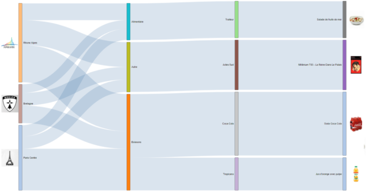
- Flow: Patient admission and visit flow through your health system - where are patients coming from and where do they have encounters without our facilities and offices?
- Flow: Patient web activity on your patient portal - where are patients looking for information and where do they end up?
- Flow: Longitudinal risk scores for multiple visits - how do risk scores change with subsequent visits?
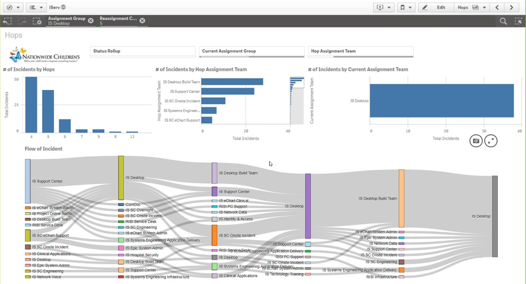
- Flow: ServiceNow ticket handoffs and SLA compliance (showcased by Nationwide Children's in Nov 2017) - which requests or departments pass tickets back and forth perhaps too much?
- Flow and Relationships: Care Pathways showing outcomes metric by various treatments or protocols - do patients receiving X have better outcomes than patients on Y?
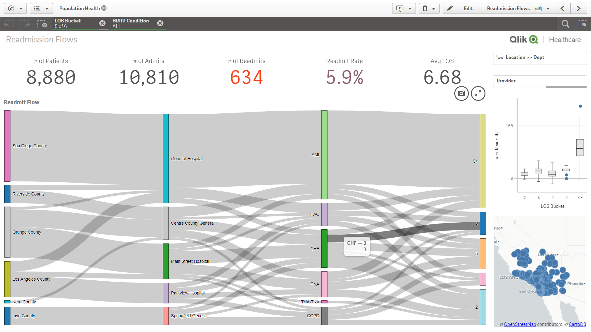
- Relationships: readmissions by a variety of dimensions like county, hospital, condition, complexity, comorbidities, outcomes
- Relationships: Adherence by a variety of demographic and SDoH dimensions like sex, age, race, ethnicity, smoking status, language, support network, community, etc.
- What else have you seen or envision to be useful with a sankey? Please leave a comment here.
Data Requirements
To build a Sankey diagram, you need to have data that includes source and target categories (dimensions) and a metric that you are tracking between them. Luckily, with the Sankey diagrams, these can be completely different types of dimensions and hierarchies, or they can be source and (multiple) target(s) to visualize paths.
Think about it like this: you have one metric/measure of interest (like volume) and multiple dimensions to look at. In contrast to a scatter plot where you have one dimension and multiple metrics/measures.
How to Build/Download a Sankey Diagram
Qlik Sense
- Sankey Diagram for Qlik Sense - http://branch.qlik.com/#!/project/568aa0b06ed0f0f47a89d7f2
- Colorable Sankey - http://branch.qlik.com/#!/project/59f895c77b3744420b107829
QlikView
- QlikView Sankey Improved - http://branch.qlik.com/#!/project/57fce146e41f9c61570e6521
Examples

-
Wu's News - Operating Room Efficiency
Howdy folks! My name's Jeff Wu, and I'm a Solutions Architect here at QlikTech. I joined QlikTech back in June of 2012 and prior to that was at Epic... Show MoreHowdy folks! My name's Jeff Wu, and I'm a Solutions Architect here at QlikTech. I joined QlikTech back in June of 2012 and prior to that was at Epic for six years serving as the Senior Application Director for the OpTime and Anesthesia applications.
Since joining I've gotten an opportunity to see what a lot of customers are doing with Qlikview and it has sparked my passion for better healthcare delivery and a desire to share my experiences in healthcare with others.
Today I'd like to talk about my favorite place in the hospital…
The Operating Room.

You're getting sleepy...
In my years as an implementer, I've gone live with Epic at over 50 individual hospitals; there really is no place like the ORs. With the ED a close second, there is no place in the hospital that is more critical to have operational efficiency from start to finish. According to a recent HIMSS article, the ORs are responsible for up to 60% of a hospital's revenue. On that note, the ORs can also account for more than 60% of a hospital's margin. This means that the most minor of problems in this area can have monumental effects on a hospital's operational effectiveness. First Case Late Starts, Delays, Add-on Cases, PACU time, patient transfers, etc. can all have very negative repercussions if not addressed in a timely fashion.
Take for example, the effect of one situation:
A surgeon is 15 minutes late to pre-op his first patient of the morning. The patient is scheduled for a basic laparoscopic cholecystectomy to treat gall stones. When she arrives, the surgeon speaks with the anesthesiologist, who is hesitant to go through with the procedure due to the patient's history of smoking, asthma, diabetes, and a recent bout of pneumonia. The surgeon is annoyed, but not wanting to lose her surgical slot, orders some STAT blood tests to check the patient's ability to undergo surgery. Upon return, it is confirmed that the patient is too sick to undergo the procedure. The case is cancelled.
What sort of revenue impact did this have? Well let's see. Due to the surgeon arriving late, the case was cancelled too late to actually make use of the room time. Both the surgeon and anesthesiologist lost the revenue that would be associated with performing the procedure. To insure speedy transitions, supplies for a surgery are laid out prior to a patients transfer into the OR--all those supplies are now wasted. Any pre-induction meds mixed specifically for that patient by the pharmacy or anesthesiologist are also wasted. What started as one small problem (surgeon arriving late) can develop into a significantly more complex problem. Now, you might think that this is a very rare occurrence that such an unfortunate series of events could happen, but I guarantee that if you talk to any surgical staff, this kind of thing has happened at least once in the past month, or more probably, the past week.
All of these combine for a massive loss to the hospital. Now, there are bound to be times when physicians are late; there are bound to be times when a patient forgot that they had to be NPO, but addressing what can happen will mitigate the financial impact of what inevitably will happen.
So how can we address this?
With data.
But not just any, or some, we need all of it. All of it is the only way we can have an informed understanding of the situation and make an informed decision to correct it. As technology has progressed, sophisticated documentation systems have evolved to capture all the components that are necessary to address these problems. The next problem is that this data lies in disparate systems that have difficulty communicating with each other. This was what I dealt with on a near daily basis in my time at Epic. Customers came to me with problems that they had the data to understand and correct but could not associate it meaningfully to make an informed decision. Take, for example, the very simple question every OR Director or Manager has to deal with:
Based on the number of add-on cases for the day, should I open an additional OR or pay my staff overtime?
This seems like a simple question, but what goes in to making an informed decision for an issue like this is extremely complicated. Factors such as the add-on procedures, to the staff on hand, to the cost of staff, average hours per stay, average time per procedure, even the day of the week can all impact whether the person in charge says yay or nay to something as simple as opening an additional OR. Additionally, this information is in multiple places besides the EMR. In my experiences prior to QlikView, OR Directors and managers were relegated to simply making gut checks on whether they thought a new OR was needed or whether paying staff overtime was sufficient, even though they had powerful systems and loads of data to look across to make a decision.
Here's where I get excited by QlikView. Because of QlikView's inherent powers to associate disparate sources of data, the previously difficult or impossible is now a logical first step.
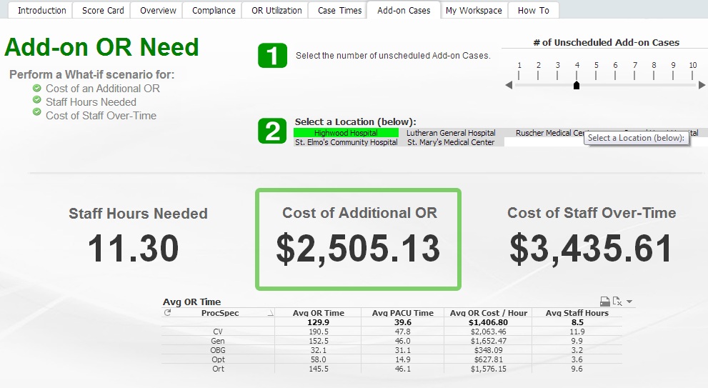
This application takes into account EMR and Timelog data to help visualize information for decision making.
And we're just scratching the surface on what's possible.
Check out our upcoming marketing data sheet on ED and OR operational efficiency coming soon!
Up Next: A review of Meaningful Use Stage I and a foray into Meaningful Use Stage II
-
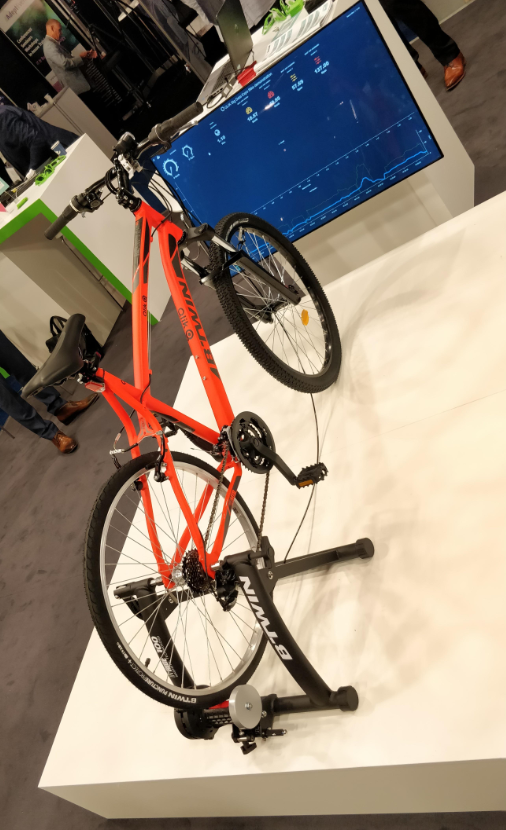
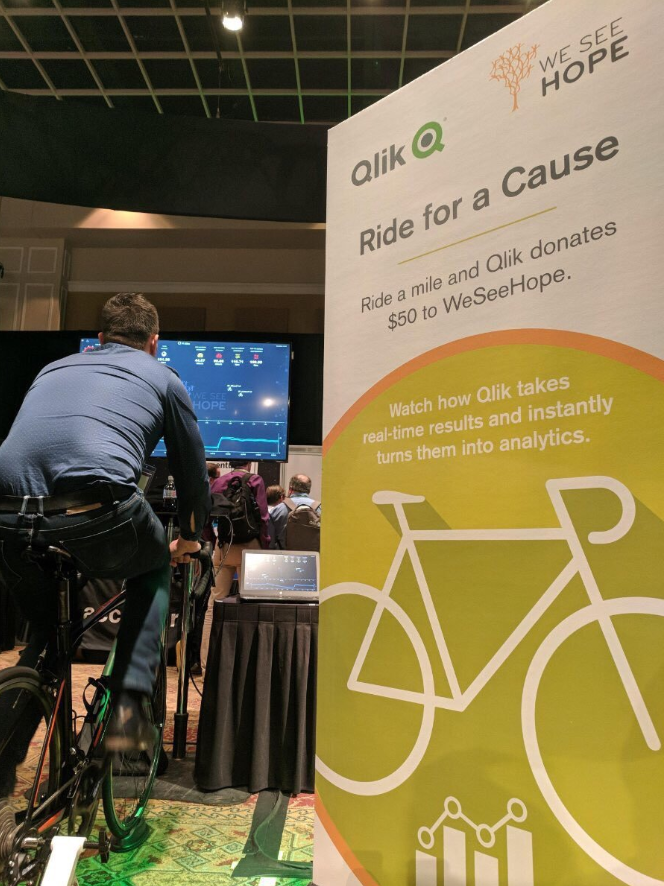
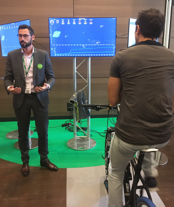
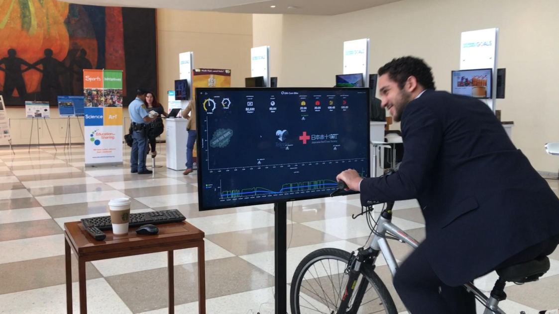
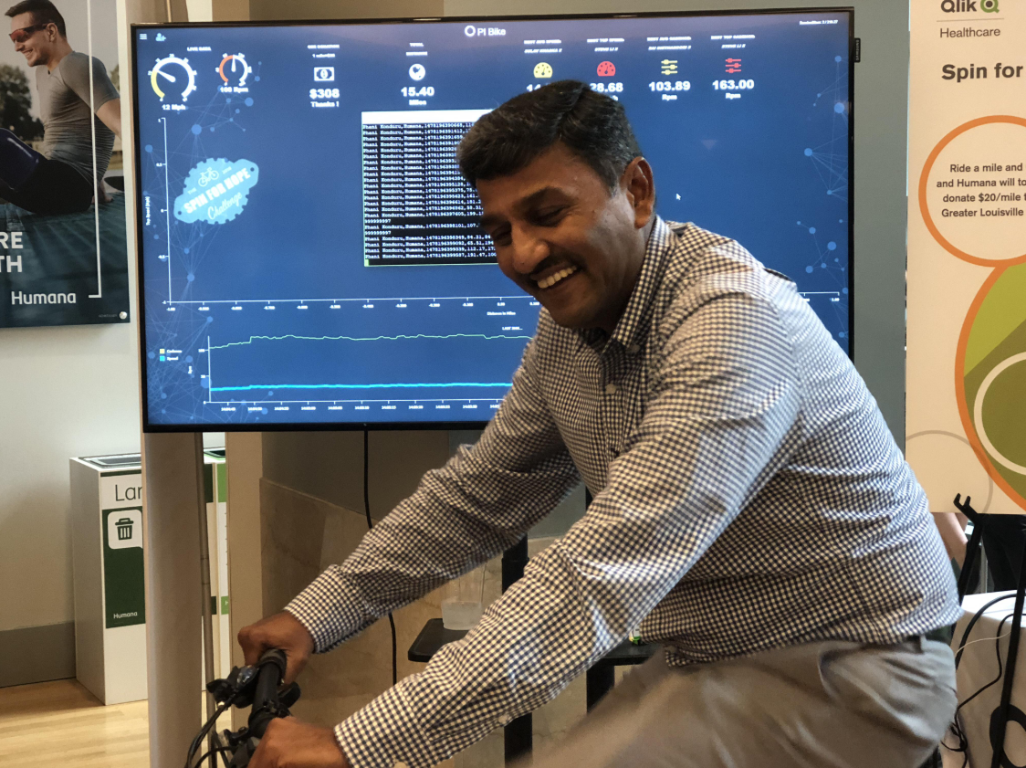
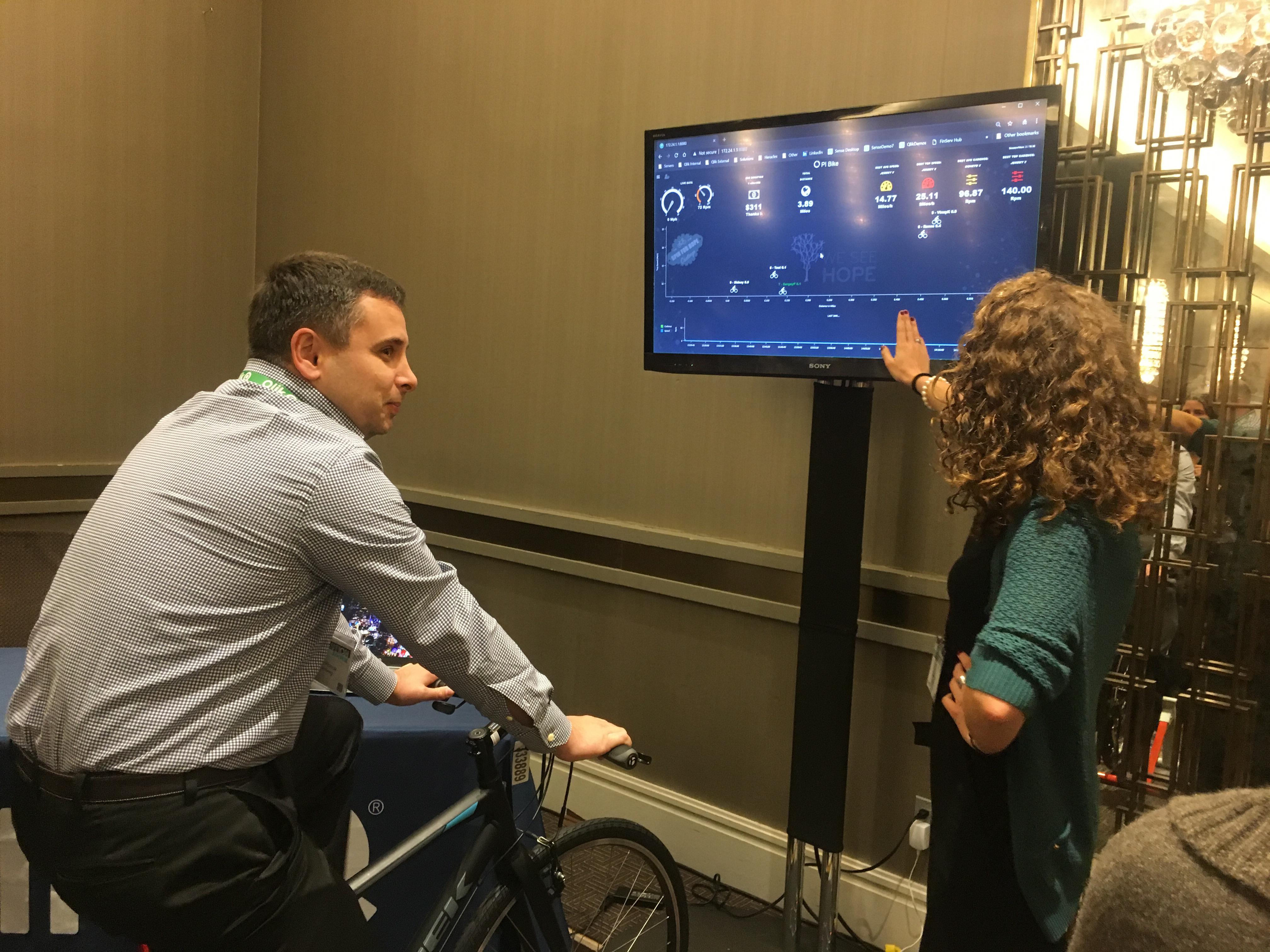
The Qlik Core Bike - Touring the Globe
You may have seen, heard about, or even ridden the Qlik Core powered bike at any of many various events. Qlik Core and the fun bike experiment launche... Show MoreYou may have seen, heard about, or even ridden the Qlik Core powered bike at any of many various events. Qlik Core and the fun bike experiment launched at Qonnections 2018, and the bikes have been making appearances and making people sweat in their business casual clothes ever since.
Some posts announcing and describing Qlik Core and the bikes:
- Introducing Qlik Core® - Beta
- Bike.qlik.com - The beauty of Qlik's Open Source with Qlik Core, Enigma.js, Picasso.js and Qdt-components
- Meet the New Kid on the Block, Qlik Core is here!
- You can also visit the main site and explore the resources at https://qlikcore.com
If you're interested in bike, just let us know. It's great for fundraisers and fitness challenges!
Now for a few random photos of the bike and participants. A few videos at the bottom.
 _qlik bike_ _ Search _ LinkedIn.png)
 _qlik bike_ _ Search _ LinkedIn.png)

 _qlik bike_ _ Search _ LinkedIn.png)
 _qlik bike_ _ Search _ LinkedIn.png)

Overview video of Qlik Core:
Introducing Qlik Core - YouTube
Qlik Core Bike in action video:
Qlik Core Helicopter Game
Qlik Fed Summit
Qlik Fed Summit
#QlikCore #QlikBike #QlikCoreBike #PiBike
-
Appalachian Regional Healthcare Transforms Machine Learning Insights into Improv...
Now more than ever, healthcare organizations are tasked with delivering better patient care. But for many reasons, including worker shortages, healthc... Show MoreNow more than ever, healthcare organizations are tasked with delivering better patient care. But for many reasons, including worker shortages, healthcare systems are having to improve efficiency and effectiveness with the same resources. A growing trend is to introduce an Internet of Things (IoT), artificial intelligence (AI), or machine learning (ML) solution to streamline staff workloads and address other common challenges. But these solutions can be expensive and risky if they fail to deliver. The many organizations that have decided the reward is worth pursuing are adopting creative solutions to mitigate the potential risk.
-
Healthcare Apps experience in Cardiology, Radiology and Oncology
I am looking to present to healthcare C-level leaders the value add of Qlik applications in the following departments: Cardiology, Radiology and Oncol... Show MoreI am looking to present to healthcare C-level leaders the value add of Qlik applications in the following departments: Cardiology, Radiology and Oncology.
Would you have predictive analytics experiences or KPIs that could be interesting to pitch to a CFO for example?
Where would you recommend me to search?
That would be great if you can share experiences. Thanks.
-
3 Potential Impacts Real-Time Operational Data Can Bring to Your Healthcare Syst...
Hospitals generate an enormous amount of data daily, which can be turned into actionable insights that can better operations, save costs and overall p... Show MoreHospitals generate an enormous amount of data daily, which can be turned into actionable insights that can better operations, save costs and overall produce better patient outcomes. However, if the data is siloed or housed in various conflicting formats, it can be outdated, incorrect or valueless once accessed by its user.
-
How to Connect QlikSense to a 2013 SharePoint List
** Prerequisite – Install Qlik Sense REST Connector **1) Get guid from SharePoint list (Maybe your SP Administrator can provide this?) Navigate to t... Show More** Prerequisite – Install Qlik Sense REST Connector **
1) Get guid from SharePoint list (Maybe your SP Administrator can provide this?)
- Navigate to the aspx page that contains the list:
Example page: http://sharepoint/company/home/folder/project/new/newer/_formats/001/default.aspx
- Click on the Site Contents link
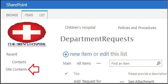
- Click on Settings

- Doesn’t matter if you actually have permission to the object the Access Denied page has the information you need! Look at the URL and search the string from RIGHT to LEFT and find the first instance of the word “List” and copy everything from that point to the end of the URL.
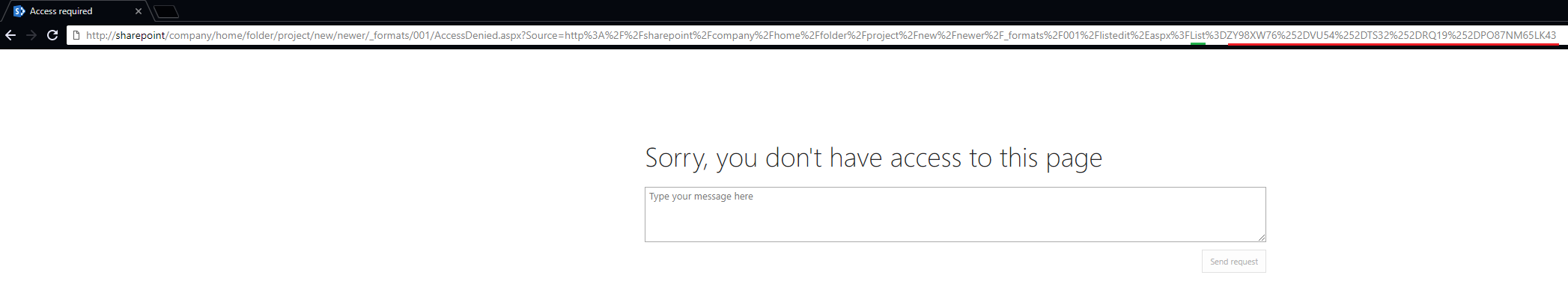
Example url: http://sharepoint/company/home/folder/project/new/newer/_formats/001/AccessDenied.aspx?Source=http%3A%2F%2Fsharepoint%2Fcompany%2Fhome%2Ffolder%2Fproject%2Fnew%2Fnewer%2F_formats%2F001%2Flistedit%2Easpx%3FList%3DZY98XW76%252DVU54%252DTS32%252DRQ19%252DPO87NM65LK43
- The %3D in the url encoding just means the equal sign (=) so it can be ignored. Change all “%2D” to “-“ (I used notepad)

- Wrap the result in curly brackets and you have the List ID
Example GUID List ID = {ZY98XW76-VU54-TS32-RQ19-PO87NM65LK43}
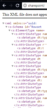
2) How to view xml code of a list view
- Build URL: http://{0}/_vti_bin/owssvr.dll?Cmd=Display&XMLDATA=1&RowLimit=0&List={1}
{0} – The URL to your site. This could be the root web or a child site.
{1} – The GUID for your list.
Example URL for viewing XML in browser:
http://sharepoint/company/home/folder/project/new/newer/_vti_bin/owssvr.dll?Cmd=Display&XMLDATA=1&RowLimit=0&List={ZY98XW76%252DVU54%252DTS32%252DRQ19%252DPO87NM65LK43}
- Copy and paste the new url into your favorite browser and you should see a page of XLM. If you can't view the XML in a browser you won't be able to view it in QLIK so make sure you can see the information before continuing.
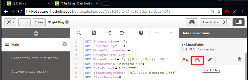
3) Open your QlikSense application and create a new connection using the "Qlik Rest Connector".

4) Create new rest connection.
- Enter the url you created in step 2.
- Set the authentication and create a meaningful name (cnSharePointExampe)
- Fill out the remaining options as follows and test the connection
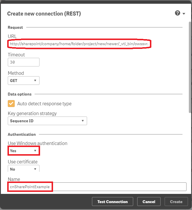
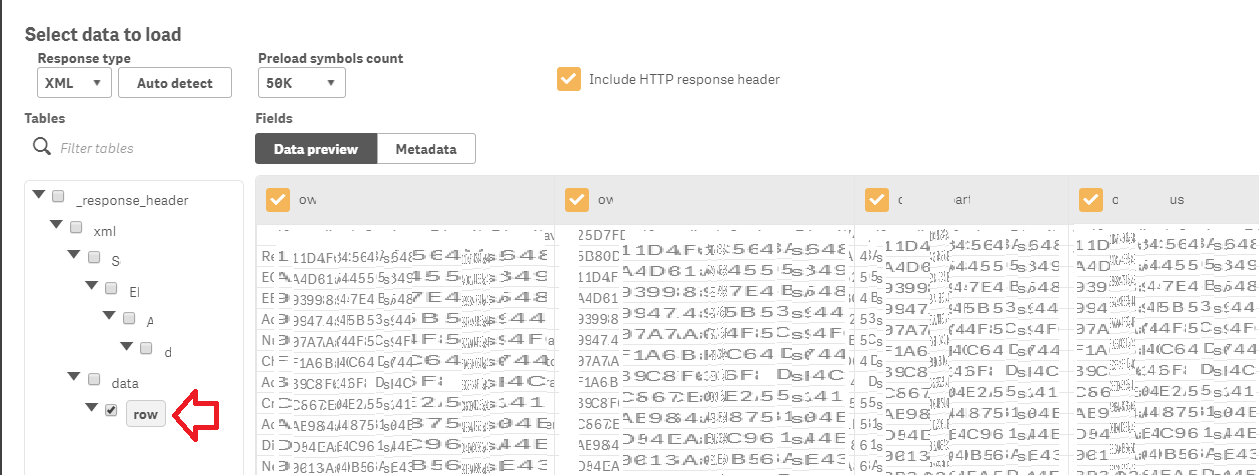
5) You can now load data (similar to any other data load process)

-
EPIC In HealthCare
Hello All,Marry Christmas!!I want to know about EPIC EMR. How can we integrate EPIC EMP records in our dashboard.Do we need to purchase some API or co... Show MoreHello All,
Marry Christmas!!
I want to know about EPIC EMR. How can we integrate EPIC EMP records in our dashboard.
Do we need to purchase some API or connector from EPIC to do so. Please provide a basic structure details we need to incorporate in our Qlik application to enable user to access EPIC EMP records and details in the dashboard.
Thanks,
Sujeet

-
Bullseye Chart in Qlik Sense — Just Added! (Use it to visualize drug development...
💥Bam! Meet Bullseye charts in Qlik Sense! 🎯Qlik counted on us to provide its customers with "additional choices for building even more compelling vi... Show More💥Bam! Meet Bullseye charts in Qlik Sense! 🎯
Qlik counted on us to provide its customers with "additional choices for building even more compelling visualizations," and we couldn't stop innovating 😎
⚡️ The March 2021 release of our Qlik extensions is out with the Bullseye chart — one of a kind in QS 💎 Also added, new great features for Gantt charts. All highlights here — see what's new.
🏆 Enjoy the new versions and hit the bull's-eye in data-driven decision making with Qlik and AnyChart.
What do you want to get next? Let us know!
-
Predictive Analytics Will Define the Future of Healthcare
At HIMSS 2022, one of the big topics of conversation was how to drive efficiency in healthcare without compromising the patient experience. Healthcare... Show MoreAt HIMSS 2022, one of the big topics of conversation was how to drive efficiency in healthcare without compromising the patient experience. Healthcare is human-centric, and the literal life-or-death situations faced by clinicians and patients every day means there’s little opportunity to experiment with new processes and technologies that could drive efficiency. Any change needs to be simple to implement, work quickly and reliably, and produce results in order to be deemed a worthy investment.
-
Turning Health Data Deluge Into Actionable Healthcare Analytics
At the time, the 2009 HITECH Act and the introduction of the Meaningful Use program represented a momentous step in healthcare’s digital transformatio... Show MoreAt the time, the 2009 HITECH Act and the introduction of the Meaningful Use program represented a momentous step in healthcare’s digital transformation. With billions of dollars in government investment and incentives in nearly two years’ time, over 77 percent of hospitals had reached Stage 3 of the Electronic Medical Record Adoption Model (EMRAM), or gone even further, pulling millions of data points into newly-established EMRs.
-
Did you miss connecting with our healthcare partners at QlikWorld?
Join your peers at our Public Sector Partner Summit starting June 7 to learn about:Addressing Population Health Challenges with Qlik from the Deputy ... Show More


.png")
.png")
.png")
.png")


Healthcare

| User |
|---|
|
New Member
|
|
Contributor
|
|
Observer
|
|
Contributor
|
|
Reader
|